Monthly Archives: April 2015

Class Trip to Galleries – Wilbert Perez

The Chinese Photobook at Aperture

Prior to entering the exhibition at Aperture, I had a small clue as to what I was getting myself into. I was instantly amused and excited to find the specific works on display that tackled issues like culture, lifestyle and history. The works at the Chinese Photobook unveiled new aspects about its dynamic culture, dramatic twists in politics and it’s rich diverse heritage that allow it to be better understood and better represented in a foreign light. The photographs depicting the history of China during numerous years were very different.
In my opinion, the section that shined a pivotal moment within Chinese history at this exhibition was the photographs taken of Chinese Leader Mao Zedong. At a first glance, you can visualize the decisions the photographer took in great thought about he whereabouts and how he was representing those whereabouts to those not familiar. The thought-process in how he chose the angles used in the photographs reflect the attitude of the country’s people. Certain aspects are put into place to reflect Mao’s impression on his people as an almighty, culture-defining leader, and one who was looked up to an idol and was highly respected. From a low angle it gives us the impression as if we were looking up to him.
The scenery complimented the lighting choices, which happened to be always fully lit and mainly focused on his face, even though most shots that were taken outdoors. The background past him were usually not in focus and not as bright as Mao was which made him look much more radiant in comparison. The people featured in Mao’s photos were applauding the man, praising him. The photographs captured Mao at several points of his life, political events and non-political tasks or activities.
The way the photos of him were arranged and framed reflected how the exhibition wanted us the audience to experience Mao. It reveals the different stages from his life as if his life was to begin from the start of his term all the way to the end, producing a visual and interactive record of his reign. I was able enjoy these portraits of him, mainly due because due to elements of photography that were used back then and how those elements continued to be used today for special and particular projects.

Jimmy Nelson

The exhibit featuring Jimmy Nelson’s photos at the Bryce Wolfowitz gallery were show-stopping. The presentation nailed the atmospheric feeling from its photos. Nelson’s interests in diverse cultures were explicitly depicted through the emotions of the models, and locals of where they were shot.

The fact that Nelson’s photographs were composed of very vibrant, saturated colors and high contrast, says a lot when reviewed in a broader sense in the gallery. His choices challenge the idea of social equilibrium within this culture since each of the models expressions was very firm. The facial expressions of the models draw you into each photo and help you as the audience want to question their culture and environment. Nelson made key, tough decisions that proved to be successful in showing a lot about the culture. The best photo in my opinion included the men afloat on what looks like to be different rafts. For one moment it feels as if the world halted and the water was a standstill while Nelson captures this shot. The decision on what to focus on was questionable at first for me, but after reviewing the photo for a longer period I began to take on small cues as to why the photo was shot in it’s format.
The levels of detail within the photos featured are astounding and give the audience an “I could have been there myself” type of feelings. Nelson tries to introduce a new level of significance by propelling them to the focal subject of his project using different ranges of composition. Lighting choices for the human subjects are critical to delivering his message by defining the culture for the world to witness, instead of the culture being just mentioned and later to be forgotten. The photo-series feels much more like representation then a description.

The Public Eye

The last exhibit of the Public Eye was based on the influence of sharing and how fast-paced our world around photography has become. It explained the different methods photographers went through to be able to share their work, whether it is by crowd sourcing, photojournalism, social networks and or others. This exhibition only reassured photography’s importance in modern day America alongside the strides made with the tool around the world.

Looking back at photography, it has definitely come a long way and the differences between how photos were shared centuries ago to now be astounding. Photography is a much more open subject now then even as far back as 10 years, simply due to people being more accessible to them.

One particular photographer that I noticed was Ethan Levitas, who shot “Frame 21. His subject is being shot from what looks like a bird eye’s view, but in actuality it’s in front of a NYC security camera. Using what looks to be the camera’s peripheral vision, the photographer is able to capture unsuspecting subjects or split-second reactions from people with a good eye.

Final Project
As for my final project, I want to capture emotion and vibrancy. I want my photography to be vivid and lively. I’m not too sure what I will be focusing on regarding composition but I will work on making sure the lighting is in sync or consistent within the photos. I’m looking to refine my abilities as a photographer and mash up my skills to build up a well-thought photo series that could potentially work for a advertisement of some sort.

Career goals upon graduation
My career goals include furthering my education to it’s maximum potential, working on particular projects to further my portfolio, work with younger and older creative people to get both sides of a prospering industry, follow-up with a internship or work as a free-lancer.

3 Para, Trip Description (Antonio Griffith

The first exhibition we went to was for the Chinese photo book at the Aperture Magazine headquarters. I have never been in that buildings before where this exhibition was but I sure liked it at first site. I visit some galleries in Chelsea a few weeks before this trip and did not see this one. I did not like the exhibition as much because it was so much history going on when the tour lady was explaining to me. Each section of this exhibition was different to emphasize certain points about the Chinese culture at that particular time in history. What I did liked about what I saw there was the Aperture Magazine. I like the magazine because of the weird front cover along with other creative weird images that made me say wow.


The second exhibition from artist Jimmy Nelson I saw before  2 – 3 weeks with my friend. This trip reminded me on how good the photographs were at this gallery. I pretty much like all the photographs there because it captures a culture I have never seen before. Most photographs like myself do not get the chance to photograph these subject matter that was displayed in the exhibition. The images were so raw because these people are living in poverty compare to the American culture and the way they decorate themselves with raw material. The decoration they have on their body is part of their culture and is not just put on for the photographs. I wish I could travel to places like Jimmy Nelson and photograph exotic subjects we don’t see everyday.


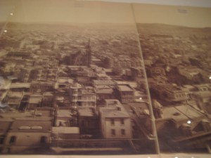
The last exhibition “Public Eye” was pretty good as well. It felt like a museum because of how the design of the building inside. My favorite piece was the photograph of a wide landscape. The photograph was multiple shots of the town put together to look like one shot. The photo was taking by Eadweard J. Muybridge. The photograph was a 360 degree panorama from one of San Francisco’s tallest hills. I got inspire when I saw this shot because I feel like I can do it myself one day. The feel of the photo gave a dreamy feel as if I want to go there and see how the people live there. Also made me feel hope about life and making me feel like I want create art because I love it so much.

Career Goals

After Graduation I would like to get an internship that leads to a job. My Major is Communication Deign in the Broadcast module. Although I do love that I like to consider myself a jack of all trades I’d like to work in many different aspects in the design world. Id like my portfolio to show that. If I do something from the broadcast module, I really believe that shooting Pictures of different lighting showing different moods or portraits of people with a good background can show the aspects needed to make a video very appealing. a specific idea can be making a mini set with lighting that could show lighting on a set. Clear portrait shots that can show that i have good composition with people on screen and camera.

Gallery Report

The visit to Aperture was very interesting. Especially to find out they They had published the famous picture of the twins, I was excited to venture further into the gallery. These were all works from China. the China books really showed how westerners tried to portray the Chinese. There were books used as propaganda that showed the same events in very different ways. One country would show the glorification of going to war and the other country would show the destruction and how horrible they are. One that stood out to me was the pictures of the destruction with illustrations of bright red fire along the edges of the photos. It really made the photos feel more intense. There were illustrations and photos showing industrial and common people growth in China. Some of which felt Worlds Fair-esque and believed to be only for people in the higher-ups of China. Even with the wall of Mao you can see how communism has changed China. The Gallery shows much of China’s propaganda. I was found it all to be very interesting.

At the Second Gallery it was different but again very interesting. it followed various tribes with very rich photos. The First photo walking in was my favorite. It was a portrait of two tribesman by the waterfall. the one standing appeared to be older, wiser. The other appeared to be younger, he is sitting but livelier. The lighting and the colors really stood out to me. it was a very powerful photo with great composition with the waterfall right behind the tribesman standing on a rock. I really liked the photo that was a wide shot as well with all the tribes women. They Almost looked like warriors and were seemingly a very important part of the group. All the photos were very powerful and well done with great lighting and composition while still making i feel natural.

Trip Description, Final Project, Career Goal

The Chinese Photobook at Aperture

The visit to Aperture was very insightful and interesting. The photographs at the Chinese Photobook revealed many things about its dynamic culture, dramatic twists in politics and its’ rich diverse heritage. The photographs depicting the history of China during numerous years were very different. The section that stood out to me most at this exhibition were the photographs taken of Chinese Leader Mao Zedong. From viewing the photographs, you could tell the photographer took great thought in how he chose to deliberate the photographs of him. Ranging from the angle and position, to the composition of the photographs of Mao gave the audience the impression that he was a “Great” leader, one who was looked up to and highly respected, which surely was an intentional decision. Taking the photos from a low angle allowed us to view him as if we were looking up to him. The lighting were always bright and mainly focused on his face, even shots that were taken outdoors. The backgrounds were mostly not in focus and not as lit as Mao was which made him look much more radiant in comparison. Not only by the way the photos where taken, but in photographs where people surrounded him, were applauding him. The photographs captured Mao at different stages of his life, doing various political and non-political tasks.  The positioning of the physical photographs in the gallery also made an affect of how we understood who this man was. It seemed as if they were positioned from the start of his term to the end, forming a visual record of his reign. I really liked these portraits of him, mainly because it shows how using elements of photography can give definition to a person or thing.

Jimmy Nelson

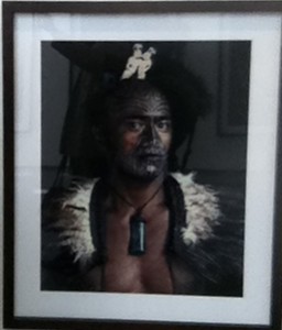
Jimmy Nelson’s exhibit at the Bryce Wolfowitz gallery was stunning. The images that he captured were simply captivating. His interest in cultures were beautifully depicted through the emotions of the models, and locations where they were shot. I loved that his photographs were composed of very vibrant, saturated colors and of high contrast. It gave the photos an equal balance since the models expressions’ were very serious. The facial expressions drew you into each photo and their culture. He was successful in showing a lot about the culture, by the decisions he made in the positioning of the models, lighting used etc. He showed the woman being strong and independent and the men in other photos equally the same. The one photograph that really stood out to me was the portrait of the man whose face had a tribal painting in black, looking at a 45 degree angle. The intricate detail of this photo lured me in as if I was staring into his soul. The poise of his body and lighting on his skin made us think of him as a strong leader of his tribe or someone of importance that unconsciously whispered “I was here”, which is what Jimmy Nelson is trying to do with this project. Truly an amazing and a successful portrait.

The Public Eye

The last exhibit of the Public eye was ironically very “eye-opening”. It showed me the different ways in which photographs were used and shared before and now. Whether by crowd sourcing, photo journalism, social networks and others. This exhibition opened my eyes to how photography has come a long way and the comparison between how photos were shared centuries ago to now conscious and unconsciously and the fact that photography has always been and still is a social interaction to us. I was really intrigued by Jeff Wolin photographs, where he created a series of portraits in the environments of the subjects home and have hand written stories behind of them. A unique way of how photographs play a role in forming and captivating our memories. In each photograph you were immediately confronted with the portrait, their expression and their story. The choice of having the photos in Black and white, also gives you the feeling that the subject’s story were something of the past.

Final Project

For my final project, I have few ideas in mind, but have not made a final decision. I am thinking of doing some detailed and intricate close-up portraits where each model will have a face painting that depicts themselves, whether it be their favorite sports team, culture or favorite food. I would like to capture very vibrant images that also tells the story of different individuals showcasing that everyone is unique and different.  Another is creating patterns using different types of food. I also thought of an idea themed “seeing double” where i will create a series of photographs of pairs of things that are usually unconscious to us in everyday life. These are ideas that I think I will be able to use in future ad projects for my portfolio to display my design and photography skills combined.

Career goals upon graduation

My goal upon graduation is to start working as a freelance graphic designer and photographer. I would also like to then further my education in pursuing my Masters in Graphic Design. I would like to build long lasting relationships by connecting with people in this industry who share the same passion as I do along the way. I want my portfolio to show my diversity in advertising and understanding of graphic design principles with my own unique style. Also, my ability to think outside the box and the creative combination of photography in my work. My longterm goal is to be able to open my own Advertising  and Print Agency overseas. I want my portfolio to show my diversity in advertising and understanding of graphic design principles blended with my own unique style and skills in photography.


Barrington Simpson Final Project

Based on my senior project which is an Underwater Casino, I might decide to take pictures of my class make in casino themed clothes so as to make the work i need to do in photoshop much easier. Other thank that i really don’t have an idea of what i might do for the final but it will come to me soon.

Barrington Simpson Exhibit review

The Chinese photobook exhibit at Aperture somewhat interesting. In terms of the photography it was quite interesting to see how photos where done back then. The  self made edit were amusing. The way they scratched out different people in the picture to highlight and keep the focus on their main subject. The different use of paper throughout the years helped to show how the craft of photo taking and back then advertising slowly progressed to new age time. It was also evident that the main themes of the pictures of the Photobook exhibit was what took place during the war.Thus, most if not all their photos where either war or propaganda based.

I really liked the Jimmy Nelson exhibit at the Bryce Wolkowitz gallery. Unlike the photobook exhibit where they mostly focused on what was going on in the city politically, it was clear Wolkowitz  main purpose was to highlight these people as a culture over all. He mainly  shot close up target so as to give a deeper look into these people’s lives in my opinion. Each picture gave a different feel to the exhibit and just made a clear distinction.

The Public Eye, at the NYPL  was ok. Most of the pictures that was in the exhibit i had already learned bout in my History of Photography class so  they were very familiar to me. Thus, its because they are so familiar is why i can say that this exhibit was better understood. Knowing the situation behind how these pictures were taken just proves there significance to the show. Take for example “The Steerage” and the fact that the photographer had to run and get his camera below the deck of the ship and luckily he returned to the same image he had seen and was able to take the picture without a problem. SO all in all the three exhibit all had different appeals but they all had significance.

Gallery Report & Final Project Ideas

The Chinese photobook exhibit at Aperture was quite interesting. Not because of the aesthetics of the work or the technique of the photographers, but because it reminds me that we always need to use a critical eye when examining media. There’s an old phrase –  “cameras don’t lie,” and it illustrates an idea that people used to believe, namely, that photographs depict the truth. But whose truth is it depicting? The most telling was the two photobooks that contained images of the the Sino-Japanese war. One book was pro-Japanese propaganda. The other told the opposite story.

The Jimmy Nelson exhibit at the Bryce Wolkowitz gallery was stunning. The images themselves were breathtaking. Jimmy Nelson has traveled the world and made photos of indigenous people in very remote locales. I do take issue with the way he exotifies his subjects – we are basically forced to look at them as “other,” as people who are very foreign to us in every way. That being said, his images are also incredibly successful. One of my favorites was a man with a very elaborately painted face and headdress. He’s in what appears to be smoke (or perhaps fog) and the contrast between the reds and blacks of his face paint and the smoky white is extraordinary.

The third exhibit, the Public Eye, at the NYPL was also very interesting. Stylistically, it was a bit of a grab-bag. There was all kinds of work, from Ansel Adams to anonymous selfies! I was drawn to work by a photographer who was previously unknown to me – Ethan Levitas. He’s a street photographer who uses a large format camera to obstruct the image feed of surveillance cameras. It’s interesting because in doing so, he is basically “removing a frame” from the surveillance stream and creating something else with it. The images themselves were also interesting in their candid nature.

Career Goals

My major is web design, and ultimately, I’d like to design sites for artistic clients. I feel as though it would be interesting to design sites for musicians, artists, and fashion designers. I’m also really interested in the culinary arts – designing restaurant logos and websites is something that I do already. I would like to work for a small firm or agency, where I could learn things from my colleagues, but I’d also like to freelance for myself on the side. Basically, I want to make money and have some flexibility in how I accomplish that.

Final Project

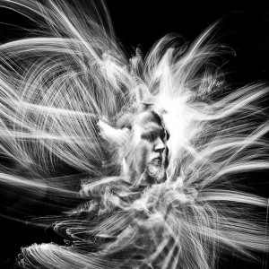
I could go in many different directions for my final project, since I’m a web designer I feel as though I have a lot of flexibility. I’m contemplating doing some interesting portraiture and “paint with light.” I’m really drawn to the experimental nature of it – you don’t know what you’re going to get with each shot. Here’s an example:

deforest1
Another idea could be food photography. It could be useful if I’m looking to brand myself as someone who specializes in restaurant websites. The only drawback is that I feel as though food photography is deceptively difficult! Perhaps doing some sort of food-related still life could be interesting. Something like this: Nadine-Greeff-Dark-Food-Photography-6


Trip Description, Final Project Description and Career Goal – AnaMaria Saenz

Final Project and Career Goals

After I graduate I would like to work, in any company that requires updating or design for their web pages. It doesn’t have to be a company of design, such as:
The New York Times, Thomson Reuters, etc.
The idea would be, that my portfolio show my photography skills. And can present a story or a product successfully to the public.
About the project, I thought of showing the public ; the paintings of a friend which will be published on a website. On which I am working on.It is going to showcase the talents of students around the world.

The Chinese Photobook

I’m really surprised how the government (Communist) controls the media. In this case the photos that were divulge. All trying to sell a good image of Mao Tse-Tung , such as charismatic as he was; his favoritism towards the village. etc. The photographer obviously showed him smiling, sharing; finally as a friendly person, also as a leader. From a low level view point the photographer tried to empower him with this angle.
Another thing I seemed curious, was how the Chinese government used a “magazine” between people of the same government. To put them all up to date, as what this wanted such as: when they were selling the idea of agriculture. From idea and how easy that they made it seem, with smiling people without fatigue.
Another thing that caught my attention was, how the Japanese government showed the friendly face of war; with soldiers smiling and saying goodbye to their families. They were going to this, when in fact the war was not, if no a waste of blood and suffering for all the people.

Second Exhibition

Jimmy Nelson, exhibition seemed to me spectacular; must be because I like photojournalism. The portraits that he took from all indigenes around the world, I found spectacular . He clearly presented the different cultures to the society, so we had a general idea and remind us of them. All typical costumes, decorations and colors represent something of the tribe. As well as their social position, also those imposing landscapes that he capture in his photos; such as the lush jungle with waterfalls and rivers made his work wonderful.

Third Exhibition

The NYPL Exhibition, public eye caught my attention; the work of Eadweard Muybridge. Since for the time they were taken seems very wasteful work, and interesting . This photo 360 degree panorama , of San Francisco gives the feeling of freedom. As it is not restricted by measures, of conventional photos and the overhead view; you always wonder ” what lies beyond the edge?” and the answer is plenty. definitely unleash the imagination..
IMG_1939

jimmi nelson

RR5-poetry : Mikhail Reid

This poem by e.e. Cummings is a great example of extended metaphor. On the surface, the poem appears to be about a driver’s excitement to drive a new car. The use of the pronoun “she” could be man’s tendency to refer to an automobile as feminine. Upon further examination, it becomes convincing that the poem is actually an extended metaphor for a man’s sexual experience with a woman, and the woman is possibly a virgin.

The poem “Coming Home, Detroit, 1968″ by Phillip Levine is also talking about a man in a car driving. This poem sets a sad tone especially when they said “A winter Tuesday, the city pouring fire, Ford Rouge sulfurs the sun, Cadillac, Lincoln,Chevy gray”. which could  be talking about the factory smoke is covering the sky to point you cant see the sun and just leave the city to look dark and cold.  The other line was “One brown child stares and stares into your frozen eyes”, which seems that the child is helpless and seeking for better days to come in the city.

Both poems have similarity and difference. For one they both talking about cars in a metamorphic way but at the same time e.e. Cummings talking in a good experience while Phillip Levine is going experience a rough time in Detroit as he watched his city going down the wrong path.