Category Archives: Uncategorized

Inspiration 3

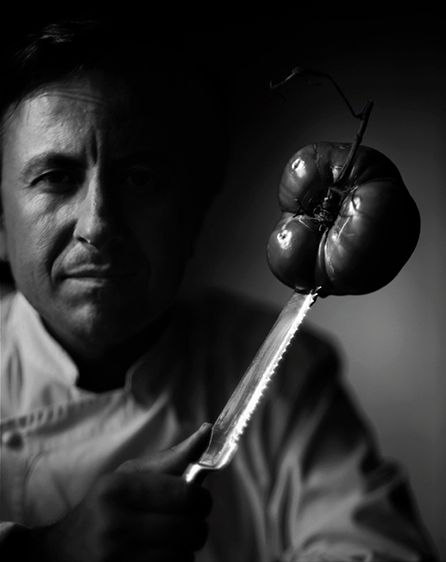
Gregory Heiseler uses a split light on the person and vegetable. We are able to see their expression as they look directly at the camera. A serious face, it expresses hard work and passion toward their profession. The portrait being black and white emphasizes how fierce the person is. There is also light in the background where the vegetable is, there is a focus on it creating a silhouette. The overall composition and lighting of the portrait is direction of the eye, we look at the person, then the knife, lastly the vegetable. As well, that the person is cut off from their left arm, seeing part of his left hand and him holding the knife gives continuity to the portrait. Moreover, the shadows show a lot of detail to the portrait.

Gregory Heisler

From looking through Gregory Heisler’s photographs I’ve noticed that he was a lot of different photography styles. I love how unique his pictures are. From looking on his website http://gregoryheisler.com/portfolios, I loved how unique each series was.

My favorite album was Vibrant, I loved the different lighting and colors he used. My favorite photograph out of the album was this image. From looking at the image he used three-four lights. I believe he put a color sheet in from of them each light as well. For the backlight, he used pink and the key light he used blue and the slide light he used blue as well. I noticed the pink light behind his ear and no his back and I think that was another light he used. I also think that the color of the backdrop is the same color at the blue lights on the model’s body. I feel that this was the best color option because it allowed the image to be more Vibrant. If the backdrop was black or white I feel it wouldn’t have the same effect.

Gregory Heisler Inspiration

This photo by Heisler was a part of one of his portfolio series called “Miners”, which is a photo series of portraits of miners. I was immediately attracted to this photo out of the photo series. The way Heisler composed this photo was well done and unique. Heisler fills the frame with the subjects face and appears to use a shallow depth of field which makes the subject stand out more. The lighting in the photo is also impressive. It looks like Heisler used the off camera flash in an outdoor environment. The lighting is lightly flashed over the subjects face, giving it a very soft and natural look. Due to the combining the factors of the nice and smooth lighting along with the way the photo was composed, the subject in this photo gives the subject a very soft and delicate feeling and look to him. Even though the subject who is a miner has a very scruffy and rigid appearance to him, the lighting makes him bring out emotion. The lighting that is reflected in his eyes even make him appear to be emotional and raw and the eyes are what stand out the most in this photo to me. Heisler does a good job not only in this portrait but in a majority of his portraits giving his subjects a raw emotional look but still being in their natural state. Heisler handles lighting and composition well to achieve this nice contrast.

Week 3

Gregory Heisler , photographer born in 1954, has created amazing pieces of art. In his portfolio are included Quiet, Vibrant, Contextual and Dynamic, amongst many others. The one that caught my attention the most was Dynamic. The way these images were captured, with blurred background, make the images come alive, in a way. Every photo creates a sense as if you were physically there as the camera, witnessing the subjects’ every movement. This was created by slowing down the shutter speed. The movement blur was created because the shutter of the camera was opened long enough to allow the sensor to capture the movement. Images like these are one of my favorite types because the viewer can feel the movement. For photographs like these I do not imagine there being a light set up. In my opinion, these are more of a daily life thing. Things that happen unexpectedly that can be captured to later tell a story. The somewhat high saturation is very noticeable in these photographs. Most of them are very sharp and have high contrasts. Another portfolio art piece that captured my attention was Miners. These set of photographs are very different than Dynamic, but at the same time very similar. In these, the viewers can see several men whom, from the name of the piece, we know are Miners. These are portraits, unlike the others which were full body photographs. You can even see the details of the eyes in some of these. We can see that the contrast is also very prominent because of all the detail in the face. I enjoy the way the aperture was controlled because the background is blurred so the main focus is put on the miners. The lighting style seems the same for all of the set of images, key, with a possible softbox.

Inspiration #2: Yosuf Karsh and Nadav Kander

Yosuf Karsh’s work is dramatic and makes it look like no other picture. Its seems as he wanted to bring out the true character of the person who is was working with. The lighting hits the center of the face or the side of the face to bring out the person features. Karsh’s photos used the lighting to create that sense of drama and played around with the poses of the subject to bring out and make them feel comfortable to bring out a natural soft  portraits.

For Nadav Kander, his work is more serious and dark in nature. he seems to take his subject and pose them the way he wants rather than letting them do their own thing. His setups are less natural than Yosuf Knader’s work. Kander uses different lighting styles rather than just one setup with the same person. Kander  leaves a sense of mystery and drama with the way the the photo is taking.

I do love Kander’s portrait of Thom Yorke. he seems to use the mirror that Yorke is holding and playing with it in the photo. You see the person three different ways rather than just one direction. The use of lighting creates that drama that is always in his photos. the one i like the most from Karsh is the portrait of Grace Kelly. He does seem to want to capture her beauty which she was known for. The photo creates the sense of importance rather just her beauty speaking for her.

Inspiration #2

Yousuf Karsh portraits are all in black and white, a mix of him filling the frame with his subject’s face or showing a background.  The portraits make a silhouette with the lighting and the dark background. It makes the subject pop more, it being black and white there are more details seen and highlights. The use of body gestures and covering certain parts of the face as the viewer we can guess how the shape is formed. It creates continuity among the shadows and highlights of the face. 


Nadav Kander portraits are a mix of conceptual and close up of the subjects. In three quarter view, the majority of her images look away from the camera. I noticed their facial expressions are key to the portraits rather than the gestures or posture of their body. Her use of light that reflects onto her subject, such as one side the light hitting the side of their face. Or a specific light that she uses that lights up only a small part of her subjects face and shadows created show two different tones to the portrait. 

Overall, 

Yousef Karsh & Nadav Kandar

Yousef Karsh and Nadav Kandar are both very talented photographers with similar yet different styles. They both specialized in portrait photography.

Yousef Karsh’s photographs were in black and white. What I liked about his photographs where the lighting. I love how he brought out the shadows which added texture to the black and white. Sometimes when I see a black and white picture feel it doesn’t go with the picture but Yousef Karsh made sure it makes the pictures work together with the black and white.

While Nadav Kandar also works with black and whites and also adds a different texture to some of his pictures. What I love about some of his black and whites is when he adds a tint of blue. It makes the picture feel very warm, this was a very unique technique. I feel that black and white photography can show a sense of seriousness and when he adds the blue it lightness up the mood.


Inspiration #2

Both Karsh’s and Kandar’s work have a deep,dark moodiness about them revolving their subjects. After looking at Karsh’s work I noticed that his style is exclusively black and white, but also have a lot of emotion held within them. The black and white effect is a nice contrast compared to his subjects who are energized and seem to have a positive aura surrounding them. Kandar’s work is similar, yet also quite different compared to the work of Karsh. Kandar’s work has sort of a cool monochromatic color scheme using a mix of blues, greys, blacks etc. And while Kandar’s work has some kind of color in it his subjects appear to be a lot more moody compared to Karsh. A majority of his subjects look deep in thought and emotional, also with a lot of them not looking at the camera. One tacit that I learned from looking at Karsh and Kandar is to maybe work on human emotion in my photos. Instead of the person looking stiff and emotionless maybe try to convey a little emotion from them in my photos. Not just with the subject but maybe with the background or any other photo effects etc.

Yousuf Karsh & Nadav Kander

When looking at Yousuf Karsh’s photography work, one can see that there is a theme going on. All of his photos are portraits in black and white, showing less than half of his subjects’ body, or a medium close up, while they are pensive, or lost in thought. There is a lot of contrast because we can clearly see the details and expressions in each image. The lighting style, short light, for most of them is also the same, considering that the poses are all three quarter views. We know this because the lighting is coming from their left side which causes for there to be a shadow on their right side which seems to have been diffused. Karsh did a good job framing and capturing the photo because none of the subjects’ head is cut off at the top. He does a great job overall setting a tone to the images he captures.


Nadav Kander, on the other hand, has a tendency to lean more towards, what seems like, gel filters. In this case, there is a constant use of blues and greens. Even though his photographs also consist of a lot of portraits, most of them are using broad lighting. Just like Karsh, he uses a three quarter view, where you can barely see one side of the face, but are still able to see both eyes. There is also a theme of transparency in his photos. Some have an image placed behind them that bleeds through the main image, which is the subject and the others have a very blurred out background which could mean that he used a very low aperture.

Dawoud Bey

Dawoud uses the lighting from one angle capture the features of the students perfectly. Highlighting the most basic features on a person like the eyes and somehow capturing the sense of innocence and pureness. The subject is at the focal point of the shoot and with the background being being out of focus makes them pop more than if everything was in focus. As well the colors of the students clothing and the contrasting of the background make the the student standout due to the fact that the background is more colorful and lively but the students’ with muted clothing capture the viewers eyes more taking away from the busy backgrounds. The posing of the students create the sense and feeling of innocence and being more mature than their ages. Bey captures those elements well with the angles and lighting of the students to create that helpless sense and in their need of guidance although in their stories them seem to have that already. Bey’s portraits of the students wants me to focus on the subjects features more and how i postion the person in the frame. To take more photos from the front of the subject rather than moving all over the place.