This week, we spotlight the excellent CMCE Career OpenLab site, which offers “career information and opportunities for construction management and civil engineering students and graduates.” Overall, the site offers a fantastic model of a job resource for City Tech students, both showcasing the work of City Tech alumni and directing current students to job postings and additional resources. I highlight some of what makes the site so effective below:
An engaging, media-rich home page: Instagram, Facebook and Twitter have gotten all of us used to a long, vertical scroll. That said, the best way to keep a reader’s attention with this format is to break up chunks of texts with images or other forms of multimedia. The CMCE Career home page does this very well. For example:
- Below the header image, the site includes an important note to students that is bolded and in a bigger font to catch their attention. The note reads: “Whether you are just getting started, are currently working, want to switch from field to office work or office to field work, or are switching industries entirely, there are people like you in our department and among our alumni.” It foreshadows what students will find on this site, which is alumni stories, job and internships postings, and information about CMCE.
- A second menu below this introductory text allows the reader to jump to the section of the site/ home page they would like to visit: Jobs & Internships; Where CMCES Work; Alumni Stories; Alumni News.
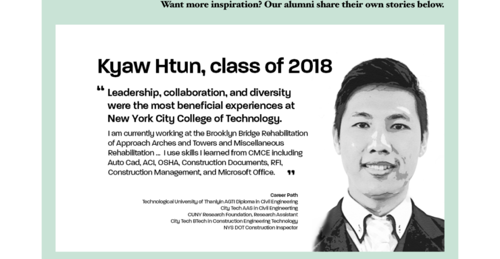
- Spotlight boxes with CMCE “talking heads” give students a compelling visual and brief descriptions of possible job options and alumni success stories.

- A search functionality at the top of the page allows readers to easily find what they are looking for once they’ve skimmed the home page.
- Pie-charts and graphs provide visual breakdowns of CMCE career paths, helping break-up long chunks of texts.
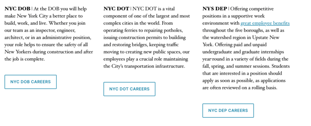
The Jobs & Internships page takes advantage of the block format to direct students toward public agencies and private companies that have job opportunities. Each company has its own block on the page: its title is bolded, the full description of the company is prominently included, and a button links you out to the company’s site. Note that this lay-out makes it easy to digest information. It is also more effective than simply featuring a bulleted list of hyperlinks to various companies. We encourage OpenLab users to to follow this kind of model when linking out to other resources: it is always more engaging for readers to have the full description of what they are being linked out to than to just see a link on a page.

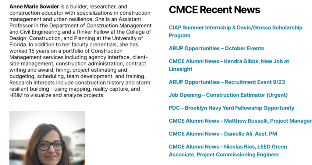
The footer gives more information about the site’s creator, A.M. Sowder, including a brief bio and professional headshot. But it also features recent news from the department, linking out to blog posts updating visitors on the activities of faculty, students and alumni. This is a great use of widget space: remember that footers appear on all site pages, which means they are unlikely to get overlooked.

These are just some of the many innovative features of the CMCE Career site. It is a great model of a jobs and internship site that is reader-friendly and replete with information.


