This has been a great experience so far. I can feel and see myself become a better designer and just learning new things outside of school. Not only am I getting to know about bikes (which I never knew there were so many great things to know about them) I am learning a lot about managing my time and meeting deadlines. I sound a bit hypocritical since I have been slacking with my journals but they all have been for a good caused.
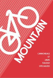
Today I got to see the finalized signs I created printed. They look pretty cool; I like how everyone was able to recognize the kind of bike it was by just looking at the illustrations I made for each of them. I kept them very minimal to no details, but the shape is what makes the brain understand what they are and of course the name helps. Here are the final ads that they chose to print out. These will be hung on the ceiling of the shop and they are all 3 pages each. One page shows the kind of bike it is with an illustration of the bike, second page are the brand names the shop has for that kind of bike and the third one is simply Tread’s logo.
signs2 <—– CLICK ME!


