Monthly Archives: April 2015

Journal Entry Week 9

I am beginning to see design through the eyes of clients and consumers, and not only as a designer. This is an important part, if not the most important part of being a Graphic Designer. I use to have so much pride in my work that I was often taken back by criticism and repetitive revisions. However editing is an essential part of design and makes the design stronger and stronger after each revision.

Fine-tuning is essential and necessary especially when working on projects for others. As a designer you have to have understand that your clients have a vision they want you to bring to life for them. It is not your vision, but you certainly do have a say in what goes into it, and its final outcome. We provide influence on the design, as well as principals that some of our future clients/customers don’t utilize, or are unaware of.

I now realize how important prompting questions are. It helps fine tune concepts and ideas so not much time is wasted going in the wrong direction on a project. Although I made 12 specs for my supervisor to choose from he only chose one to use. From that point I still had some alterations. Although it wasn’t a problem, I know that we could have saved some time and came across a final window sticker a lot sooner.

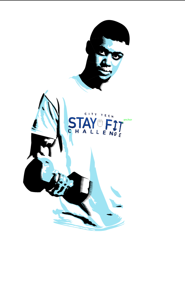
These past few projects have allowed my supervisor to see what I am capable of, and more importantly how I follow instructions. As the weeks go by I challenge myself to create materials in ways I have never done before. I feel that this internship is great practice for a future freelancer. I’m often asked to do logos and business cards, and tee shirt designs, and I feel that I am ready as a designer to begin to capitalize on that venture and provide some great graphics for my own clients.

Journal Entry Week 8

This week was off to a great start; the manual was finally finalized and looks great. I feel that I have accomplished a great design, by utilizing a simple layout and incorporating text that adhered to the brands esthetic. This project helped to show my capabilities and flexibility when it comes to certain projects.

With that being said I was excited to being a new project this week. The window sticker was something a little more fun. I initially wanted to stick with the same essence of simplicity that was displayed in the manual. I began by making a few samples for my supervisor to review as I researched sticker-printing companies. As A designer I understand the importance of working on a project in reverse, but since I already knew the dimensions needed, I felt the need to backtrack a little while my supervisor reviewed about a dozen samples. This allowed me time to see which company offered the best deal, as well as the best quality print. As I finished that up, my supervisor built upon one of the concepts I showed him, and we were able to quickly alter the design to meet his brands standard. We ended with a sticker that displaying the empire state building and incorporated the KISI “K” into the buildings structure. Keeping it simple and coinciding with the brands overall message, the sticker says “The New York way to access. It is very simple and innovative which represents their product in a great way.

Journal Entry Week 7

I find typography to be one of my weaker areas as a designer. And being that this project relies heavily on readability, I felt the need to take my time with it. This is the part of the manual I found the most difficult. Due to revisions, I often had to make adjustments to the layout. Trying to fit 20 instructions on a horizontal brochure was a little more difficult than I thought.

As I approach the end of this project, I see that it has forced me to rely heavily on Adobe Illustrator and InDesign. The challenges certainly helped me to discover new functions, and how to utilize certain tools the correct way. This has been a true learning experience. I feel that I am learning more as a designer, than I did at internships I had in the past.

As we approach the final stages of revisions, my supervisor and his partner gave me a few new projects to get started on. One being a mockup for the new website, and the other being a window sticker to be put on clients doors in order to bring awareness to KISI at their respected offices. While I’ve never done a mockup before, I didn’t find it difficult to accomplish, and was able to complete that in a couple days as I steadily worked on revisions for the manual. The mockup showed a simpler, user-friendlier layout to allow KISI’s clients to be able to utilize more of the functions and tools they provide to make access easier. With that being said, the sticker will be one of my top priorities next week.

Journal Entry Week 6

This week I began by clarifying a few of last week’s sketches for the manual. I also began to plan out the layout of each step. My supervisors Bernhard and Max were very helpful and open to my ideas and suggestions.

Next, I began to illustrate the icons using Adobe illustrator. I feel that my skillset is weakest in Adobe Illustrator; therefore I only use it for line work. I like the way illustrator allows you to manipulate lines in terms of stroke and weight. Since the icons for each instruction was made to be very simple and abstract sort of like an IKEA manual, I knew I would be relying on illustrator for a bulk of this project.

Keeping in mind and important design lessons I learned last week, “simplicity is key”; I decided to use mainly line weight and variations of strokes to illustrate each graphic. I don’t use my Wacom tablet as much as I should, but for this assignment it came in handy, and helped me crank out a lot of the initial icons this week. The Wacom tablet allowed my hand to be free, and place each point exactly where I wanted, and needed it to be. Max and Bernhard liked my illustration style for the icons so far and gave me a board to track my progress. The board became a networking tool for me due to the fact that KISI is located in a co-shared office space. Some of the other companies in the office began to look at my work, compliment me and even ask questions pertaining to certain images.

Journal Entry Week 5

This week I worked more on the instruction manual. One of the biggest things I’ve learned so far is not to cheat the design process. I tend not to make detailed sketches when designing. I usually do a few chicken scratch like sketches just to get the idea down pact, or I write out what I will need to do. Although I do enjoy drawing, I never use to see the point of going in depth with sketches before turning them in to vector images.

While working on this part of the instruction manual, I realized that sketches help tremendously, especially when working with a client, or company. It helps to clarify the vision of both the client and designer. Sketches are essential because you are creating someone else’s vision. Before graphics are created, it’s best to get out all the small issues because it saves a lot of time.

With that being said, I’ve spent this whole week sketching out 20 icons for the instruction manual. Although some steps will utilize the same images, I still had to sketch them out in detail to ensure that the image fit the purpose of steps it will be utilized for.

Furthermore, My supervisor and his partner were very impressed with the visuals I came up with to coincide with the directions. Another thing I learned was, the simpler the better. When you are working on a project that needs to be universally understood, such as an instruction manual for consumers, it’s super important that the message is very clear.

Journal Entry Week 4

This week I worked more on the instruction manual. One of the biggest things I’ve learned so far is not to cheat the design process. I tend not to make detailed sketches when designing. I usually do a few chicken scratch like sketches just to get the idea down pact, or I write out what I will need to do. Although I do enjoy drawing, I never use to see the point of going in depth with sketches before turning them in to vector images.

While working on this part of the instruction manual, I realized that sketches help tremendously, especially when working with a client, or company. It helps to clarify the vision of both the client and designer. Sketches are essential because you are creating someone else’s vision. Before graphics are created, it’s best to get out all the small issues because it saves a lot of time.

With that being said, I’ve spent this whole week sketching out 20 icons for the instruction manual. Although some steps will utilize the same images, I still had to sketch them out in detail to ensure that the image fit the purpose of steps it will be utilized for.

Furthermore, My supervisor and his partner were very impressed with the visuals I came up with to coincide with the directions. Another thing I learned was, the simpler the better. When you are working on a project that needs to be universally understood, such as an instruction manual for consumers, it’s super important that the message is very clear.

Humberto MV Journal Entry #11

This week at my internship I’m still doing the St patrick’s video but the designer told me that the footage I used was not the one he wanted because they were shot in different frames per second. He did not tell me he did not want them mixed. so now I had to create a new montage with the specification he wanted. I had asked him before I started putting it together and he just said pick the ones that look cool and seem to flow. Sometime the lack of info and specification has to be more clear even if you had already asked questions. The senior designer has to be more specific because its just double to work for me and I have other assignments to do also.

I am also still continuing the bridge series logo. It has already gone through at least 15 different variations. These guys are really indecisive. They say they like one thing then when I think I got the definitive one they decide to change it for no reason. When I asked them what is the reason they just respond with I don’t know I just don’t feel it. Even after I gave my reasons for choosing the design I chose and its significance of what I think the logo should embody. Hopefully they agree on something with the next batch of variations I do. I also got an emergency design to do.  I got a single cover to do for some artist named Rawyals. I’ve never heard of them. Its a girls rap group but they sound like any other rap group out there. I don’t find anything interesting or unique about them, but I digress I have to sketch up some ideas for next week and they gave me the song I have to the cover on. Its called “King Me”. Lets see how it goes next week.

Journal Entry 12- Latimel Rodriguez

This week I walked into internship and continued working on the posters for the fitness center in the school. I had thought that the last two were going to be it for this project, but Al told me to continue the third poster and complete it by the following day. It seemed like a lot of work and I explained that it would take me a couple of hours but he gave me the green light. I was excited at the same time because of a continuation and completion of the project kind of told me that he liked the first two and he possibly wanted to use my work for the school if he was asking me to complete the third one.  I got to it right away and it was the same process as the first two, the only difference was the color used. I used a black for the shadow and a icy blue for the mid tones.

Once I was done with the project he asked me to walk with him to the back of the studio, I stood above an “x” he had marked on the floor and just stood there. He was using this opportunity to put together some reference shots. Also this technique lets him adjust the lighting before a big shoot. In shorter words he won’t have to adjust the day of the shoot because he did it the day before. this process took about ten minutes which was neat because i finally got to stand up from my desk.

Once we finished, he asked me to return to my desk and bring him all the poster files, he asked me what I thought if we used the posters next semester. I simply said “it’s a smart idea”. We use them at the beginning of the semester and we can play around with them all through out the semester until December. Al didn’t give me any more projects for the day, even to take home which made me kind of happy, I can finally catch up on my work.

I still had about two hours to kill so I decided to use the time to cut a project I had in my portfolio, eat and look at poster inspiration on the internet. Just in case Al got the idea to give me another project.

Here’s an example of the project I completed for Al last week.

Screen Shot 2015-04-29 at 12.01.48 AM

Entry #8

Last week I had a very exciting task: to take pictures that will be featured on Nucleus, which is a quarterly magazine that portrays the work done by the Faculty Commons at City Tech. This edition of the magazine is going to feature, among other stories, the accomplishments by the Architecture department, in the Voorhees building. I went over there to photograph faculty and a few classrooms. The structure they have was impressive to me, I had no idea about all the 3D printing machines they have out there. The only class I’ve taken in the Voorhees building took place on the first floor.

Prof Jordan instructed me to take abstract pictures and have one of those be the cover of the magazine. There were so many interesting objects that the students were able to create with those machines. Most of those objects were made of paper using the laser cut machine, but there were also a few that were 3D printed.

I tried getting a broad range of photos, so I went around taking pictures from different angles, and exploring the bright sunlight that was coming in through the window. It was 1pm and sunny outside, so a lot of light was hitting the objects, thankfully.

I showed the pictures to Prof Jordan and she was very happy with the results. Now, we have to decide which ones we’re going to use. Some past editions of Nucleus feature one image as a spread for cover and back cover. Other editions have one photograph for each of those pages. This week, we should get a final decision on which ones to go with.

Journal #11 – Brian Rubio

Things have calmed down since last the chaos last couple of weeks. I’m back to making and  placing t-shirt orders for clients of the store. We usually take orders via email when it comes to making custom shirts but personally I like talking to clients on the phone and hearing their ideas out. I write notes as they talk and try to capture their enthusiasm in the design as well as staying true to the message they want to portray. For example, I made a phone call to a gym that wants a cancer fundraising shirt designed to raise money for a brother-in-law of one the jiu jitsu blackbelt professors that is struggling to pay medical bills. I was curious to learn more about the school and the reasoning behind coming up with this idea of a fundraising shirt. As I spoke to the professor, not only did I learn about to go about designing the shirt but I learned how tight-nit the fight community is. We began to talk more about jiu jitsu and his gym and was even invited to train with him if I was ever in town. Communication is key not only to help personalize a design but as humans we need to speak to someone in order to articulate feelings, hopes, and emotions that us as designers can translate into a solid design. Through doing this and taking that extra step, I’ve noticed that clients take the company a bit more serious and appreciate the call. This drives them to leave something as simple as a good rating or review can be such a great help to a small business in the long run. The shop strives on customer service and receiving good feedback is REALLY good for business.