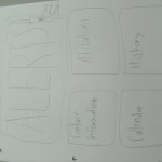
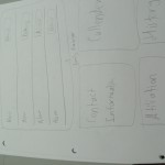
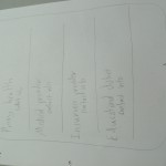
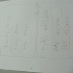
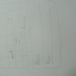
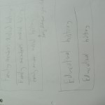
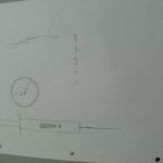
These are our sketches of what we would want our app to look like
Monthly Archives: October 2012
HW 5
How can we shrink time when a user interacts with an interface?
We can shrink the time by improving the navigation time used to get to the specific content the user wants. one example is the iPod. You can access your favorite songs with the touch of one button. There is no need to scroll through anything.
What do you think about letting a machine make choices for you?
I have no problem with a machine making choices for me if it only made small choices, or those that I consider to be everyday choices. I would not be able to let a machine make a choice that would affect me on a larger scale, like a life or death decision.
What is one way you’ve figured out how to save time?
One way I feel I save time is by doing something while traveling from one place to another. I feel I get stuff done when I do reading for school while riding the train to and from school.
Post 5: Time
Back in the bad old days when computers took a long time to load and you had to be a computer programer to understand what was happening, waiting on things was a norm. In fact programs were written to use less memory. Today we don’t really care as much about how much memory programs take simply because we have more processing power. Its funny that even thought we have more processing power we started messing up with how users would use the device. The user interface is something that is reality simple to make, compared to all the back end stuff but its also the simplest to mess up simple because people interact with things differently. The easiest way to shrink the time a user interacts with an interface would to have less options while still get the user from point A to point B. Having a machine make choices for a user would help the process go by faster only if the user knew what the computer was gonna do otherwise it will just result in frustration of the user. When I use to listen to music on my old phone, I would have to unlock it in order to switch songs. On my new phone I just have to turn on the screen and i am able to switch the song without unlocking my phone.
HW#5 TIme
Interestingly enough the authors analogy of waiting for a web page to load, is comparable to road rage. Which leads me in my own frustration with use of the internet. So much so I’m coining the phrase Cyber-Rage. Pretty much its occurrence from slow uploading/downloading speeds leads me to want to verbally and physically attack this inanimate/inorganic machine, of which half of my day is spent on. I agree that in today’s world time is definitely more precious than money. This need for efficiency has a great influence on how we create technology. For example last night I downloaded an new app for my android phone called Dolphin Companion. This app in short saves battery life on mobile phones and or tablets. The major complaints today for cell phones is battery life (time used). It turns out the app was a file management application that took control of my settings and preference and catered them around my usage as to increase my efficiency and power by 30%. As much as I’m grateful for this app app there are other app that do more than whats required. for example when you download an app by accepting the terms your agreeing to expose location, caller info personal data etc. Especially file management apps send your data back to corporations. This is unacceptable and dangerous for as time is expensive, so is information. Identity theft is not only on a rise but is happening to large corporations gathering your info from these apps and company security being breached. Our impatience and laziness as a society cost us more when our identities are stolen. In my own experience in the corporate arena I found that the best way in dealing with waiting examples of internet usage was simply time management by means of multitasking my assignments. Instead of allowing idle time to pass while waiting for uploads/downloads I revert my energy to another task ergo alleviating my frustration. Or I would pass the buck to someone else as it has been pass to me. I call this the circle of laziness. The article stated for manufacturing technology to shrink time by saving time or staying in line with the flow of time which ever cost less to implement wins.
HW#5
John Maeda “TIME”
After reading the article by John Maeda, I must agree with him, that we spend a lot of time waiting. I think a way of saving time would applied to school. As we all know many students go to school to get a degree in what they hope to have a career in the future. Yet the school system seems to be wasting our time and our money with certain classes that have nothing to do with it. For example, if a student is majoring in graphic design, why would he or she need to take astronomy class as a requirement before they can graduate? I think it would save students a lot of time in school if they can just take classes majoring in their field and actually have them work on projects that are current in the real world. I think hands on experience is better than just having student read from a book and take test.
Noitatidem group (Ian, Remy, Rosa) post 2: Looks
We got pages laid out, and pieced together a logo. We also drafted a couple of graphics for the interface. Not visible in the diagrams: There will be a bar at the bottom with Back and Forward buttons. The logo will be at the top of the page as a transparent/faded background.
Here’s everything!
Reading Assignment – “Time”
How can we shrink time when a user interacts with an interface?
I am not sure this is good example or not but this reminds me of easter egg of new version of youtube player. When we are waiting for loading video, there is a spinning white dot icon. While its spinning, user can play worm game by pressing arrow keys (white dot becomes a worm). Sometimes loading is very long. Then, this cute game can shrink user’s time efficiently.
What do you think about letting a machine make choices for you?
It was mentioned the iPod shuffle in this reading as an example of machine make choice for users. I personally am getting familiar with letting machine make choice for me in everyday life. For instance, I usually set my playlist randomly, so that my mp3 player can select random song for me. But that is not completely random because there is option such as, ‘random in recently added songs’ or ‘random in favorite songs’ so I can make a range of random songs. I think this is similar to the example of ‘Amazon.com’s recommendation search’ in the reading. I am much more comfortable with these computer’s choice things nowadays as computer’s getting smarter.
What is one way you’ve figured out how to save time?
I know this sounds silly but I used to set my clock 10 minutes earlier than actual time so that I could do all things 10 minutes earlier. This worked a few days =) Also I always try to make a list that I finished already / have done so far / what I have to do things like that so that I can see whole picture of procedure. I think it is helpful to save time.
Reading Assignment – “Graphical Excellence”
The article says that we can make quantitative data to a graph. The first part of reading, it says about graphical display – pros and cons, etc. Graphical display is not always effective and efficient. The array of irrelevant data cannot be a good graph, no matter how fancy it is. The article used ‘Solar radiation and stock prices’ graph as an example.
Choose one of the images from the reading.
– I chose the graph of ‘stomach cancer, white females; age-adjusted by country,1950-1969’.
What is working about the image?
– We can see the density of white female with cancer nationwide.
Is there anything unnecessary or any information you think is missing?
– I think it could be very helpful if it has population density of female so that we can make a comparison.
Have you seen any designs where you’re paying more attention to the aesthetics than the information?
HW #5 Time
I think there are a few ways for the time a user interacts with an interface to decrease. 1) properly optimize the content. Whenever I create websites, the time it takes for the site to load is a major factor in my design and development process. 2) an easy to use navigation. if a user has to think about how to use the navigation or where to find it, then the navigation is poorly designed.
I would have to say it depends on the situation. When it comes to picking out what to wear, I would say yes, it is sometimes annoying for me to decide on what to wear, especially with the weather always changing. I already let a machine pick the music to play, obviously the choices are within my library.
One way I can think of where I saved time is I saved commonly used HTML code snippets. This way, instead of having to constantly write out code, I can just tap a few buttons on my mouse and voila the code appears. This leads to me having extra time to focus on the content of the site and any debugging I would have to do.
Remy’s 10/17 homework | step count: 8764


