Here’s how far we got: https://www.youtube.com/watch?v=wL4xUa76V7Y
Final Project (Gabby and Remy) post 2: Final Video
Leave a reply
Here’s how far we got: https://www.youtube.com/watch?v=wL4xUa76V7Y
We got attached to the game we thought up, so we’re sticking with it. Mostly. We’re going to set our game in the the post cybernetic apocalypse (organic computers got invented, people stuck em in our brains, and after a while the computers realized people suck and killed those who stuck em in their heads!) where resources and trading makes your life a looot easier. You COULD play by yourself, but you’d have a much easier time trading with other people around the world (in later development, your location would determine your resources).
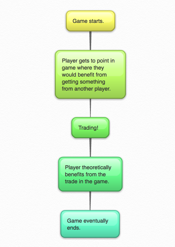
Flow chart:
 Wireframe:
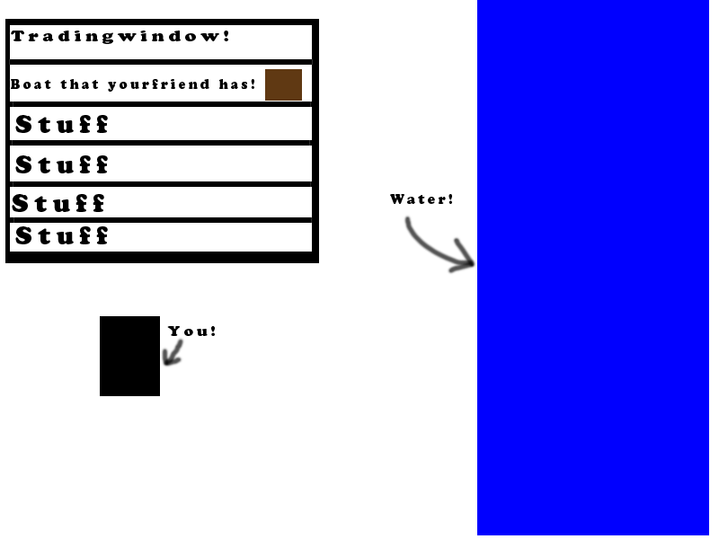

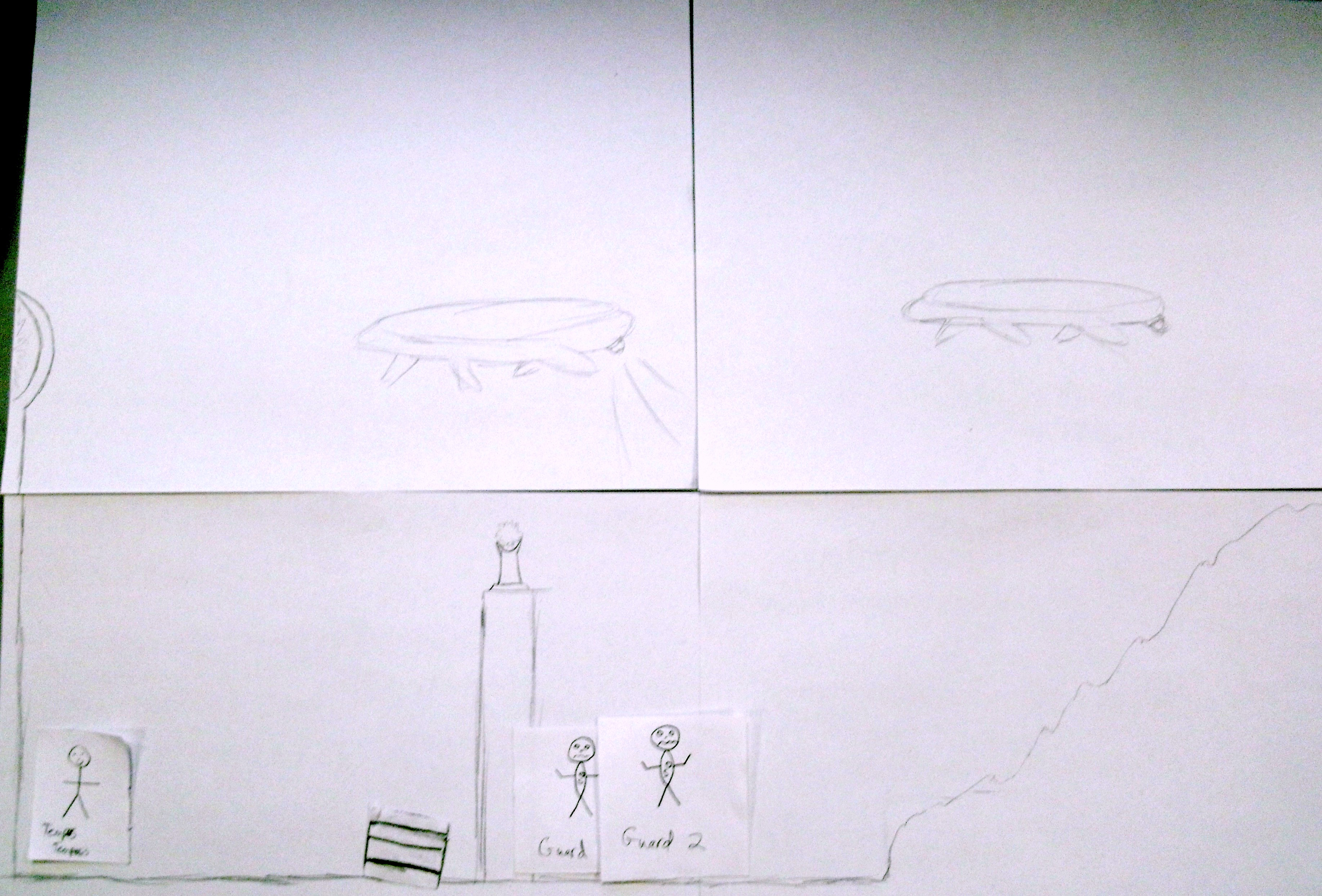
Alright, here’s the stuff we did! Me Gabby and Rich. Map drawn by Gabby, characters and buttons by Rich, crate and circle by me. Also, here’s our design document:
https://docs.google.com/document/d/10uAVcpBgY0lJvelRuw_MB2Kif7KnTNUqW5CiVzwOXYc/edit
I’m ecited!

our questionaires!
https://docs.google.com/document/d/1_f8eKcceagTMAUL0N5RT_4QzMuE4hodsxnZgIgYNnZ4/edit
our doc!
:<
our video was corrupted. Sad day.
I started making the pages in CSS/HTML and Rosa and Ian made some buttons and icons.
Aaand that’s about it.
Yup!
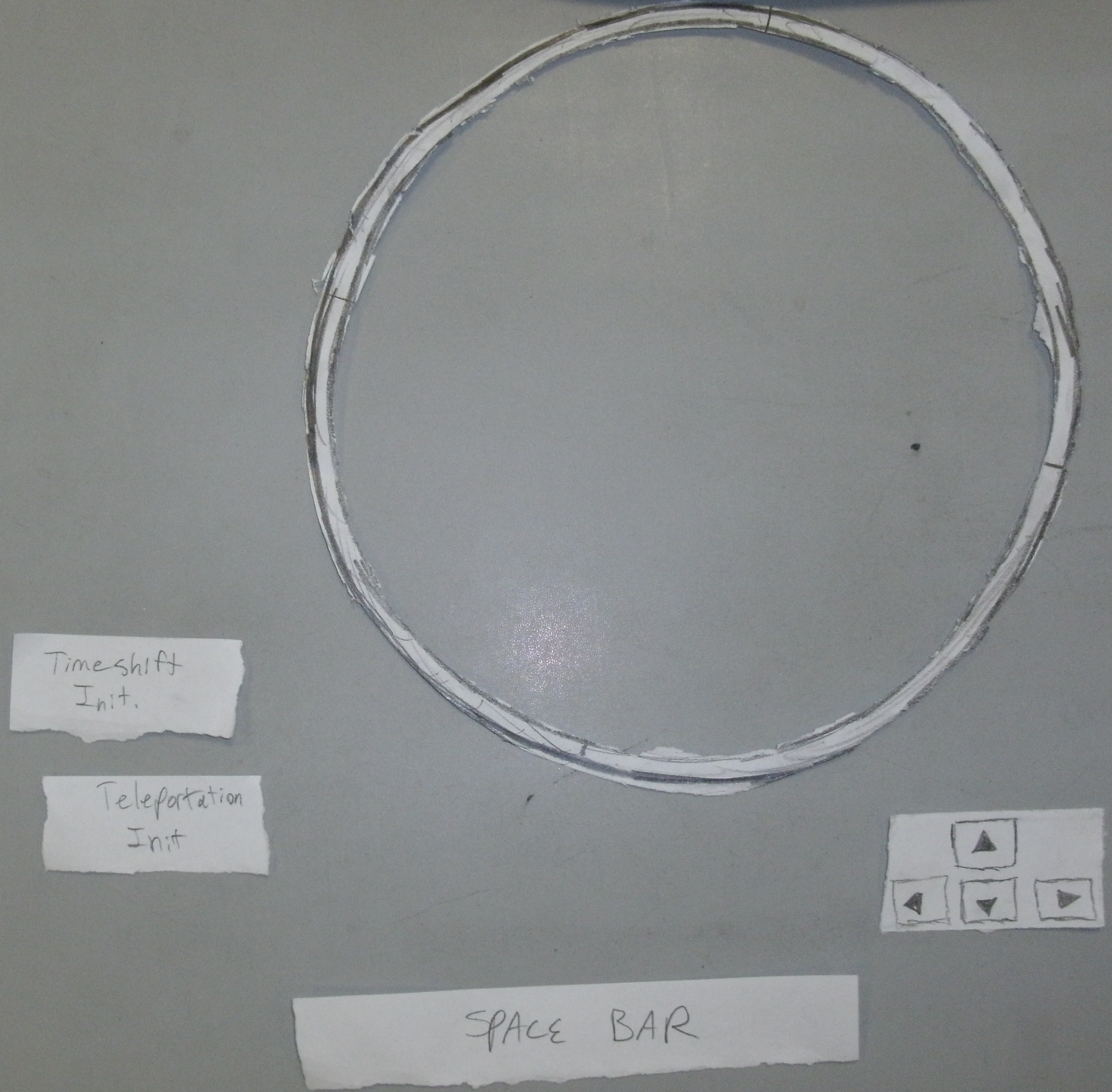
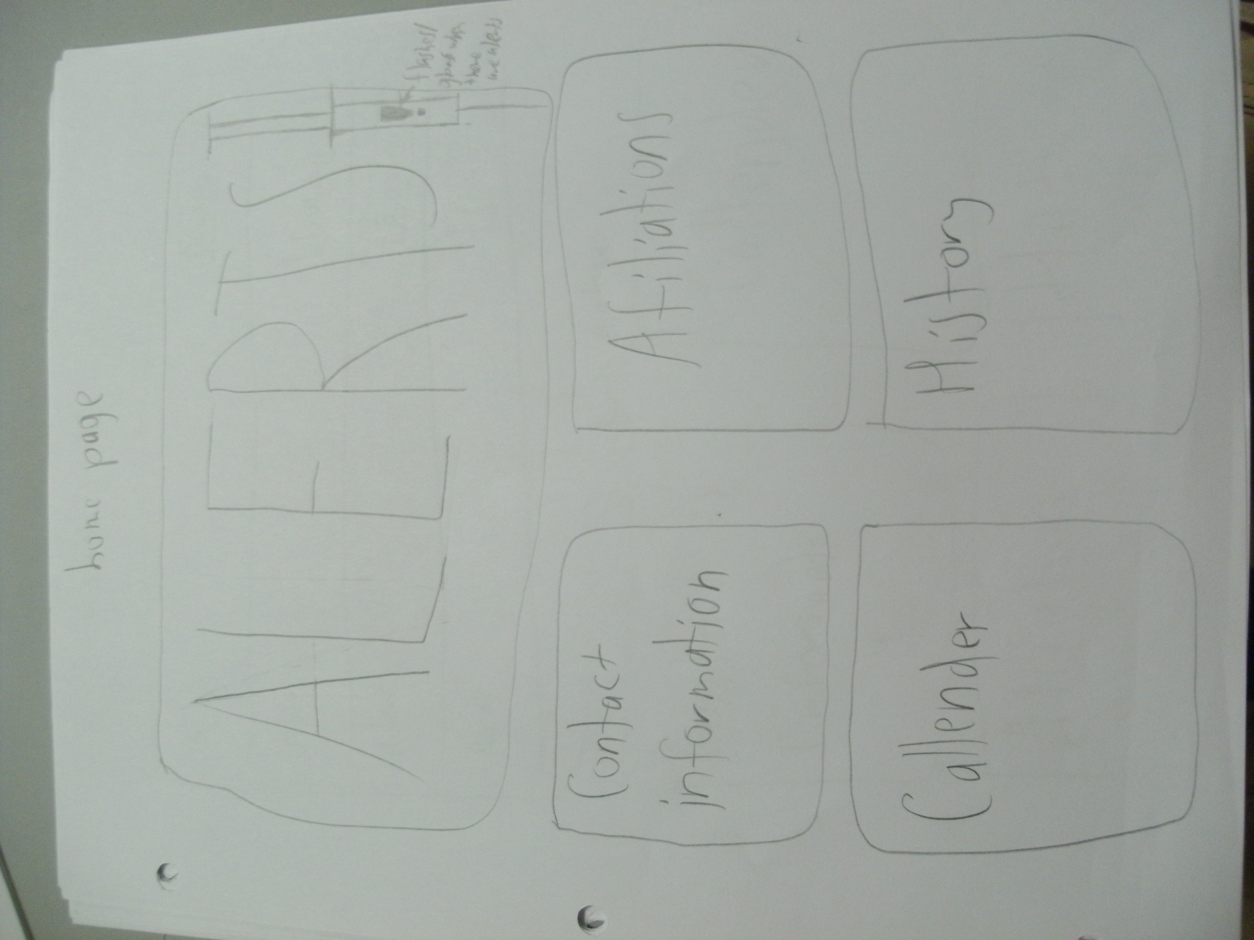
We got pages laid out, and pieced together a logo. We also drafted a couple of graphics for the interface. Not visible in the diagrams: There will be a bar at the bottom with Back and Forward buttons. The logo will be at the top of the page as a transparent/faded background.
Here’s everything!


I chose the Trachea, bronchus, and long cancer: white males; age-adjusted rate by county 1950-1969 map. The image does what it says, tells me where there are different rates of cancer from 1950-1969 in white males. I don’t know what the population is of each county. Maybe it could draw lines or some sort of pattern to illustrate degrees of the population?
I can’t think of designs where I think of the look more than the information any off the top of my head. It has happened, I just can’t remember what they were for. Usually when it does happen it’s because I don’t understand what the information is supposed to day.
Team name: Noitatidem (“noy-ta-ti-dem”)
Title of project: Proxyhealth
Proxyhealth keeps parents up to date with immunization and the board of education’s department of health.
It’s going to help kids stay healthy, parents stay in touch with their kids needs, and helps the healthcare system make money.
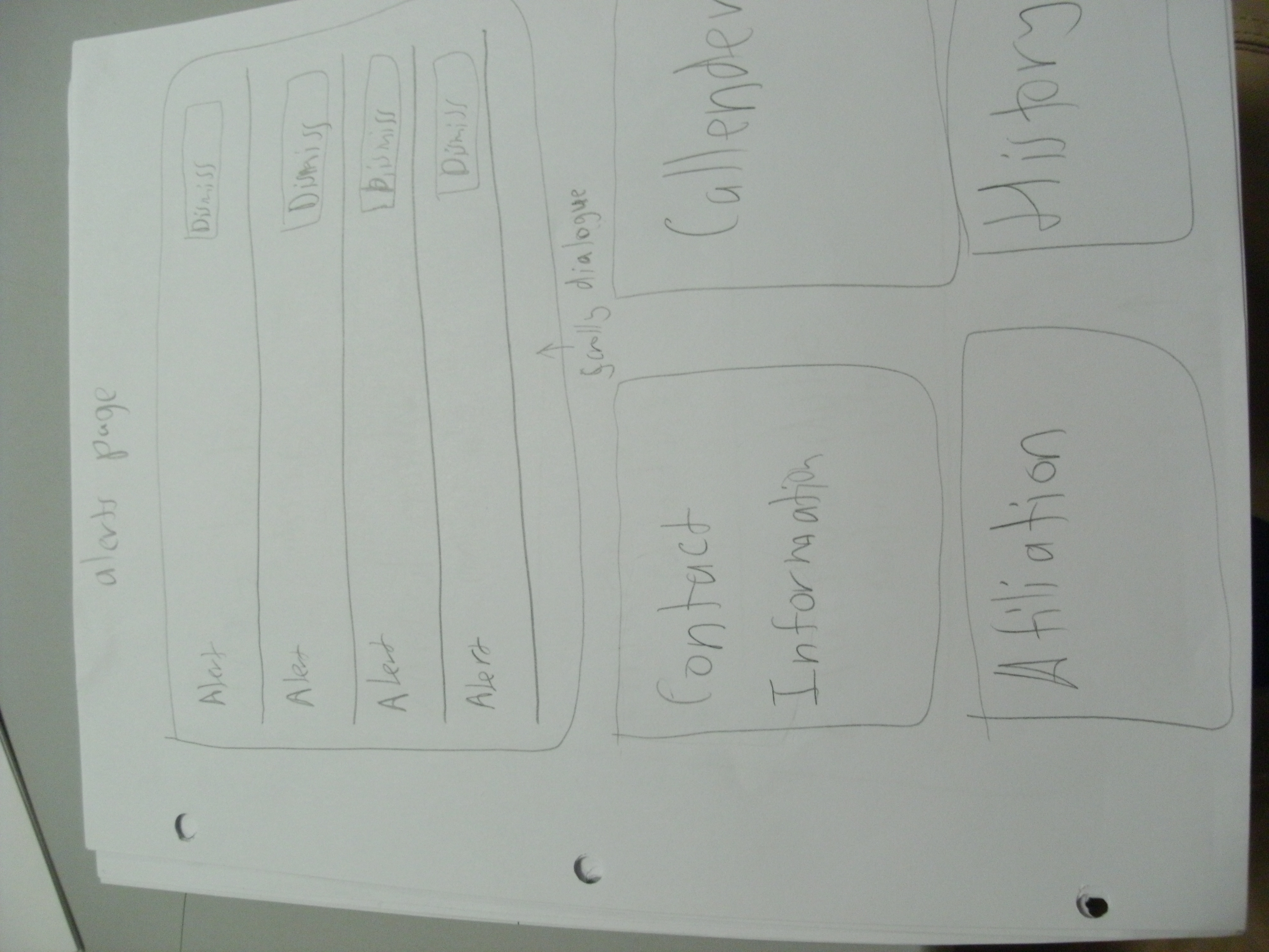
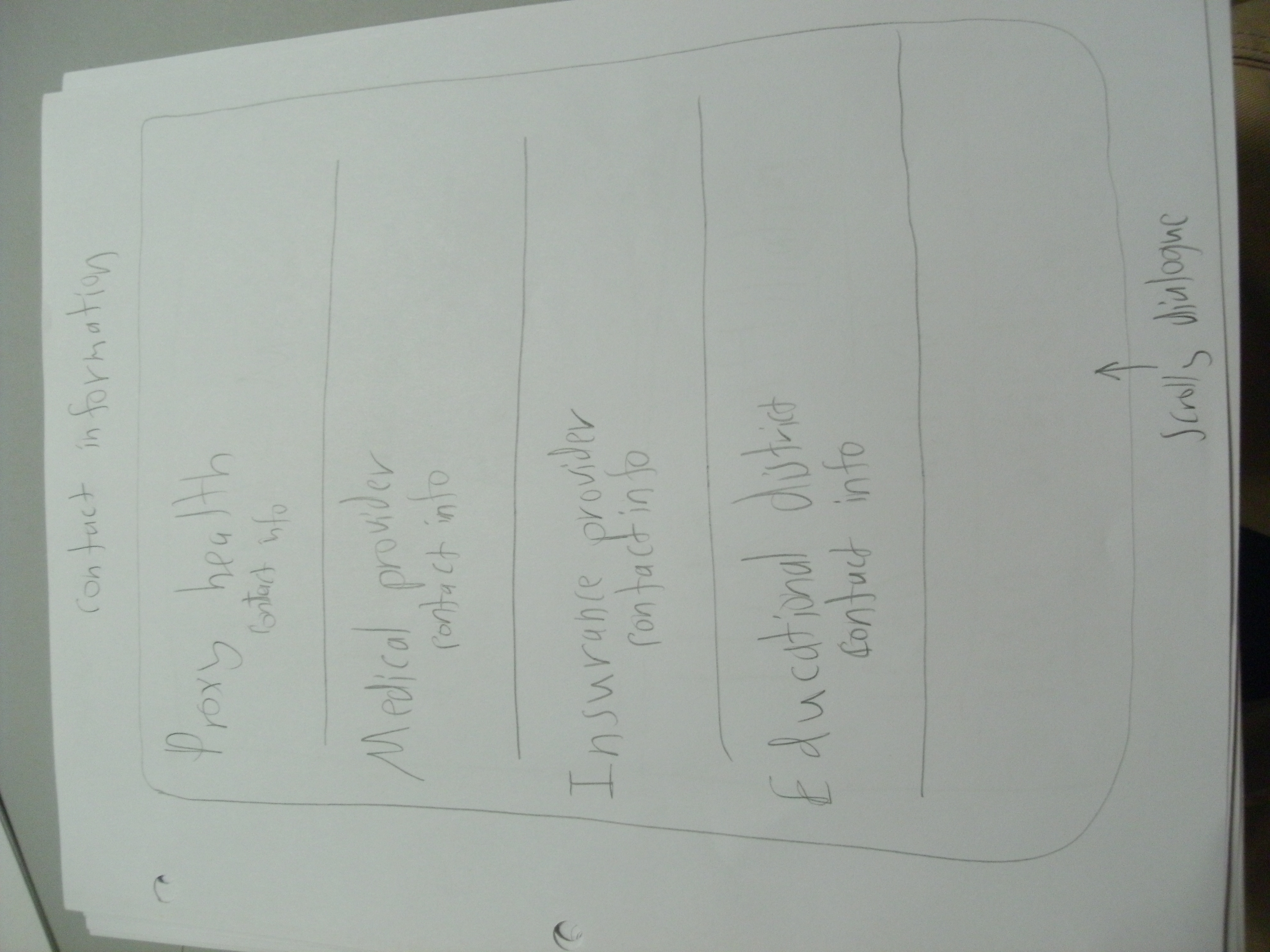
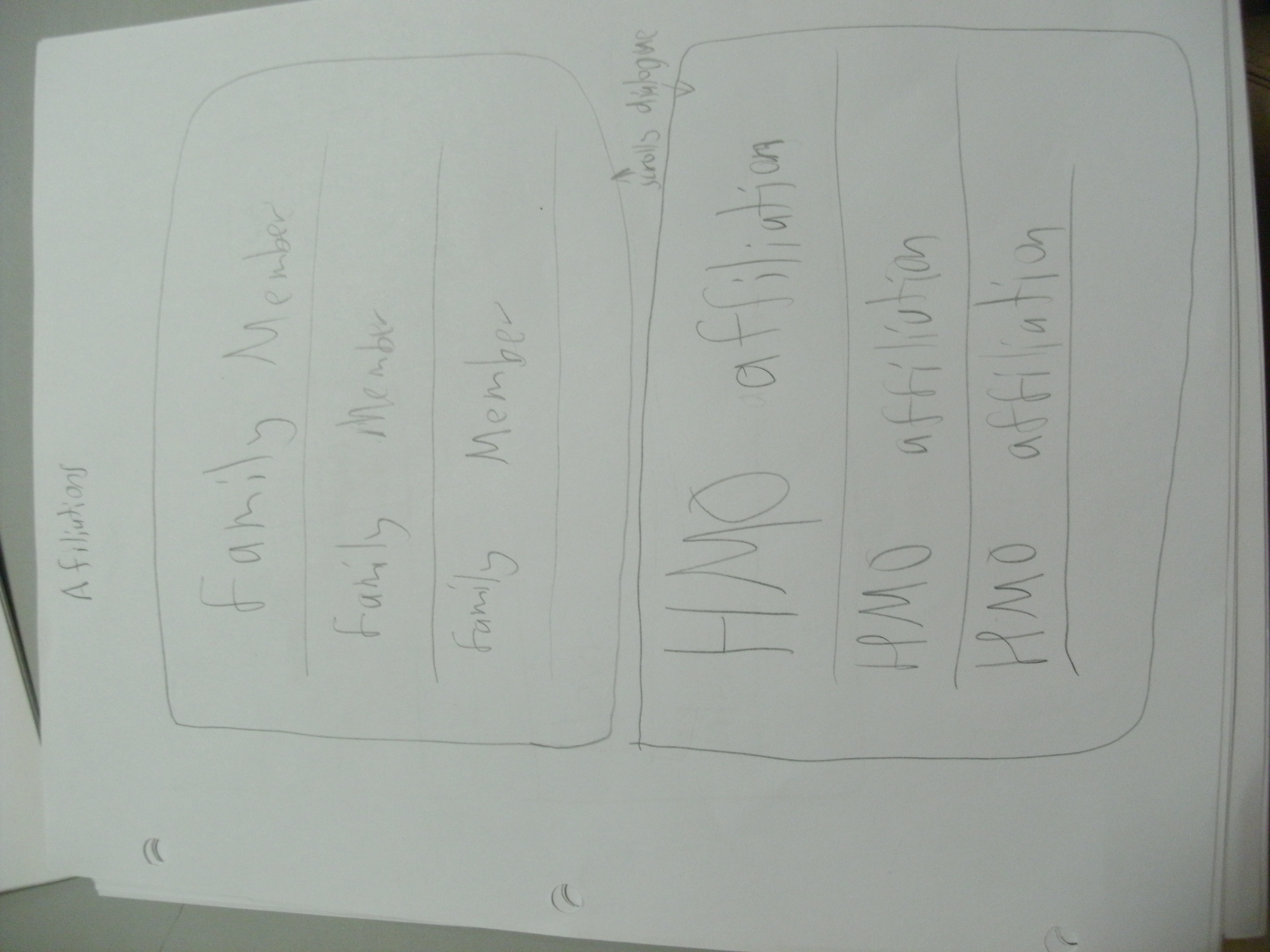
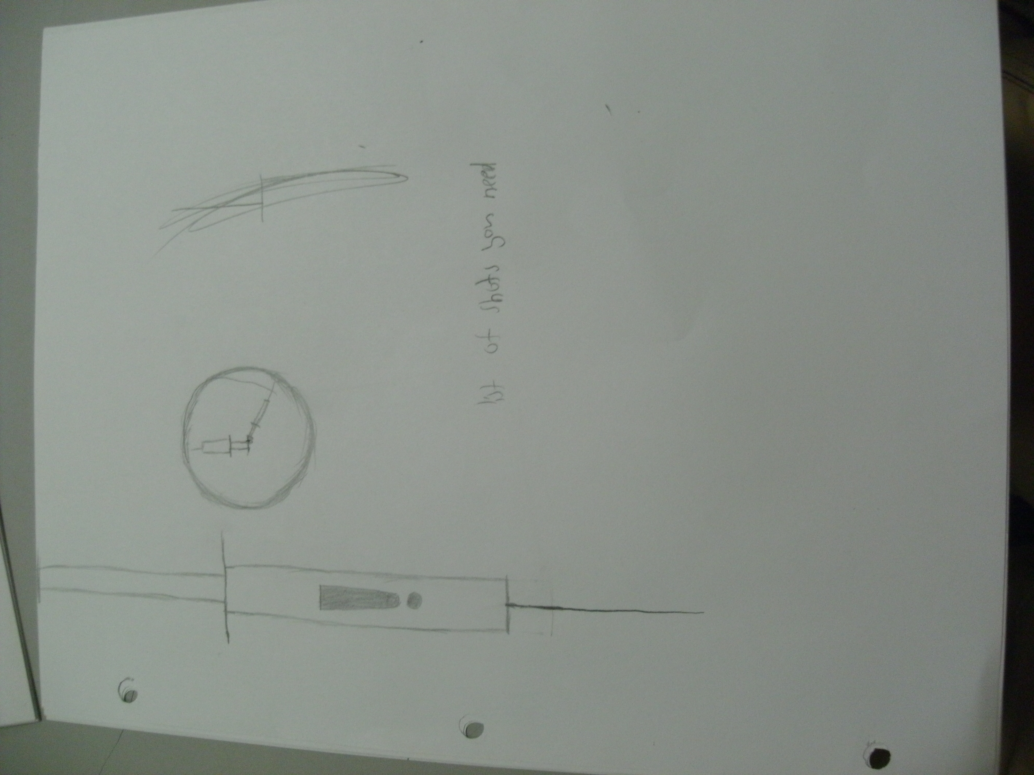
If we were to make a final product, it would be an app on a smartphone. However, in the span of the semester and for the sake of simplicity, we’re just going to create a UI that looks like it could be on a smartphone, but it’ll run on a computer. Or maybe we’ll make a site that is formatted for a smart phone. But anyway, the home screen will have buttons for appointments, alerts, and history. And those tell you what your appointments, alerts, and history are.

Next time!
TBD
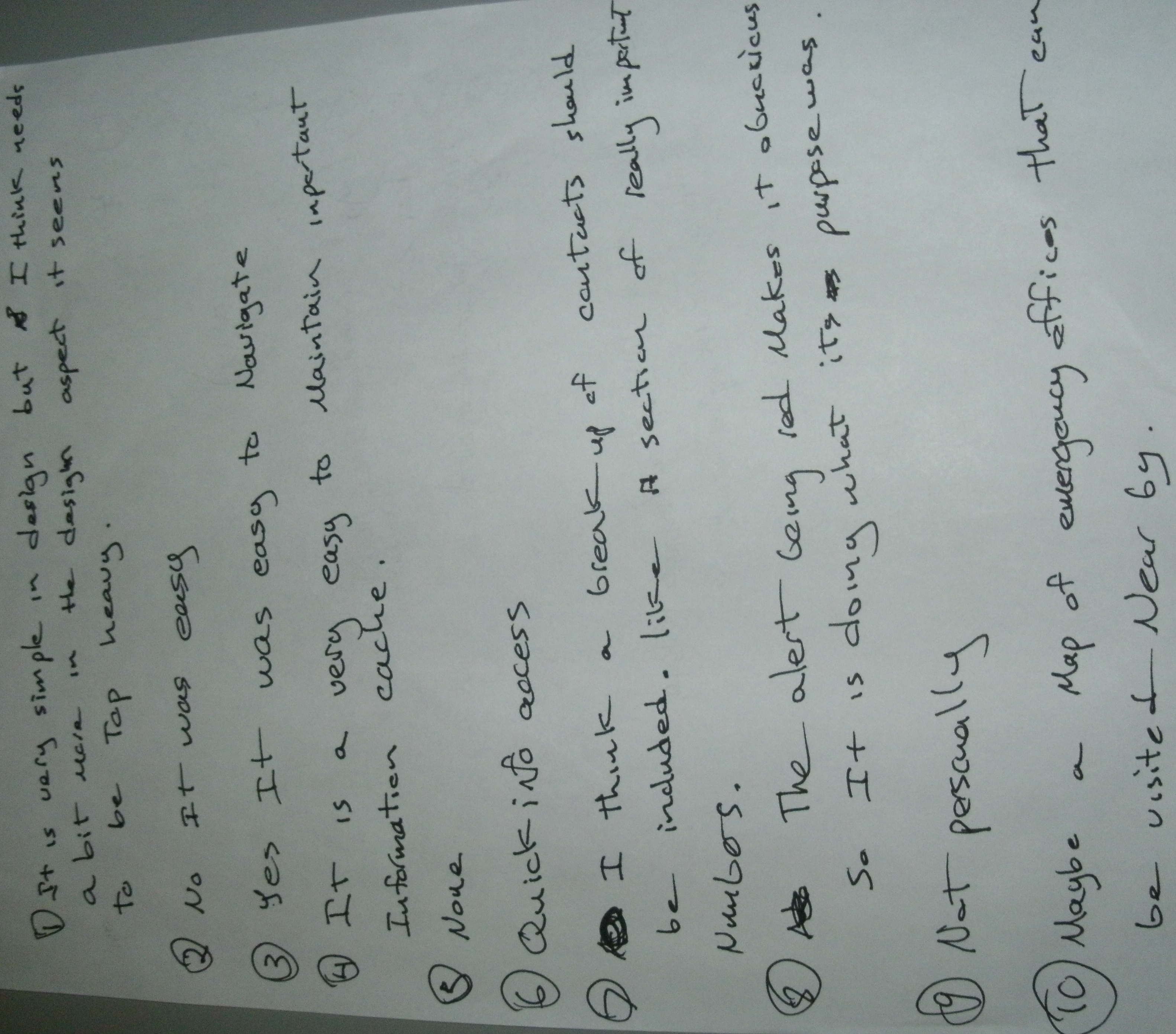
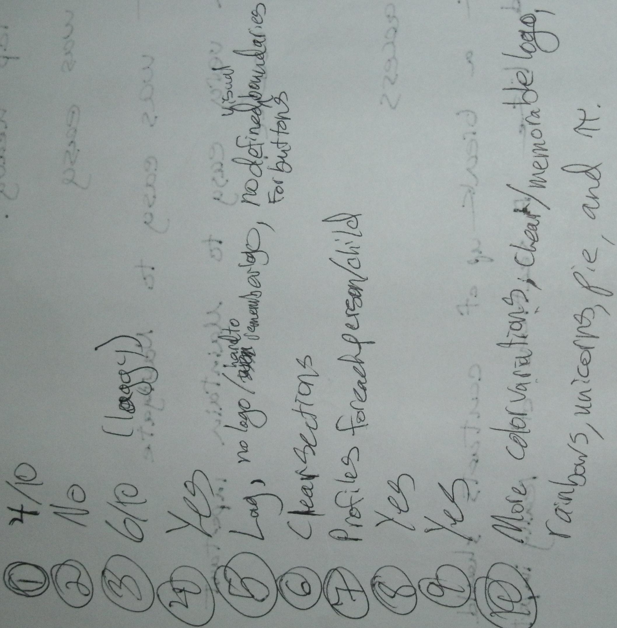
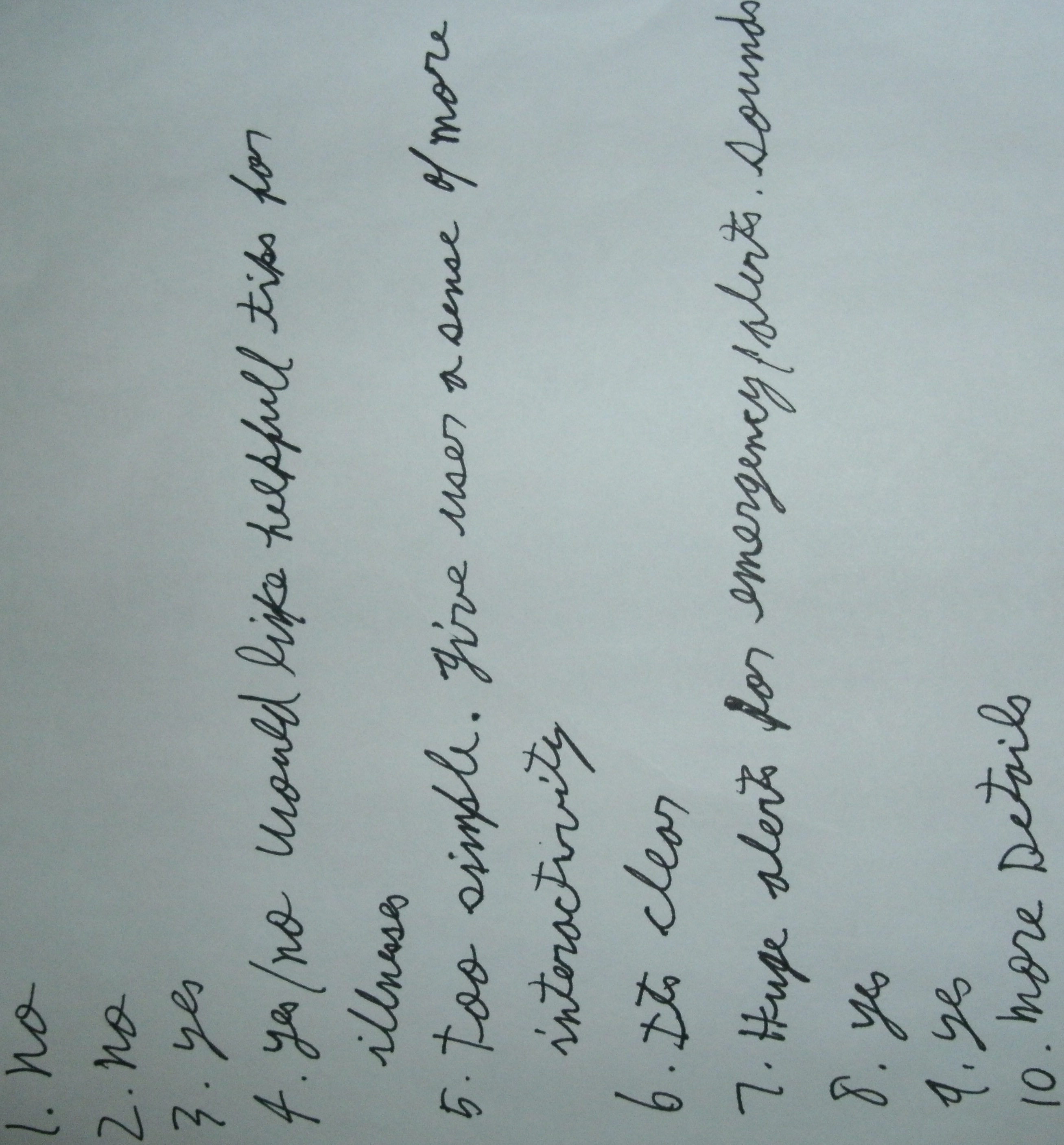
We know that our service would be useful if it were to be implemented in the real world. However, what we need to know is how easy it is to use. We’ll have people try it out and give us feedback on it. Responsiveness, if it’s an eyesore, what we should add, etc. We’ll give our subjects whatever platform we’ve developed for, give them a scenario, and ask them to complete a task or two.
Nope! Nope! Nope! We’ll probably need graphics and sound of some sort. Maybe not even sound though.
I find Maeda’s observations to be very on point. The things and people that grab my attention and fondness most are the things that at least try to express emotion. Even if they are simple emotions, like smilies.
Designing for emotion fosters engagement in a huge way. Perfect example, in Half Life, VALVe spent a lot of time developing their NPC (non player characters)s to convey fear, appreciation, dependance and weakness. I felt very attached to the characters when I first played. They looked and sounded terrible but they caught my attention and I grew fond of them. Then a remake was released a week ago, and they haven’t grown on me as much. The emotion isn’t there. They look and sound spectacular, but insincere.
I can’t think of any particular design off the top of my head, but I do know that designs with a lot of emotion catch my attention more than anything. It’s the reason why realistic games don’t appeal to me as much as imaginative ones. Like Darwinia and Battlefield. In Darwinia, you’re responsible for protecting and reviving little green digital men. They cry when they’re under attack, and they frolic when they’re safe. They even explore! Meanwhile in Battlefield, everything is hard and cold, very detailed but not very expressive at all. It has a hard time grabbing my attention.
The OpenLab is an open-source, digital platform designed to support teaching and learning at City Tech (New York City College of Technology), and to promote student and faculty engagement in the intellectual and social life of the college community.

