Monthly Archives: October 2012

HW 5 – John Maeda – “Time”

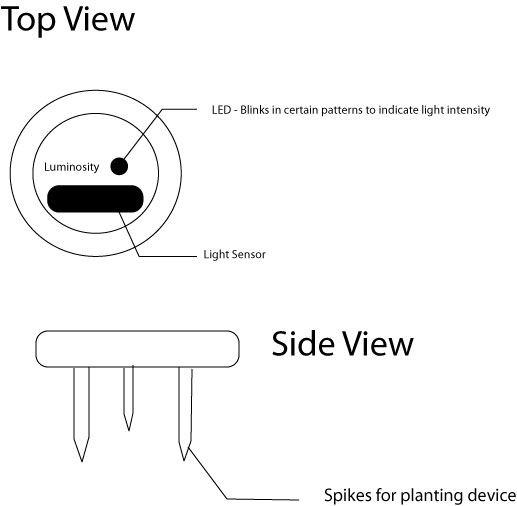
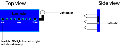
There are numerous ways to shrink time when a user interacts with an interface. One such way, that John Maeda discusses in his piece “Time”, is to use a progress bar. It creates the feeling of time passing and makes waiting all the more bearable because it looks and feels like it won’t be much longer until whatever you’re loading is finished. Another way is to remove steps done by the user when possible. Having them automated – which Maeda dreams of having Google or Apple do with everything eventually – allows the user to refocus their time. Shrinking time, after all, is all about making the wait shorter AND making the wait more tolerable.

However, I cannot agree with Maeda on having Google, Apple, or any device making choices for me, even if they think they know what I want. It’s something that I’m not willing to give up, making that choice. Once you give up a choice you’re giving up your freedom, and I’m not going to give up my freedom to some algorithm-driven device programmed by a person or people I’ve never met. I don’t think anyone should, either, but I’m not going to remove, or lobby to remove, their choice to have that ability.

One way I’ve figured out on how to save time when it comes to playing games is to position my hands over keys I know I’ll need to use. In an MMORPG, it’s WASD with my left hand and my right on the mouse. In a MMOBA, it’s QWER for the left and the mouse for the right. For a 2D MMORPG Side Scroller, it’s CTRL and ALT for the left and the arrow keys for the right. For a MUD, it’s left hand over the main area of the keyboard. and right hand over the numberpad. Even in games like Dance Dance Revolution, you stand on the left and right squares of the pad, not the center.

Moving away from games, when I’m about to reach the top of the stairs to get into my apartment, I have my feet halfway out of my shoes, my headphones off and unplugged, my cellphone in my pocket, my iPod turned off, and my purse and book bag in my hand. This allows me to get to “I’m home” mode a lot faster than I would otherwise. And for someone whose college days has her out of her house at 7:30 AM and home at 7 PM, this is direly needed.

HW 4 – Edward R. Tufte – “Graphical Excellence”

“Graphical Excellence” by Edward R. Tufte has many images within his piece. On page 17, he has two maps, but they both have the same issues so focusing in on just one is unnecessary. These maps, which are meant to depict all types of cancer in whites, which are age-adjusted rates by county during the years of 1950-1969, are relatively terrible.

Assuming that whites are the only one who need be depicted – and they’re not, having maps for all of the races instead of just whites would be better, and better yet having many maps depicting different ethnicities instead of broad racial groups would be best for the purposes of research – this map has a number of issues. The map only portrays the continental US. Hawaii and Alaska are completely forgone. The map is made hoping that the layout of the counties will make clear where the state boundaries are. However, the boundaries are hard to see. A thickening of the lines on the boundaries would help with this.

Moving on, this map is broken into counties. This assumes that the observer knows where all of the counties are in each state. However, many of the counties are so small they’re impossible to determine in the first place. Labeling the counties, while messy, would make this far more effective in portraying information. Then there’s the coloration. The key is on a different page altogether, which makes reading this map further impossible to deal with.

Personally, this map fails on aesthetics and information. And I can honestly say the first thing I look for in any infographic is the actual information provided instead of how well it’s laid out. In fact, I may notice the aesthetics only when the layout is so terrible I can’t determine what’s being portrayed.

HW 2 – Bill Moggridge – “People”

In Bill Moggridge’s piece, “People”, he discusses the four methods of the human factor being integrated into design and interaction. These four methods – Learn, Look, Ask, Try – are actually the categories for a larger group of methods.

The four methods do best when used in tandem with one another, but one must be attempted to be done alone, I would suggest it be “Try”. Try takes the factors of Learn, Look, and Ask and has the creator of design hypothesize what results Learn, Look, and Ask would bring about. To quote Bill Moggridge, when one does the Try method, they “create simulations and prototypes to help empathize with people and to evaluate proposed designs.”

He proceeds to list submethods with examples to emphasize what possibilities could exist. Three of these four submethods listed are ones I’ve already utilized in the past: Empathy Tools, Scenarios, and Informance.

Empathy Tools emphasizes adapting yourself with props in order to offer a new perspective that you may normally lack. The example given is about wearing weighted gloves to simulate having limited dexterity and tactile sensation. When I was in high school, I was wondering what it was like for the deaf students in my school. It was an arts school, and these students were unable to hear any of the singers or musicians. I couldn’t begin to fathom what it was like as someone with extremely sensitive hearing. Knowing that I had few days off coming, the day before I had off I went to school with earplugs and sound-reducing headphones. I experienced what it was like that day in school, and over my vacation, to interact and live life without sound. And it changed my perspective on the deaf community and on how being deaf should be viewed. Whenever I’ve had thoughts of things I could create, I always take the deaf community in mind now – how could whatever I might make, whatever ideas I come up with, be effective to those with and without hearing? I think back to those days where I sat through a concert recital unable to hear a thing, or how shows that lacked closed captioning that had people talking without facing the screen or talking off screen made watching a show impossible.

When one illustrates a character-rich storyline describing the context of use for a product of service, Bill Moggridge would say they are using the Scenarios submethod. This is one I use often. I think of the possible paths a decision may take, and then write out small stories with people involved in my life to determine what would happen. It leads me to have four or five vignettes or short stories from one decision. It’s a very useful practice that can also be applied to the design world, as is described in the example from “People” with the designing of a community website.

Acting out an “informative performance” scenario by role-playing insights or behaviors that you have witnessed or researched is what one does when using the Informance submethod. Again, this is one I use frequently, both with my relatives and my significant other. I’ve also used this with my two younger relatives with disabilities so that they can show me how they see me acting with them, or how others are interacting with them, so I can teach them what to do or how to respond in the future.

Using the Try method is acceptable in pretty much every project one can think of, so long as there is a human that will be interacting with the finished project.

HW #5: 10.06.2012

Today I finished reading another excerpt from John Maeda’s book; this chapter focused on Time and how we view it. He wrote about how people have this constant worry of time and trying their best to reduce the time spent in activities. This is tied to time management, and the anxiety of having to wait for something. Since no one likes to waiting for anything, there have been methods created for specifically to shorten the time spent waiting. For example, the “status bar” on a computer gives the user the illusion that time is moving faster or at a normal pace when in reality, it isn’t. Another example is when you are on hold and an automated voice tells you how much longer until you can speak to a another person on the phone.

What we can take from this is that people feel more comfortable waiting when they know how long they have to wait; this is also stated in the reading. A few ideas we could implement to shrink time when a user interacts with an interface would be: having a short mini-game the user could play while an interface is loading for the user or a short tiny movie that could draw the users attention and distract them from any frustration that had dealt with previously.

During the reading, Maeda also spoke of another way of reducing time spent waiting, an autonomous object that made decisions for you. The example he used was the Ipod Shuffle, a device that has no screen and only some buttons for moving back and forth between songs and a play/pause button. This version of the ipod doesn’t let you choose a song, rather instead it chooses for you so the short couple of minutes you spending choosing a song are cut out. So this raises the question: should be allow machines to make choices for us? Personally, I wouldn’t mind as long as I had the choice of allowing the machine to do so. As long as it isn’t making choices without my consent, it would be entirely fine with me.

We all have ways of saving time, as for myself, I tend to multi-task alot when I feel like I’m not getting what I want done fast enough or if I’m late. For example: I’ll make myself breakfast in the morning but I won’t sit down to eat it right away. Instead, I wrap it up and eat it on the train thus eliminating at least 10 minutes spent eating.

TEAM DISCO NINJAS WIRE DIAGRAMS!!!!!! [-_-]~


Now that we have a general Idea of how our program is going to be laid out as well as the flow it will have, we can begin our programing and get a rough working prototype. After that we can Begin to discuss our design ideas such as color, fonts, images, sounds. Then we will add this to our first prototype and see how it mixes with our program. We also want this to be usable by Color blind people (Ahmad)

Yoonshik, Bluestar, Rich Interaction Design Group Project

Project Title: Black Mason


Description: A bag that attaches to a bike which has the ability to store green energy gathered by the natural peddling motion from the cyclist.


Social Aspect: Cyclist find that certain devices such as head phones and I Pods makes their journey easier and more entertaining than just getting somewhere or exercising. What happens when you go great distances and your device battery is not up for the challenge. In most cases the cyclist is left without one of their sources of motivation. This invention will prevent that.


Interaction Model: The bag that attaches to the bike is equipped with a compositor that stores energy and an alternator that converts the energy into AC/DC power. The bag will have outlets that will allow the user to charge and power devices. This invention has two additional attachments such as a onboard computer, about the size of a wrist watch that allows to cyclist to see how much power is stored. The second device is the cyclist helmet which is equipped with solar panels that allow energy to be collected via the sun. The helmet stores a small detachable compositor that can be injected into the alternator inside of the bag for additional energy.


Schedule: The bag which houses the compositor and alternator has a wire attached to the wheel; which allows the energy to be collected while the wheel is in motion. The energy is transferred to the compositor that stores the energy. The compositor then sends the energy to the alternator for conversion which allows usage through the outlets.  The removable compositor attached to the helmet is removed once fully charged and can be inserted into a slot on the alternator. We will accomplish this by first affixing the compositor and alternator to the bag. We will then connect the cable from to the wheel using along with a rotating device. We will then attach the other end of the cable to the compositor. From there we will connect the compositor and the outlets to the alternator.


Test Cases: We will recruit several long distance cyclists to try the product. We will be looking for feedback on how long it takes for the compositor to charge, how much peddling it will take to keep the compositor charged, the distance the cyclist can travel without hiccups, how long will the compositor stay charged while the bike is not in motion and the amount of wattage that the device can provide.


Materials / Budget:


Bag

Helmet

Small computer that can read wattage

A small compositor

A small alternator

Outlets

Cable

Turning mechanism and

Small solar panels.


Response to Graphical Excellence

The map by E.W. Gilbert “Pioneer Maps of Health” show where people died and the water pumps that were in the area. This information lead to the discovery of the pump that had cholera. The map could have shown where the people went to get water but using common sense we can see that people usually go to the one that is closer to their house. When I go look information the thing that I think matters most is the information. The way it is presented usually comes second in my opinion but if the information can be present in some sort of visual way of course I would prefer it.

Michael Perez, Ahmad Woods, Philip Zak, Design Doc and Flow chart


Group: Disco Ninjas

Members: Michael Perez, Philip Zak, Ahmad Woods

Title of project

Learning Revolution


  • A tablet designed to assist children with learning by managing their work and progress, which also plays upon a human’s competitive nature to foster learning.


  • To reinvigorate learning. Students don’t interact in the classroom any more and as a result they aren’t engaged or attached to what the teacher is writing on the blackboard. Children these days play a lot of video games and video games are often competitive in nature. People usually play games to unlock every achievement they can and that drives countless hours of gameplay. What if a similar “achievement system” was introduced to the classroom! We hope that this device sparks a thirst for learning by making it more interactive not only through the use of the device but through the competitive functionality it brings among students.


Describe the interaction model- how does it work? What is the interface like? How will people interact with it?

  • The device is a tablet 7.60×4.8 with a 7’ pressure sensitive capacitive screen.
  • The user can use their fingers or a stylus to interact with the device.
  • Stylus attached to the device by a wire. 3’ long and a .25’ wide


HW #4 Graphical Excellence

I chose the all types of cancer, white males; age-adjusted rate by county, 1950-1959.

The image depicts exactly what the title states. My problem with the image is that: a) there is no key, so I don’t have a clear understanding of the difference between the counties where there is little/no shade and counties with a dark shade. b) I wish there would be some kind of statistical information. For example, top 10 cancers or an age rage that is affected most.

I can’t think of a time where I saw a design and cared more about the look than the information portrayed. I am sure it has happened, but just can’t think of a time.