Author Archives: Jonathan A.

Final Project Team: Jonathan Alicea – Justin Seda

During hurricane sandy we saw the best and some times the worst come out of people. A lot of our emergency responders did great work before, during and after the hurricane. We are planing to make a game using bender that will involve you driving a ambulance during the hurricane. Objectives will include picking up and dropping off items and getting to places with in a certain amount of time.Objectives will differ depending on how well you complete the last one and what “time of day it is in the game”. Once you complete you “shift” the game will be over and you will receive a score.

Jonathan, Gabby, Justin Screen Shots

These are our sketches of what we would want our app to look like

Post 5: Time

Back in the bad old days when computers took a long time to load and you had to be a computer programer to understand what was happening, waiting on things was a norm. In fact programs were written to use less memory. Today we don’t really care as much about how much memory programs take simply because we have more processing power. Its funny that even thought we have more processing power we started messing up with how users would use the device. The user interface is something that is reality simple to make, compared to all the back end stuff but its also the simplest to mess up simple because people interact with things differently. The easiest way to shrink the time a user interacts with an interface would to have less options while still get the user from point A to point B. Having a machine make choices for a user would help the process go by faster only if the user knew what the computer was gonna do otherwise it will just result in frustration of the user. When I use to listen to music on my old phone, I would have to unlock it in order to switch songs. On my new phone I just have to turn on the screen and i am able to switch the song without unlocking my phone.

Response to Graphical Excellence

The map by E.W. Gilbert “Pioneer Maps of Health” show where people died and the water pumps that were in the area. This information lead to the discovery of the pump that had cholera. The map could have shown where the people went to get water but using common sense we can see that people usually go to the one that is closer to their house. When I go look information the thing that I think matters most is the information. The way it is presented usually comes second in my opinion but if the information can be present in some sort of visual way of course I would prefer it.

Jonathan, Gabby, Justin Design Doc

Interaction Design: Group Project

Team: TFGD (Touch Fuzzy Get Dizzy)
Group Members: Jonathan Alicea, Justin Seda, Gabrielle A. Bartomeo


Title and Description

The title of the project is QPQ. QPQ stands for Quid Pro Quo. Quid pro quo is Latin for “Something for something.” Another word for swapping something for something else is bartering.


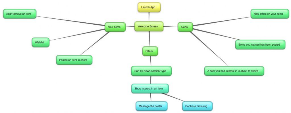
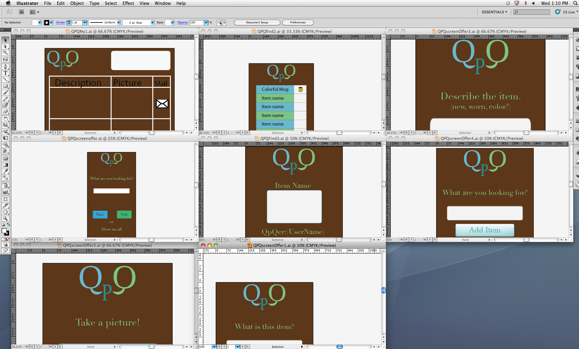
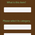
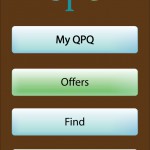
QPQ is a phone app that allows users to barter with each other.

QPQ Goes Social

In economies of old, long, long ago, there was no such thing as dollars, coins, or credit. If you required an item, you would barter for it by offering items you have to another person to get the item you want. You didn’t trade what you could have, but what you had.


Enter the economic crisis of 2008 and the recession that appears to refuse to leave. The credit and housing crisis sent and continues to send many into poverty and homelessness. Those who are jobless and unemployed have shot up to unprecedented levels in number, and those who normally would be hiring have not been. Still, needs exist for all people. It is always better to trade that which is tangible rather than that which is intangible.


QPQ will allow people with smart phones to find and offer barters so that they can receive what they need, whether it’s food, clothing, games, art, or more. The best part about QPQ is that the barters you participate in do not involve money or credit – it involves only what you and others have.


This app’s target audience is ages sixteen and up, as anyone younger seeking to participate in a barter should contact a parent or guardian to learn about bartering and have their parent help them, providing a potential bonding experience.


Hw #2

In this reading Bill Moggridge talks about how designers design better when they take the future end user in to consideration. This meant know how the end user would use the product and how they would engage the product over the course of its lifetime. With that information you could determine how you would design a product that is center more around having a  user friendly experience. His team at IDEO took it a step further and developed a deck of cards that show 51 ways to learning about people. This is helpful because people are complicated and if your end goal is to satisfy everyone of your consumers then it best to get brainstorming all the possibilities. So this deck of cards includes ways to learn about the users, ways to observe them, questions to ask and showing them prototypes.  These cards helped take the complicated and some what intimidating task in to a some what fun and inspiring board room meeting.

Hw#3

In this week reading “Emotion” by John Maeda he talks about how many of our modern day items have been designed to be “simple”. By simple he means a usually one color with a sleek design. He went on to talk about how an about with such a simple design show no emotion and some people even go out and buy cases or even customized the items they buy in order to produce the emotion response that we expect from said item. The fact that we stepped away from crafting items in order to make more in mass production also has a lot to do why they are simpler and less elegant than things a while ago.

Persona project: Jonathan, David, Justin

Location: We went to a plaza in DUMBO.

Summary: We took a walk to the 65 cent vending machine in the DUMBO and originally had plan to observe people interacting with the vending machine but not many people did so we observed the people in the plaza. Overall we saw an interesting bunch of people in the area.

Persona:

Age: 60ish
Location:Brooklyn
Interest: Painting and Gardening
What would they do in the area: To paint and eat
Project: Noise canceling headphones

Age:20ish
Location: Manhattan
Interest: Volunteering
What would they do in the area: To eat and talk with his friends
Project: Sound proofing glass

Age: 50ish
Location: Brooklyn
Interest: Fashion and crafting
What would they do in the area: Go partying and drinking
Project: Heels that can go on cobber stone streets

Age: 16
Location: Queens
Interest: Tweeting and Blogging
What would they do in the area: Tweeting about her everyday life
Project: Free Wifi ( which they have)


Assignment #1

In this week’s reading, “The Psychopathology of Everyday Things” I can come to an honest conclusion that some designers get carried away designing. They forget about one of the important things in design which is how the end user will interact with the product. Donald Norman, list several examples in his writing of product that can be improved upon if they would have just taken the way humans naturally interact with the objects that we use. One such example was the way the slide projector control would work, the fact that it had only one button to move the slides forward and backwards was a bad way for a user to interact with a device.

One device that I believe should be made better has to be slightly improved upon is the scroll wheel for my mouse. It uses a touch pad type system and it is not able to do horizontal scrolling. It also doesn’t have the middle mouse button which is common in a lot of mice. Instead you have to tap on the touch pad. Its works but it take a little too much practice.