final project video
Leave a reply
Link for prototype: http://fac.philipzak.com/
I think there are a few ways for the time a user interacts with an interface to decrease. 1) properly optimize the content. Whenever I create websites, the time it takes for the site to load is a major factor in my design and development process. 2) an easy to use navigation. if a user has to think about how to use the navigation or where to find it, then the navigation is poorly designed.
I would have to say it depends on the situation. When it comes to picking out what to wear, I would say yes, it is sometimes annoying for me to decide on what to wear, especially with the weather always changing. I already let a machine pick the music to play, obviously the choices are within my library.
One way I can think of where I saved time is I saved commonly used HTML code snippets. This way, instead of having to constantly write out code, I can just tap a few buttons on my mouse and voila the code appears. This leads to me having extra time to focus on the content of the site and any debugging I would have to do.
I chose the all types of cancer, white males; age-adjusted rate by county, 1950-1959.
The image depicts exactly what the title states. My problem with the image is that: a) there is no key, so I don’t have a clear understanding of the difference between the counties where there is little/no shade and counties with a dark shade. b) I wish there would be some kind of statistical information. For example, top 10 cancers or an age rage that is affected most.
I can’t think of a time where I saw a design and cared more about the look than the information portrayed. I am sure it has happened, but just can’t think of a time.
After reading “Emotion”, an excerpt from John Maeda’s book “The laws of simplicity”, I realized that most of our items that are used on a daily basis have been designed to be simple looking. For example the iPod, a monotone object but with a sleek design. John went on to say how these simple designed items show no emotion and this leads to people to accessorize the item in a way that makes the item have some form of emotion. To me, I feel like companies create items with a simple design so mass manufacturing the item would be easier and consumer can spend more money on the item by buying accessories.
In my opinion, a lot of art is designed with emotion and is meant for viewers to engage the art. For example, the artist can create a piece and viewers would walk up to the piece and ask themselves questions like “who are these people?” or “these look like the mountains I can see from my house.”
There really isn’t any object or design that I am attached to. In terms of design, I lean towards simple designs, nothing blingy. If I had to pick one object I am attached to, I guess I would say my iPod classic. I believe it is the last iPod with the wheel released by Apple. To me, it reminds me of times where people were asking each other what music they had on their iPod and not comparing their stats in Angry Birds or Temple Run.
The location we picked was the 2nd floor cafeteria in the vorhees building.
The things we saw were people eating, talking, doing HW, studying, surfing the web, and one person was sleeping.
The person we talked was Sebastian. The things he would change the area surrounding the stairs, have the dirty tables cleaned more often, more power outlets, and better internet.
In our group was myself and Michael Perez.
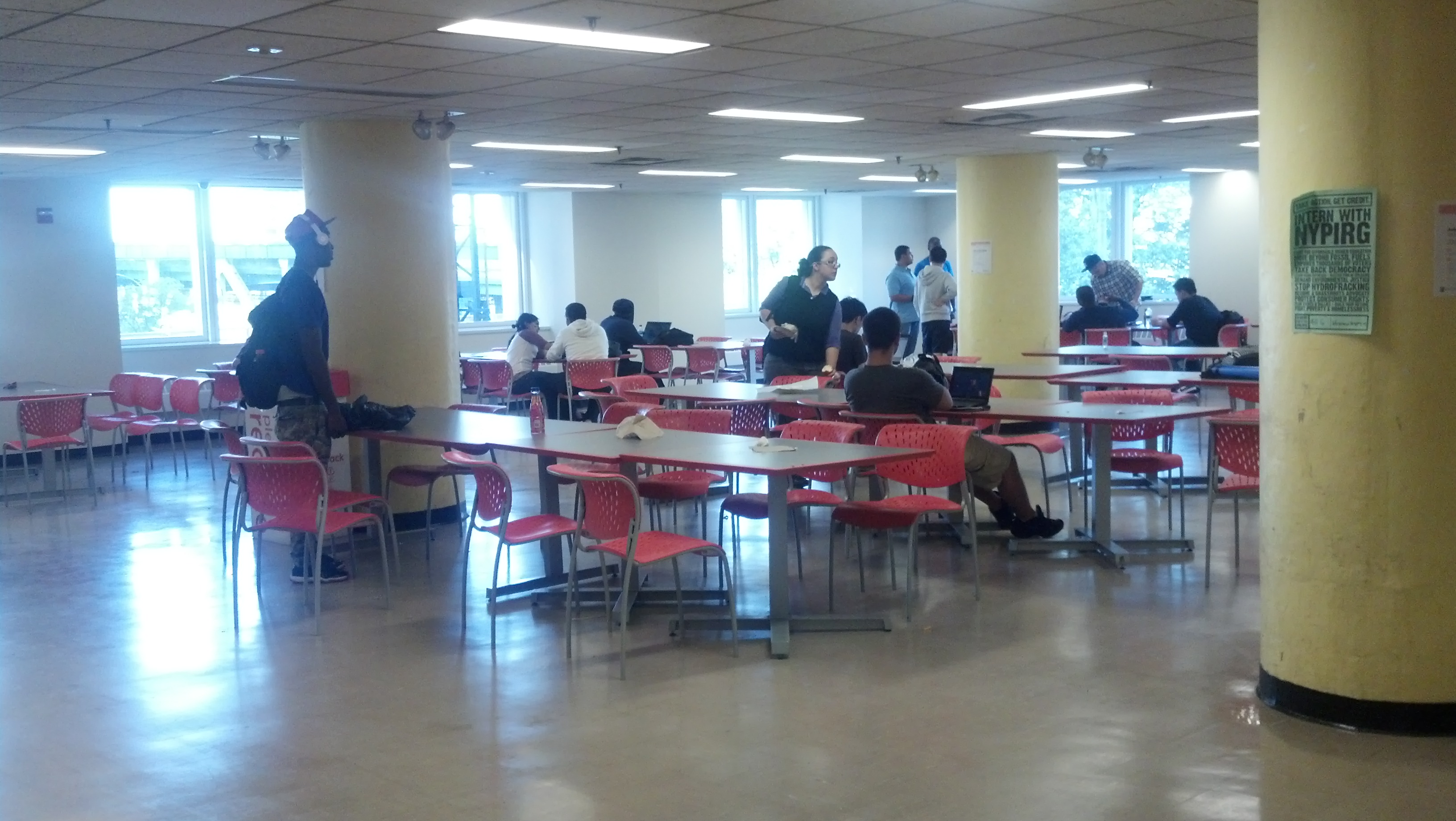
Four personas we came across was the tech user, business user, casual user, and power user. they all live in NYC. Their interests range from apps, making money, women, and teaching. They would use the space as a working environment and break area, as well as a eating establishment. They would use the project for various reasons but all have in common they need a clean and quiet area to maximize productivity.
In his book “Designing Interactions”, Bill Moggridge has a section called “People”, which talks about four different techniques in which a designer can observe potential users of the designer’s project. The four techniques are learn, look, ask, and try. After reading the excerpt, I feel the “Look” technique would be most beneficial to a designer in his or her projects. Each of the four methods within this technique (fly on the wall, a day in the life, shadowing, and personal inventory) can yield a lot of information about the target user(s). If I had to pick one method and use it in a project, I would have to pick the A day in the life method. I believe, in order for this method to gain as much information as possible without the user changing his or her daily routine, is to observe the user from afar and not let the user know. This way the observer can collect data about the user without the user changing his or her routine.
I would most likely use this method on a project that involves a portable device, like a cell phone or mp3 player. I believe this method would be best on a project like this because the observer can see how potential users use their portable devices on a daily basis and what features are being used. For example, does the user use wifi when available, or GPS, etc. After the information is collected, the observer will have a better understanding of what features should be in the product and what features are not necessary.
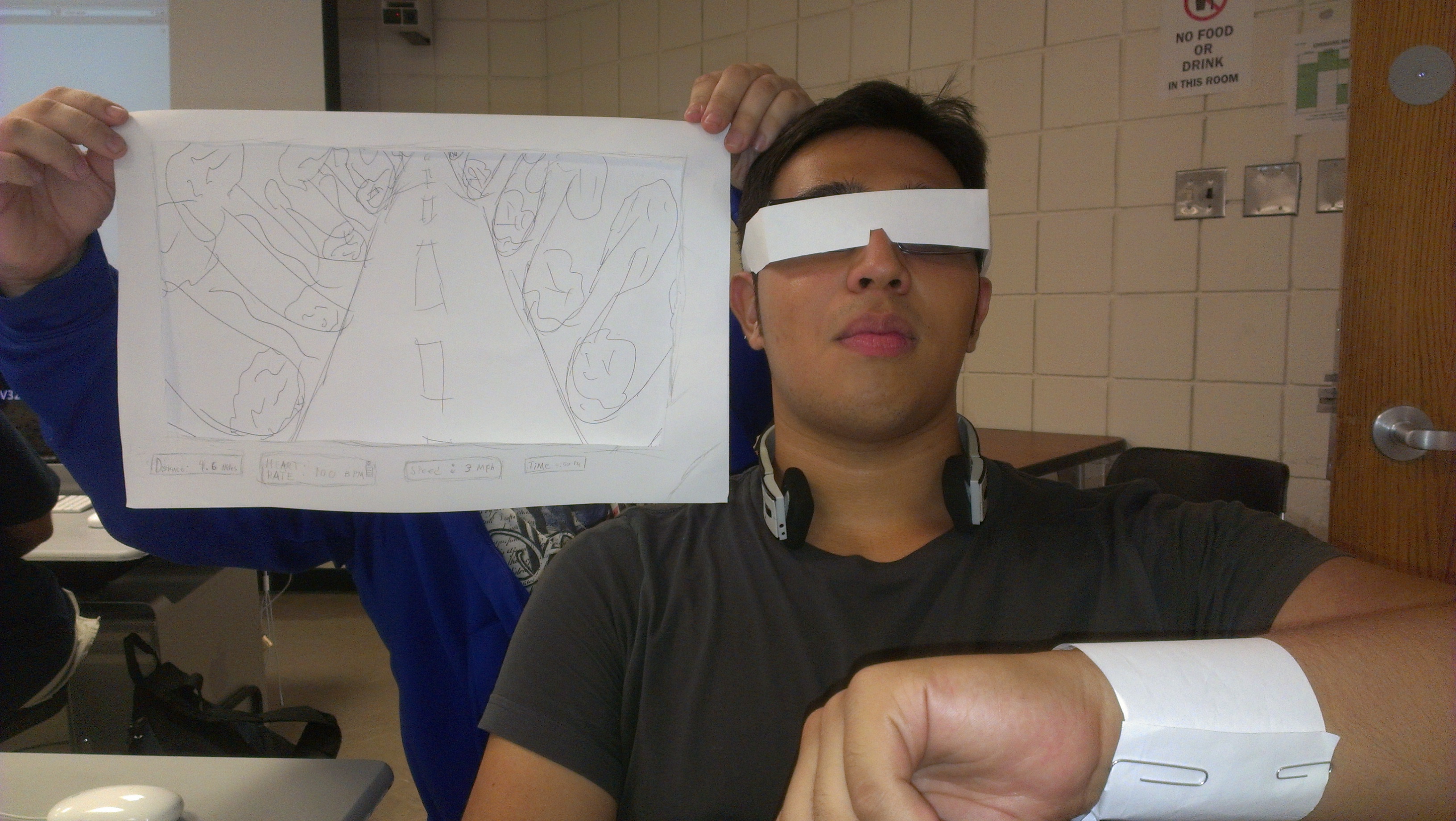
The project is to display a ghost version of the user.
To interact with this project, the user will wear a special kind of glasses that will display certain information. For example, the user’s heart rate, how far he or she has ran, how fast they are running, and current time.
Members of the group: Michael Perez, bluestar, Jonathan Alicea, Philip Zak.
After reading “The Psychopathology of Everyday Things”, it made me realize that a product designer can design a beautiful product, but in the eye of everyday people, that product maybe confusing and hard to use. Sometimes I feel like designers care more about the look of a product than how easy the product can be used. Even though the reading was a bit funny, for example the guy being stuck in the revolving door, the author was right about how year after year, we see the appliance or electronic come out, but with more features. For example, the iPhone, since its release in 2007, every year since then a new one has come out. Even though there have been changes to the physical phone and software each year, sometimes I feel like Apple does this because no matter what they put out, people would buy it.
One usability problem I recently encountered, is turning on the stove in my girlfriend’s apt. At home, all I do is click a button, then press another button to the desired temperature I want to pre-heat the oven to. But at my girlfriend’s apt, apparently to turn the stove on, you have to push the dial in, while holding it down, turn to the desired temperature, hold it there for a few seconds then release. The only way I figured this out was by Googling for the manual. I don’t think anyone would have expected it to be this complicated to turn on the stove.
The OpenLab is an open-source, digital platform designed to support teaching and learning at City Tech (New York City College of Technology), and to promote student and faculty engagement in the intellectual and social life of the college community.

