Author Archives: Rich

Rich’s Final Project

Name: Prep Time

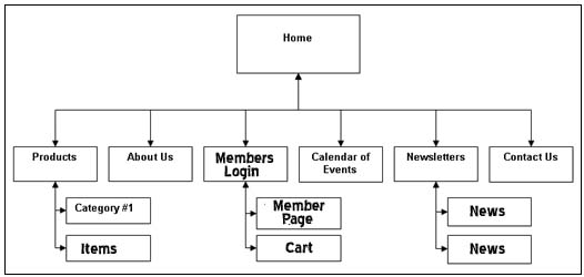
Description: A website for local citizens that accepts donations for distribution to members as well as provide a service where our team work with local citizens with being prepared for storms and disaster.

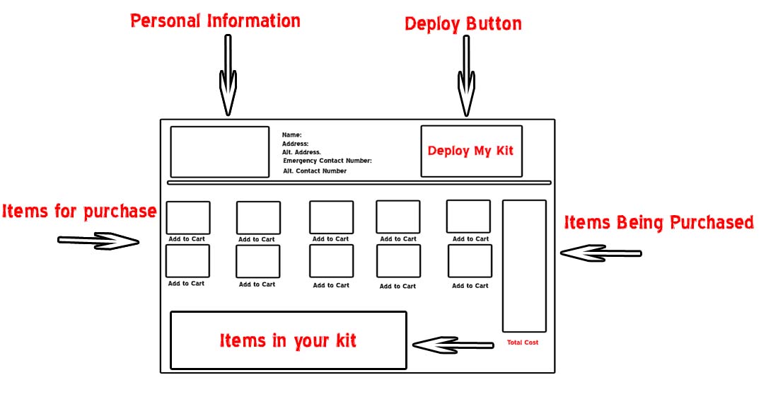
My idea derived from when Hurricane Sandy hit my neighborhood. We all lost power; therefore we all pitched in to ensure that our neighbors had everything that they needed from ice, to batteries and so forth. The storm also showed us how unprepared we were for something like what occurred. My project is a member website where locals can join and buy items that is needed in the Case of an emergency. These items will be available for delivery to your home upon request (24-48 hours delivery time). We all know that losing power is a big issue during the storm; therefore the site offers services that will follow up with you during the time of a storm. We will first try to contact you via phone, and if we are unsuccessful doing so, we will make a trip to your home to provide you with your emergency kit that you set up on our website.

The material used consist only of my laptop, design software and a server to host the website.

With regards to test cases, I would promote the website locally via flyers, local papers and radio commercials to see how many people that I could get to sign up. Offer a free trial and send surveys to the members for feedback.


http://youtu.be/4KaqeIT6GJ8


HW #4 Tufte

The image that I caught my attention is Edmonds Halley’s 1686 chart showing trade winds and Monsoons on a world map. I’m personally a visual learner therefore I’m all for maps and graphs. This image provides a lot of important information, especially given the time that it was created. With the new technology and new information that we have learned since 1686, certainly there is information that can be added.

If I was to add anything, I would add maybe the frequency of these storms; maybe by seasons according to the location. I do question the accuracy of the information provided. The design is simple and I feel that it only display what is needed.

Yoonshik, Bluestar, Rich Interaction Design Group Project

Project Title: Black Mason


Description: A bag that attaches to a bike which has the ability to store green energy gathered by the natural peddling motion from the cyclist.


Social Aspect: Cyclist find that certain devices such as head phones and I Pods makes their journey easier and more entertaining than just getting somewhere or exercising. What happens when you go great distances and your device battery is not up for the challenge. In most cases the cyclist is left without one of their sources of motivation. This invention will prevent that.


Interaction Model: The bag that attaches to the bike is equipped with a compositor that stores energy and an alternator that converts the energy into AC/DC power. The bag will have outlets that will allow the user to charge and power devices. This invention has two additional attachments such as a onboard computer, about the size of a wrist watch that allows to cyclist to see how much power is stored. The second device is the cyclist helmet which is equipped with solar panels that allow energy to be collected via the sun. The helmet stores a small detachable compositor that can be injected into the alternator inside of the bag for additional energy.


Schedule: The bag which houses the compositor and alternator has a wire attached to the wheel; which allows the energy to be collected while the wheel is in motion. The energy is transferred to the compositor that stores the energy. The compositor then sends the energy to the alternator for conversion which allows usage through the outlets.  The removable compositor attached to the helmet is removed once fully charged and can be inserted into a slot on the alternator. We will accomplish this by first affixing the compositor and alternator to the bag. We will then connect the cable from to the wheel using along with a rotating device. We will then attach the other end of the cable to the compositor. From there we will connect the compositor and the outlets to the alternator.


Test Cases: We will recruit several long distance cyclists to try the product. We will be looking for feedback on how long it takes for the compositor to charge, how much peddling it will take to keep the compositor charged, the distance the cyclist can travel without hiccups, how long will the compositor stay charged while the bike is not in motion and the amount of wattage that the device can provide.


Materials / Budget:


Bag

Helmet

Small computer that can read wattage

A small compositor

A small alternator

Outlets

Cable

Turning mechanism and

Small solar panels.


Read John Maeda, “Emotion

What do you think of Maeda’s observations on simplicity and emotion?

I can really relate to some of the point that was brought up in the reading by John Maeda, “Emotion. I was especially interested in the section where he discussed Shintoism. This is something that I have felt my whole life but had no clue whether it was taught it even exist. When something or an object does not cooperate with what I’m trying to do with it, I will somehow deprive the object of its natural state as a form of punishment. Now that I know that there is an actual term for it, I feel less crazy. I do a lot of graphics work and I always feel that simple is better; however after reading this article, Maeda has certainly shown the importance of complexity when related to emotion. When dealing with an item that a designer intends to market, emotions play a huge role with the item or brand longevity in the market place.


How can designing for emotion foster engagement?

In order to capture the emotions of the majority, information and ideas has to be considered from a large arrange of people with different personalities. Any time you put together a group of different opinions and input, the act of engagement will come natural.
Is there an object or design that you are attached to?

If there is an item that I am attached to, it will be my cell phone. Like most people today I almost feel naked without it.

Persona – Team Blue Star & Spazz

Group members: Corey and Richard


1 ) Location : Celeste Cafe

2) We observed people more less eating, reading and primary keeping to themselves. The booths were filled with couples that kept their conversation between each other.

a. The person that we spoke to was nice enough to answer questions; however he still gave me the impression that he’d rather not be bothered.

3)

Persona 1

a. Age: 30

b. This person is from Staten Island. this person have a contemporary look with a mix of old school. This person appears to be looking for something

4) This person is interested in having a good drink and a good time.

5) This person see this space as a place to go for the environment and good people. As well as a good drink.

6) This person will use the project to determine the best time to go to the space.


Persona 2

a. Age: 24

b. This person is from Brooklyn. this person have a casual look. This person appears to be familiar with the area.

4) This person is interested happy customers, lite work, stuffed animals, pop-music, trinkets, blogging and soap operas.

5) This person see this space as a place to go for a job, big tippers and enthusiastic co-workers.

6) This person will use the project to predict when the space have the most people in it.


Persona 3

a. Age: 36

b. This person is from Mexico. Very pretty lady. This person is not familiar with the area.

4) This person is interested meeting new people.

5) This person see this space as a place to meet new people.

6) This person will use the project to meet people.


Persona 4

a. Age: 24

b. This person is from Manhattan. Young man with med build.

4) This person is interested in art and nature, and meeting like minded people

5) This person see this space as a place to eat and read.

6) This person will use the project to meet likeminded people.


brainstorm activity

1. What is your prototype of? This is an app that works and communicates with the automobile navigation system, and fuel gage. It tells you whether it will be cost effective to switch to a hybrid based on you travel pattern.

2. How do people use it? Interactive touchscreen allows you to monitor/view details of your gas consumption and travel distances. The app records the amount of money spent and gas consumed over a period of a week, month and year. it also provides a “can I make it” that tells you if you have enough gas to make it to the next station


Bill Moggridge, “People,” p. 664-681.

The method that I chose from the article “People” by Bill Moggridge, is “look” “A day in the life”. A lot of designs derive from the creators want to improve something that affects them directly or someone that they know. The title of the article is most appropriate being that “People” are who you will be marketing to; in most cases. I believe that the “look” “A day in the life” method encompasses a lot and provides a great deal of unbiased information that’s important to a design. Observing people in their natural state gives the designer insight of how the majority defines improvement as opposed to the creators view only. With designs related to improvement, a product may inconvenience someone in a different way than the creator of the new design. With the “look” method, observation not only provides another approach to the look and feel of the design, but it allows the new and improved product to appeal to a group that may see the cup as being half full as opposed to half empty. The article mentions the ego of designers with I think has a negative effect on the overall outcome of the designed because it may limit the acceptance of an opposing option. With designing something that is meant to appeal to the majority, the goal is to obtain information of how the existing product affects people from different groups and walks of life other than your own.

An example where the look method will play a huge role is the creation or improvement of an app. People tend to use apps for different reasons. For a designer creating a new app for navigation, the initial thought is that people are looking for functions that allow more accurate routes and easier to read maps that will get them to their destination quicker and easier. That will be great for the people that use the navigation primarily for directions. The navigation serves as more than just a map that gets you to a destination. People use this technology for many other reasons that would be unbeknown to someone who does not observe this outside of an office or lab. If you ride with someone that uses this device on regular bases, you will discover that more people may rely on the device to provide information such as distance, the time that it will take to get to a particular destination or all that’s in between. These are areas in this example that the designer may not invest a lot in because of lack of Intel that these features are just as important to improve on as the primary function of a navigation system.


Read Donald Norman’s “The Psychopathology of Everyday Things,” p. 1-8.

I can certainly agree with many of the points made in the article “The Psychopathology of everyday things”. I think that most designs today are made with visibility as the primary outcome as opposed to usability.  As technology grows the want of more functionality in a smaller package also grows. On the upside,  the consumer can receive more with less human interaction, however to take full advantage of the product they will need to be a bit more mechanical or technologically savvy then maybe 10-15 years ago. Most of the designs mentioned in the article was quite basic such as a door or microwave oven, and I can see the design flaws could possible confuse people; however not to the point that they could not quickly figure it out through a little trial and error.  I can also relate to the example with the phone system. I’ve worked in telecommunications for the past 10 years and I have seen firsthand how the technology has changed. When people get use to a product and how it works, an upgrade is not always a good thing or welcomed.  The example the hold button complaint is a very real and common issue. As the technology improved, there were many changes made to the look, size and functionality of the devices. Some people were use to a big bulky brown phone, with a red bulb on top of it. The stylish sleek designs were reserved for only the few that could afford them. As technology grew the nice sleek designs along with the features became more affordable; therefore many companies upgraded to these devices. When the upgrade occurred, the bulky brown phones with the red bulb, was replaced by the sleek ergonomic black phones with maybe a smaller flashing indicator light; or no light at all. Although the newer phones provided the same functions and more, the reluctance for change could have played a role in the inability or unwillingness to learn the new technology. With new technology there is more programming skills involved which dramatically decreases the usability factor. I certainly agree that simple products should be workable without needing a manual, but unfortunately that would be at the expense of the new technologies that our lives easier.