Week Three
One of the next assignments we were given was creating cover art for the podcast. We were in a sense going back to what we discussed during week one- what works and what doesn’t work when it comes to cover art.
This is also a very important part of the podcast since this would be the first thing viewers see when they click to listen to the podcast of the week. This picture would be the image to represent the podcast so it’s important that the picture not only attracts the listener but also plays on what the podcast is about.
I initially had a lot of ideas when the assignment first came up. I wanted to, of course, focus on the fact that this was a podcast made by women for women. It was always important to me to depict a woman on the cover so the listener could know exactly what the podcast they would listen to was about.
Like many of my other designs, I wanted it to be a simple yet effective cover. With a logo still being designed, I wasn’t sure how the placement of that would be but I knew I wanted the image to resonate with the initial ideas I’ve had for the logo. In this cover art, for example, There is an image of the woman who runs the podcast with a simple white background and equally simple font choices for the text.

There was also the option of using vectors of women instead of actual photographs of women. This idea was appealing to me because I had already played with the use of a silhouette of a women in the logos I initially designed for the podcast name. I figured with the cover art, I have a bigger canvas to work with instead of being limited to a simple logo design.
In the end, I decided to use photographs instead. With notes from the supervisor and what she specifically wanted for the cover art, I think I came up with some solid ideas that can be integrated with the other interns’ ideas so we can create the perfect cover art with all our ideas combined.
Week Two
During week two of our internship, we were tasked to create logos.
This was an important job considering this logo would be what the viewers would see first when it came to the podcast.
While we did discuss what we thought the brand colors should be and threw a couple of ideas off of each other, when it came to submitting our first logo ideas, we all worked separately to create our own work.
When I was creating the logos, I wanted them to have a simple yet effective feel to them. I didn’t want it to be too crazy and I wanted to get right to the point in order for it be able to fit across different media channels.
The colors I chose to use for the logo are purple and pink.
I chose pink to represent that this would be a woman’s podcast. While the gender norms are becoming less strict in today’s world, many people still associate the color pink with women.
Purple combines the calm stability of blue and the fierce energy of red.
I wanted there to be a sense of a calming color with the lighter pink to play on the actual title of the podcast: Bent not Broken. I feel like the purple and pink work well together.
I drew inspiration from many different places when it came to actually designing logos.

I wanted to create a logo like this one- something that used a face in the actual logo design itself. I liked the idea of a silhouette of a woman or a simple drawing of one itself with lines only rather than adding the actual skin color or other specific details.

When choosing the font for the logo, I decided to go for a sans-serif font. I just felt like it flowed nicely. With a sans-serif font, I was able to connect the text more easily than I would with a serif font.

Since the title of the podcast has two B’s in it, I wanted to focus on the letter B itself. I felt like I would be able to play on the fact that two words were sharing the same letter. That would also be another point for me to be able to make the logo flow nicely.
While we are still deciding on a final logo design for the podcast, I was very happy with how my logos turned out I cannot wait to work with the other interns to come up with a final logo design for the podcast.
Week One
Bent Not Broken is a new podcast that is expected to launch later this year. The podcast focuses on women’s issues like the Me Too movement, body image issues, infertility, etc. That was why I was personally so interested in working for this podcast. It was created by Juanita Kelly, who once said
I wanted all women to be represented in the world of fashion and in pages of magazines.
She used her experience in the fashion industry to try to reach a broader audience in podcasts. In this all woman team, it was made clear to me during the interview process that this internship would be completely remote. Using Slack, I would be connected to my supervisor and fellow interns online which I found interesting since we were all from different areas of the United States. One intern, for example, was from Tennessee.
As a way to throw ideas off of each other and build a sense of relationship, we were tasked to talk to each other following different questions given to use from our supervisor. One of the questions was regarding other podcasts. We were asked based on our design style, which of the cover arts we liked the most. I chose the following…
![]()
I chose this podcast because, not only am I familiar and a fan of the podcast, but I appreciated the fact that they went for a simple yet effective way to show what their podcast was about without giving away too much either. Any true crime fan would know that using cutouts of letters like that represents crime. The font they used to show their names was also an homage to crime.
Looking through all the different podcast cover arts gave us ideas on how we can represent the podcast with our own touch and which way to not go in regards to artwork. We also got to know the podcast world a little more getting to see all the different genres they had to offer. I also personally saw how unique the Bent Not Broken podcast really was and grew excited to be able to build the brand from what we were learning.
So, the first week of the internship mainly focused on building relationships with my fellow interns and supervisor and getting to know this brand new company a little better.
Cooper Hewitt
Have a look at the Cooper Hewitt website, and on your eportfolio post something that you are excited to see when we go next week.
Something that I am excited to see when we go on this trip to the Cooper Hewitt museum is the Immersion Room. It is a high tech space that provides a pen to be able to select digital images of wallpapers or to sketch our own so I feel like that would be very exciting to experience. While the rest of the place seems really exciting, this room is what really grabbed my attention.

Project #3 (Value Project)
On your eportfolio post pictures from project 3 (Value project) and tell us what you learned.
The Value Scale Project was definitely a difficult project to finish up. This was definitely one of the hardest to finish up but I did try my hardest.
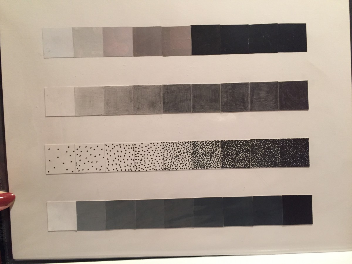
This scale where I had to make from gouache, pencil, texture and magazine was difficult for me to make all the perfect squares to go into place. It was also difficult to make sure everything was at the perfect shade from going from white to black.
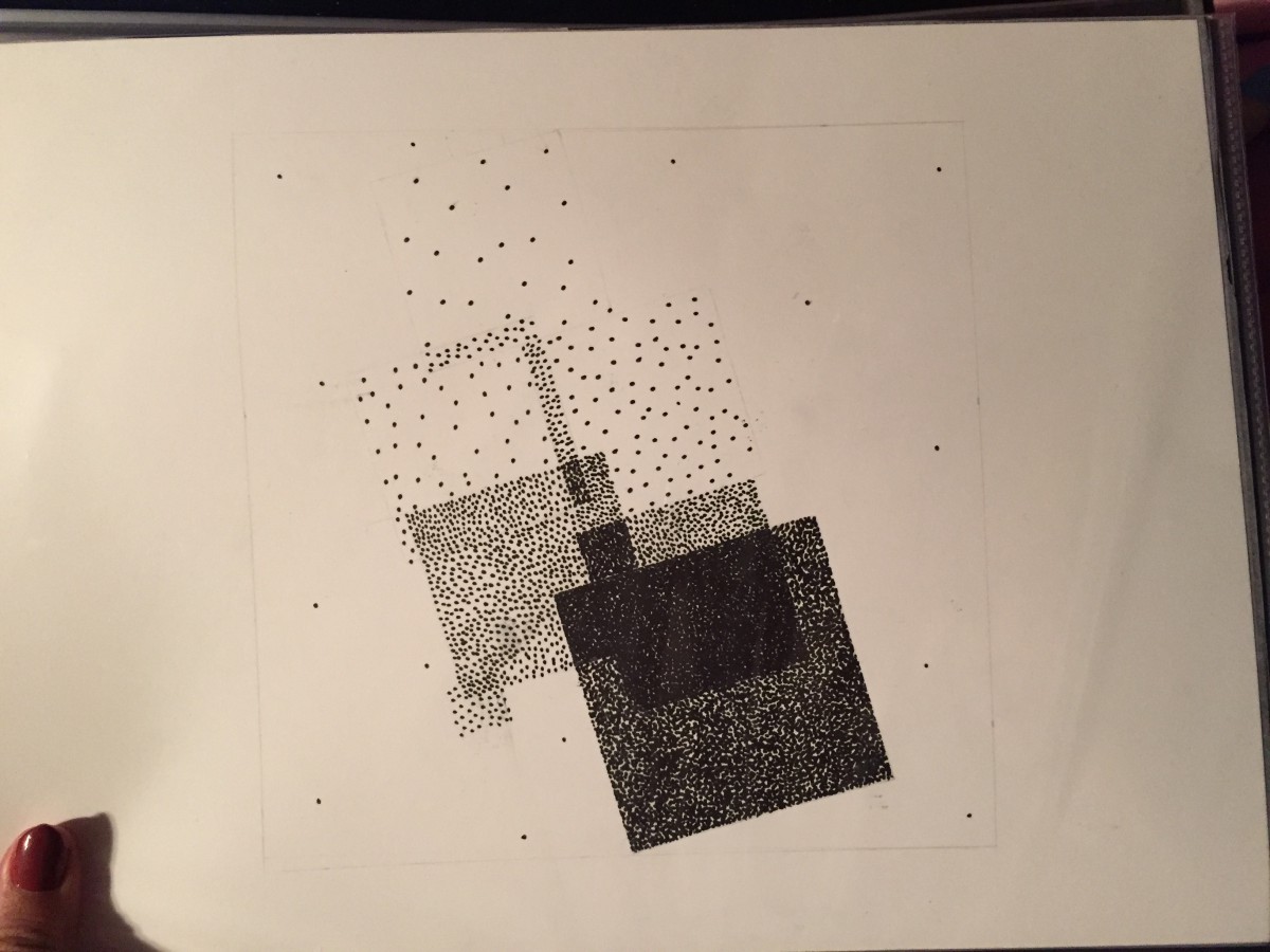
Doing the texture portion of this project was one of the funniest part to do. Because I did a lot of dots for the texture, it was hard to get it all done but I managed to do it to the extent that I wanted to and it is one of my favorite parts.

Gouache was also difficult in creating in making being I had to make sure everything was in the lines and that the craftsmanship was good which obviously wasn’t too great on my part no matter how hard I tried.
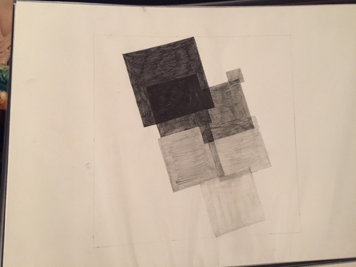
Using the pencil to create the different values in this piece proved to be harder than I thought being i had to make sure everything was smooth. Since the background was also the lightest white, I wasn’t sure where to go with the border but in the end I definitely learned that I should’ve erased all extra pencil marks to make the craftsmanship a lot better.
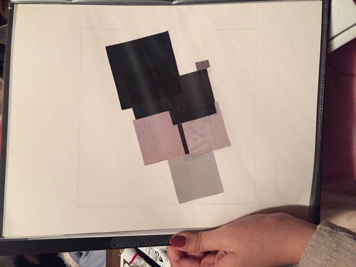
While creating the magazine piece I learned that I should’ve chosen pieces that didn’t have writing clear in the background that in the end bled through the lighter pieces. I also realized too late that I should’ve added the whitest white magazine piece in the background instead of just leaving it blank.
Companies I’d like to work for
On your eportfolio post 3 companies that you’d like to work for and tell us why. Include links to their websites.
- Tumblr Being I am a massive fan and user of Tumblr, I would really like to work for them myself. I would like to put my own personal experience and thoughts on the site and app in order to help improve it and add what other users strongly feel should be implemented on the website. I would like to further improve my skills in photo/video editing and web designing.
- Marvel
As a fan of the movies and comics, I feel like I would really enjoy working here. Not only would I be able to keep an eye on how the process in movie making and comic distributing works, I would also really actually enjoy what I learn and understand it being I am a fan myself.
- Buzzfeed I am a big fan of this site and their content. Along with their articles, I watch most of their videos and always tend to wonder how the process in coming up with the ideas or even editing the videos themselves goes along so I would be really honored and determined to learn more from them and the process in video making and article writing.
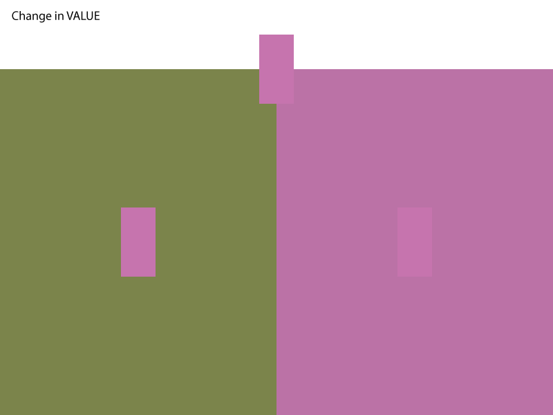
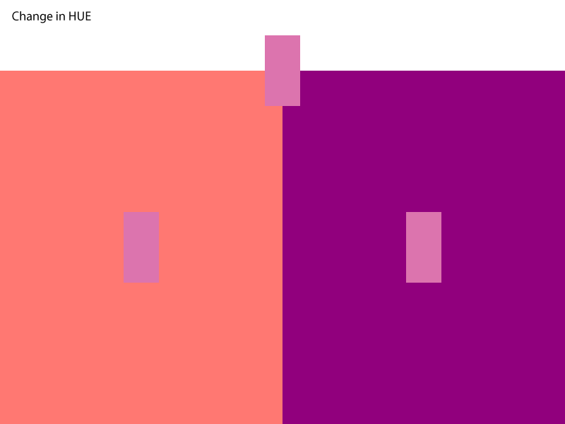
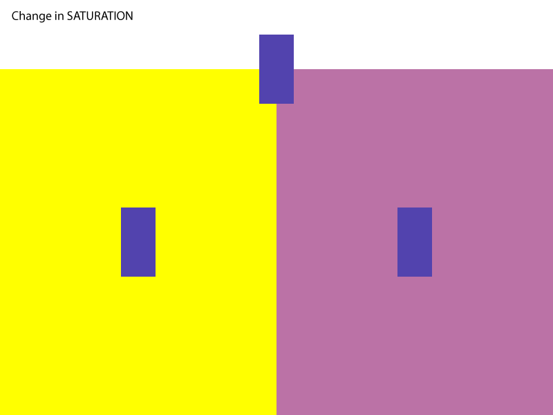
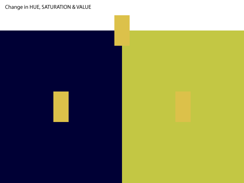
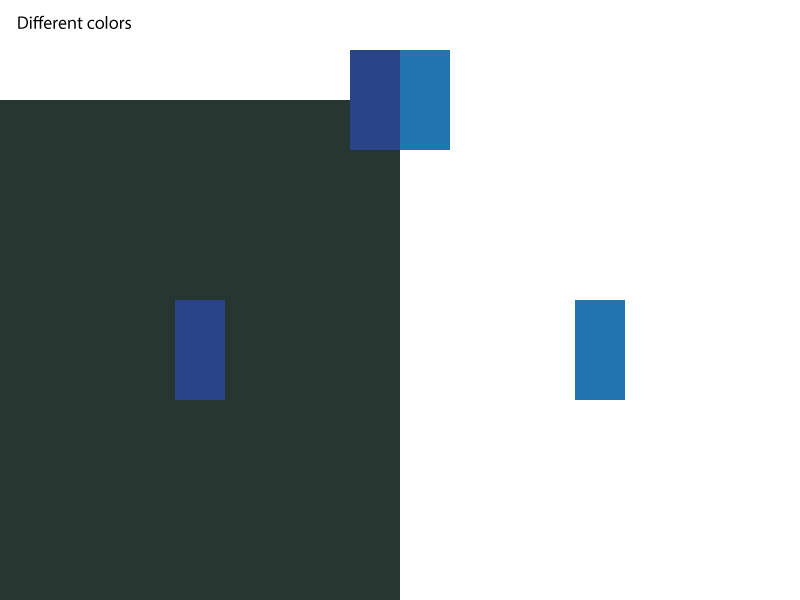
Change in Value, Hue, Saturation, etc.
Back and Forth Geometric and Organic Shape Composition Exercise

Creating the first piece was a lot easier for me considering and I had fun creating it for the first time.
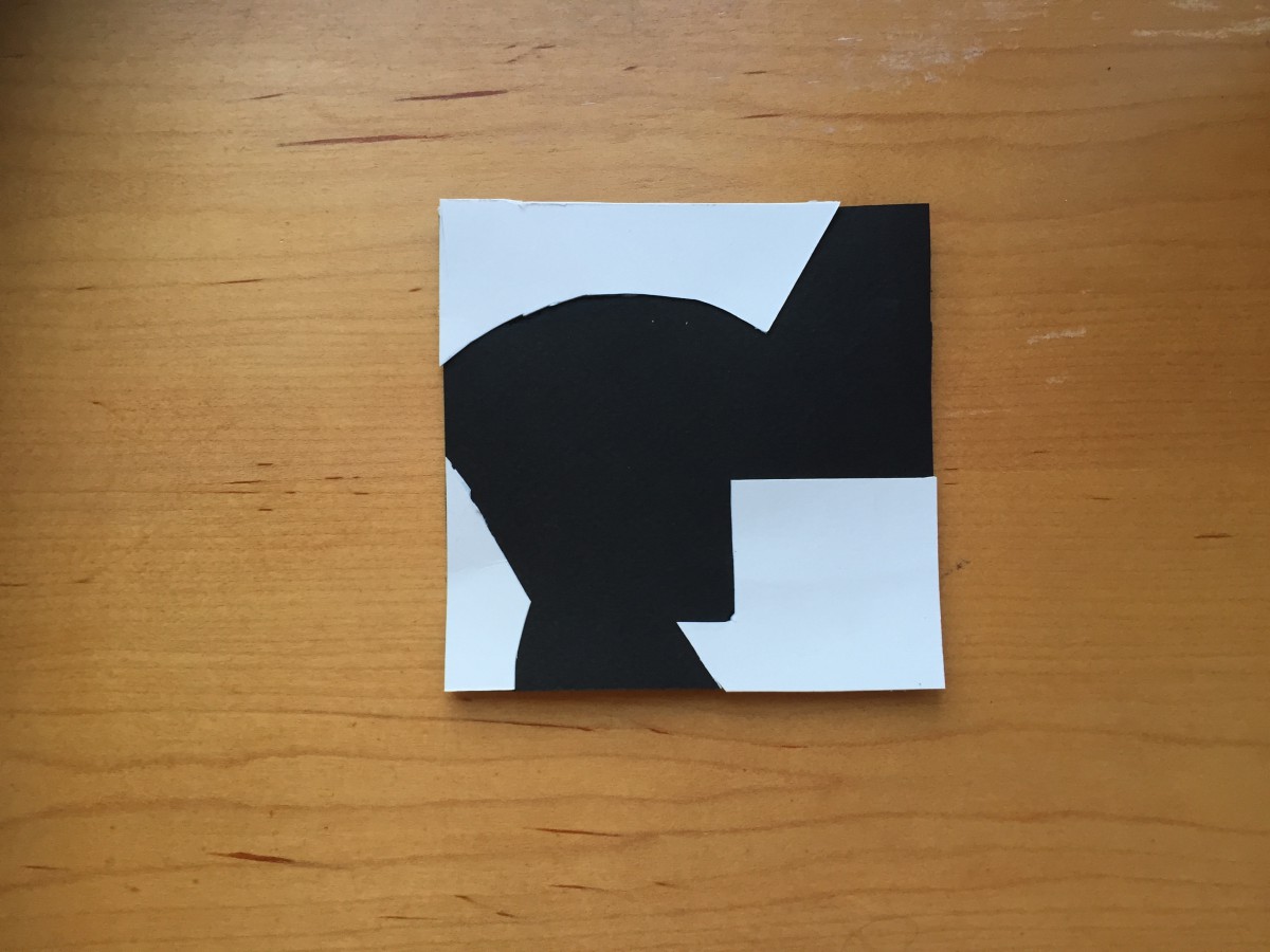
The second image was harder considering I had to cut the negative space out from a piece already created then had to cut it again to create a whole new shape.
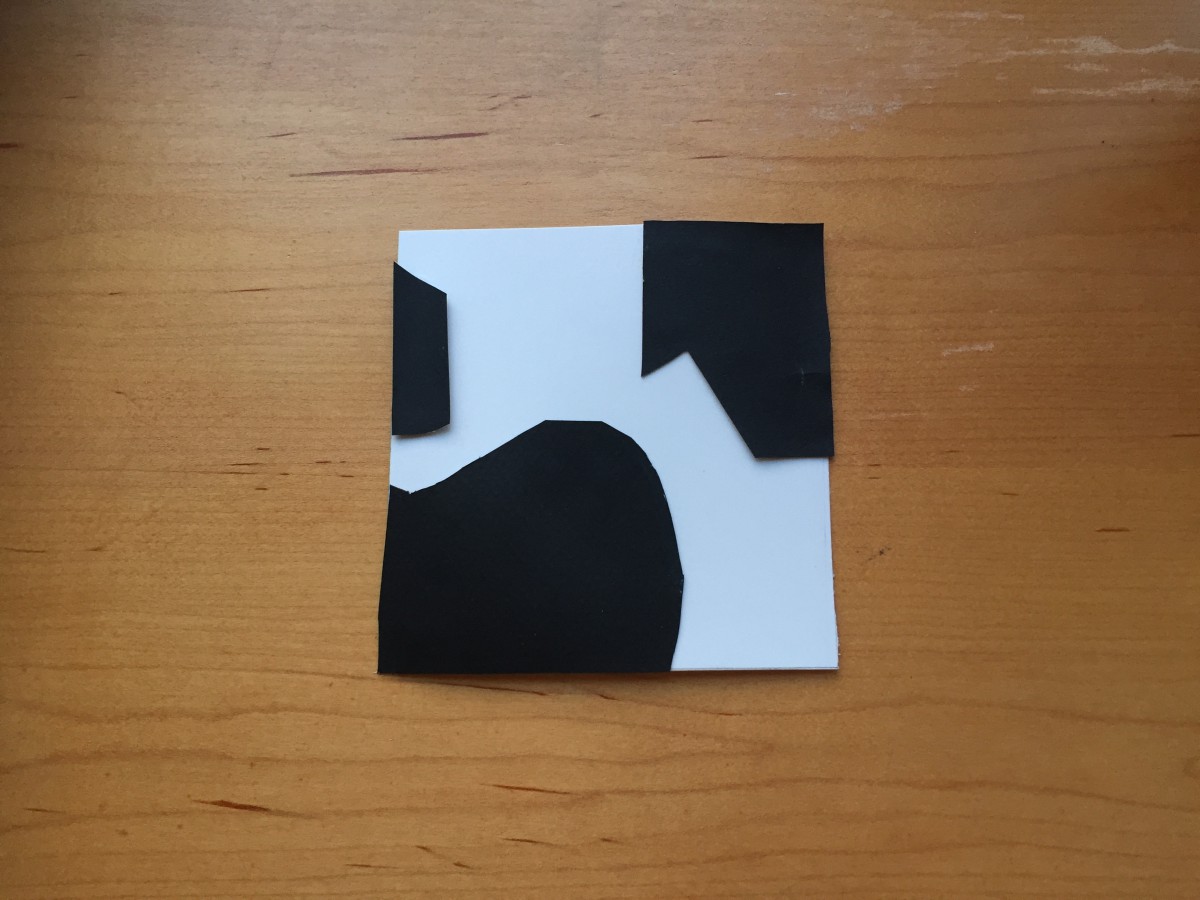
Creating the third image was definitely harder, especially since I didn’t want to create anything similar to the piece before this one.
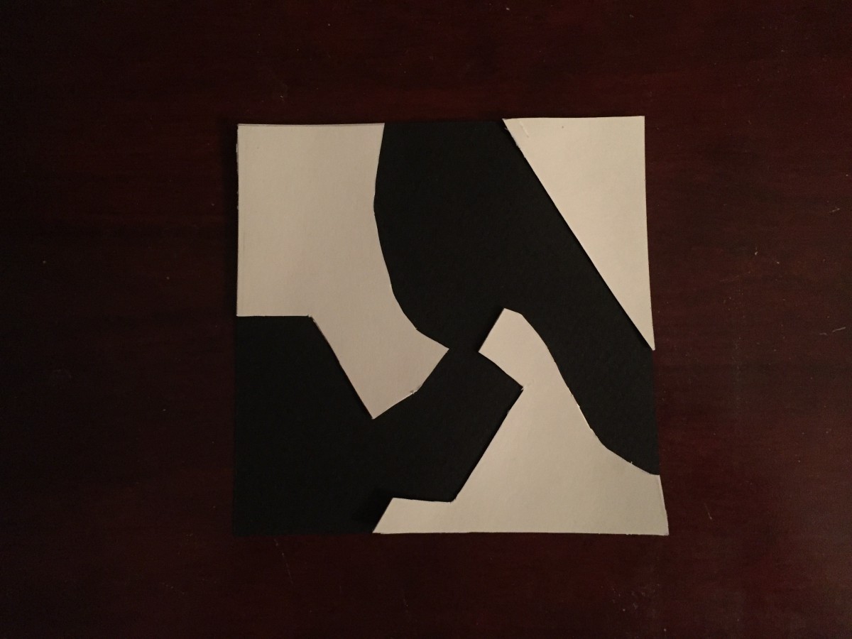
For the final image, realizing some of the shapes looked like something and I knew that wasn’t supposed to happen, I knew I had to be careful.
Overall, I learned that shapes and positive and negative space is all something that can be very difficult to understand especially as a first time creator of art like this. Having to cut up the negative space and create an entirely new piece without adding or taking away any of it was difficult but after manipulating the shapes and using the positive space to my advantage, I was able to come up with four very different pieces.
Assignment #3
Coming across the article When a White Square is More Than a White Square on the New York Times, I immediately became infatuated with the art presented in this article. Robert Ryman’s abstract paintings have this beautiful simplicity to them. Whether it’s the ‘Untitled’ or ‘Counsel’ painting, he finds a way to capture the color white and different textures and size of the paintings. His different techniques in creating each different painting is all very interesting and unique in his own way which I feel had me more intrigued with his art. My favorite had to be Accord. Not only was it very different from his paintings since it was made from aluminum with bolts. I believe it’s simplicity is what drew me in. Arista is also very interesting because instead of using paint, he used fabric. It also wasn’t a completely new piece of fabric which made it that much better. The holes in it from old staples helped give it a small but better look.


