Ethics Paper

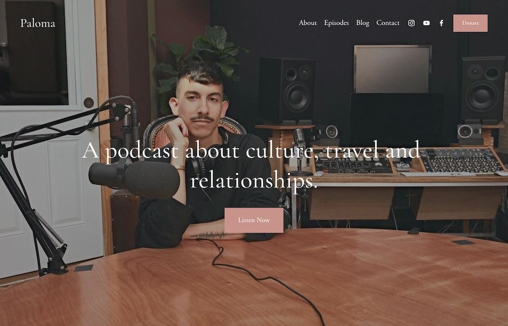
My internship experience is both new and exciting for me. The Bent Not Broken Podcast was started by Juanita Kelly who is growing the company with the help of us interns as well as other fulltime workers she has on staff. The way my internship handles sourcing of images is by strictly using stock photos. Since this is a starter company, they do not have all the resources to buy the images so to make sure everything is legal and used correctly, I only use free stock images when creating the advertising. The company’s trademarks and logos also follow the same policy of using free for use fonts and graphics made entirely by the designer.

At the beginning of the internship, I did have to sign a confidentiality and non-disclosure agreement. There weren’t many restrictions placed on my journaling for this class- the main point being that I could not disclose any information that could affect the business of the company. This was an entirely new concept to me. I am always so used to sharing my work and asking others for advice or to just get their opinions on it. But with this non-disclosure agreement, I couldn’t be as open as I’d like to be. Still, I thoroughly enjoyed the experience of the internship.

21 Best Podcasts for Women to Share – Women Podcasts You'll Love

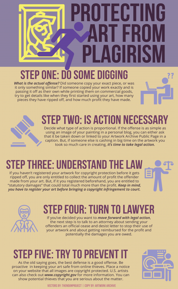
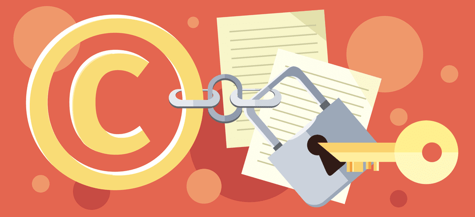
In the past, I have used another’s creative work. For my assignments for earlier classes, I have used photographs for multiple different campaigns. I always made sure to give explicit credit when discussing my design with the professors. Since I did not have access to the resources or even a camera that would help me do all the photography myself, using others’ creative worked greatly helped me in completing my assignment. What I read in the AIGA chapters did help me realize just how important it is for designers to not only credit another creative’s work but also how vigorous the process could be in obtaining the rights to use the work. Whether it’s payments, rights, copyright notices, using someone’s work without their explicit permission can cause big trouble.

I think I only ever used photographs without purchasing them or getting permission from the artist because they were solely used in school projects- not in any way for me to get money myself. I also didn’t anticipate my school work being used anywhere other than for projects or even a few in my portfolio. Still, I would explicitly say that the images don’t belong to me. However, in the future I will be going about using other’s work the right away- and even using stock photos to ensure I am doing everything right. I wouldn’t want to use someone’s work without doing it legally, especially if it’s for work.

How to Copyright Your Website's Content | Elegant Themes Blog

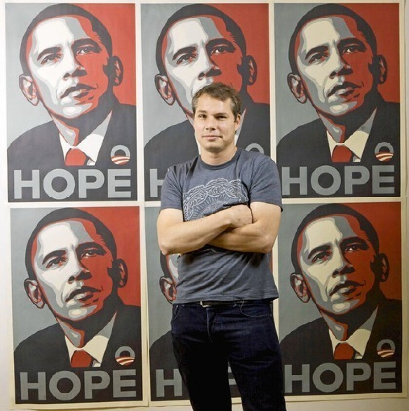
When it comes to the Fairey case, I understand why there was such rukus following the discovery that the Garcia Obama photo had been used without explicit permission from AP. If he had just gotten inspiration from the photo, it would’ve been a different story for me. But, he used the photo directly in his design which I think made it that much more important that AP got some credit. It is important that as the owner of the photograph, they get some of the same royalties that Fairey was getting for his design. I get why they felt like they deserved some of the money since it was their photo that gave the artist inspiration. However, I also think since Fairey did most of the work anyway, he shouldn’t have to pay as much to them.

I do agree with the final ruling. I think it was fair for the two parties to get the rights to make and distribute posters and merchandise of the Hope image. It is important to Fairey since he is the one who designed it but the photographer also deserves some credit for being an important source of the image itself. I think it was a good way to settle the case. And it was important that this happened because of how famous this case was, any future cases can look back at this to see how it was handled.

Shepard Fairey sentenced to probation, fine in Obama 'Hope' case ...


INFOGRAPHIC

Week Thirteen

My last week of Internship!

With my 120 hours finally being completed, I had finally reached my last week of internship.

The experience with the Bent Not Broken podcast has truly been an incredible experience that I will never forget.

This is the first time ever working for the field I’m studying for- and although it was an unpaid internship I feel like I learned so much from it and it only made me even more excited for what’s to come.

The interview process and beginning was all nerve-racking but today I feel better than ever about getting chosen to intern for this podcast.

I feel especially lucky that it was a completely remote internship which definitely prepared me for what is happening in the world today. With this pandemic overtaking everything, it felt comforting to know I had an internship that wouldn’t have changed at all and continue to teach me so much about the industry and what to expect not only when I graduate but if the New York pause continues on even after.

Even though it was remote, I still feel like I learned a lot of what I could’ve learned from working in an office. Having complete access to other interns and supervisors through Slack felt comforting to me- knowing that even on days when I wasn’t meant to be working, if I had any questions they were just one instant message away.

I learned a lot through this podcast about logos, brand identity, web design, cover art and much more. I, of course, have learned about this in school as well but to be able to do this in real life and for someone who is so invested and passionate about her business- it only heightened that feeling of responsibility which is definitely great in the long run.

The Bent Not Broken Podcast is an empowering, inspirational, must-listen to talk show that highlights today’s topics that pertain to women.

Being a woman in today’s world has it’s difficulties but hearing others stories and knowing you’re not alone, it can definitely help those who need it most.

When I first heard just what the podcast was about, I was beyond excited to work for a group that would be talking about these topics.

I cannot wait for this podcast to finally launch and for everyone to see how incredible their work is.

4,277 Women Empowerment Stock Illustrations, Cliparts And Royalty ...

Week Twelve

Following previous week’s assignment, this week I basically had to do the same. The only difference was that last week I worked on the episodes for season one while this week I continued on to season two.

It felt crazy to me at first to discover that these podcasts were already planned so in advanced. But it was something new I learned in this podcast business at least. It’s best to have everything prepared early on so you can be prepared for any future issues that may arise.

Getting this new list also made me very aware of just all the different types of issues women deal with. This new list brought more women together and gave even more the chance to share their stories.

For this next batch, I was excited to be able to continue on with the style I did previously but continue to explore what different kind of ways I can change it up a bit.

The image search process also continued to challenge me. Still limited by stock photos, I found myself going back to old pictures a lot more frequently than I’d like. I definitely didn’t want to repeat photos but it was hard to find new ones with the images already being presented being limited enough.

Still, I made sure every image was new and different from those in season one. And I continued to make sure that there were women of different ethnicities all equally represented.

My supervisor made a comment on this, saying she liked that she could feel like she would see any of these women walking down the street. She felt like they were all normal girls like her and that brought her comfort which she thought would continue on to the listeners as well.

Collages Diverse Women Together In Square Stock Photo, Picture And ...

Week Eleven

Every episode needs a cover photo when posting about it on social media.

So, for this week, I was assigned to do just that.

When I first received the episode list, I was really excited to see all the topics that would be talked about on the podcast.

They really are planning on touching base on everything that women deal with. Obviously, not everyone is going to be able to relate in the same way, but on the episodes that you could relate to, I wanted to make sure that the first thing the listener saw when hearing about the podcast represented it correctly.

I also didn’t want to offend anyone in anyway. That’s why I think the imagery is so important, because I didn’t want to make the listener too sad or upset about it but rather feeling like they could relate to it and couldn’t want to actually listen to the episode themselves.

For example, one of the episodes I found particularly hard in finding an image of was infertility. Millions of women suffer of infertility globally. I’ve watched my loved ones go through that and I know it isn’t an easy topic to talk about- let alone be shown. I didn’t want to be insensitive to those women going through it by selecting the wrong image to represent the episode.

Immediately, the first image I thought of was before I even googled the word infertility itself.

Infertility Causes, Treatment and Support | Right as Rain by UW ...

This is a strong and powerful image that I knew would be a straightforward way to represent infertility but I was limited to using free stock photos and this was definitely not one- and not even a photograph like the rest that I created.

It’s such a strong image but with my restrictions I could only really use the image I felt was the most visually pleasing and relating closely to the topic at hand.

While the work has already been submitted, I would definitely go back to make sure all the pictures I chose for each episode is the perfect one.

Week Ten

While nothing had been formally announced yet- or launched for that matter, my supervisor wanted to be prepared for everything graphics wise.

For this week, we continued to work on social media posts but this time it was for something different. For these graphics, she wanted to work on posts that would announce that a new episode was out.

Following the theme of photo-centric posts, I chose photos that would give more of a happy feeling than photos that may have been chosen based on what the text was saying.

Since the only text given to me for these posts was “new episode available”, I didn’t have to base the photos on that. In fact, I thought that ‘happy’ photos would be best because they would give the listener seeing the post excited seeing an equally excited woman in the image.

Excited Women Stock Photos - Download 45,748 Royalty Free Photos

Like with color, I wanted the images chosen to make the viewer of the post feel happy. So, I also made sure that the images were all bright and had vibrant colors. I also made sure they were woman of different race in order to continue to represent everyone in the community instead of just sticking to the same woman you see all the time in magazines or on the runway.

That was a very important point brought up by my supervisor. She created the podcast for that very reason- to show representation and diversity.

As for the text, I stuck to the font Bebas Neue, like I have been for every other work I created for the podcast. It was important to me that it matches and that it doesn’t seem too out of place from anything else- even if it is just a quick Instagram story post they may never see again.

It was especially important to me for the instagram posts since that would directly link the listener to the podcast episode itself.

I think everything worked out nicely and I was able to create multiple posts that all varied in images and style but still worked well if put all together.

Week Nine

Before we could officially post any episode officially, we had to make sure that there would be women who would be willing to share their stories in each of the podcasts.

Of course, there are already special guests lined up with to share their stories for each podcast episode, but there were still slots that needed to be filled up by other women to get more stories across.

While we did have the pitch form I edited earlier in the internship, this edit that I would be creating would be directed towards the audiences on social media. In this posts for Instagram and Twitter, the posts would discuss a specific episode of the podcast and tell the listeners how they could get on the show if they share an experience with the topic presented.

These messages would be straightforward but also captivating to the viewer by the use of photographs. I decided early on this would be a photo centric edit. When looking for inspiration, I thought of a simple magazine layout.

How to Create a Page Layout and Magazine Article Template in InDesign

In this image above, there is a simple image of a woman with the text to her side. The way the text fit perfectly in that first page and does not overlap the woman’s photo in anyway is something I wanted to follow.

Of course, the dimensions are a lot different than what a magazine’s would be. I would be limited a lot more to the size. While the text was straightforward, there was still a lot of it to make it a little harder to fit everything in one small space. I had to think of using the right font so that it wouldnt be distorted if it was too small and use images that wouldn’t take up too much space.

In the end, I realized using Bebas Neue, like I did with other assignments, was really effective because it’s such a simple font that doesn’t take up too much space.

Bebas Neue Font Free by Flat-it | Font Squirrel

It’s also a font that I can rework to look justified or just fit along the shape of the woman for any image I chose.

Week Eight

The exciting thing about this being a podcast that hasn’t launched yet is actually preparing for that launch.

That being said, I had to create images that would be posted on social media leading up to the announcement of the launch date.

Unlike the banner, I didn’t want this to be image focused. I wanted the first thing that people notice to be the words.

I wanted the words to pop and have an exciting feeling to them since this would basically be teasing a big announcement.

Big announcement coming soon!! #news #dancemoms #shma #dance ...

I liked this image as a reference because it was exactly like I imagined it myself. The main focus is the words and the fact that a big announcement was coming soon. There is a vector in image but it doesn’t take the attention away from the message itself.

Even more, the colors used for the vector and words stands out from the background, which makes it more distinctive. It’s a very simple image but it’s still very effective.

However, I also still wanted to stick to the colors we were using for other advertisements for the podcast, as well as the banner I created last week. That color is pink, so I wanted the image to follow a monochrome theme of pink.

MAC In Monochrome Spring 2019 - Beauty Trends and Latest Makeup ...

I wanted the image to in a sense follow this idea of pink background with white text placed on top. There were some difficulties since the colors are close to each other and not have as much contrast like in this photo above.

To solve that, I used a darker shade of pink as the stroke to give it that sense of pop like I wanted when I first received the assignment.

In the end, I think I was successful in making the images be exciting yet effective in getting the simple message across:

Big announcement coming soon!

Week Seven

Like the the pitch form, I learned quickly how important banners are.

This week’s assignment was just that- a banner that would be used on social media platforms like Facebook and Twitter.

A banner is an important part of social media because it is the first thing the a potential listener sees when they find the podcast on any of the social media platforms.

The main things my supervisor wanted on the banner was the name, of course, the website of the main page and all the icons where the podcast could also be listened to at like Stitcher, Youtube and Apple Podcasts.

One other specificity given to me by my supervisor was to the an image of a woman- or women. She wanted this banner to go along with the artwork the team had previously chosen as the icon for the social media pages.

The image is of a woman with flowers in the background, which at first made me think that maybe I should stick to the idea of a woman surrounded by flowers. I thought it would be both aesthetically pleasing but the main idea being the woman rather than the flowers unlike in the icon.

Young Woman Flowers Bouquet - Free photo on Pixabay

I specifically liked this picture because of how simple it is. It has a woman and flowers which is both of what I really wanted for the image but it isn’t going too overboard where I wouldn’t be able to add all the text needed for the actual banner.

Once I actually got to designing the banner though, I realized that I didn’t want the image to be solely on one person. I thought it might be better to have multiple women of different races to represent just how this podcast is for women everywhere- not just one specific type.

Premium

I feel like diversity is important. I wanted to share the message that it doesn’t matter what race, body size, sexual orientation, etc. Everyone is important and therefore deserves to have that same representation in media today.

Week Six

The website was a crucial part of the internship where I basically had to establish the flow of the design so I could continue on working on future projects pertaining to not only the site but other social media platforms.

Since the podcast hasn’t launched yet, a lot of the documents aren’t exactly prepared or polished enough to be ready to post for everyone to see. One of these documents is what my supervisor called the ‘pitch form’. This was basically a document that called out to women who may be interested in participating in the podcast.

This document told the viewer what the podcast was about, the issues discussed, a background of the host and how exactly they could apply to be a speaker on one of the episodes.

The content was all already there, it was just a matter of changing the design and making it more appealing to the person viewing the work.

One of the main things my supervisor wanted was a welcoming banner to be included on both pages. There wasn’t a banner at first so she thought a banner would be best to not only apply more color but to make the form pop more instead of just being a boring document.

For the banner, I wondered if it would be better to use a photograph or a vector. I felt like a photograph might be the way to go but then realized a vector or pattern might be more effective since I didn’t want the header to take the attention too much away from the actual words or purpose of the document.

International women pattern | Free Vector

Immediately, I thought of something simple like the image above. I wanted it to be clear that there were women in the image but, like with the photograph, I didn’t want the image to be the main focus. The viewer should get right away that the podcast is meant for women and I wanted the image to represent that.

As for the side banners, the basic premise had already been set by the supervisor. There were words and information highlighted about the podcast- I just wanted to make it more aesthetically pleasing and fitting with not only the body text but the rest of the brand identity.

Bebas Neue Font still doesn't work - Pre 1.8 Designer Bugs found ...

From the beginning of the internship, I was already using Bebas Neue. So, I made sure everything else in the document was using Bebas Neue as well. This included the side banners. I wanted everything to be clear and present and with this new font instead of the font that Microsoft word automatically set.

This new Pitch Form is meant to attract interested parties who not only would enjoy the podcast but like the thought of including their own voice to the podcasts for other listeners to hear too.

Week Five

Continuing with web design for this internship has been both exciting and new to me. For my class, I was always used to doing what I wanted to do in regards to design but now I have a supervisor telling me just what she wants and doesn’t want in the website.

Luckily, we have a lot of similarities when it comes to design so there hasn’t been much setback in that. We both agreed that we want the colors to stay close to the pink and purple we have all been eagerly talking about.

Unlike the landing page, for the website we both decided it would be easier to use a platform that already had the template set up. When deciding between which platform we should use, we ended up going with Square Space.

Square Space already had a section of websites dedicated to podcasts themselves.

There were many templates to chose from but in the end I decided to go with the Paloma design.

Squarespace Review (2020) — Pros and Cons, Costs, Plans and ...

Almost immediately this design caught my eye because it had all the things I wanted when creating the first landing page.

The picture in the background of the homepage really catches the viewers eye but also doesn’t take too much away from everything else.

More importantly, the button in the middle directing visitors to listen to the podcast looked just how I wanted for the landing page.

It’s a simple button yet very eye catching because of the different color from the background and text surrounding it.

This simple design was perfect for me and with the colors already matching so closely to the ones we had chosen for the brand colors, I knew I should pick this template to work with.

Paloma WordPress Theme — Station Seven: Squarespace Templates ...

This is a basic example of how the entire website would look.

Everything is simple across the website which is something I really liked.

I did change things a bit to better match the feel of the brand.

For this website specifically, it works well with photographs. There will be a section for each podcast to be placed nicely next to each other in a grid form along with a small excerpt of what each podcast is about.

There was also a tab for a blog portion but I decided to take that out since, for the time being, the main focus would be the podcast.

There will be many opportunities to update the website I’m designing- especially when the podcast actually premieres but for now I really like the experience of working with Square Space and I like the direction the design is heading in.