Continuing with web design for this internship has been both exciting and new to me. For my class, I was always used to doing what I wanted to do in regards to design but now I have a supervisor telling me just what she wants and doesn’t want in the website.
Luckily, we have a lot of similarities when it comes to design so there hasn’t been much setback in that. We both agreed that we want the colors to stay close to the pink and purple we have all been eagerly talking about.
Unlike the landing page, for the website we both decided it would be easier to use a platform that already had the template set up. When deciding between which platform we should use, we ended up going with Square Space.
Square Space already had a section of websites dedicated to podcasts themselves.
There were many templates to chose from but in the end I decided to go with the Paloma design.
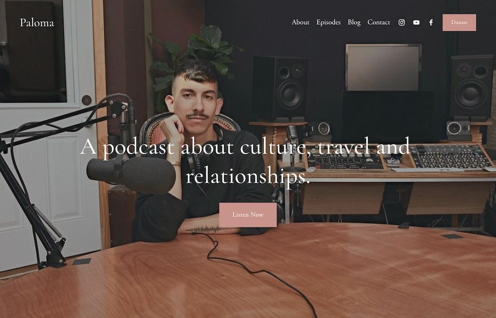
Almost immediately this design caught my eye because it had all the things I wanted when creating the first landing page.
The picture in the background of the homepage really catches the viewers eye but also doesn’t take too much away from everything else.
More importantly, the button in the middle directing visitors to listen to the podcast looked just how I wanted for the landing page.
It’s a simple button yet very eye catching because of the different color from the background and text surrounding it.
This simple design was perfect for me and with the colors already matching so closely to the ones we had chosen for the brand colors, I knew I should pick this template to work with.

This is a basic example of how the entire website would look.
Everything is simple across the website which is something I really liked.
I did change things a bit to better match the feel of the brand.
For this website specifically, it works well with photographs. There will be a section for each podcast to be placed nicely next to each other in a grid form along with a small excerpt of what each podcast is about.
There was also a tab for a blog portion but I decided to take that out since, for the time being, the main focus would be the podcast.
There will be many opportunities to update the website I’m designing- especially when the podcast actually premieres but for now I really like the experience of working with Square Space and I like the direction the design is heading in.

