Before we could officially post any episode officially, we had to make sure that there would be women who would be willing to share their stories in each of the podcasts.
Of course, there are already special guests lined up with to share their stories for each podcast episode, but there were still slots that needed to be filled up by other women to get more stories across.
While we did have the pitch form I edited earlier in the internship, this edit that I would be creating would be directed towards the audiences on social media. In this posts for Instagram and Twitter, the posts would discuss a specific episode of the podcast and tell the listeners how they could get on the show if they share an experience with the topic presented.
These messages would be straightforward but also captivating to the viewer by the use of photographs. I decided early on this would be a photo centric edit. When looking for inspiration, I thought of a simple magazine layout.

In this image above, there is a simple image of a woman with the text to her side. The way the text fit perfectly in that first page and does not overlap the woman’s photo in anyway is something I wanted to follow.
Of course, the dimensions are a lot different than what a magazine’s would be. I would be limited a lot more to the size. While the text was straightforward, there was still a lot of it to make it a little harder to fit everything in one small space. I had to think of using the right font so that it wouldnt be distorted if it was too small and use images that wouldn’t take up too much space.
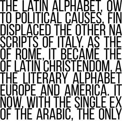
In the end, I realized using Bebas Neue, like I did with other assignments, was really effective because it’s such a simple font that doesn’t take up too much space.
It’s also a font that I can rework to look justified or just fit along the shape of the woman for any image I chose.

