I visited one of my favorite museums – the Museum of Modern Art (MoMA). As always, there was so much artwork to look at and take in, but there were a few pieces I found that really grabbed my attention than the others. First piece was from Jean-Michel Basquiat as seen below.
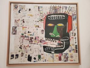
Basquiat is known above all else as a graffiti artist using spray painting techniques etc in most of his pieces. The piece above is called “Glenn”. There is so much going on in this piece. I see a face of a black man wearing headphones. His mouth is open which indicates that he is being vocal and so many things are coming out of it. There are pictures of bicycles, cars, houses and more head figures –the more I stared at this piece is the more I took it to mean that this big black “head” is talking about his life from childhood to adulthood and has a lot to say about its experience.
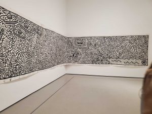
The second piece of artwork that had me dazed was a piece by Keith Haring. It took up the entire wall and then half of the adjacent wall.
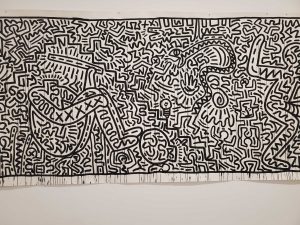
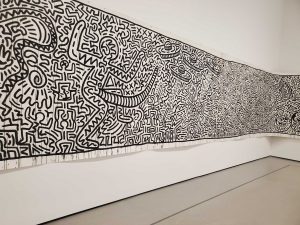
At first glance, this untitled piece of art looks like some type of Aztec art. There are the common human type shapes, as well as snakes etc. What’s unique about this is the entire piece is mostly made of all sizes of human-like shapes, from afar the big ones stick up but as you get up close you see all the smaller human like shapes that help to define the bigger human-like shapes. I also spotted some sombreros. I did notice a man sitting on the ground with his arms around his knees, as a big snake attempts to attack him — but in the corner i see a brain and light bulb as if to signify this man just got a bright idea. In the corner of the wall (last pic) I even see some cartoon characters resembling mickey mouse as well as the science spherical symbol. There’s no doubt that there are a lot of ideas in this piece and several story lines.
Other pieces of art that caught my attention are below. Some were so abstract that I really had to take a minute and figure out what exactly I was looking at. Once I did, I then stepped back and looked at the piece holistically and tried to interpret what exactly is the artist trying to tell me? What can I take away from this?
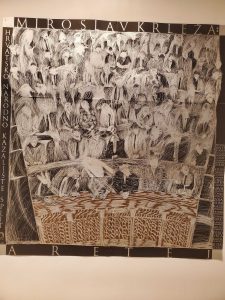
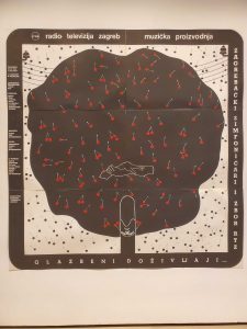
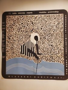
For example, the 3 pieces below from Boris Bucan. At first glance, figure 1 reminded me of a bundle of hay, but when I look closer, it’s abstract figures of people sitting in rows as if in some type of parliament or governmental room, or in an orchestra. Figure 2 looks like a cherry tree but inside there are two hands shaking. This can be symbolic of many things such as an agreement to keep nature alive (keep growing cherry trees), or that nature perhaps fosters relationship and partnership.
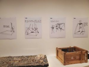
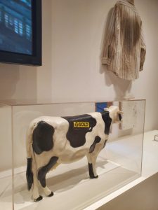
The pieces below are from an artist that goes by the name Pope L. They are actually props from a cow commercial/1960’s ad campaign he created entitled “Got Milk? Black Domestic” . These were supposedly parodies with racial stereotypes that turn identities into consumable commodities.
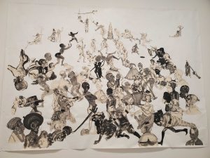
Another interesting piece I came across was by Kara Walker. At first I thought it was dealing with race but it was actually portraying social and religious ideas, and how the history of American culture as we know it was formed as far as she was concerned. Christ is pictured walking alongside many recognizable figures such as Martin Luther King Jr. and Frederick Douglas.
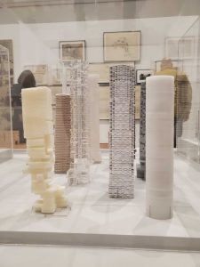
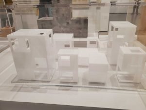
I then came across these architectural pieces where the construction was so intricate yet so captivating. The pictures really don’t do it justice but they were so cool to look at. Some of the mock-ups even had tiny sized people in the buildings (not pictured here).
Artist Ryue Nishizawa:
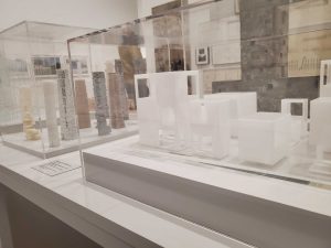
Artists Hrezog & de Meuron:
