Assignment: Design a ligature logo for your ePortfolio banner.
Preliminary Sketch #1
In this sketch, I used elements such as shared strokes (of the K,D, and S), and a little bit of overlay (of the letter S, by imposing it on the letter D, and slightly touching the K). The 3 letters are representative of my full name (first/surname). The “S” also symbolizes the first letter in my middle name so here, it plays a dual role as my surname and middle name. The placement of the “S” was strategically put there to appear as dollar sign and is symbolic of money/business (two things that I am passionate about). I did not choose this design because it wasn’t abstract enough for my liking, and did not quite envision what I had in mind.
Preliminary Sketch #2
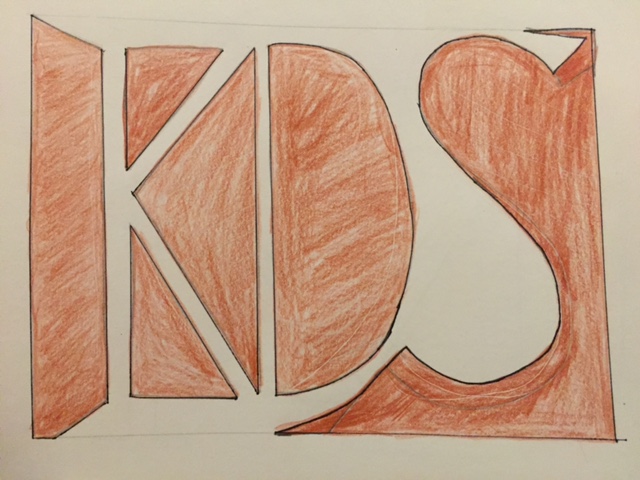
In sketch #2, I decided to utilize the negative space to bring out my initials – “K.D.S”. It was more abstract than the first one but I still wasn’t satisfied with this look. Furthermore, if colors were added, I don’t think it would provide me with the sleek, professional look that I envisioned…but this was definitely on the right path.
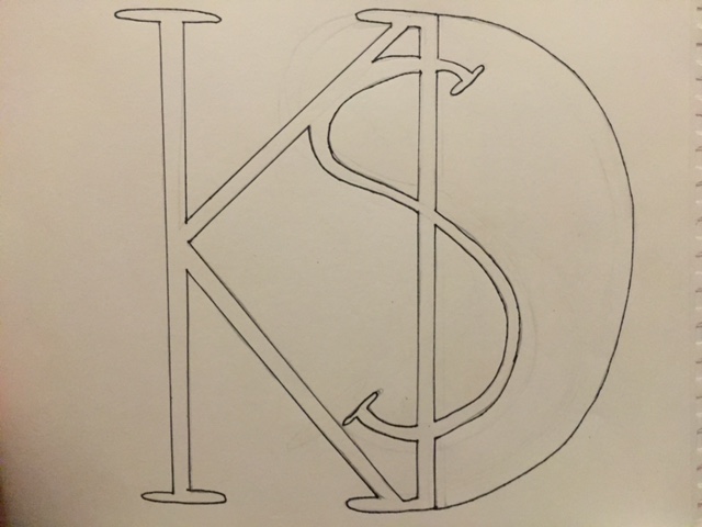
Preliminary Sketch #3
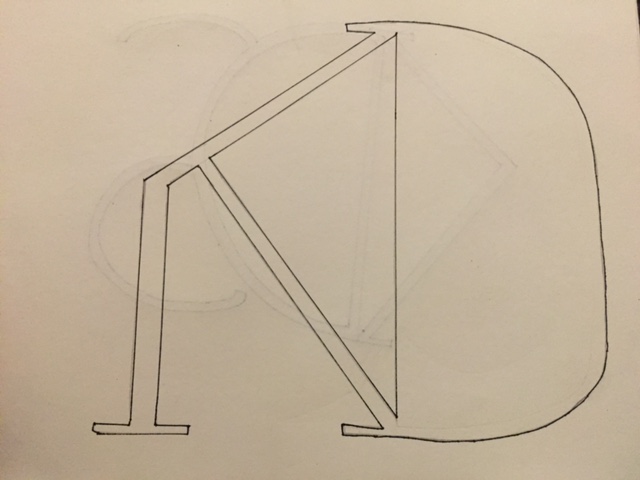
In the above sketch, I removed the top stroke of the letter “K” but had the other 2 strokes share the “D” stroke. I did not add in the S because I wanted to see how it would look first. It’s abstract and was close to the look I was going for however, it felt as though something was missing. Also, I wasn’t too fond of the particular phantom stroke that was left out.
FINAL LOGO/LIGATURE BANNER:
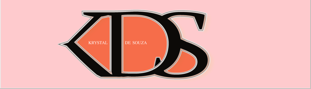
I am very satisfied with my logo/final design. I implemented four design elements: phantom stroke (of the “K”), overlay (all 3 letters), crossbars (of the “K” and “D”) and shared strokes (“K, “D”, “S”). For the capitalized letters (KDS) I used: a serif font (Public Type Serif aka PT Serif) and slightly altered the serifs on the “S” to make it appear more pointed. The type height is 25.5 picas (4.235… inches). The type theme/font style was left at regular (bold feature was not used) . The kerning was set as “optical” although I dragged the letters closer together so they can share strokes. The leading was set to 367.2 pt.
THOUGHT PROCESS: I wanted to design a logo that looked sleek and polished, yet simple and memorable. That is what I want my trademark to be as a designer: to produce something professional yet uncommon. It’s the reason why I decided to add the letters “olutions” after my initials “KDS”. My goal is to develop a business where we have solutions to every [design] problem/inquiry. That’s precisely why I chose to remove the entire vertical stroke on the “K” – to show that even though there may seem to be no resolve, with me, you will find one. As with any phantom stroke, I wanted to create a sense of illusion – to see the unseen. For the color scheme, I decided to use analogous colors (pink and orange-red) based on the color wheel (both deriving from my favorite colors). Additionally, I think the the pinkish color could appeal to the female audience, and the orange color (which is bolder) could appeal to the male audience. I decided to leave the letters black with a gray (on the outside) and orange stroke (on the inside) so they can stand out against the soft background – which is in turn a representation of me (quiet but outspoken when need be). I only filled the inside of the letters with the red-orange for aesthetic purposes – it just looked better and gave a sense of unity and fluidity.

