“LINE DESIGN“:
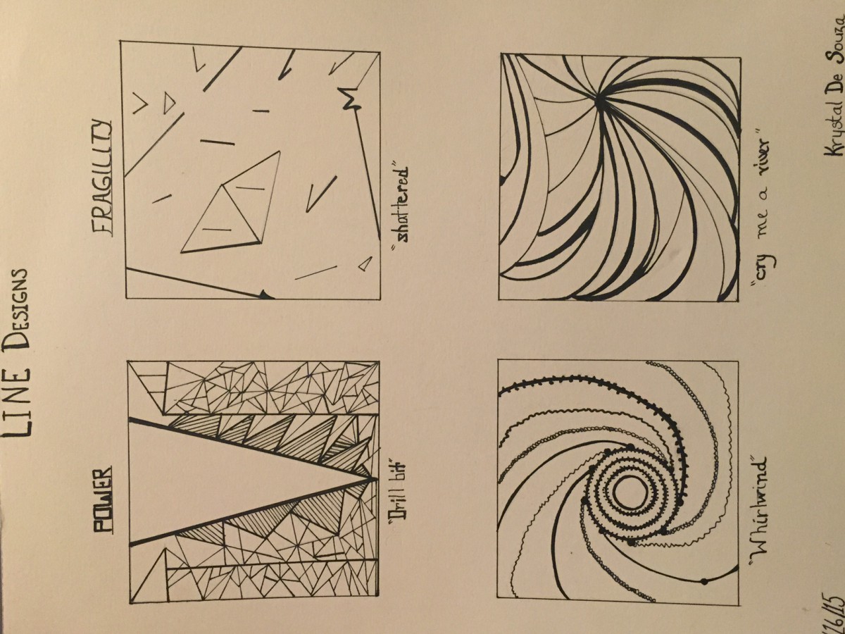
This was one of the very first projects I worked on in this class. The goal of this project was to use the design element of line to demonstrate two words: power and fragility. We did a series of sketches and the above illustration was the final piece.
The first power sketch I entitled it “Drill Bit” because the image reminds me as that of a drill digging down into a piece of rock/earth. A series of triangles and lines of varying direction/size were used to illustrate the point of power– one big triangle is surrounded by smaller triangles/ lines and are all generally flowing in a downward direction. The wide-opened side of the triangle represents the head, and all the power is flowing from the head downward to the smaller counterparts (or smaller triangles/lines). The second power sketch I entitled it “Whirlwind” because that’s exactly what it resembles. Personally, I think power can have a negative connotation in that sometimes someone or something that’s in full power may tend to “suck” the life out of, or take advantage of everything/anyone around it.
The two fragility drawings I entitled them “Shattered” and “Cry Me a River”. The “Shattered” piece contains a series of broken lines and triangles to represent the discord that I think accompanies the word fragility. The “Cry Me a River” drawing uses strictly curved lines of varying sizes to give the illusion of fluidity, which in turn represents the unstableness of something that is in a fragile state.
I really enjoyed working on this piece because it really pushed me to think outside the box since we could only use the element of line to construct 4 pieces of artwork.
“SHAPE/ORGANIC FORM —> GEOMETRIC GRAPHIC —> SYMMETRY DESIGN“:

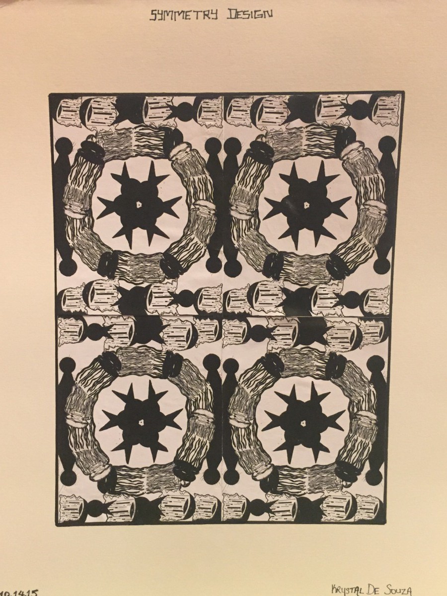
Let me just start off by saying I LOVED this project. Although it took several images/sketches to reach the final image (which is labeled “Symmetry Design”), I must say it came out way better than I had expected! I really enjoyed the process that was undertaken to reach the final result (refer to the “symmetry design” image above).
The animal of my choice was the jellyfish. I chose it because for one I knew that this animal was not one that someone would naturally gravitate to or think of, and secondly, I thought it would’ve given me a bit of a challenge to come up with a “symmetry design” for it (fyi- I always like a challenge 😊) and it sure did!
All four graphics (“illustration”, “image related graphic”, “concept related graphic”, and “arbitrary”) were utilized to form the final design of this project which was the “Symmetry design”. I arranged the image-related and concept-related graphics of the jelly fish in the outer circle. The arbitrary drawing of the jellyfish was used in the innermost circle and in between the outer circle as to form some type of separation or partition between the other replicas of the circles.
“Elements of Color“:

The goal of this project was to understand the concept/theory of color, and to distinguish the difference between high chroma and low chroma colors.
Paint was used as the medium for this color project. The first color grid contains a full color palette which has an array of warm/cool colors (browns, light yellows, greys, peaches) and bright, high chroma colors such as the bright yellows and reds. Black and/or white was used in the paint mixture to form the low chroma colors- warm/cool colors. No black and very little to no white was used in the high chroma colors.
The second color grid entitled “Monochrome Palette” contained variations of blue only. I started off with a very dark navy blue (looks almost black), then transitioned from dark blues to very warm blues to almost a very light baby blue. In the midst of the transition, I had included colors like a “bluish green”, “bluish violet”, “bluish grey” to help move from the very dark blues to the very light blues.
“VALUE/TEXTURE COLLAGE“:
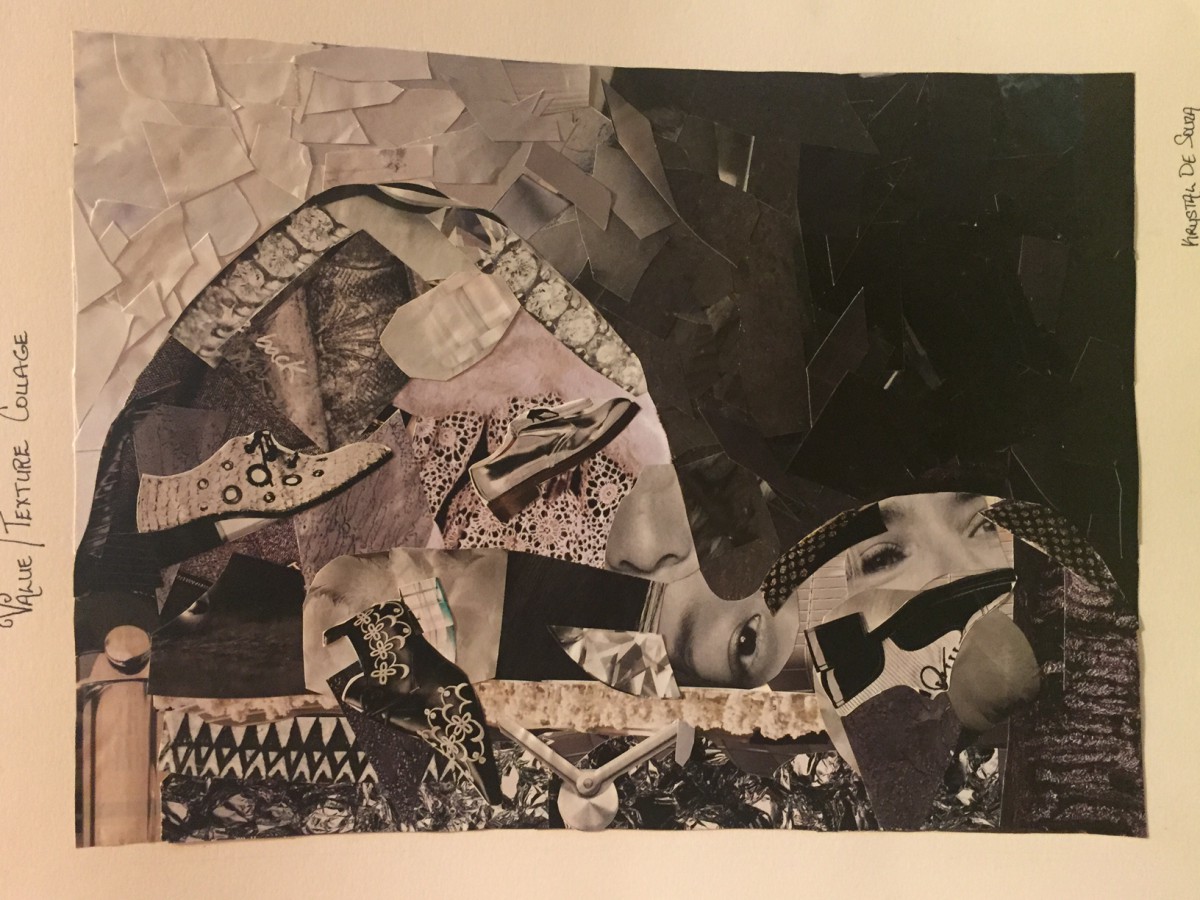
This project consisted of making a collage to demonstrate the principles of Value and Texture. I used only magazine clippings to form both sides of the collage. The only challenging part of this project was finding the “whites” and “greys” for the value part of the collage (where it transitions from black to white), as something that would appear white on a magazine page would appear almost ivory or off white when put against the other colors…so finding the right balance was a bit time consuming.
For the texture part of the collage I used clippings of shoes, jewelry, clothing, even hair and a few eyes to illustrate texture from rough to smooth etc.
“PERSONAL FLAG” (final design project):
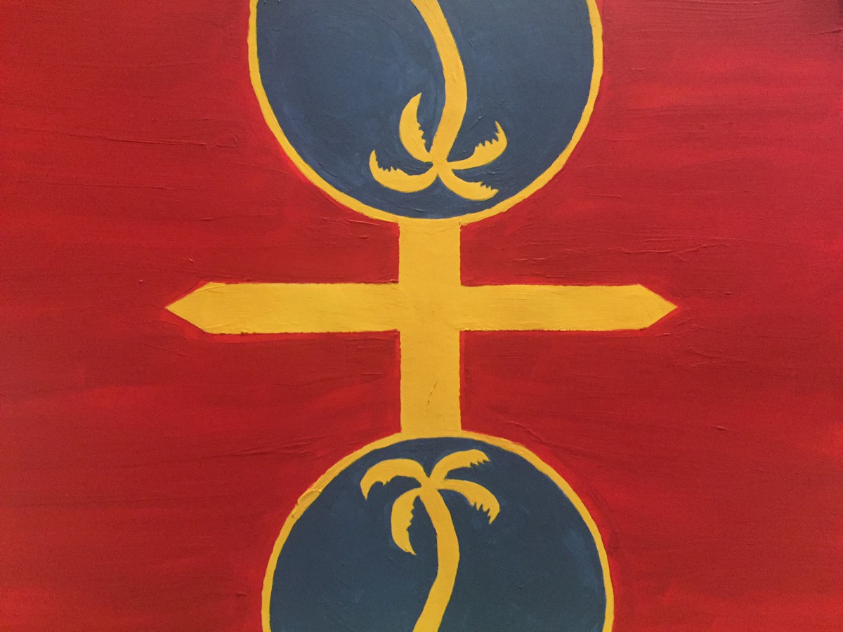
I was very excited to work on this final project because it gave me the opportunity to express my personal identity through an artistic lens. The medium was paint.
The personal flag above contains two spheres, two coconut trees and an intersecting cross. The blue spheres represent a globe which portrays my love for travel. I’ve traveled to mostly every continent and I’ve learnt and seen so much. Experiencing different cultures is very eye-opening and definitely a life-changer. The coconut trees represent my birthplace and the cross represents my faith (religion).
I decided to do a symmetry design because I am constantly reflecting on how can I improve myself (in every aspect of my life) and how I can be the “best” me. The red represents my passion for music, travel and design (among other things). The blue represents the sky since I am always in a plane, and the yellow represents my calmness.

