Assignment: Design a print postcard that will visually enhance a quote of your choosing.
Quote: “Veni. Vidi. Vici.” (translates to I came. I saw. I conquered.) by Julius Caesar.
I chose the above quote because from the very first time I heard it and understood what it meant, it stuck with me immediately. I often use it as a motivational reminder that the only thing stopping me from accomplishing anything in life is myself. As long as I set my sights or put effort into a goal, there is no reason why I can’t be victorious over every obstacle and conquer my dreams and goals.
First concept:
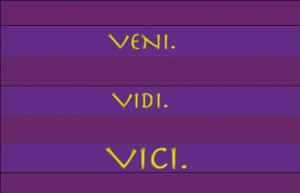
I found the wording of this quote to be very brief and abrupt and therefore I put each sentence on its own line and in its own space. I enlarged the words “Vici.” because I think it’s the gist of the quote. I decided to use the colors purple and yellow because it’s representative of royalty, which is what Julius Caesar was since he’s the author of the quote. The font used was Herculanum which is reminiscent of the “Roman square capitals” writing that was used in ancient Rome and currently seen on some Roman structures such as the Pantheon, Trajan’s column, and the Arch of Titus. This concept did not make it as my final because it was too plain and did not really convey the power of this quote.
Second Concept:
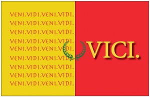
For the second concept, I decided to use colors from the ancient Roman flag – yellow and red. I also added a green (since gold didn’t quite fit) wreath which was symbolic of martial victory and usually worn by royalty. I placed the wreath in the center to signify a unity between seeing things and conquering them. I repeated the words “Veni. Vidi” on the yellow side because it’s representative of two things- 1) when I think of yellow I think of sight (such as seeing the “yellow” sun rays on a sunny day); 2) the repetition of words represents some of the trials and testings I’ve been though… but finally, I conquered it! which is why “VICI” is on a side by itself. I thought since red can signify battle wounds and also victory, that “vici” should be put on the red side instead of the yellow. This concept did not make it to my final however because those particular shades of yellow and red reminded me of McDonald’s.
Third Concept:
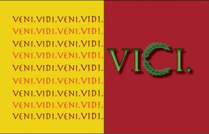
I played with the idea of the second concept but this time I altered the colors to a deeper red and yellow. I still wanted to keep the Roman component so I kept the wreath and the font type. The placement of the wreath however was changed to represent the letter “C” in the word “Vici”. I also added several effects to the word “Vici” as I wanted it stand out more. The color of the lines (“vidi.vici”) were alternated between red and black font to not look too monotonous as in the second concept.
Fourth Concept:
Photo cred: pixhder.com
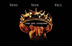
I decided to add an image for the fourth concept especially one of a hand holding a crown because it represents power and victory. This image may be commonly associated with the TV show Game of Thrones. I decided to space the words “Veni. Vidi. Vici.” at the top to make no mistake what the image represents. I mixed the fonts by using Roman Grid Caps for the letter “V”, and using Charlemagne Std. for the rest of the letters. I thought it would be overkill if I used the same font for the English phrase in the center of the crown (I came. I saw. I conquered.). I wanted to provide the English meaning for the quote since one can’t go without the other (at least I think so). I placed it in the center void of the crown because aesthetically it looks better. I chose a black background because there will always be casualties of war, disappointments, testings and trials in life. The bruised, blood-stained hand holding the crown (image from pixhder.com) represents victory over any and all opposition. It represents someone that has conquered their circumstances no matter how glum it may seem; someone that saw or knew what they wanted and fought relentlessly to keep their dreams alive. It simply represents…VICTORY!


