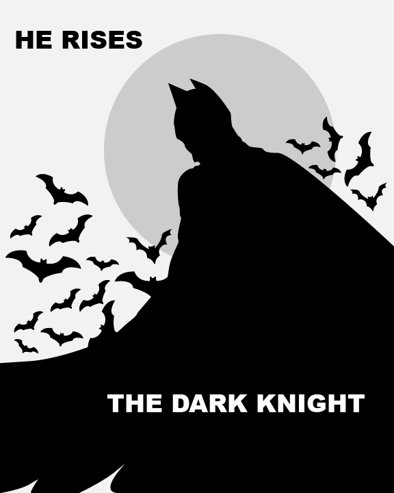
For my color study concepts, I wanted to try and use a limited color palette simply because of the style and feel I’m going for. For the first image, I wanted to do only black and white, with a little gray in it to give it more of a feel. Since the movie is centered around darkness and evil, I wanted to invoke that feeling. I also wanted to try different positions for these concepts. For the first one, I wanted to have Batman walking away.
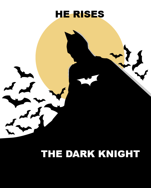
For the second color study I wanted to try and use some color with some highlights (work in progress) as well. For his cape, I wanted to take up the bottom half of the poster instead of having different cuts throughout his cape. For this concept, I wanted Batman’s position facing towards you in sort of a revealing manner. Certain elements and the detail of his suit would slowly appear in the light.
For the text, I wanted to create my own type, but since that takes some time, I placed a placeholder to see how it should look and what areas I may need to improve on. I also want to try and test out some textures to give the poster this sort of worn out and dirty aesthetic.


Leave a Reply