Category Archives: Uncategorized

Project 2 – Texture and Pattern

In my opinion, the lines were easier to do than the words, as it was somewhat challenging to decipher how to make one part “darker” in a sense compared to another. I ended up using the same strategy as the line one, which was making letters or numbers closer to each other to represent the darks/grays, as I did with the lines.
The project, though difficult, was fun to do, would I do this again? Ehhh, but was it a learning process? Definitely.

Project 2- Txture & Pattern Deliver (Angel Cuevas)

I honestly enjoyed this project, however, I would not like to do it again. I learned how different pieces of lines, letters, and Thickness of these two, can create an image. It really forced me to think and look for other options. Something I would apply to my next projects is more time, and do more sketches and apply more ideas and variety to them.

IMAGE#1 – TEXTURE

LINE/TEXTURE


TYPE/TEXTURE

At first, I did not know how to make the darkest part, black since all the letters are together, Our eyes would not be able to differentiate the letters from one another. Which is why I left a tiny white line around each letter. That makes it easier for us to see which letter is which.


IMAGE #2 – PATTERN

LINE/PATTERN


TYPE/PATTERN

Everybody uploading Project 2 – Txture & Pattern – images, please revise image size. They need to be SMALLER than 50k.

Hi resolution final images please upload to Dropbox (see email) or send them to me via email.

Thanks!

Project 2, Texture and Pattern – Andre Jones

Hey, folks! Here are photos of my finished Texture & Pattern Project. Unlike the last project – where we couldn’t use line or type to convey texture and pattern – this time we used ONLY line and type to convey texture and pattern. So this is how it went.

As a graphic designer, my strength lies in anything BUT illustration. I’ll be honest – I detest drawing. It’s tedious, boring, uninspiring – and as a chronic multi-tasker – nearly drives me crazy to have to only do one thing at a time. HOWEVER – with all that being said – I HAVE learned a few things.  First, I learned that I am better at translating ideas to paper than I thought.

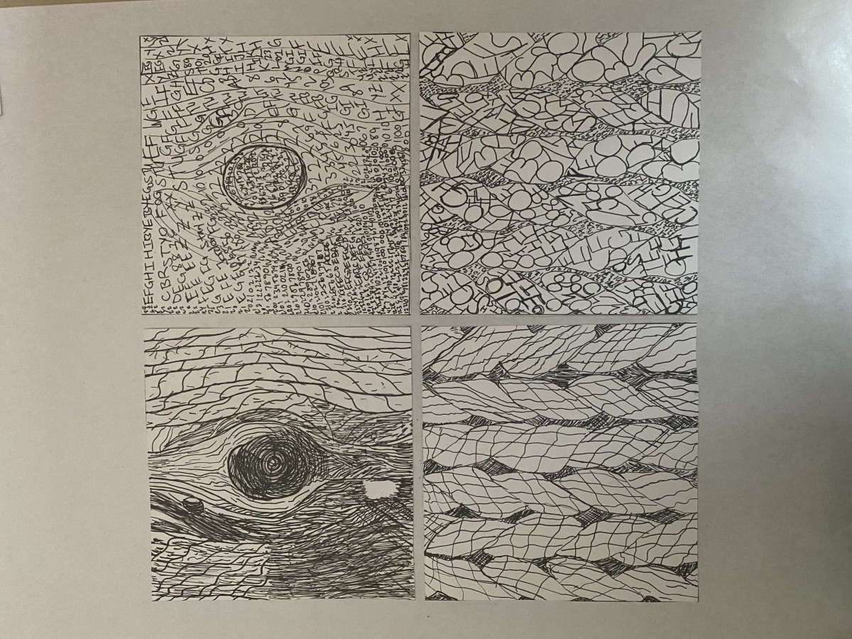
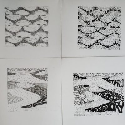
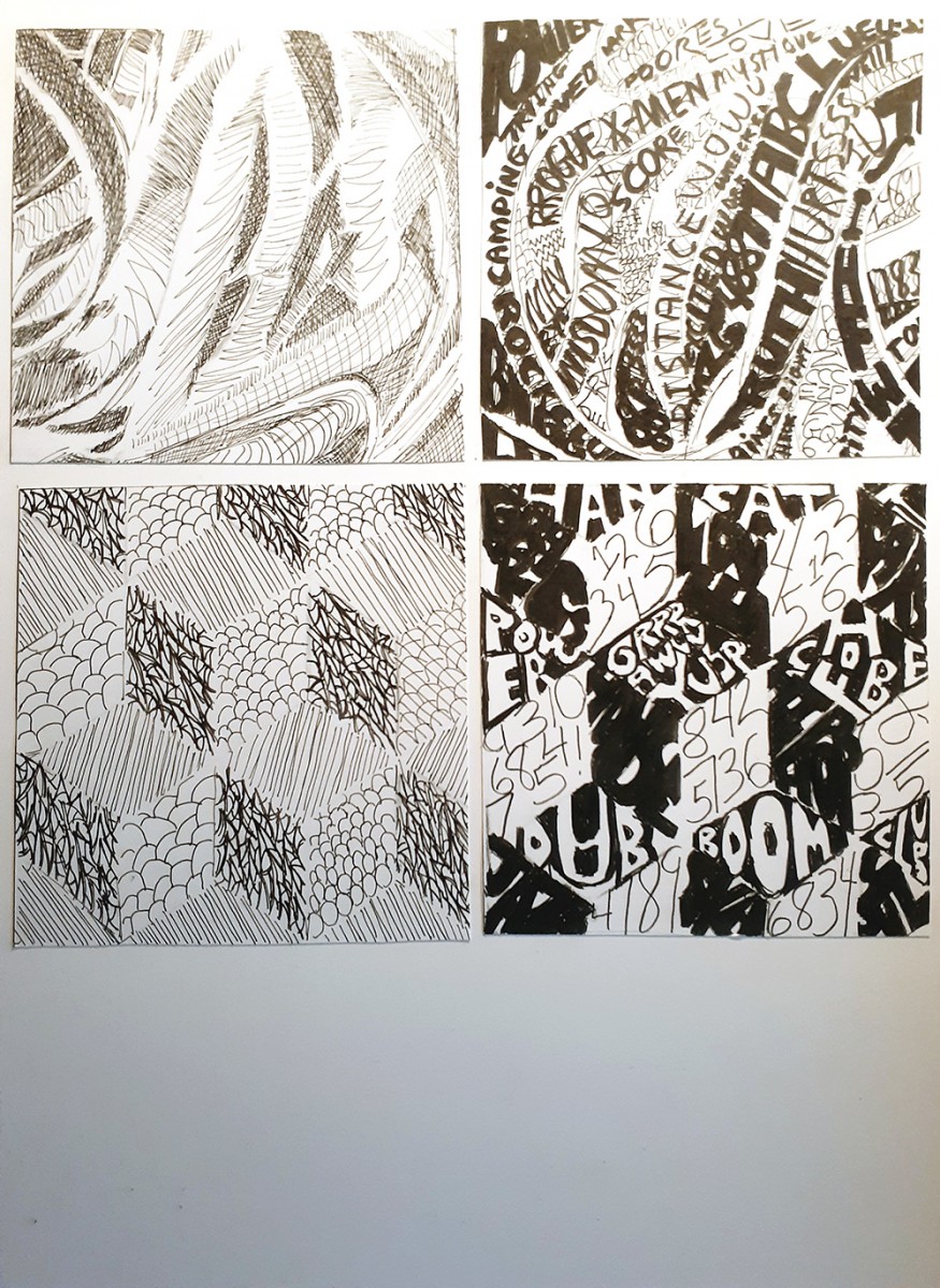
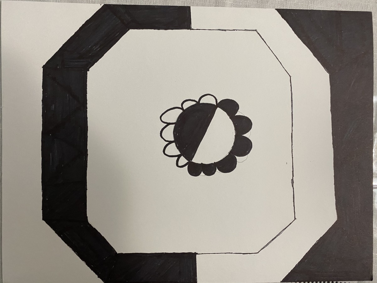
Here is my final project:


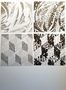
I double-tacked my Pasta line and my Cube lines upside down (though with the Cube you can’t really tell). Though I’m intimidated by hand illustration, I did learn how to use different tools to better serve my purpose. I can now speak semi-intelligently about pencil and ink varieties and the cost of Bristol these days (LOL)…but yes, I did run into a few challenges

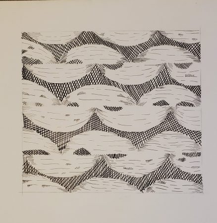
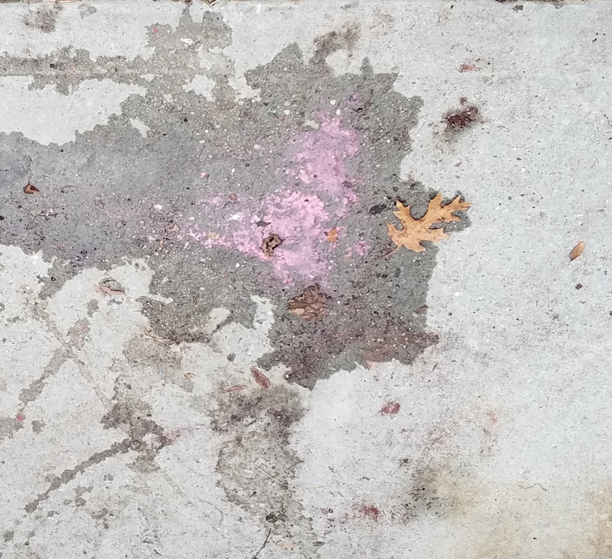
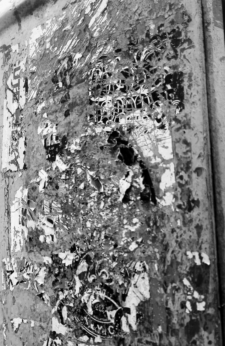
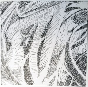
Line (Pasta/Texture)

When I chose the Pasta photo for the texture portion of my assignment, I had no idea it would be this challenging. To make things easier, Professor Rennis had us break down the textures into 3 basic shades of grey. This helped simplify (a little) a very complex photo. Even with this great bit of technique, I still visibly had trouble with capturing the tone of the original photo using only line to create shadow and depth.


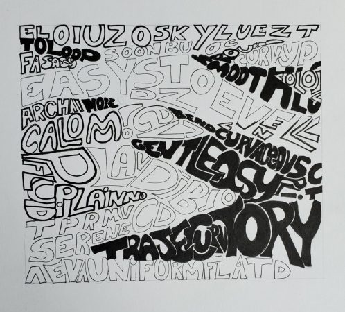
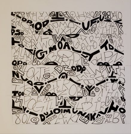
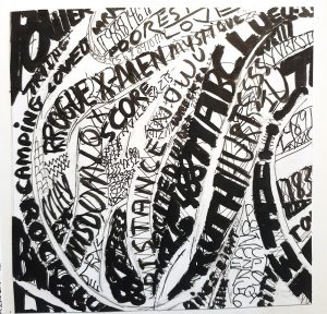
Type (Pasta/Texture)

Again, I had a hard time translating the tone of the piece using the constraints of the project guidelines, but I kinda had fun with this one. I was actually pleasantly surprised that I was actually interested in using type to create texture. Though I’m not sure I fared any better with type, I still enjoyed trying!
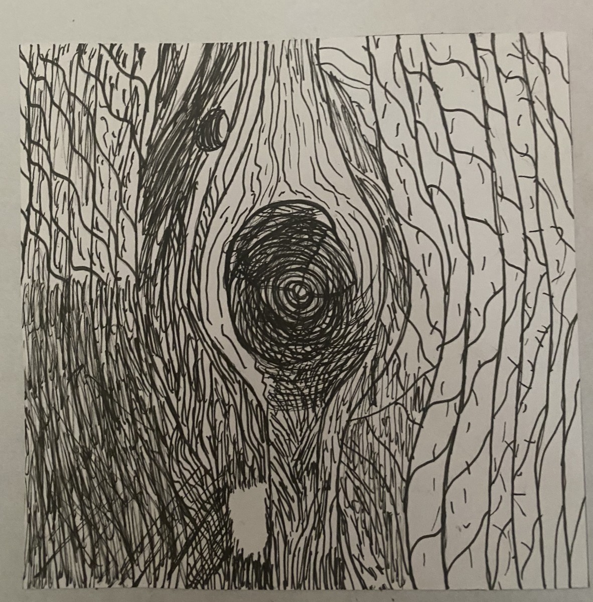
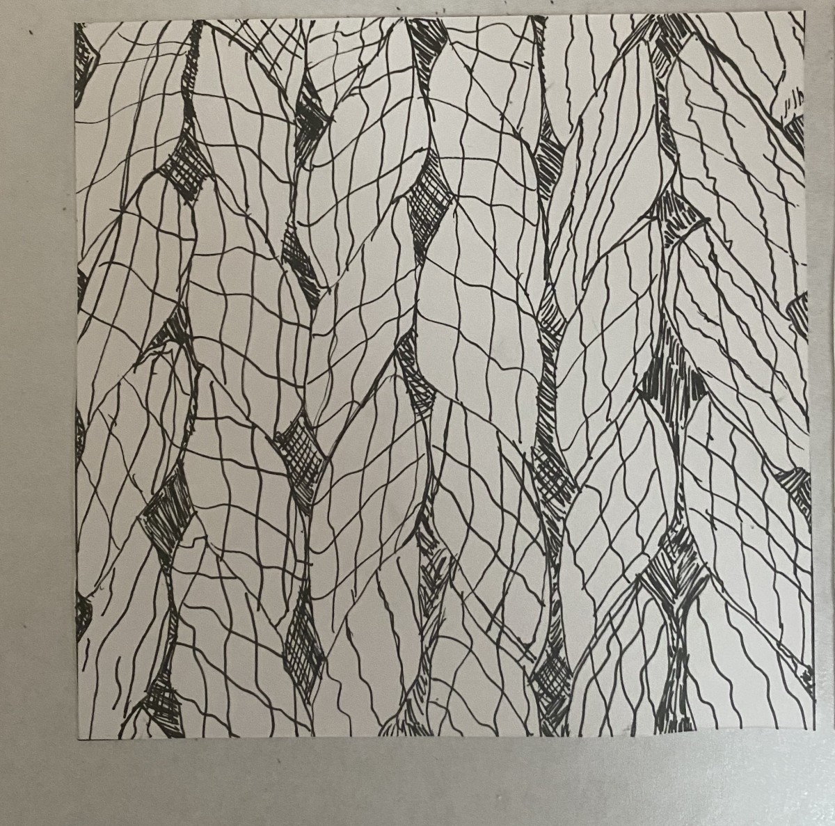
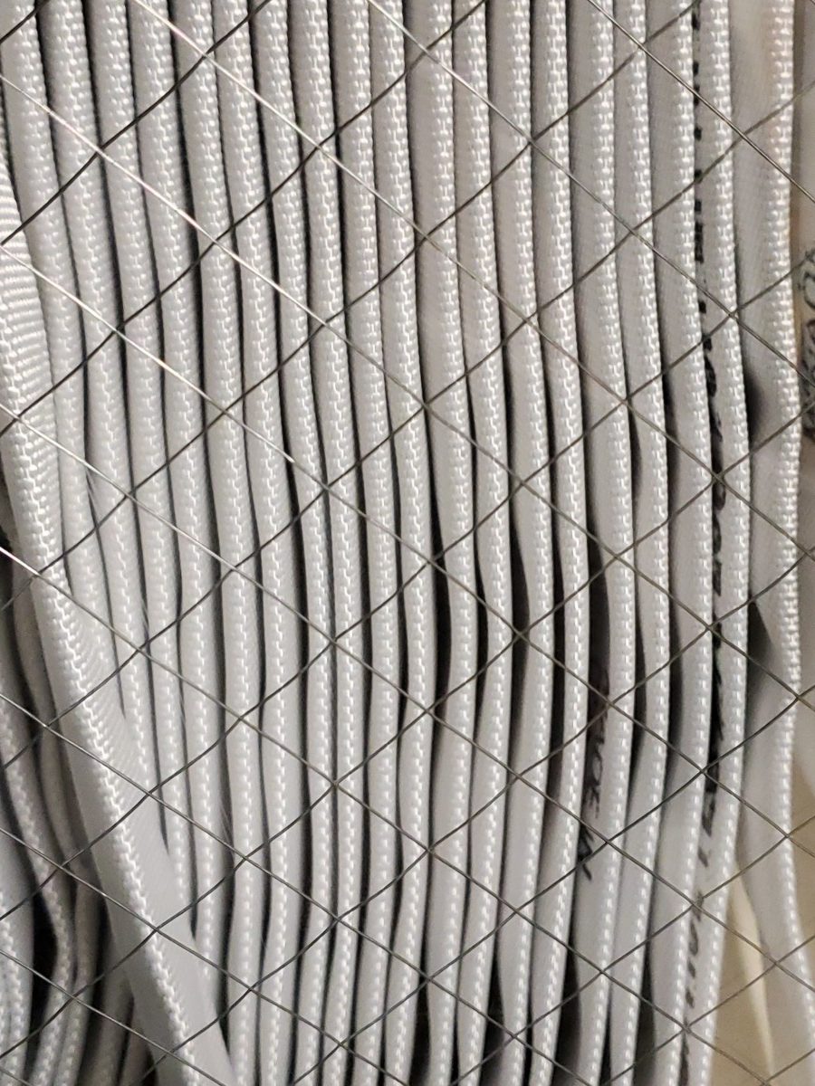
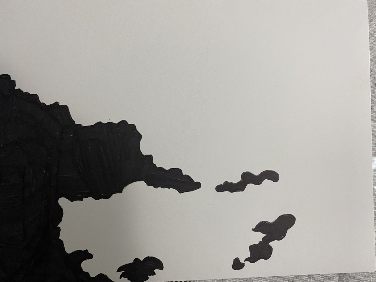
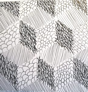


Line (Cube/Pattern)

I think I did a little bit better with pattern as opposed to texture, simply because I know how I like to work – I like structure. Nothing open to interpretation, just simple, obvious instruction and this cube provided it. After saying all that, you’d think I would have been more successful at conveying the original mood of the printout. I quickly learned that knowing what tools to use and how to use them is key in reproducing a mood. I am still handling my ink clumsily. However, I think I did a pretty good job of thinking out the differences in greys and attempting to create separation and shade with different line formations!
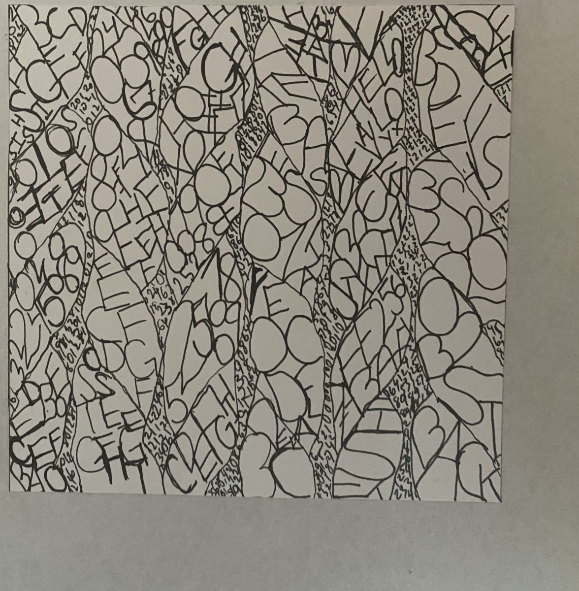


Type (Cube/Pattern)

This one wasn’t as challenging as I thought it would be (again, structure), but I did go heavy handed on my middle grey structure, which made it nearly indistinguishable from darker areas of the drawing. All in all, I like this on the best. If I had the time, i would have done this over and eased up on the ink for my medium grey component (again, not knowing how to use my inking tools correctly)


alt

Have you every looked a map of the United States and look at New York, This is what it reminds me of how small NYC is compared to other state in the country. With having 5 boroughs including up state and long island it sounds like but separating them one by one if actually small like Manhattan and the Bronx has so much, but Brooklyn and Queen being together one of the biggest boroughs. Living in NYC for 17 years I started to see more development with citizens and the buildings, Im glad i grew up in a place where you can experience new things.

Project 1 – Lost & Found – Angel Cuevas (Discover & Deliver)

OBVIOUS #1

A hole on the wall

Story – It originally used to be a small crack on the wall until one day this man who was not having the best of his days and was really angry due to losing a competition, showed up and was raging. To relieve his anger he punched the wall so many times. Thus, causing this big hole.


AMBIGUOUS


Fire Hose

Story – This is an enchanted Fire hose created by one powerful blacksmith who was also a mage years ago. It was a gift for firefighters. However, it was hard to control. The water pressure coming out of it was too much for regular humans like the firefighters to handle. Which is why they have decided to put it away behind a powerful fence so nobody could use it.


DELIVER: & CRITIQUE

OBVIOUS  FINAL


This project helped me to simplify pictures without losing its essence. What I could have done better in this image is to add more detail to the borders of the object to emphasize its texture a lot more.


AMBIGUOUS FINAL

I learned that you can find other ways to do something you can’t without breaking the rules. This image had fences that were lines. At first, I tried leaving it out but the image did not end up being the same. So I had to find a way to include the fences because they were an essential part of the image. What I feel I could have done better is make all the fences have the same thickness.

Defining – Israel Martinez

https://drive.google.com/open?id=17eYLYjFBm02JS3PQ175yIBGJpAErRSyn

vault

My ambiguous was inking in a way that its like a left versus right. I wanted a yin yang which makes everything pop out more. My first ink drawing was smaller and made the drawing a bit bigger so it could relate everything better. The first one had a smaller shape shows more of the outside and didn’t get the right proportions that I wanted.

After presenting I found out what I did wrong and what I could to make everything come together better, and to focus on the actual black vs white.

land

My obvious ink drawing started off good, but the proportions were off just a bit so I changed it while going into the Bristol. So I zoomed in on the picture and made the proportions better. From 60/40 to 70/30.

I will be editing the pictures and turning in on Tuesday


Eduardo Cortes M- Pictures Storys

Ambiguous Image

The Apocalypse painting

This picture was first taken near 14 street, where this an old abandoned firebox that people use to call the fire department just in case there was any fire nearby, but this box has been abandoned and as you can tell destroyed by scraps off stickers being placed on it, as well as the paint falling off.

The backstory of this photo is that the earth has been destroyed by other countries by bombing and nuking everywhere in the state and every country because; the people had enough with every policy in the country so in act to control the people all the states agreed to start over by bombing everywhere. Which they did, but haven’t anticipated how many they would save, and it was too late for the government and president for each state to do something. One by one the town and country starts blowing up, with the people unknowing of the occurrence being destroyed with theirs towns. However; not all was lost some people did survive by hiding in underground bunkers but almost all their loved ones were destroyed. Now that time has passed throughout the broken earth some people start realizing a painting that was freshly made almost everywhere the people went. Which was the painting of a misshapen human with a big leg and a small body walking around the rubble of houses and cities, and after a while the people around the world started theorizing who he or she was? Was he/ she a person who survived but slowly started mutating because of the radiation that all the nukes and bombs they were near too. Or was it because he/she grew mad about having no one to talk to so they started to paint to keep their insanity around the world hoping to find someone. Whichever the case is it kept people safe in a way that there are more survivors who have also survived the nukes and bombs that were set off, by different governments.


This image is called “The last,” this image was taken in Brooklyn near City Tech, and its a picture of a cap of a glue bottle that was left or dropped in the street of the crosswalk road.

The Story of this picture started with a boy named Roy where he was an average Freshmen in high school until a certain Monday came where he realized there were less and fewer people in his high school and on the streets, which for an average person wouldn’t mind, but reports on the news lately started popping up that people were mysteriously despairing out of nowhere. He soon started to get nervous until one day he came to his first-period class he realized he was the only one in his class, but not only that he looked outside he saw no one that he could see he then started to wonder and freaking out. So in a desperate act, he ran home to see what has become to his family, but he soon found out when he started to run his booke back started to float up. But not only that he was starting to fly up as well he finally knows what happened the gravitational atmosphere of the earth finally broke because of people’s pollution causing our atmosphere to float when we least expect it. But by the time Roy found out he was floating away, and a few days later after Roy flew up his book bag fell back on the floor where he floated and his school supplies fell where a bottle of glue cap fell out and landed in the streets.

Story Behind the Pictures Israel Martinez

Ambiguous

This is a picture number 1 of the Lost and Found Project

The story behind this is that two major lands are fighting to get all the keys to unlock the vault. This vault contains much military power that can change the war, both sides have all, but two of the keys to unlock the vault this is one of the doors that opens the vault and with the key you must try and complete the puzzle to continue. When the key is put in the all three turn and lead to the puzzle room which nobody has ever got into. Lets hope the rumors are real and we are able to unlock vault and win this war for my land.


obvious

This is picture number 2 of the Lost and Found Project

This picture represents the two lands that are fighting in the war. Both lands fighting against each other to control all the land. The leaders putting both lands in hard times just for power they conquered other lands took people hostage and destroyed villages just to grow in strength. The people of both lands want this war to stop and be united peacefully, but the leaders both just want as much power as possible.