
lines
Was a lot more easier to do and was fun but I feel like I could have done better
Line
Leave a reply
lines
Was a lot more easier to do and was fun but I feel like I could have done better

Hi everyone this is the finish project personally I thought this project was a lot more flexible then the last .
but overall I thought it was fun…now that I’m looking at this I spaced out the images too much but what’s done is one
One thing that I wish that I really did better at was sizing the images better than I did. One thing that I can take from this is being positive that everything is to perfection. I really enjoyed this project and showing how not every design has to do with shading and you can get the same design through lines and text and not only shading.

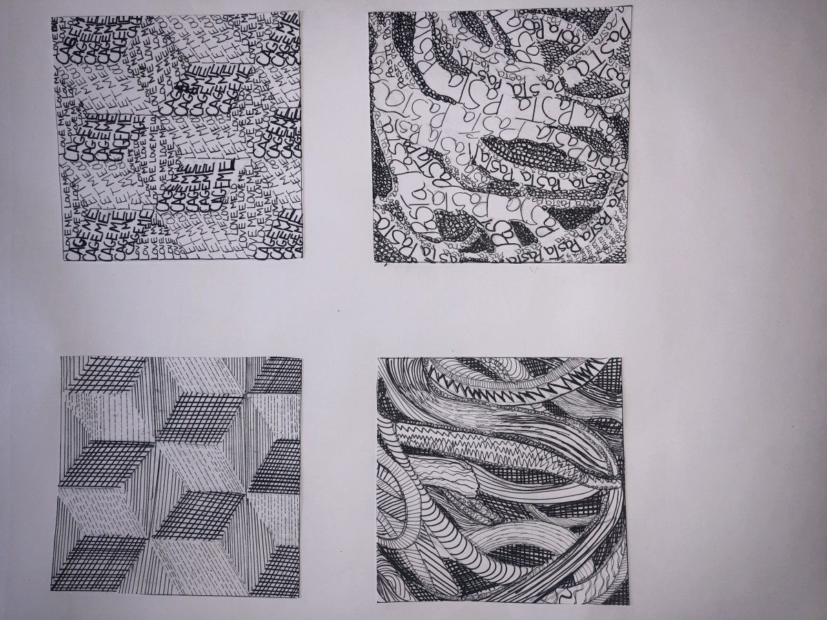
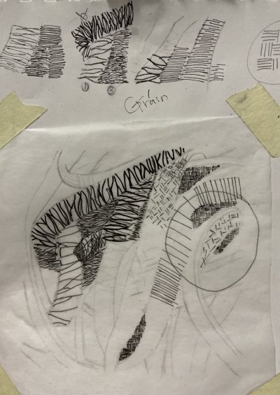
On the Left is the example design and on the right is my line design. I feel like this was the easiest one for me, but a lot of rethinking went into it. The hardest part of this was finding how to makes the dark’s, dark with out shading anything in. The way that I did it was by thinker lines with smaller lines in the filler spots. I feel like this is the best design that I did throughout this project.
On the right is my text version of the tree design, this was the most difficult out of all the designs, because trying to catch all the details with text you have to be able to shift the words and letters in a way that it matches the design. For the effect of darkness I used a darker ink pen rather than finer. Also adding extra letters helped me out with trying to create the shadow and dark effect that it needs.

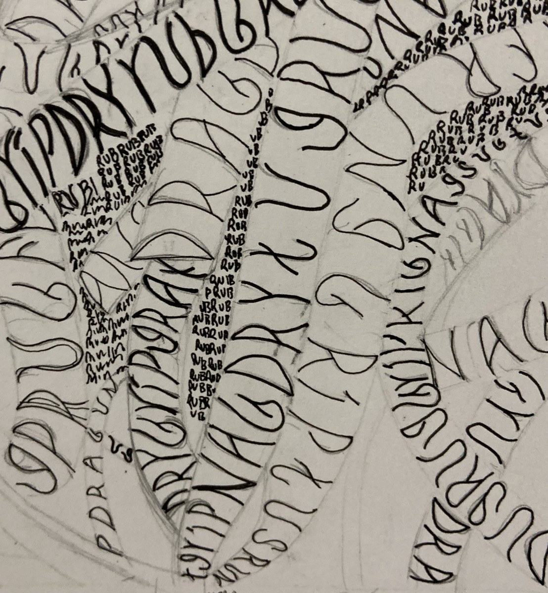
My line design is what gave me trouble with the yarn/rope design I found my self getting in trouble with the spacing of the actual design. I do feel like that I did portray the feel of the original design. Finding the dark spots in the design and trying to do them in line was hard because in the original it is so fine that it makes it look like it is shading.
In my design I feel like the way that I showed the spacing was good by making the letters and words in darker ink going the same way as the original. One place that I wish I would have done better in is there are some open spaces that could have been added with more letters. This design was overall my favorite that I did throughout the whole project, due to the fact that it shows how everything can be blended together.

Line/texture
Type/ texture
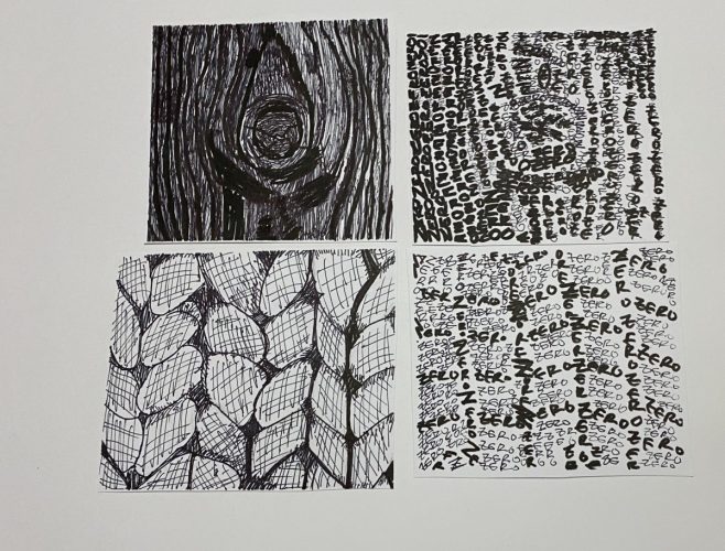
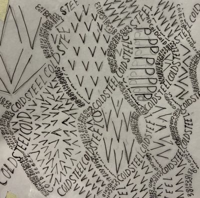
For some weird reason, I believed this picture to be of rubber bands rather than pasta. I envisioned it would have a dry and rubbery texture. It has no pattern. The lines are for the most part smooth. However, there are some jagged edges. Each strand is rectangular in shape. In terms of rhythm, the strands resemble the flow of messy hair. There is not a sharp contrast. There is also a lack of balance not only through the lighting but the positioning of the objects, it is almost chaotic. I hope to achieve the tactile feeling of dry rubberbands through a sketch.

Line/ pattern
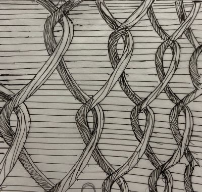
Type/ pattern
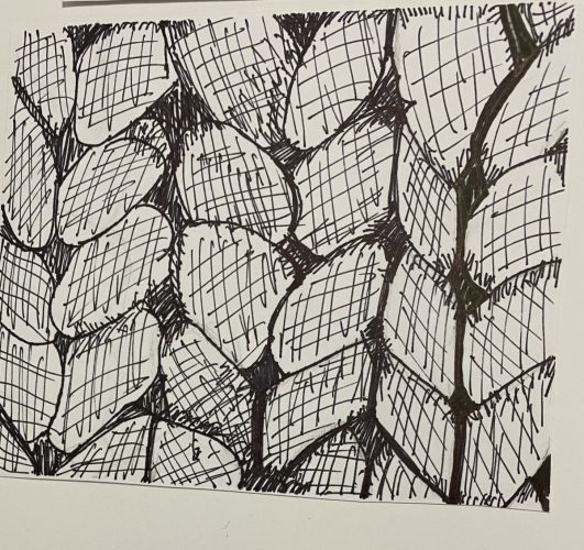
The chain fence has a smooth texture. It is cold to the touch. There is a clear pattern in the fence. Which the pattern is made up of diamond shapes. A fence follows a geometric rhythm. The sharp contrast makes it easy to distinguish the shades of color apart. Because the fence is geometric in nature it has a balance to it. My goal is to create a tactile feeling of smooth cold steel.
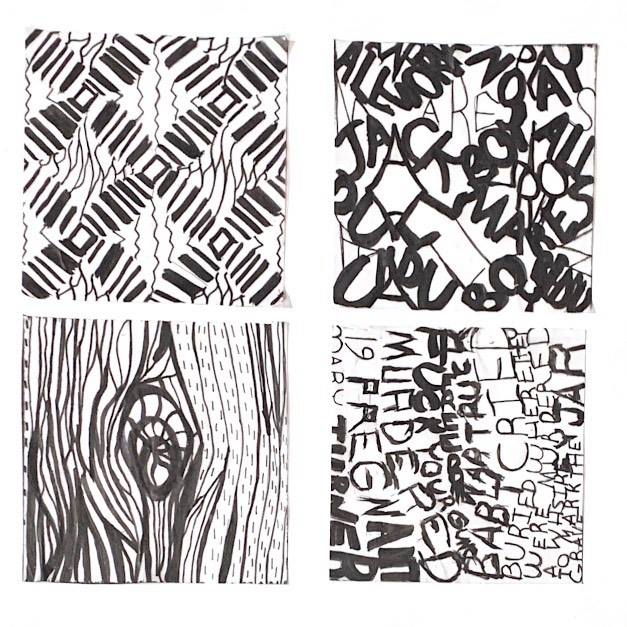
Hey, folks! Here are photos of my finished Texture & Pattern Project. Unlike the last project – where we couldn’t use line or type to convey texture and pattern – this time we used ONLY line and type to convey texture and pattern. So this is how it went.
As a graphic designer, my strength lies in anything BUT illustration. I’ll be honest – I detest drawing. It’s tedious, boring, uninspiring – and as a chronic multi-tasker – nearly drives me crazy to have to only do one thing at a time. HOWEVER – with all that being said – I HAVE learned a few things. First, I learned that I am better at translating ideas to paper than I thought.
Here is my final project:
I double-tacked my Pasta line and my Cube lines upside down (though with the Cube you can’t really tell). Though I’m intimidated by hand illustration, I did learn how to use different tools to better serve my purpose. I can now speak semi-intelligently about pencil and ink varieties and the cost of Bristol these days (LOL)…but yes, I did run into a few challenges
When I chose the Pasta photo for the texture portion of my assignment, I had no idea it would be this challenging. To make things easier, Professor Rennis had us break down the textures into 3 basic shades of grey. This helped simplify (a little) a very complex photo. Even with this great bit of technique, I still visibly had trouble with capturing the tone of the original photo using only line to create shadow and depth.


Again, I had a hard time translating the tone of the piece using the constraints of the project guidelines, but I kinda had fun with this one. I was actually pleasantly surprised that I was actually interested in using type to create texture. Though I’m not sure I fared any better with type, I still enjoyed trying!

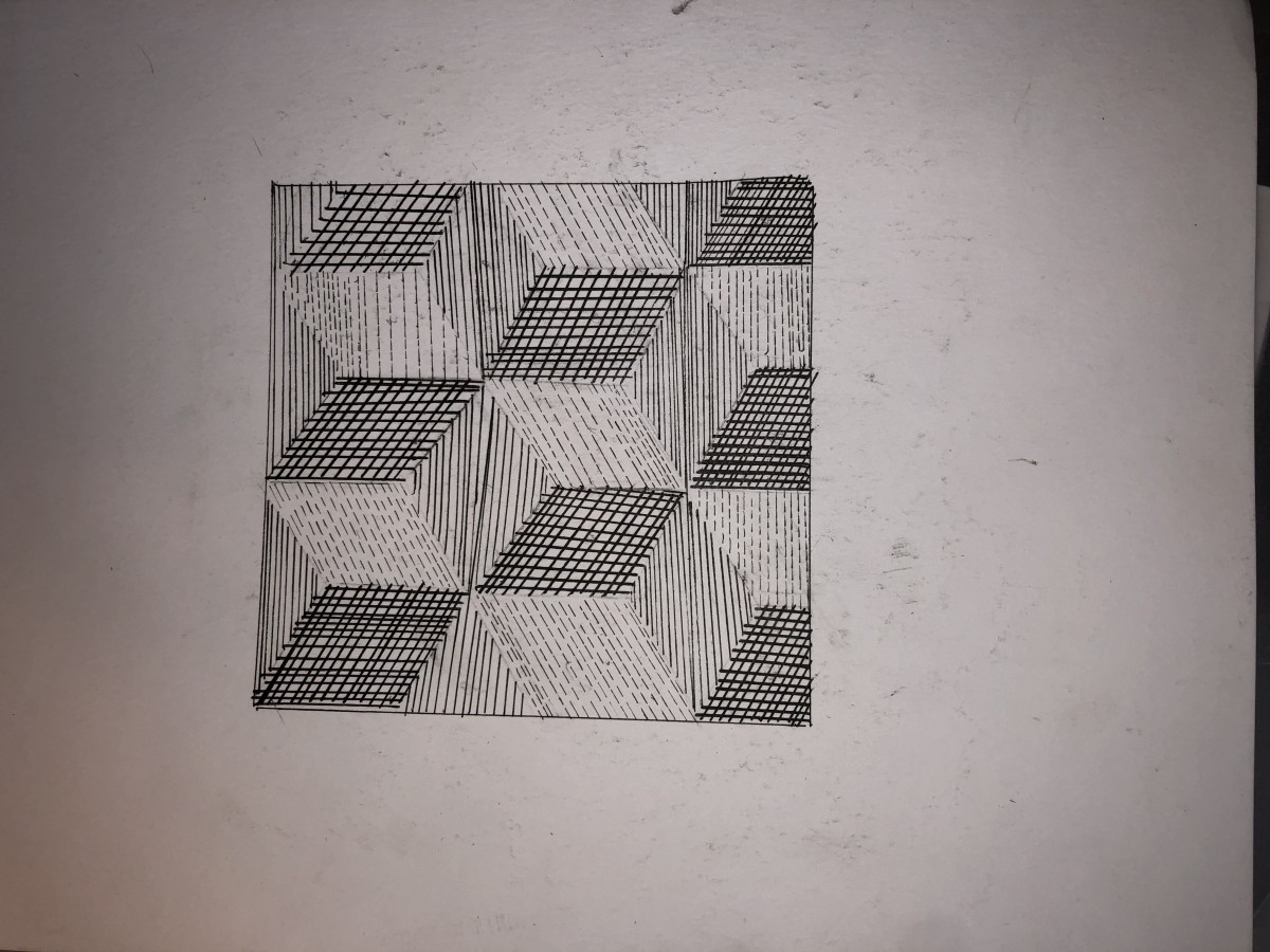
I think I did a little bit better with pattern as opposed to texture, simply because I know how I like to work – I like structure. Nothing open to interpretation, just simple, obvious instruction and this cube provided it. After saying all that, you’d think I would have been more successful at conveying the original mood of the printout. I quickly learned that knowing what tools to use and how to use them is key in reproducing a mood. I am still handling my ink clumsily. However, I think I did a pretty good job of thinking out the differences in greys and attempting to create separation and shade with different line formations!


This one wasn’t as challenging as I thought it would be (again, structure), but I did go heavy handed on my middle grey structure, which made it nearly indistinguishable from darker areas of the drawing. All in all, I like this on the best. If I had the time, i would have done this over and eased up on the ink for my medium grey component (again, not knowing how to use my inking tools correctly)

Hey everyone! The world is ending and we’re all going to die of The Corona but at least I uploaded my project! Hooray! I am running on a blood transfusion and 3 Red Bulls but I knew I would forget to upload this in the morning so it’s going up at 1am! Am I a vampire? No but blood does have a nice taste!

Overall- this project was a fun challenge but it’s not a challenge I want to do anytime again soon. When it came to linework I think I did pretty okay, but I really struggled with the type aspect of the project. No matter how much feedback I would get on my type, it would never seem to want to come out the way I envisioned it and that was really frustrating. The entire project had a lovely idea behind it but a horrid and ugly output on my part.
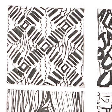
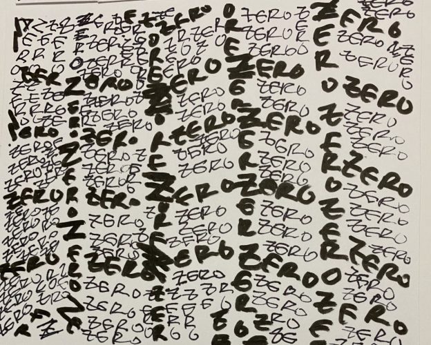
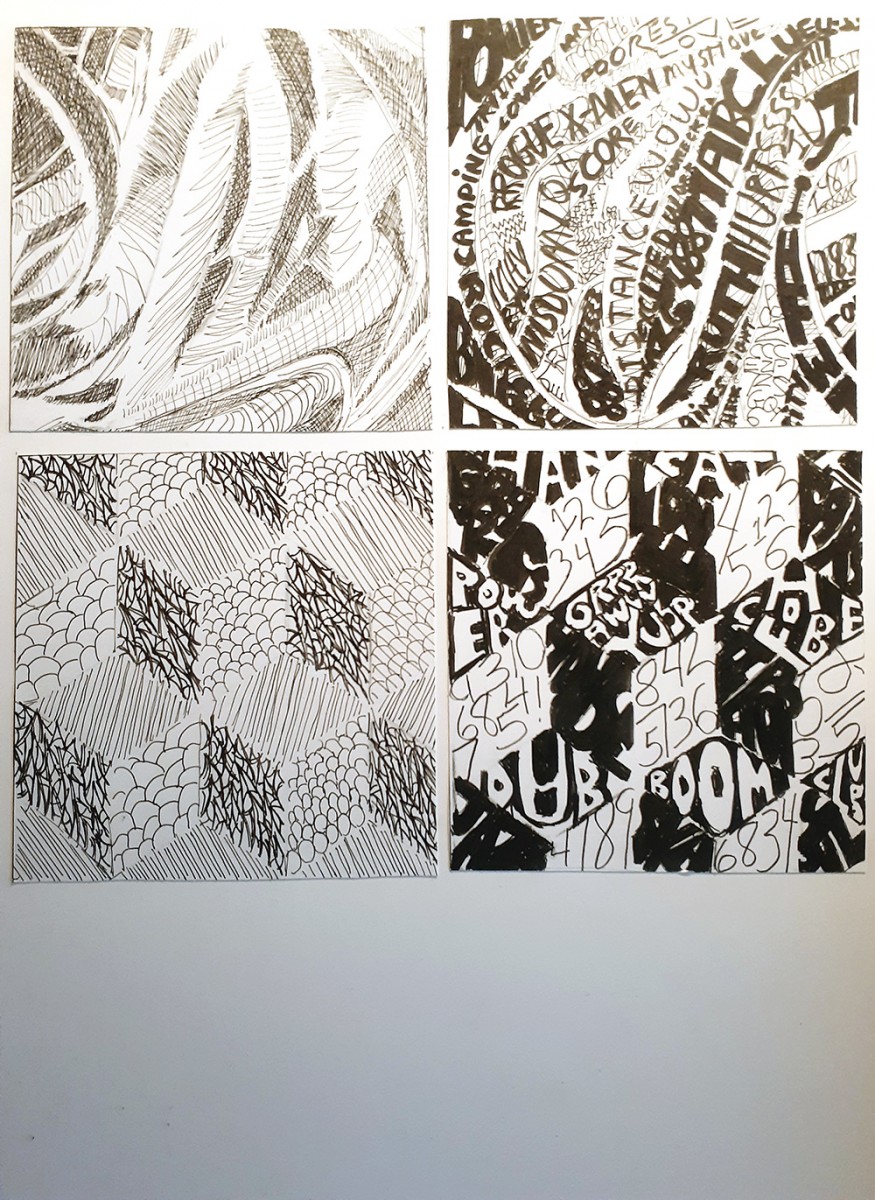
LINE / PATTERN
The mood that I got from this pattern was very groovy- very 60s, illusionist, something you would find on a rundown hotel’s carpet. I wanted to go for linework that captured a groovy, loose image while changing up the appearance of the image completely, and I actually really like how it came out.

TYPE / PATTERN
I discovered pretty quickly that working with random letters didn’t motivate me and didn’t give me enough of a challenge. I wanted to lean into the “rundown hotel in the 60s” mood I got from the pattern, so I decided to lean into that when working with the type for pattern, so I decided on the quote “All work and no play makes Jack a dull boy” while also sneaking a “REDRUM” in the end for good measure. Again, I got rundown hotel vibes from this pattern so why not use some quotes from The Shining?
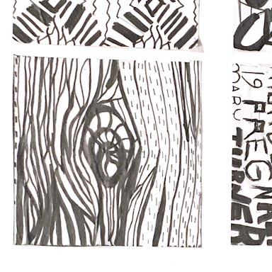
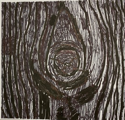
LINE / TEXTURE
Out of all the ones I did, this one is my favorite. The mood I was going for was uncomfortable and uneasy, almost a little threatening, and I feel like I perfectly captured that. I loved being able to have a little more creative control over lines and how to use lines to convey color in texture compared to pattern.
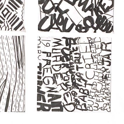
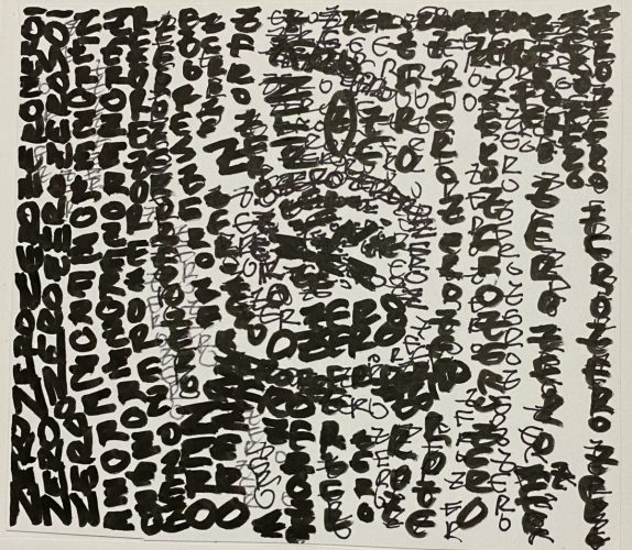
TYPE / TEXTURE
This is the one out of all four that II had the most trouble with, most likely due to attempting to fit text into small lines- eventually I decided to make the text bigger and follow the flow of the line instead of the size, and I think it looks pretty okay. To keep up with my uncomfortable, threatening mood that I got from the texture, my text consists of modified lyrics from the song “Mary Turner Mary Turner” by Xiu Xiu; a song that tells the true story of a heavily pregnant women who was lynched after protesting the lynching of her husband, and while they burned her alive they cut open her stomach and proceeded to crush the skull of her baby, and left their bodies in a gravesite marked by a whiskey jar. I’m not sure why I decided to do such a political piece, but I think it has to do with me learning that lynching only officially became a federal crime in 2018, combined with going to the south for the first time and being extremely disgusted and uncomfortable with the casual racism that surrounded me in the south- even as a white person, I felt unsafe in situations where racism was heavily present, and America has a history of treating minorities, namely black people, horribly, and America will never be a country with freedom and justice for all until we understand the “for all” part.
The OpenLab is an open-source, digital platform designed to support teaching and learning at City Tech (New York City College of Technology), and to promote student and faculty engagement in the intellectual and social life of the college community.

