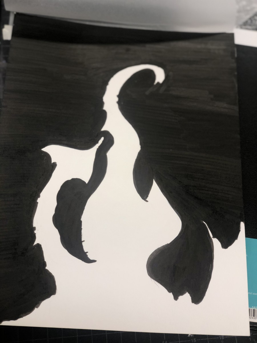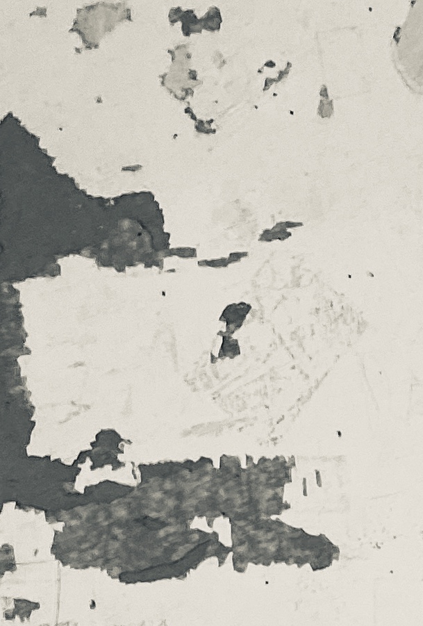
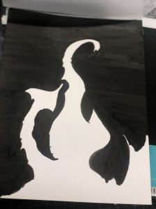
- personally the thought this project . was great and was happy to see other’s artwork and hear people’s different interpretations of images.in my own. work I wish I used china ink instead of ink markers to receive less texture. for the next project I will do better and make sure I have the right materials for the project.
obvious
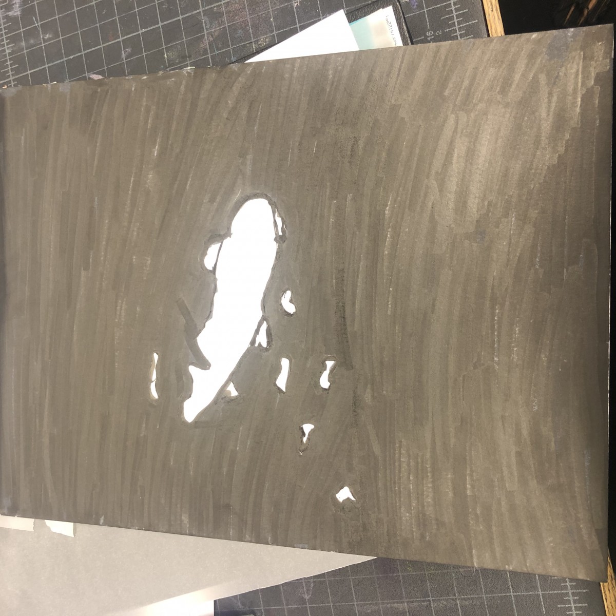
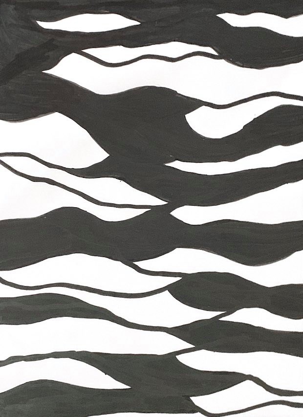
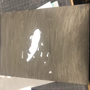
Step 4
Leave a reply