Monthly Archives: May 2020

Museum Visit

The art piece I chose is from the Kaws exhibition at Brooklyn Museum, from 2015-2016, cited as the “DIG E, Brooklyn Museum photograph.” I am comparing this to my color project. The differences I can state, is that Kaws’ usage of color is more elaborated, in a sense, where he uses about 13-14 different colors, as opposed to my 2-3. I was attracted to the “abstract-ness” of the piece as well as the color usage. The similarity, deals with the way certain colors are placed, regarding the eye being a different color to around the eye, as well as the lighter colors kind of being a focal point.

Deliver – Project 5

I felt like this project shows interpretation and more creativity to find the letters made out of just random things that you can find. This project isn’t the best one that I have done, but I did learn a lot while trying to make something out of nothing. I feel like I could have done better with the creations of the backgrounds, but other than that I feel like I did alright.

Andre Jones – Museum Visit

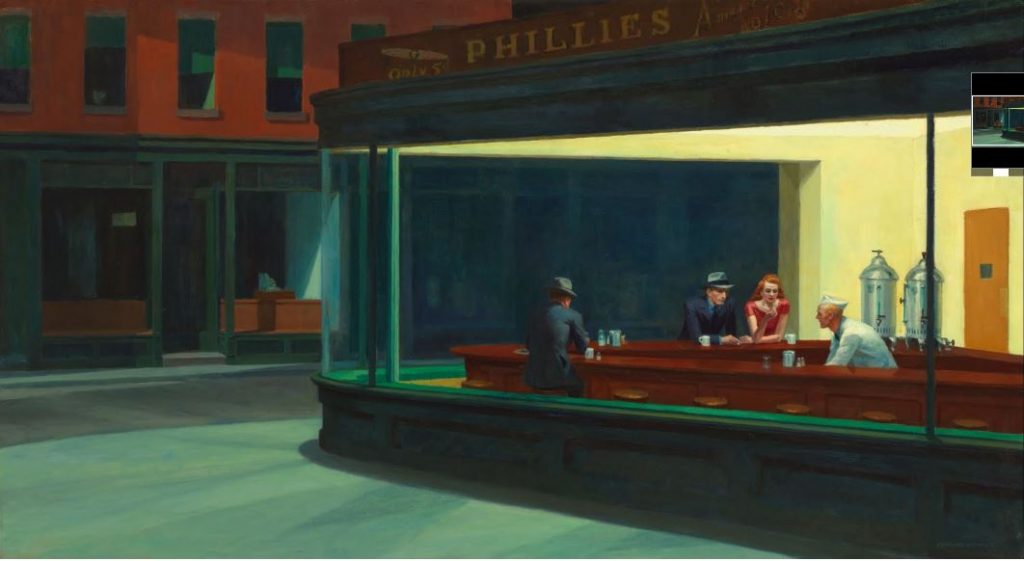
Edward Hopper, “Nighthawks”,  Oil On Canvas, 1942

(courtesy Google Arts & Culture, Art Institute of Chicago)

Obvious and Ambiguous.

Through use of shadow, Hopper creates clear foreground/background relationships in a deliberately simplified space. The presence of shadows always means there’s light. This light isn’t created – it’s implied

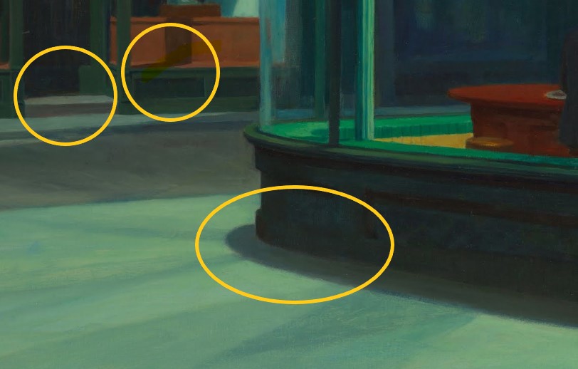
Texture and Pattern. 

While this may sound repetitious, Hopper’s brilliant use of shadow is what gives this piece it’s deep sense of dark nostalgia and introspect, so it’s hard not to talk about it. Not only does his use of shadow create clear figure/ground relationships, but also helps create textures that tell us that it’s nighttime, that there’s a corner, that there’s glass in the windows.

Motion and Emotion.

The focal point is obviously the diner, characterized by the stark contrast in colors suggesting electric light in an establishment. Grayscale (along with line), has it’s part in this piece, as it gives us the shadows that create the mood and establish clear figure/ground relationships.

Color. 

What I really wanted to talk about concerning “Nighthawks” is the brilliant – yet subtle – use of color to convey mood. Color is what really this piece is all about. Color creates the obvious foreground relationships we see. Color is used to imply texture (I say “imply” because even as a modernist piece, it still nods at impressionism in terms of technique).

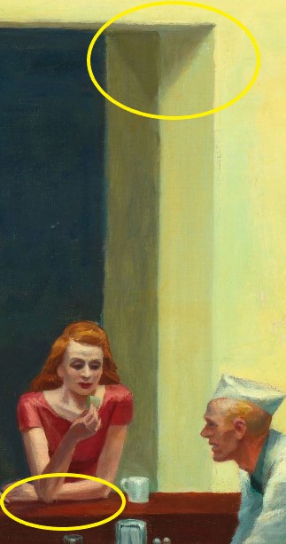
Look at how Hopper cleverly used color to also imply light and source. There are TWO lights in the piece – one inside the establishment and one outside the establishment. Though no light is actually depicted in the piece, we know where the lights are based on Hopper’s use of black mixed with color to create a sort of dampening of light in places where the unseen light source is actually directed.  You see it on the curb, in the shop doorway and window. You see it on the first man’s back. We know that at least one of those lights is off scene – perhaps across the street.  We know that shadows can always be traced to their source and Hopper shrewdly suggests a world outside of the scene.

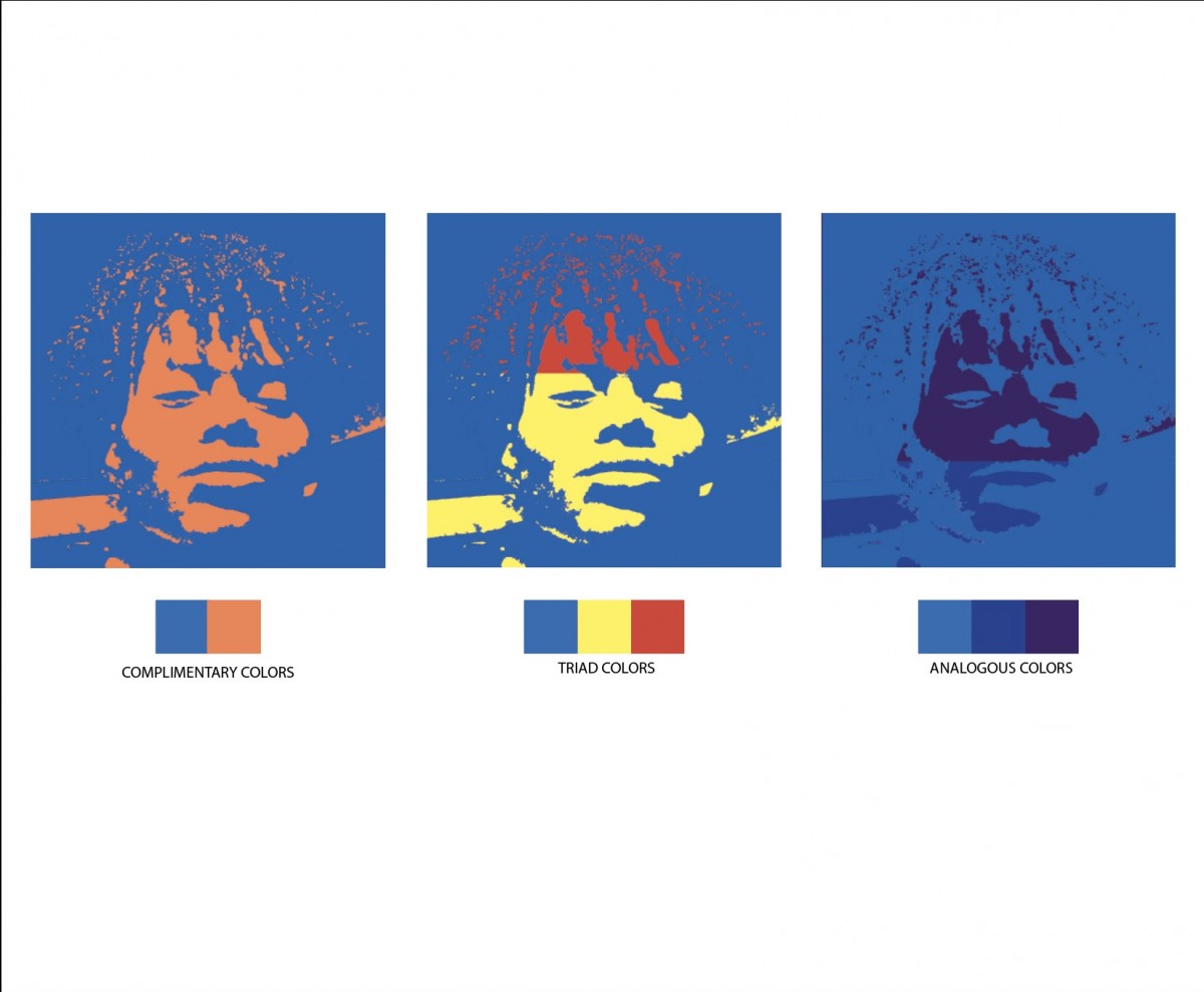
Hopper uses a warm, analagous color scheme (yellows, oranges, and reds) to soften and humanize the interior and to lend personality to one of the figures, while using a darker analagous scheme for the exterior (contrast) and the other two characters. This reminds me of my analagous composition, which uses color to convey a dark, icey mood without actually using black.


Groovy Braided Twist

White Blob

Locked Premise

This project was pretty fun, due to the fact that it felt very free, since it was based off of what I saw inside my imagination.

Ulrike Müller and Amy Zion

The Conference of the Animals and 120 Years of Children Drawing New York City

I chose this Piece because it embodies the majority of what we have done this semester and the projects that I personally enjoyed. this piece is by Ulrike Müller and Amy Zion  named “The Conference of the Animals”The full-scale exhibition organized by Amy Zion will close August 16, 2020, while the wall painting by Müller remains on view through February 21, 2021.she foregrounds the painted wall with giant animal-like shapes. Their muted palette and monumental scale is similar to the gray scale of we did in the beginning of the semester .we can definitely see the texture between the two dogs with the direction of the lines.just by looking at exhibit I can feel the texture and the sediments of the wallI think it is similar to this project being that both use texture and grayscale even though Ulrike Müller and Amy Zion used dogs I still think these two art pieces are similar

Angel Cuevas


1)  Wired Cable.

2) Hole on the wall.

3) Light Bulb

  1. (S_A_X) I used ink to add the black background because i wanted to leave the letters white, so it looks more like the original picture.
  2. (A_K_E) I wanted the letters to have the same texture as the original picture and tried doing the same with the color.
  3. (S_V_N) I tried to have the same spiral vibe as the light bulb. I added two picture because i really liked how the letters without the purple background came out. I tried giving the letters some shades with pencil to match the light bulb.
  4. Overall, This project was fun. However, i felt a little limited to only use objects from my house. I wish i could have gone outside and find different starting points and explored more options. But i am satisfied with how it came out .

Steph Balloqui / Project 5 / Deliver

I found this project really hard due to the lack of inspiration around me- Although font and typeface projects are usually always my weakest. I really had a hard time capturing what I was seeing.

DRIP- I used white-out to capture that texture of plaster
OOOOO- I used red paint and small dots of white-out to capture my wall with paint splatter on it
OOPS- I used hair dye and black paint