
Andre Jones – Images
Leave a reply
Have you every looked a map of the United States and look at New York, This is what it reminds me of how small NYC is compared to other state in the country. With having 5 boroughs including up state and long island it sounds like but separating them one by one if actually small like Manhattan and the Bronx has so much, but Brooklyn and Queen being together one of the biggest boroughs. Living in NYC for 17 years I started to see more development with citizens and the buildings, Im glad i grew up in a place where you can experience new things.
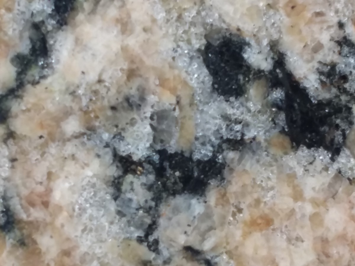
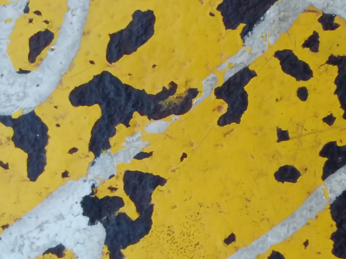
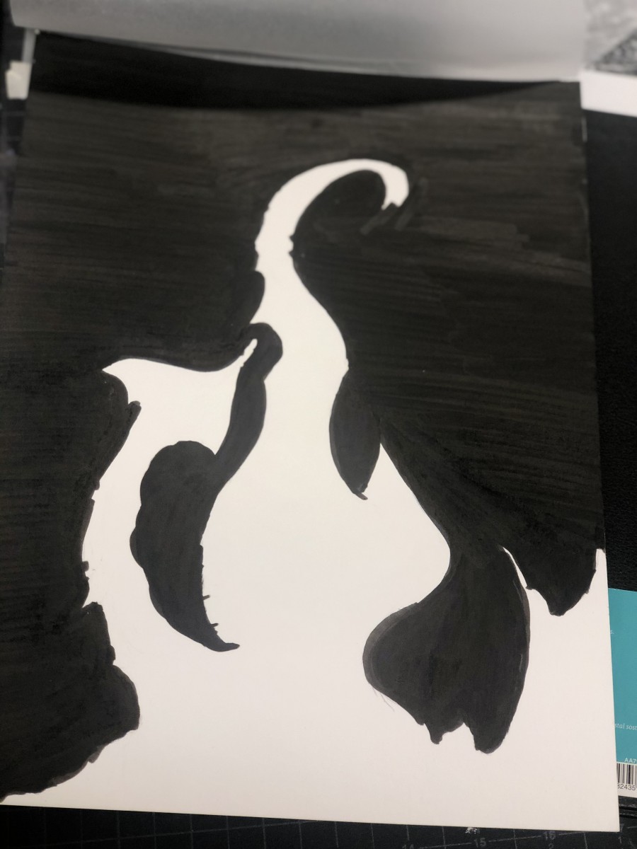
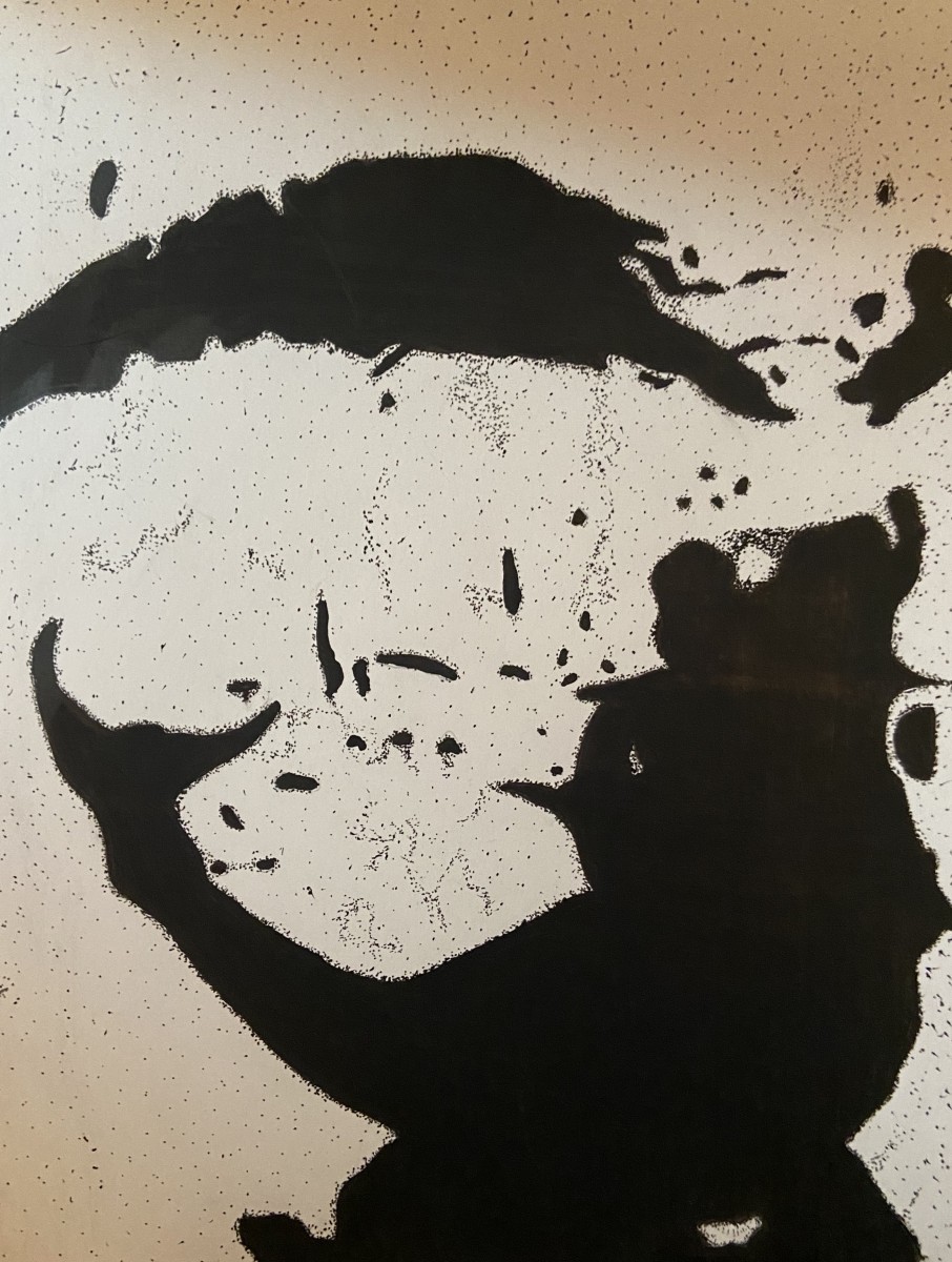
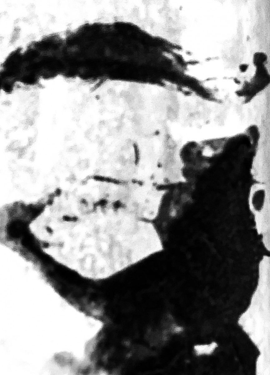
This pic was originally a pic of a metal pipe with chipped paint in Manhattan zoomed in to capture a world map-like pattern with an African-esque continent likeness in the middle. Final photo was simplified to the major Black and White shapes in the image.
Africa_Type_Original
Africa, 46 million years ago – Ambiguous
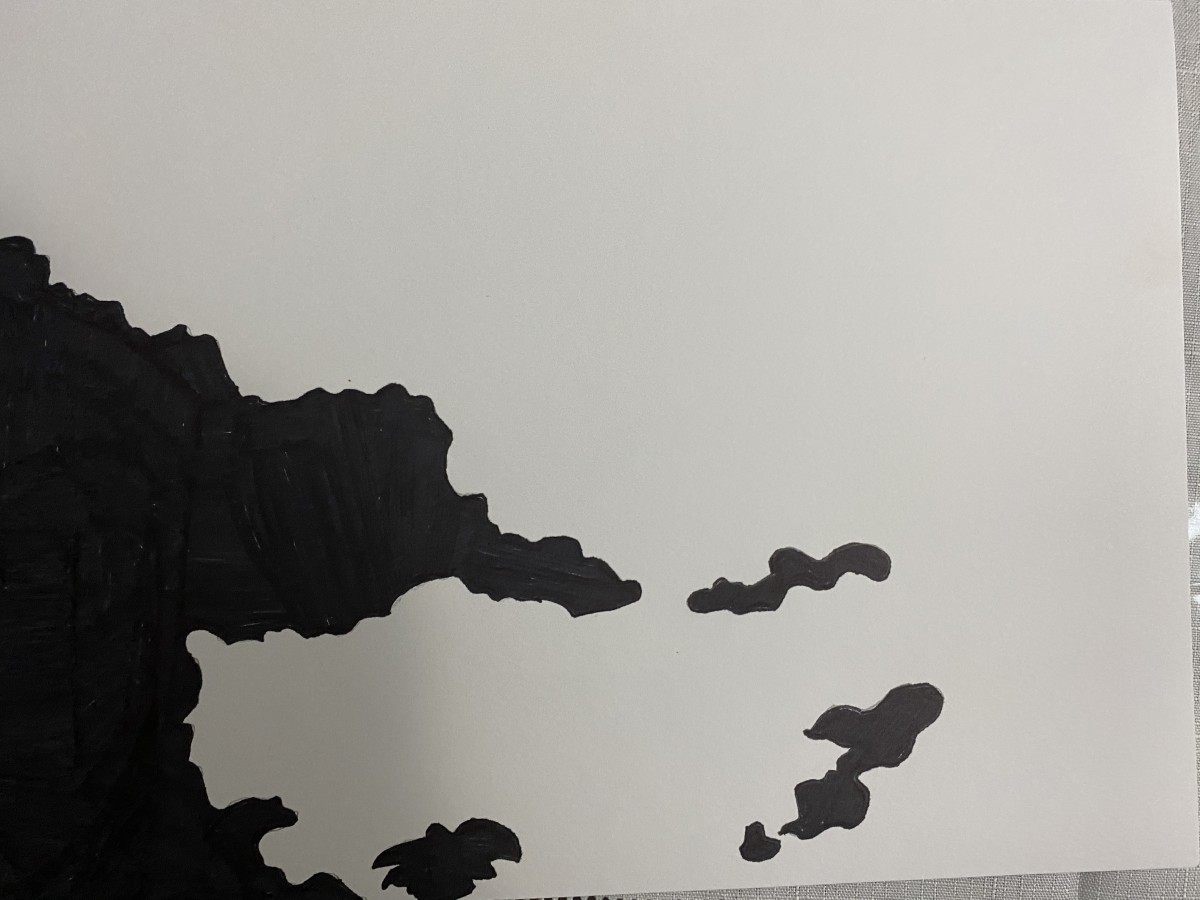
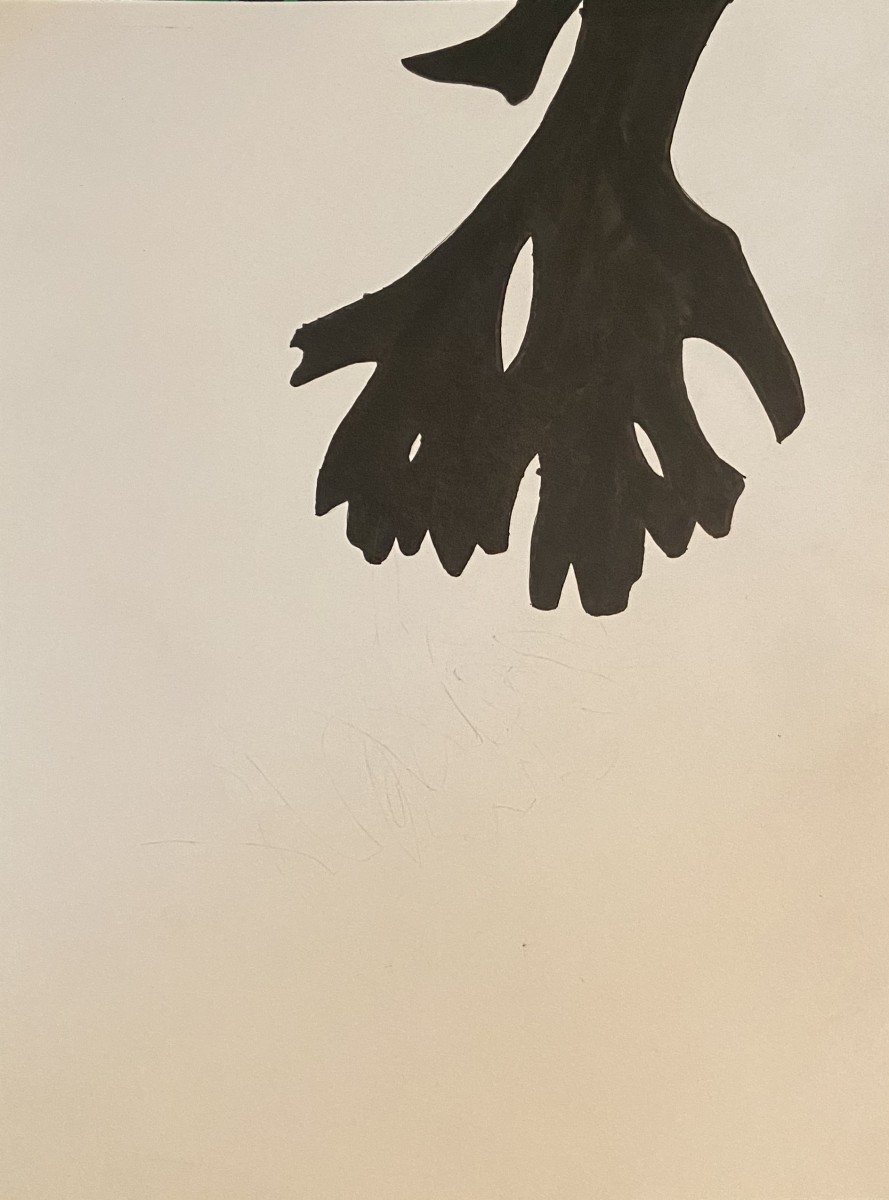
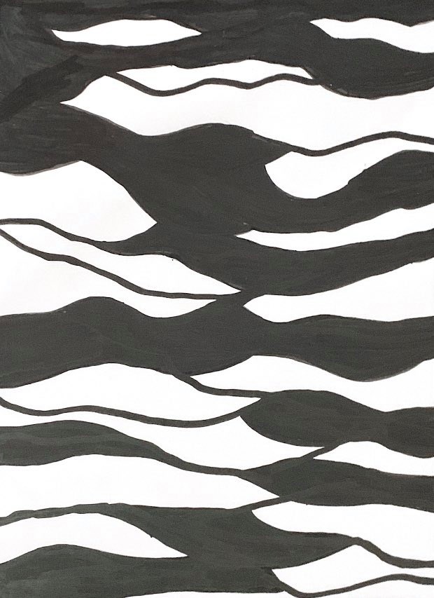
This pic was originally a pic of a piece of styrofoam on the ground (I don’t have the reference file). Though there were cracks in the surface, I chose to simplify them to black. A simple line outside the bottom illustrates the break in the styrofoam. When simplified to black and white, it can be seen as different things from a beach, to an antarctic ice floe.
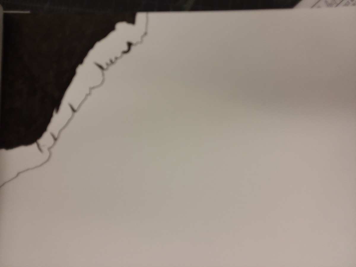
A Beach Or A Cliff – Obvious
obvious
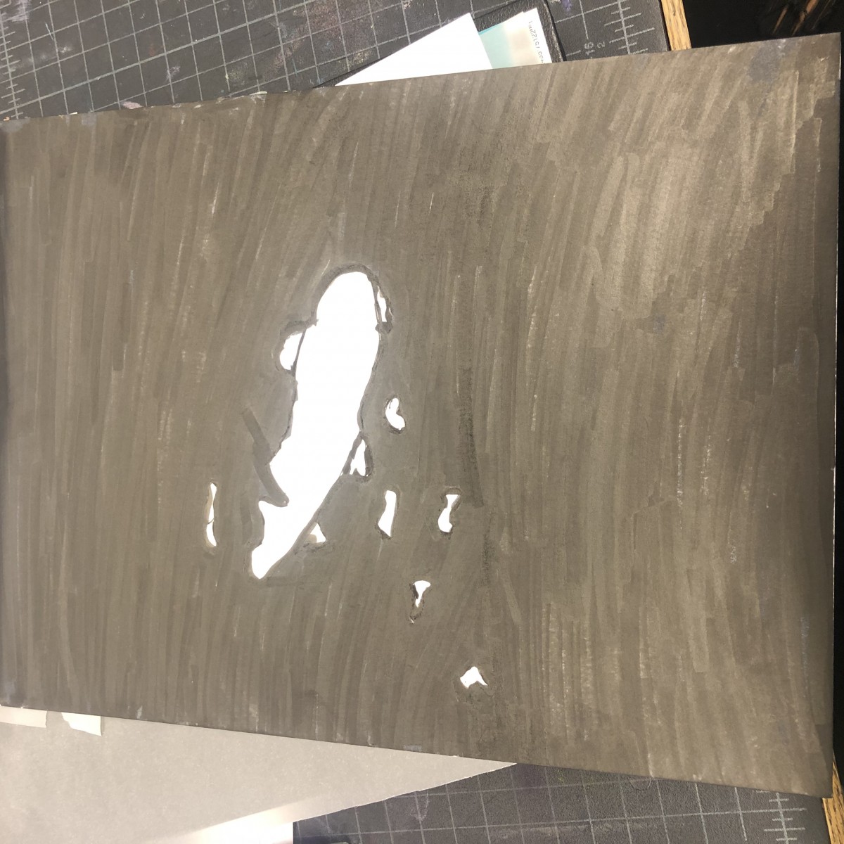
Some feedback that I got while presenting really stood out to about the ambiguous work is that when I was doing the work I thought the proportions were all good and after the feedback they were off. So when I resubmit that is one big thing that I will be looking at also the tidiness in making the shape in this also was off. Those two things affect me in the project, but will help in creating others in the future.
The thing that I found in my obvious is the way that I inked it. I should have put more in on the page so it could really show the effect of the 70/30 ratio. Also my mistake while presenting was being unprepared and not bringing in the actual photo for this one.
(The Photo Below)
OBVIOUS #1
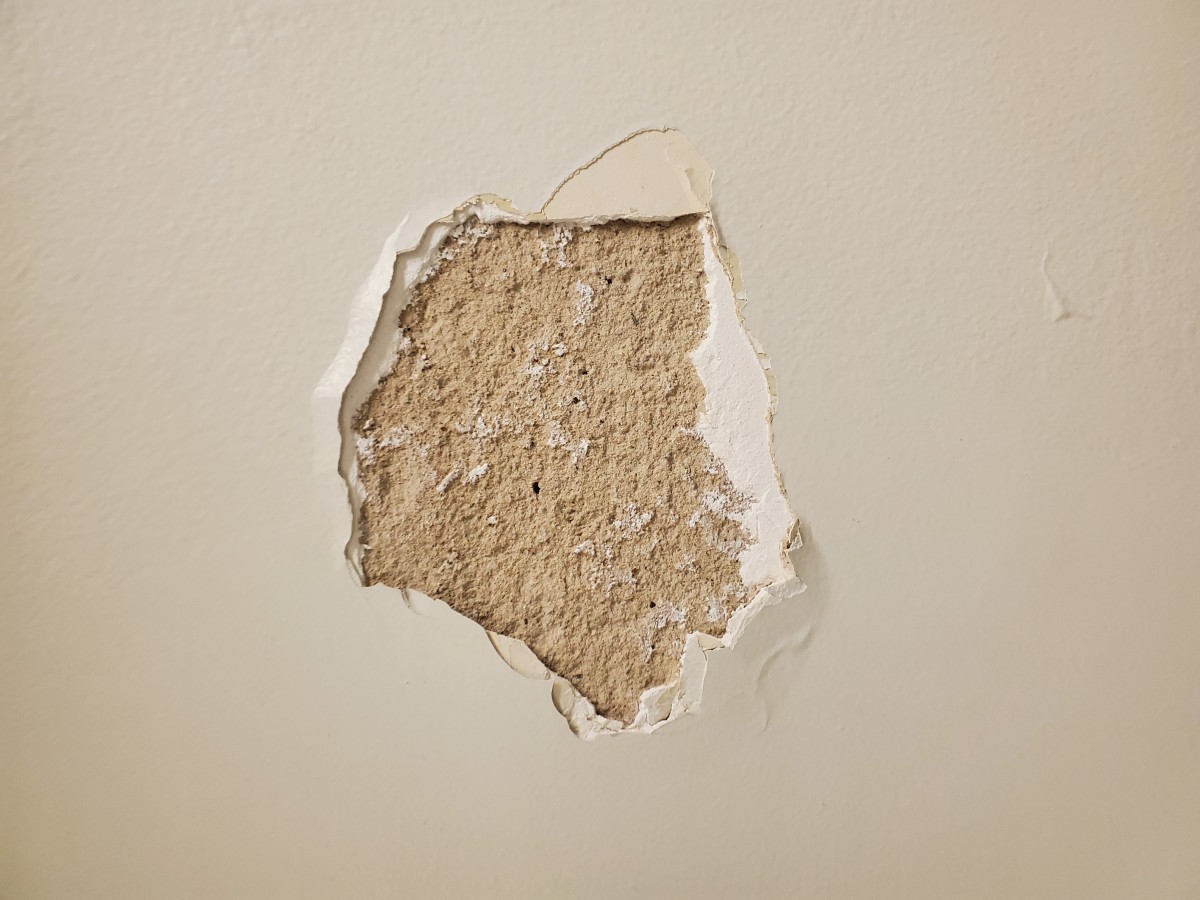
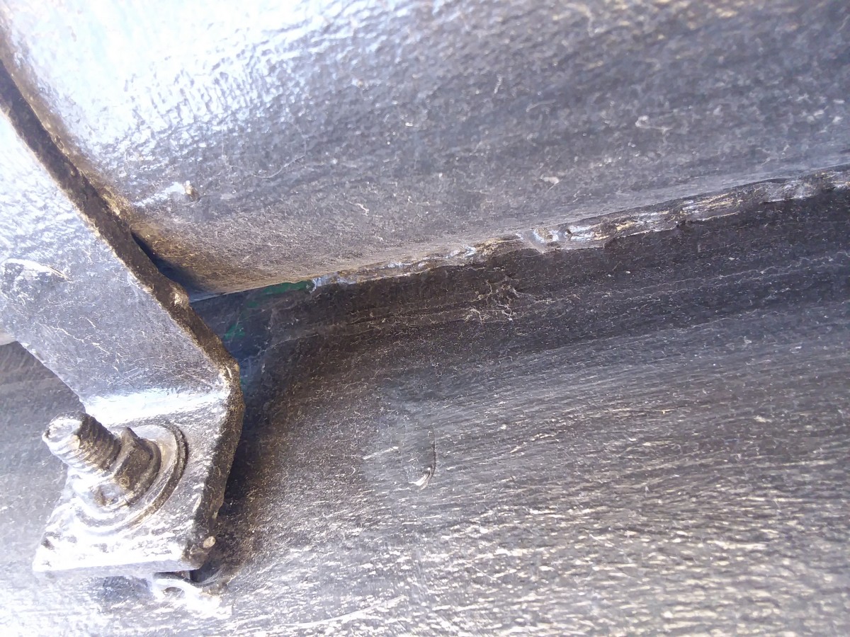
A hole on the wall
Story – It originally used to be a small crack on the wall until one day this man who was not having the best of his days and was really angry due to losing a competition, showed up and was raging. To relieve his anger he punched the wall so many times. Thus, causing this big hole.
AMBIGUOUS
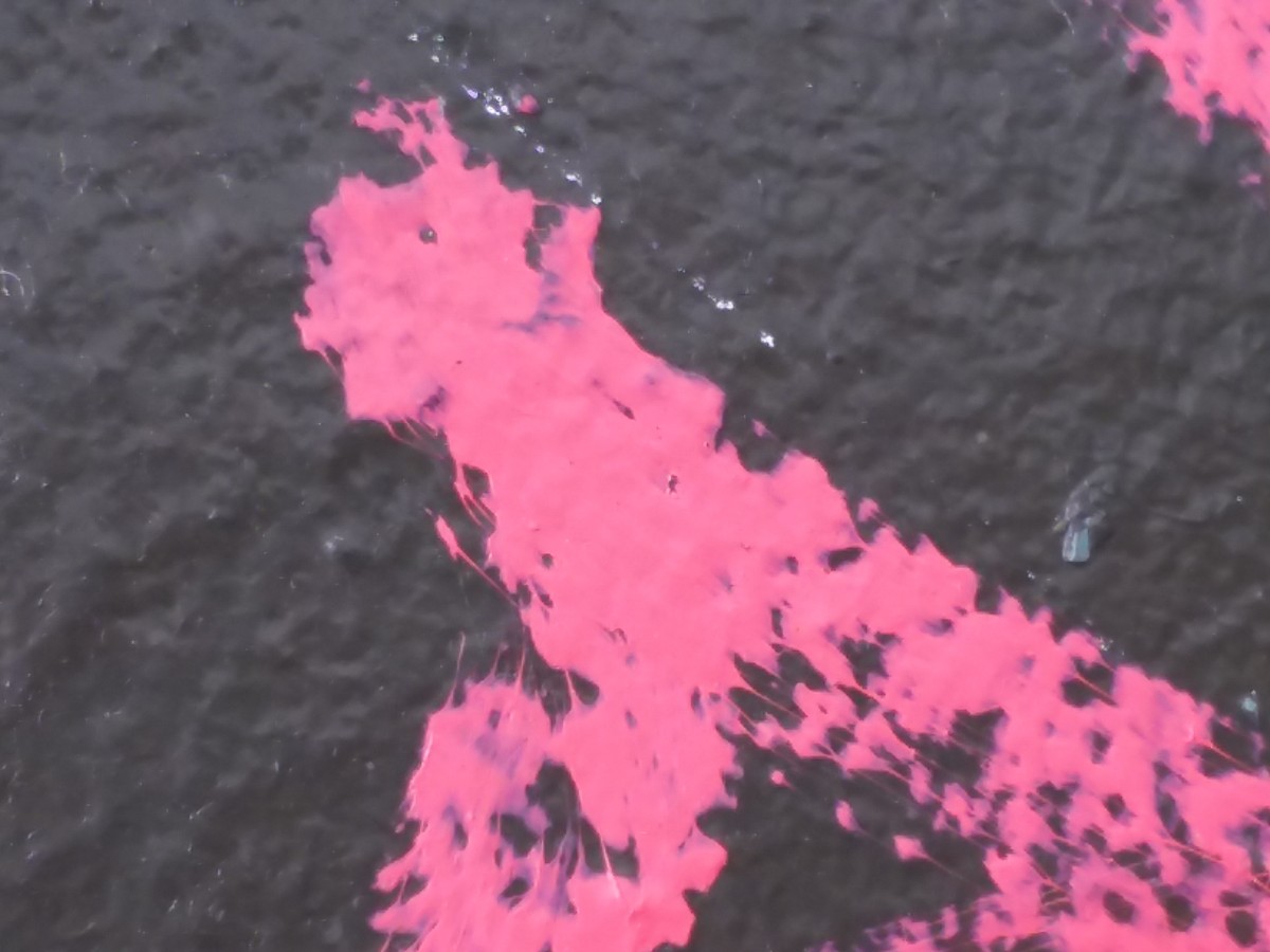
Fire Hose
Story – This is an enchanted Fire hose created by one powerful blacksmith who was also a mage years ago. It was a gift for firefighters. However, it was hard to control. The water pressure coming out of it was too much for regular humans like the firefighters to handle. Which is why they have decided to put it away behind a powerful fence so nobody could use it.
DELIVER: & CRITIQUE
OBVIOUS FINAL

This project helped me to simplify pictures without losing its essence. What I could have done better in this image is to add more detail to the borders of the object to emphasize its texture a lot more.
AMBIGUOUS FINAL

I learned that you can find other ways to do something you can’t without breaking the rules. This image had fences that were lines. At first, I tried leaving it out but the image did not end up being the same. So I had to find a way to include the fences because they were an essential part of the image. What I feel I could have done better is make all the fences have the same thickness.
Ambiguous Sketch
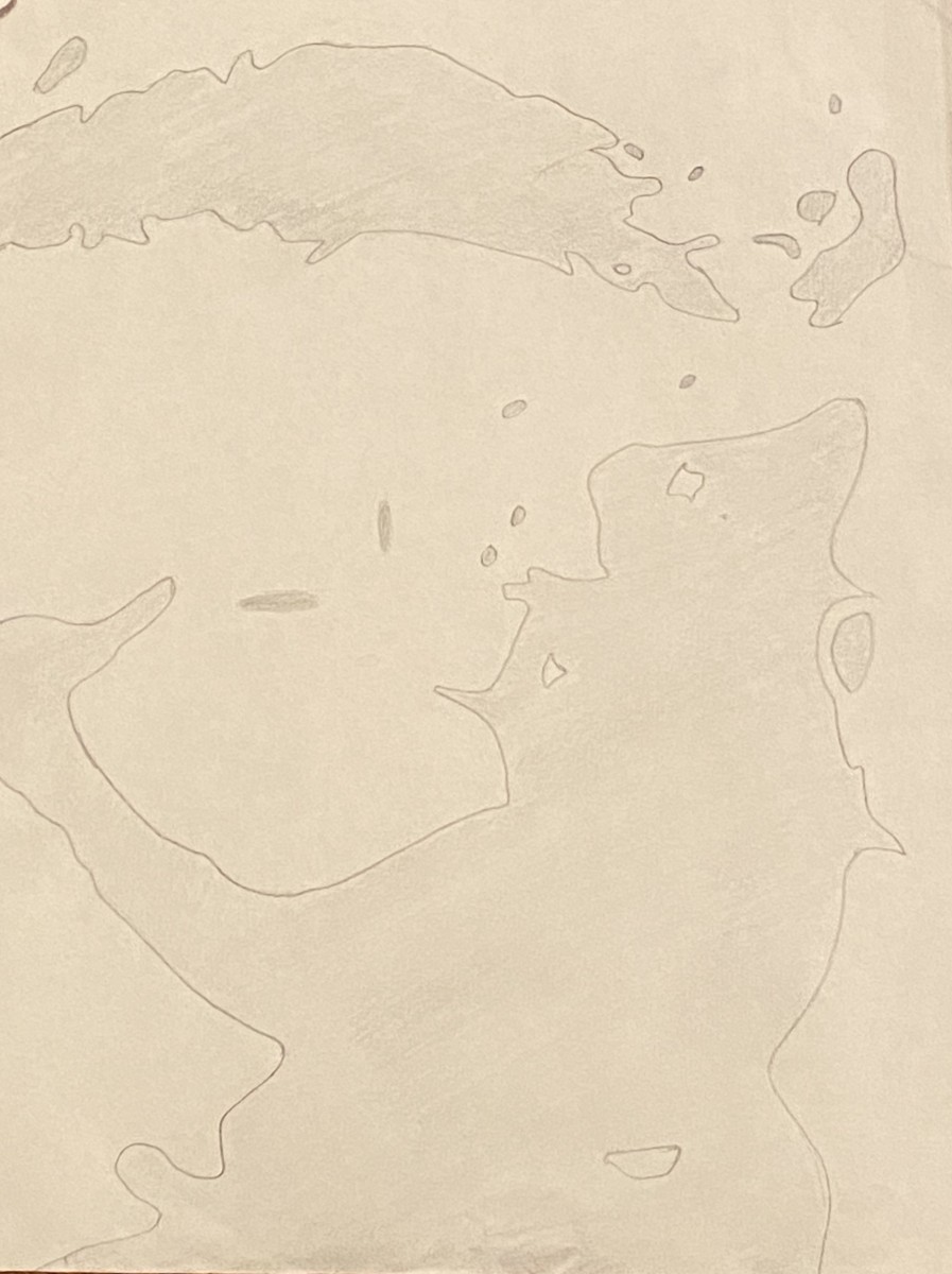
Ambiguous Refined Sketch
Obvious Sketch

Obvious Refined Sketch
Story: There are depths unknown to us. Suffocated of its gleaming blue light, the ocean now an ebony veil. A bastard with no name lurks unopposed. It is always unfortunate to hear of those missing out at sea, however. Alyona’s perilous journey is not one of those tales.
Story: The enemy never slept. We tucked in our loved ones while they loomed over our shoulders. In wisps of wind, we swore we heard nothing. Now they are at our steps, waiting.
Hello guys, gals, and gender rebel pals! Here’s the final images, inked and scanned!

Obvious
One problem I quickly encountered while inking my images was that being left handed, as well as never working with ink before, made it a really difficult process- but I managed! To get the exact shape of the image, I cut out my original sketch and used it as a stencil.
Ambiguous
This one was my favorite to do, as I found myself having more space and room to be creative and freestyle the work while also getting the original wood pattern to come out. This piece also reminds me a little bit of the album cover to Joy Division’s Unknown Pleasures with the usage of only black and white with heavy line/shape work.
https://drive.google.com/open?id=17eYLYjFBm02JS3PQ175yIBGJpAErRSyn
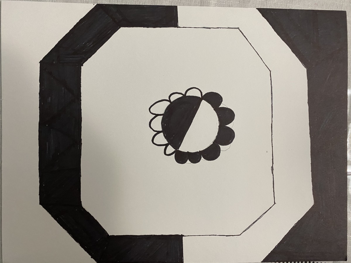
My ambiguous was inking in a way that its like a left versus right. I wanted a yin yang which makes everything pop out more. My first ink drawing was smaller and made the drawing a bit bigger so it could relate everything better. The first one had a smaller shape shows more of the outside and didn’t get the right proportions that I wanted.
After presenting I found out what I did wrong and what I could to make everything come together better, and to focus on the actual black vs white.
My obvious ink drawing started off good, but the proportions were off just a bit so I changed it while going into the Bristol. So I zoomed in on the picture and made the proportions better. From 60/40 to 70/30.
I will be editing the pictures and turning in on Tuesday
The OpenLab is an open-source, digital platform designed to support teaching and learning at City Tech (New York City College of Technology), and to promote student and faculty engagement in the intellectual and social life of the college community.

