Hey everyone! The world is ending and we’re all going to die of The Corona but at least I uploaded my project! Hooray! I am running on a blood transfusion and 3 Red Bulls but I knew I would forget to upload this in the morning so it’s going up at 1am! Am I a vampire? No but blood does have a nice taste!
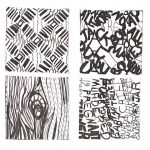
Overall- this project was a fun challenge but it’s not a challenge I want to do anytime again soon. When it came to linework I think I did pretty okay, but I really struggled with the type aspect of the project. No matter how much feedback I would get on my type, it would never seem to want to come out the way I envisioned it and that was really frustrating. The entire project had a lovely idea behind it but a horrid and ugly output on my part.
LINE / PATTERN
The mood that I got from this pattern was very groovy- very 60s, illusionist, something you would find on a rundown hotel’s carpet. I wanted to go for linework that captured a groovy, loose image while changing up the appearance of the image completely, and I actually really like how it came out.
TYPE / PATTERN
I discovered pretty quickly that working with random letters didn’t motivate me and didn’t give me enough of a challenge. I wanted to lean into the “rundown hotel in the 60s” mood I got from the pattern, so I decided to lean into that when working with the type for pattern, so I decided on the quote “All work and no play makes Jack a dull boy” while also sneaking a “REDRUM” in the end for good measure. Again, I got rundown hotel vibes from this pattern so why not use some quotes from The Shining?
LINE / TEXTURE
Out of all the ones I did, this one is my favorite. The mood I was going for was uncomfortable and uneasy, almost a little threatening, and I feel like I perfectly captured that. I loved being able to have a little more creative control over lines and how to use lines to convey color in texture compared to pattern.
TYPE / TEXTURE
This is the one out of all four that II had the most trouble with, most likely due to attempting to fit text into small lines- eventually I decided to make the text bigger and follow the flow of the line instead of the size, and I think it looks pretty okay. To keep up with my uncomfortable, threatening mood that I got from the texture, my text consists of modified lyrics from the song “Mary Turner Mary Turner” by Xiu Xiu; a song that tells the true story of a heavily pregnant women who was lynched after protesting the lynching of her husband, and while they burned her alive they cut open her stomach and proceeded to crush the skull of her baby, and left their bodies in a gravesite marked by a whiskey jar. I’m not sure why I decided to do such a political piece, but I think it has to do with me learning that lynching only officially became a federal crime in 2018, combined with going to the south for the first time and being extremely disgusted and uncomfortable with the casual racism that surrounded me in the south- even as a white person, I felt unsafe in situations where racism was heavily present, and America has a history of treating minorities, namely black people, horribly, and America will never be a country with freedom and justice for all until we understand the “for all” part.


Ugh…I wouldn’t want to do it again either LOLOL. I got frustrated, too! I can’t tell you how many times I restarted this thing (I’m so sick of looking at pasta and cubes! LOLOL), but working with type was fun – challenging, but fun. Though it didn’t turn out how you wanted it, it actually still turned out pretty awesome! It’s not a literal interpretation, which makes it way more interesting….