Author: Calvin Wang
Field Trip to AIGA
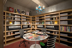
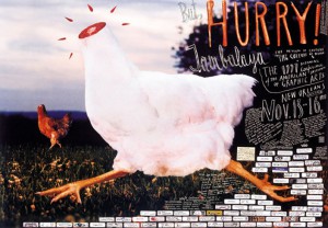
The trip to AIGA, unfortunately the gallery wasn’t up and running yet, but we had the opportunity to view some history in AIGA. We took a look at the first invitation to AIGA’s first meeting. AIGA meetings at that time were only affordable to the rich because it cost $1000 to join the program. The art and design for the invitations really catches your eye and at the same time simple. It gives off the vibe and feeling that it was going to be worth it going to the meeting. AIGA’s invitation aside we also took a look at a odd and unusually poster that got famous not because it has really good art and design kind of the opposite. It was a poster created by Stefan Sagmeister a graphic designer and creator of this headless chicken poster. This poster was created for AIGA’s 1997 Biennial conference in New Orleans. It was actually the first poster to become famous because of its odd art. What really surprised me is that such unusually, odd and unappropriated art can be listed as a famous piece in history. I find it kind of funny and interesting. It got famous because people were outraged with the art and it created a big crowd and became mainstreamed. I guess art and design isn’t just about the appearance but the attention and the unexpected We also looked at the old and new design of voting booths. The design and art of election papers, the difference between the old and new ones. Errors that changed outcomes of presidency. We also walked and took a tour into the members facility. The benefits of being a member and the resources members can use. Membership cost $50 and its only a one time payment. Overall the trip was great, we learned a lot about the art and designs and how it changed overtime. The attention art and design can bring in.
Three articles from assignment 8
“Why Coke’s David Butler is the Real Thing” from the October 2009 issue Fast
Company Magazine : http://www.fastcompany.com/1791289/masters-design-2009-why-cokes-david-butler-real-thing
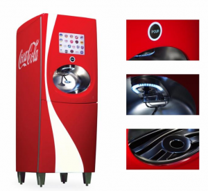
The Freestyle coke machine is actually a great idea. Although this is the first time I heard and seen such a machine. I like how its touchscreen and how simple it is to use just like an ATM. It is perfect for people like me who like mixing Sprite with Coke. The design for the machine allows the consumer to have many selections to choose from. The machine is also very appealing and the fact that it was inspired by Ferrari it makes it sound all fancy. This will be a big hit when it hits restaurants and fast food areas.
“The High Cost of Free” from the same issue of Fast Company : http://www.fastcompany.com/1353567/why-charging-just-little-can-be-smarter-charging-nothing-all
In this article it talks about why company that gives out free things is not smart. From the title “Why charging just a little can be smarter than charging nothing at all.” free is expensive, unless you are a big and successful company like Google who often gives out free program usage. Free is expensive to a company and I noticed a lot of company been trying to approach Google’s method of business by handing out free stuff. Free isn’t for every company and when approaching that method you must expect some revenue back. Imaging all the successful things companies gave out that became really popular and became mainstream, now imaging how much the companies would have made even if they just charged just a bit amount for it? Most free things has a catch, and by that I mean extra features. I am a gamer myself and I have noticed a lot of pay to play games have went free to pay, awesome right? but there will be a in-game shop that sell items that would cost real money and that’s where the company makes all its money. Same with businesses, release a new program, OS, product and you try it out and love it but want more out of it. Then they will show you what these extra features can do that can improve your product for just a small amount of additional cost.
Adobe Future is in the Past : http://bits.blogs.nytimes.com/2011/10/10/for-adobe-the-future-is-in-the-past/
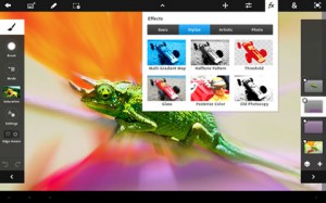
With the technology we have today the job of a graphic designer constantly gets easier and easier. Don’t get me wrong you need a set of skills and thoughtful mind to be a graphic designer and technology is one of the most important thing to graphic designers and in matter of fact important to almost any profession. With the improvement of technology new programs comes out every year it might require some training to use future improved technology. Now with these kind of programs being release on tablets and smartphones designers can do their work on the go. But with previous programs being expensive imagine how much these new programs for tablets and smartphones will cost?
Field Trip to the United Federation of Teachers
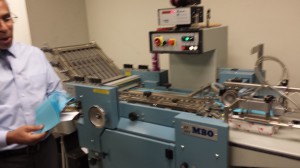
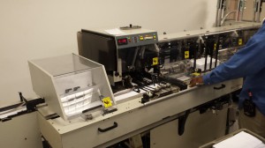
Our field trip to the United Federation of Teachers opened my mind to printing. When I entered the room filled with machines that was all related to printing just surprises me. I would have never thought printing would be this complicated and requires this much of machinery. Each machine with their own task of handling printing and performing different tasks that I would have never thought could do. I also noticed how some of the machines looked really old and is still functional. I also noticed how careful the worker were when dealing with the machines along with all the warning and safety signs posted in front of the machine. If this is how printing works imagine how crazy 3D printing will be? 3D printing will really take printing to a whole new level.
The trip really showed me a lot about printing and the many ways of printing there is. Every machine requires a person to handle it and control its function. Maybe in the far future the machines will not require a person to control its function and just has an off and on switch and a panel to edit settings. Just thinking of all the machines in the trip it really shows how technology change printing a lot. If we look back into how printing used to be and look back at today’s printing it is insane. Along with the tour we also had a really really good tour guide who guided us through different machines and gave us information and history for each machine, along with good life lessons. Overall the trip was great, gave me a different perspective in printing. Now every time I look into a magazine I would think of all the process this magazine had to go through to form this organize and well made piece of work.
“Live as if you were to die tomorrow. Learn as if you were to live forever.”
This is one of the most inspirational from Gandhi that can change ones life. The meaning behind this quote is don’t be afraid to live life and try something new, let life be the reason you are living. Gandhi points out that life is something you live to the fullness and learn throughout it. Being afraid to live and learn in life is not something a person should be doing. “Live as if you were to die tomorrow.” pushes people to do things in life they always wanted to do because their life is almost up and “Learn as if you were to live forever.” learning since you can live forever is the most important in life if you decide to live forever. Learning is not something you get bored of, rather it is something you take in. Gandhi choose the words “die tomorrow” and “live forever” to allow people to pretend there is no tomorrow and that you should do what you always wanted in life and living forever is the opportunity to learn throughout the years you live. You will never run out of things to learn if you were to live forever.
“Life isn’t about finding yourself. Life is about creating yourself.”
This quote by George Bernard Shaw that caught my eye presents to you that life isn’t something you just find and that allowing your life to be decided by something you found during the course of it isn’t enough. Shaw tells us that life is about building it, wither its education, knowledge, determination, and experience. We all start in school and move our way up to an higher education. By moving up into a higher education and creating different opportunities for us to choose in life. It is based on the opportunities we create throughout our life.
“Don’t cry because it’s over, smile because it happened”
This quote from Dr. Seuss to me means to not cry over something that occurred and cannot be changed, but be happy about it. The change in one’s life is a good thing, wither its for the better or worse. Without change in life it would be a mean less cycle reoccurring over and over. Smile is a powerful change in ones mood. Smile are used in happiness, sadness, and joy. I personally choose this quote because it reminded me of all the change that occurred in my life and how it helped me move on.
Trip to the Letterpress
Last week we went to the printing room and learned about the history of printing. We saw the Letterpress that was used over 50 years ago to product copies of materials. The Letter press require labor which means it requires the person to be psychically there to produce one copy after another. So if 100 copies is needed the person will have to manually produce 100 copies. The Letter press requires ink to be paint onto the ink plate so there will be color. Then you will have to make the plate of what you want to appear on your paper.
You turn on the machine and then put the plate on the gripper and then place a piece of paper on the gripper and when the roller touches the paper you pull the lever to make the press into the paper and pull the lever back to where it was. You then take out the paper and let the ink dry. The Letterpress was the only efficient machine that can produce massive papers at its time. Think of it was a computer printer but requires you to set up the plates used to press onto the paper, and requires labor rather then a massive machine to do the individual printing.
Dell Logo
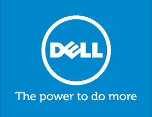
Dell’s current Logo Dell’s old Logo
The logo of a well-known company I choose for this assignment is Dell. Before I start to speak about the logo of Dell I would like to throw out some basic information on the company Dell. Dell is a leading global American company technology corporation that is located in Round Rock, Texas. The company name and logo is based of its founder, Michael Dell. Dell is currently one of the largest technology corporations in the world. The oldest Dell logo was designed in 1984 by the celebrated global strategic brand consultancy firm Siegel+Gale.
The slanted “E” in the Dell logo is suggested that it depicts the founder’s ambition to “turn the world on its ear”, and based on the history of Dell they indeed changed the way computers were processed and sold to customers. The logo immediately became popular because of Dell’s market strategy. Dell was the first technology corporation to sell computers by allowing the customers to have their computer builds the way they wanted online and then have it delivered to them. The slanted “E” in the logo stands out and allows people to recognize the logo. The current version of the Dell logo was designed by Lippincott, a famous branding agency. The logo represents the Museo typeface which was designed by Dutch type designer Jos Buivenga. The current logo was introduced towards the end of 2010. The blue ring surrounding the word Dell in the logo protects the iconic Dell logotype. The company’s new slogan is “The power to do more” is placed underneath the ring. The use of the color blue in the Dell logo signifies elegance, loyalty, reliability, confidence and intelligence.

