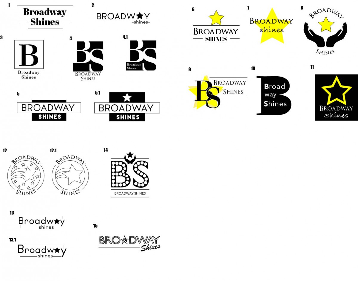
As I said in my journal entry #4 we worked on the Broadway Shines campaign where we re-brand their identity by creating a brand new logo that represent their mission statement as well as creating a website. The Broadway Shines campaign was assigned to me and Bruno to work on. Since Bruno has more experience with web design he will be the lead designer in creating the website and I will provide support for the interior and design of the website. Before the website we have to work on the logo so we can get an idea of what kind of organization Broadway Shines really is.
Our first attempt to the logos was researching on charity organizations and organizations that helps people. Our results were logos with hand gestures, hearts, trees, people/children vector arts. We also tried to incorporate the feel of the Broadway culture into it. When we presented our first batch of logos Dr. Tammie wasn’t really a big fan of vector arts of hand gestures, hearts, trees, and vector arts of people. She wanted something more simple and easy for the eyes. So we went back to the drawing board and looked up popular charity organizations with very simple and abstract logos for reference. In the end we decided to do a logotype and complete move away from logos. We played around with fonts and typography and positioning of it. In the end Dr. Tammie gave us a positive feedback on our second attempt and gave us critics to revise them.
Without the logo it is very hard to move on to the next phase. A logo is very important to an organization or to any company or branding in that sense. The logo brings out the existence of your organization and recognition. At this point we still weren’t able to pick out a logo because Stephen Daldry is a very busy man, but Dr. Tammie has a few picks in mind and will try to push him to review the logos.

