Our next assignment was to re-design the assessment handbooks covers. Tammie wanted the covers to be able to be reused for at least a few years before redesigning it again. She wanted designs that can easily be tweaked like the colors or shapes of the design.
I noticed Tammie likes simple and easy designs that allow people to quick understand “oh this is an assessment book” or “oh this is a flyer card” all based of the design. So I took this approach and did some research of how assessment handbook covers are usually designed. Then I started sketching some designs of shapes and played around with its placements around the cover.
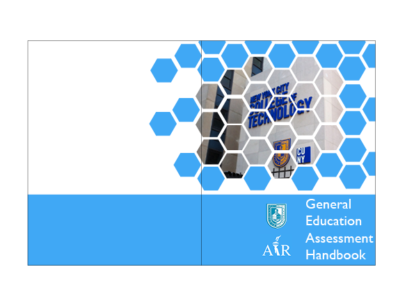
After a while I thought my designs were very generic and common which I think Tammie might be fine with it but I am a visual person. I would always look at pictures before text. So I decided to add an image to the shapes and patterns to just one of the covers just so there are so differences between the covers.
When I showed the covers to Tammie she immediately got her eyes on that one cover I used an image to. She liked that one the most cause the honeycomb shapes fits the school mascot of the bee and it was very unique. So in the end trying something different worked on in this case.

