So today we had a class field trip to The Cooper Hewitt Museum. The outside looked like an old beat up mansion, but on the inside it was very modern. I entered from the Cafe side and was kind of lost because from the Cafe there was only one pathway which leads to the Shop. So I asked one of the security guards and he told me to go past the Shop and turn right. I probably went in from the back.
When I went to the desk to purchase a ticket, the lady asked if I am here with a class and I answered yes. I paid for the ticket and she told me to listen to another lady who was already telling a small group of people the usual of the pen. The pen were basically a way to bookmark your trip of the museum so when you go home you can go online to check out the things you bookmarked.
Each floor had a huge table tablet where you can interact with it with your pen. You see create your own item and pin it as well as check out past items other people in the past created.
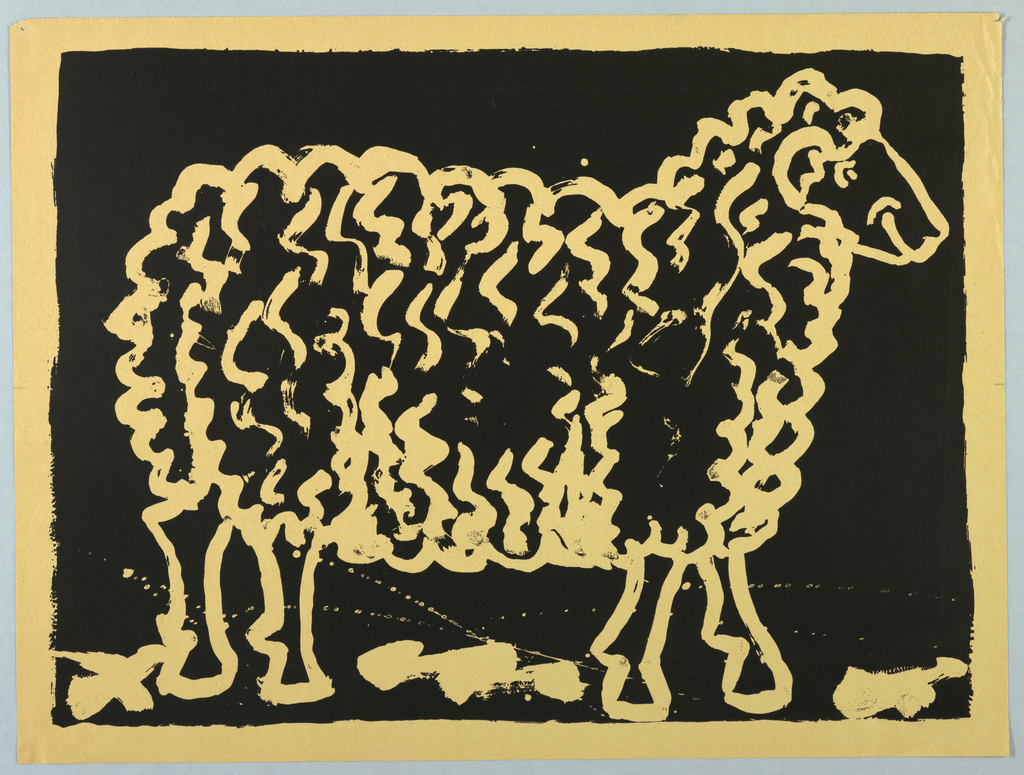
There were three pieces of work that caught my attention in the museum. The first one that caught my attention is a Sheep poster ca. 1980. It was designed by David Virgien. It is dated ca. 1980 and it was acquired it in 1993. It is a medium is screenprint on ivory paper. I love the colors used in this painting. The dull gold color used on the sheep with a black background gives attention to the eyes. Black and yellow are very common colors used together because of the high contrast both color brings out when used next to each other.

I am a very visual person so anything I see that appeals to my eyes I would put my attention towards it. Another work that caught my attention was the Ten-Panel screen, Renards (Foxes), ca. 1921-1922. It was designed by Armand-Albert Rateau. Its medium is gilt and lacquered wood, patinated bronze. I choose this piece because once again it uses very high contrast colors. At first I thought it was a chinese piece of art because it has very similar style to it. The carving in the wood is very detailed to the point where you would want to touch it. You could also see the very small added into every individual flower, leafs and animal.
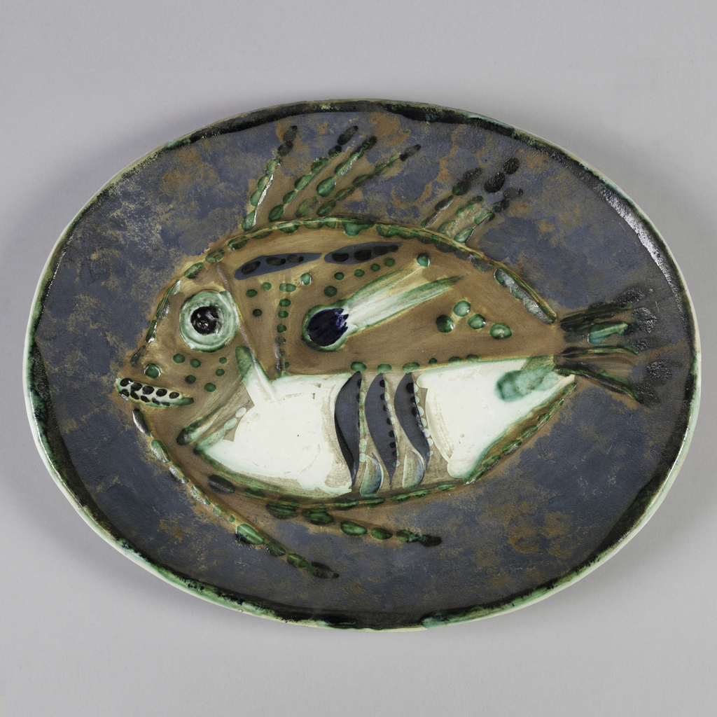
The last piece of work I want to talk about is this plate made by Pablo Picasso. It is dated ca. 1952 and was acquired in 2007. Its medium is glazed earthenware. I picked this one out cause my dad would always buy these plates for me as a kid just to encourage me to eat. The plates my dad buy for me were made from Japan and the design is very similar to this piece.

