Monthly Archives: February 2018

Hustlers

Philip Lorca- Dicorcia is one of the best photographers I ever witnessed. Photography is not just an art to capture photographs, it is an art that that tells a story. With that, we can see the sheer mastery of his work that captures that ability to tell you a story.

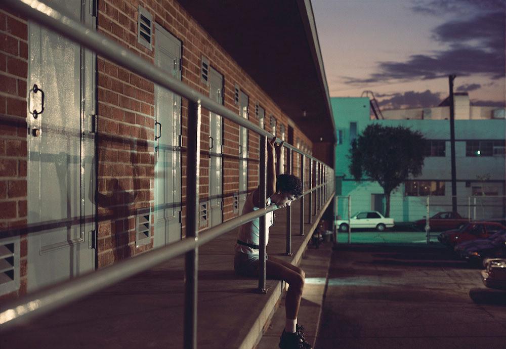
One photograph in particular from his “Hustlers” series, is the one of a man sitting at on the edge of a balcony. This mysterious man is a prostitute and the way how this photograph was set up, we can conclude some meaning behind it. The subject is sitting,looking down, with his hands grasping the rails. It makes you wonder is this man proud of what is doing, that is what explains the look of sorrow on his face. He appears to look bounded to his work, bars symbolise that seems restricted and if his line of work is the only way out of his situation. Then we have a classic play with leading lines where the railings are leading us toward the exit of the car park. Maybe that could be another way out of his situation. Not to mention the pop of flash that creates a strong shadow that is an allusion of Jesus’ crucifixion. As we all know, Jesus was persecuted and died for our sins but, the real question is, is this man ready to die for his sins?

 Philip-Lorca DiCorcia

Philip-Lorca diCorcia is a photographer that take these honest shots of men expressing themselves in true light . The style of photography that he shoots is  honest and is some what cinematic for some images taken .One of the photos from Phillip-Lorca diCorcia that captured my attention was the image of the man sitting down on the motel hallway with his chin and hands placed against the railing of  the top floor complex. What also got my attention was the calm color contrast between the greenish- blue street lights in the back ground and the warm red/ brown  tone in the foreground of the building wall. For some reason this picture represents isolation amongst the rest of the world which i believe Dicorcia was trying to convey.

Philip Lorca-diCorcia’s Hustlers

Mike, 26 years old, $40

Mike, 26 years old, $40, image courtesy of Vice.

In the 1990s, photographer Phillip Lorca-diCorcia changed photography with his series “Hustlers.”  The series depicts (what may seem like candid moments) of male prostitutes lives. However, each photo in the series was very well thought out and used studio lighting, while looking natural.

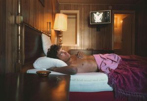
My favorite photo from the series is Mike, 26 years old, $40. The scene depicts Mike, the male prostitute lying down in a dingy motel bed as he gazes up pensively at the ceiling. This photo very much reminds me of the book Women by Charles Bukowski. It feels very 80s, due to the model’s haircut and the antiquated television in the background. The lower third of the composition is framed by the nightstand, which runs off the bottom edge of the frame to give the photo depth. It also leads us into the scene and to the model’s face. The upper third of the composition, shows a lamp, the TV, and the door to the bathroom.

The lighting arrangement of this photo creates an overall somber mood. The model’s face appears to be lit from a studio light placed at the corner of the bed adjacent to the nightstand. My reasoning for this is because of the glare you can see on the wood panel wall near the lamp in the background.


Inspiration- Philip Lorca-Dicorcia

The photograph that I chose of Philip Lorca-Dicorcia series is
Mike Vincetti, 24 years old, New York, New York. This photo shows a
man with long hair pointing out a light or maybe
showing the way to another person. The background
is perfectly working with the man style. Also, I like how
the man with long hair is the only one in the photo, because if there
were more people the photo would look busy (a lot of things going on)

In this photo the main light is on the left, giving a dramatic style
to the photo. The leather jacket and the left side of the man face look
really powerful (short light) giving him a mysterious look.
Another thing about this photo is the color of the sky. The color is
like an orange, which means that it’s almost night time or it could be
the sun rising.

Philip Lorca-Dicorcia

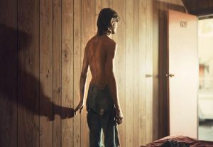
The image by Philip Lorca-Dicorcia from the series Hustlers is of a white man who stands topless in center frame with his hand touching the wall. His jeans are ripped, his skin and pants seem to be dirty. He stands with his back facing the camera but in reflective lit shadow. His hand on the wall creates a long shadow that darkens the left of the image to contrast the bright light coming from the open door on the right that he is facing. The light is strong, almost blowing out the detail on the door. It seem like the light is diffused and directed towards the torso. The subject is the middle of a light to dark gradient of the room, his skin blends well with the wooden paneled wall.

Philip-Lorca diCorcia

My favorite photo of Philip Lorca diCorcia’s hustlers’ collection is the one Chris 28 years old leaning on to the poles. The composition is really interesting to look at. Chris is looking down and holding the poles and from there you have perspective in the picture from the doors and the poles. The light is hitting on his body which casting a shadow on the wall. Chris’s positioning the head down questions where he just wondering or being thoughtful about life. There is a street where the white color car is parked has a street light which projecting the building. It is casting blue light and the wall with many doors is orange. Lorca also plays with complimentary colors. I love this image because it has everything in one frame usually having sky and two building. I feel Lorca is very curious about unusual things and then turns them into the content of the photo. I like the composition and shadows which makes it interesting to look at it.

Philip Lorca-Dicorcia

My favorite photo of Lorca-Dicorcia’s 1990 “Hustlers” collection is the one of 28-year-old Chris. First I would like to point out that compositionally you are automatically drawn to the subject because the building which vanishes towards him. There also seems to be a light shining from the direction of the photographer which is beaming against the walls. This gives you the impression that the sun might be beginning to rise. The sunrise impression is appropriate for the subject because, in the line of work that Chris is in, they are known to work through the night until morning time. As he sits on the second floor and looks down towards the ground, his face is light up from a light below which allows you to see his facial expression. His face seems to be thoughtful and gives me the impression that he might be thinking about his night, life or even lifestyle.  The body gesture of him holding on to the bars above him while his feet dangle below gives me the feeling that he is trying to hold on to something secure while he lives a pretty loose and dangerous lifestyle. The last thing I would like to mention is the building itself. I initially wanted to say that Chris is at a motel, but what I find striking is that there are no windows and the doors seem pretty industrial and heavy. These details remind me of a prison, just a door with some vents which could be a representation once again of Chris’s lifestyle.


Leibovitz and Erizku

Leibovitz and Erizku has similar subject and message delivered through their photos. They both portrays pregnant women posing for her photograph. But the setting of the picture is very different and the models look different. Demi Moore look very simple and plain in the picture. She has short hair and completely nude in the photograph. The background is very plain which puts her in the center of the picture and nothing else is fighting for the attention. On the other hand I feel like beyonce’s photo has way too many unnecessary objects all around her which takes away from the subject. I feel like the photo would be better without all the flowers in the background. The photographer put a veil over the model’s head which I think would be much more effective is the model was completely nude. I also think the photo would’ve been much better if it was taken few more weeks later.

Inspiration: Leibovitz and Erizku

The two photos of celebrities are similar and different. First of all the two portraits are pregnant celebrities. Demi Moore by Annie Lebowitz and Beyonce by Awol Erizku. The difference between these two portraits is lighting. Demi Moore is using two lights one on top and another one at the right side of the frame. Annie just tried to focus on Demi because there are no background elements. The light does justice to the portrait and the positioning of the body grabs the attention of the viewer. However, the portrait was very controversial because Demi’s nude portrait for Vanity Fair made headlines because she was seven months pregnant.

In contrast, Beyonce ‘s pregnant portrait is using natural lighting. The light didn’t give a lot of contrast on the positioning of the body. The background of flowers is distracting to focus on the portrait.  Beyonce’s expression is also not the strongest compared to Demi because she is posing with the confidence. Beyonce’s expression is very thoughtful. Also, the green veil is distracting light which is hitting on the face. It could’ve been simpler like Demi Moore’s. However, they both are different photographers. Demi is standing and Beyonce is on her knees. Although Beyonce’s portrait was not so controversial than Demi Moore because of time periods. Erizku used a lot color in the portrait but Annie had the plain background to show the light and shadows on the portrait.

Inspiration: Philip Lorca-Dicorcia

The photograph of Roy who is in his 20’s is an interesting pic. The composition looks pretty symmetrical although the stand with the lamp on top at the right side of the bed breaks the symmetry. The subjects gesture is showing a sign of being laid back, wondering what is going on with the world kind of feeling. It kind of reminds me of those scenes in the movies when the character is puzzled by his own problems. Judging by the lighting I think there are three light sources. The lamp is one, the light illuminating the left side of the bed could be artificial light or it could be a full moon shining through the window. You never know. I feel like there is a bit of diffused lighting in this scene for some reason. The lighting seems to be very soft.