Author Archives: Pamela Coca

Inspiration Gregory Heisler

The work of Gregory Heisler is really interesting because most of his photos have a lot of emotion. Like it captures the moment that a person is having. The photograph that I chose is ( ed bolszetian portrait ) What I like about this photograph is how the background light is around the old man and the black inner corners. In this photo, the face expression is on point. He looks like he’s going through some serious situation because there is a strong light on half of his face. I like how the right side of his body is dark but not so dark that you can’t see anything. That darkness is what gives this photo a more dramatic look because we can still see it in the dark.

Inspiration Richard foster

After seeing the work of Richard foster I have noticed that all of his work looks clean. He plays a lot with the lighting and controls really well the reflection of the object. He uses different colors in the background how we did in class. One of my favorite projects is the Tom Ford fragrance (Tom Ford, Jasmin Rouge). There is two bottle of fragrance. One is in the front and the other is behind. I like how he has the front bottle clearly and even you can see the glass. For the second bottle, you can’t see the bottle, but you can see a nice reflexion on black. What makes Foster a really good life photographer is how he takes the object of a product and make it interesting. Even if it is only glass. Also, his work shows how one color can be united with the product and make a more interesting concept.

Final project proposal

For our final project, I chose ” Why a cup of coffee in the morning is good for you” and the brand that I chose is Nescafe. Nescafé is a brand of coffee made by Nestlé and it has a unique blend of Arabica and Robusta. I like this kind of coffee because is easy to make, and it has a good taste. Some of the ads that I have seen from Nescafe for me they are great, but I feel like they look almost the same. I wish to change that by taking new photos and giving them my own style.

These are some of the examples that I chose for my project:


This is the first ad and my favorite that I chose as an example. I like how they took two cups of coffee and with the beans create an owl. Animals can show the emotion of a product than having people in their ad.


The second ad is really interesting because the cup of coffee has a face. I think that the lighting is perfect for this shot because it looks like the day is starting. I wish I could try that in my project. Also, the typography is good for this shot because it doesn’t disturb the photo.


For my final ad, I chose a more creative shot that it has a lot of photoshop. It has three cups and each one show the level of your coffee. It’s almost like the first ad that I chose but they have a different concept. If I create something like this I would use animals toys.


How my audience will be people who drink coffee in the morning, I will only take photos of a cup of coffee and for a dramatic look, I will try to use beans. Also, for my shot, I will use a soft light because it shows the beginning of the day.

Inspiration: Marcel Christ and Gregg Shapps

For our homework, we have to compare and contrast their work. The first photo is from Marcel Christ. He’s a short film director and still life photographer.

The work of Marcel Christ is really pleasing to see. What I like about this photo is how he took the right time to take the perfect shot. When a liquid is pouring in a glass you don’t really think that it will make cool shapes, just the water going crazy in a glass. But, in this glass is different because the milk is forming a tree shape and is totally understandable because milk is good for our bodies and this photo is like saying “milk is life”.


The second photo by Gregg Shapps ( specializing in Product/Still Life and Healthcare) is interesting because the color of the water is really blue and when we were taking photos of a glass of water our water was not blue. Somehow I think that this photo could have some photoshop because the cubes don’t look like they were inside the cup of water.


In total, I think that these photos have something in common. When they pour/drop their objects into the glass, they want that splash for the photo to look more interesting. That is the only thing I think that they have in common. Their work could look the same but they have a different concept. Base on Marcel Christ’s work, his work is more like chemistry and forming shapes with liquid. However, Gregg Shapps has already the object to take photos.


Chelsea Galleries

On February 28 we went to different exhibits and three that I chose are from the Aperture, Benrubi Gallery, and David Zwirner.


Aperture Foundation: Exhibition: Prison Nation

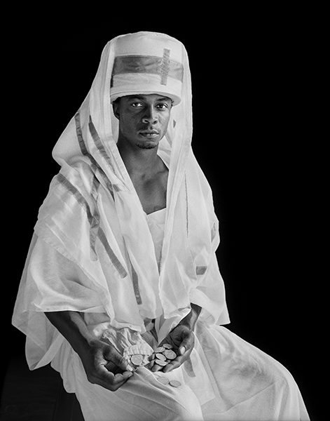
Layla “Roach” Roberts (Inquisitor), 

Photographer: Deborah Luster


I chose this photo because I think that there’s an interesting composition. The black background and the white clothing makes this photo more interesting. In this photo, I think that the man had a light 45 degrees because I can see on the right side of his face more light than the left side. Also, what makes this photo more interesting is the type of clothing that the man is wearing. He looks like some kinds of wealthy man. I feel that the kind of message that the photographer was trying to communicate is how people from those places live.


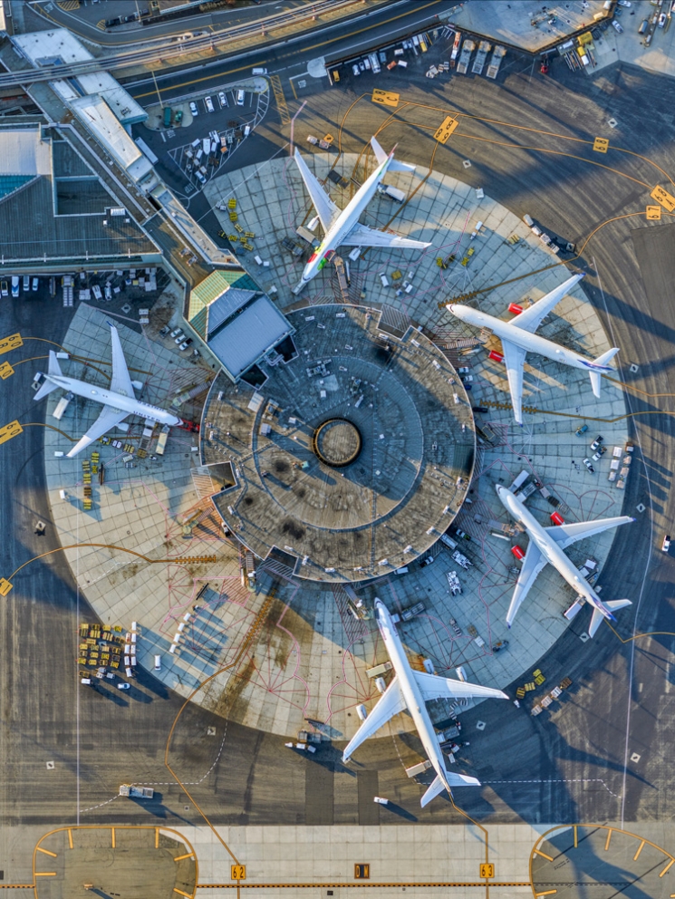
Benrubi Gallery: Exhibition: Leaning out

Photographer: Jeffrey Milstein


This photograph was one of my favorites. I love how the photographer shows us our daily life, but in a different view. I never thought how symmetrical an airport could be and how the afternoon light gives this photo a more authentic look. In our everyday life, we go to different places without thinking about our surrounding, but when you see the world in a different way even simple things like a plane, train, etc, can look amazing in photos. The shadows are important in a photo but I wish that I could see this photo without the shadows on the above-left side of the photo because I feel it would look more interesting.


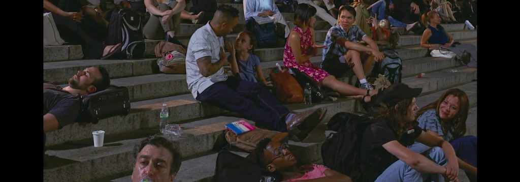
Gallery: David Zwirner

Exhibition: Scenes from the Blackout  (Photographer: Stan Douglas)

This was the last exhibition that we saw together. The first time that I saw this photo I didn’t know exactly what was it about, but when I was seeing more photos in the gallery I notice how this is how people “would react” if we had a blackout. I chose this photo because I don’t see people fighting or doing any kind of bad thing. They are just talking (some of them) and just waiting for things to go back to normal. The only thing that I don’t know is where the light on the left side is coming from (on the stairs) because if this is a blackout I feel that there is a lot of light and less shadow.

Inspiration: Michael Paul Smith

The work of Michael Paul Smith is really interesting because we can see every detail of his projects. Also, it is amazing how he can get photographs to look so real with only a compact camera. And the Last thing that I liked about his work, it’s that every project is like a challenge because every project is not the same as the others that he had worked.

For our next class, some ideas that I have to make my shoot more successful is to use depth of field and broad lighting.

Inspiration- Philip Lorca-Dicorcia

The photograph that I chose of Philip Lorca-Dicorcia series is
Mike Vincetti, 24 years old, New York, New York. This photo shows a
man with long hair pointing out a light or maybe
showing the way to another person. The background
is perfectly working with the man style. Also, I like how
the man with long hair is the only one in the photo, because if there
were more people the photo would look busy (a lot of things going on)

In this photo the main light is on the left, giving a dramatic style
to the photo. The leather jacket and the left side of the man face look
really powerful (short light) giving him a mysterious look.
Another thing about this photo is the color of the sky. The color is
like an orange, which means that it’s almost night time or it could be
the sun rising.

Inspiration: Demi Moore and Beyonce

For our homework, we have to compare and contrast two photographs. Demi Moore by Annie Lebowitz 1991 and Beyonce by Awol Erizku 2017.

Besides that these photographs are about pregnancy, they are different. The lighting, the way they look at the camera, and their surrounding. When I look at these photos I see the different locations of the lights. For example Moore’s photograph, She has three lights. The main light that is on her right side of her face, a fill light that brightens her shadow on the left, and a hair light that brightness her hair more. When it comes to Beyonce’s photo, I feel that she has more than three lights, because she doesn’t have a lot of shadows like Moore’s photograph. In my opinion, she has a light in the background because I can see the clouds and the blue color perfectly, two lights  45 degrees, a hair light, and reflectors in the front.

When it comes to the surroundings. In my opinion, the background of these photos show the different personalities of the artists. ( Demi Moore is an actress and Beyonce a singer) Moore’s photo shows a more quiet and powerful photo because of the black background and the three lights. Also, I think because this photo was in the 1991 Moore preferred this kind of style. However, Beyonce’s photo shows a more playful background with flowers and a green veil on her hair. She has a lot of colors that makes the photo more interesting.

Besides all of that, they have two things in common, and that is the placement of the hands and the pose. Their bodies are to the left and their hands touching their belly. When it comes to photos of pregnancy this is the best posture because it shows a relationship between the mother and the child.


Inspiration: Richard Avedon & Jonathan Mannion

Avedon’s work style, in my opinion, is about capturing the moment and movement. He doesn’t show a simple photo with no meaning. He shows photos with a lot of expressions. Like other photographers, Avedon had an assistant named Jonathan Mannion.

Mannion’s photograph has almost the same feel as Avedon’s work but in a different way. For example  Jay Z photograph. This photo besides that it is in black and white like Avedon’s work, it looks totally different and more modernized. The main key to this photo is the face (expressions). Without this almost angry face, it wouldn’t be same. I also think that the clothing in this photo makes Jay Z look more familiar to the 1900s, making this photo to look more like Avedon’s style.

Are there other ways in which he uses what he learned from Avedon? And the answer is yes. Mannion’s work shows a lot of movement in his work like Avedon but they have their own style.

Inspiration ( Yousuf Karsh & Nadav Kander)

For my new assignment, I have to talk about two great photographers. Yousuf Karsh, a photographer from the 20th Century and Nadav Kander, a photographer from the modern days.

Yousuf Karsh, Armenian Canadian photographer known for his famous portraits like Albert Einstein and others famous people. The work of Karsh is really interesting because even if he had everything in black and white you could see the photos perfectly. For example the portrait of Albert Einstein. In Einstein’s photo, the background is dark and even his shirt is dark, but just because he had a really strong light on his face, that’s what makes a photo powerful. Lighting can be tricky and it is possible that you might get a lot of bad photos, but when you get the right spot, everything will get its place. For Karsh’s work, I also will have to say that his photos are based on facial expression more than the body.

Besides Karsh’s photographs, Nadav Kander’s photographs give me a different feeling. Kander is a London Photographer who takes photographs of famous modern people. He has a lot of different photos with color and without color. Some of the photos have people with plenty of makeup and some with none. Also, his work is based on the face and the body. Something totally different to Karsh’s photographs. The facial expression is important in a photo and it’s even better when you can get the right pose for that photo. Also, Kander’s work shows not only bright colors but, different cool tones and blurry photos.

One portrait that I love is from Nadav Kander “Missy Elliot, 2006”. This is one of my favorite portraits because you can only see half of her face in the dark and those bright green and yellow colors.

For this new semester, my goal is to take better portrait photos because I know that I have the potential to do it.