Author Archives: Rosanna H.

Richard Foster

After taking a look at Richard Foster’s work, the ones who really stood out to me were the ones of fragrances. He uses the colorful reflections of the fragrances as an elemental design in his work. The shadow is in color instead of the usual black shadow. The composition of his background typically depends on the shape of the fragrance bottle.


In the Tom Ford Fragrance shot, the main light is coming from the left side and is pointing slightly up to cause the colorful shadow on the white “mirror”. There also is a backlight to successfully separate the fragrance from the background.


In the Richard Foster Bottega fragrance, the light seems to be coming from the back of the product. This then forms a colorful shadow in front of the fragrance. The shot itself is taken from above at an angle to be able to capture the shadow.


In the last Tom Ford fragrance shoot, the lighting seems to be coming from the left side up above. This then causes a shadow on the other side of the fragrance which gets bent down due to the edge of the table or platform. There is also a fill light in front of the product which allows the viewer to see the front of the fragrance along with the name.

Michael Paul Smith

It is always intriguing to see how people make their passions a reality, especially those that are not very common. Before Michael became a model maker and photographer he had a list of continuous jobs. He stated that you will learn from everything you do in life and eventually use it. I can not agree with this more, sometimes in life, we do or learn things that we feel we will never use again but to our surprise eventually, we do. His mailman job led him to an understanding of how towns were built and it allowed him to understand where to photograph his models. The most impressive thing about Michael is that he is no fancy photographer with fancy gear. He uses a standard handheld digital camera and natural light. The light ranges from a standard desk lamp or light shining through a window. Michael uses forced perspective to create his backgrounds. Even though he was not technically trained, Michael relied heavily on his eyes to create the desired perspectives. This was a reminder of how important understanding the basics is.

Gregory Heisler

It was very interesting to see the work of Gregory Heisler. He is very talented and is able to range his composition from traditional portraits to fun an whimsical. The portraits that really stood out to me were the ones of the miners. Immediately I notice that there is a light that flashes right in front of him because there is barely any shadow. The only shadow visible is on the left-hand side which is probably caused by the tilt of his head. The lighting choices allow you to see the details on the miner’s face which look worn down due to his profession. The subject’s eyes are squinting as if he is looking directly at you expressing his hardships. There is also a light coming from above which is highlighting his hat. I greatly enjoyed looking at Heisler’s work and look forward to following him from here on out.

Glass Photos

In the glass photo of Marcel Christ it seems like the photo is taken from a lower angle. The glass is light up evenly all around allowing you to be able to see through the glass clearly. The milk splash was definitely photoshopped in to look like a tree (which I’m guessing it is to give an organic feel). Tha background is well light to give a bright optimistic outlook on the milk product.

In the photo by Gregg Schnapps, the glass is shot against a colorful background which gives the photo a little more playful atmosphere. This was a good choice given the product in focus which is a Rubix cube toy. The background is also lit in order to be able to properly separate the glass from the background. The photo is taken head-on with the glass allowing you to see right through the glass. There is also a light placed 45 degrees over the glass which causes a shadow under it. The third light is set up above the hand in order to bring it into focus.

Even though both photographers focus on movement in the glassware, they are very different in moods and shoot set up. I was able to find more of Marcel’s work but unfortunately, I wasn’t able to find more of Gregg Schnapps so couldn’t make more of a comparison.


Final Project Proposal

My final project will be bringing awareness to gum etiquette. I will do this by photographing people blowing, chewing and playing with their gum. The tagline will state “gum criminals” and followed by “the obnoxious gum popper” of the “uncontrollable gum blower”. It basically brings focus to all the things people do with gum that annoy others. Fist I will photograph in a light background studio, people looking “bad ass” while chewing gum and some of someone flirtatiously playing with their gum. The other photos will consist of a profile view of people blowing gum. The version will be of a dark background with someone popping a bubble gum bubble in peoples ear. The only light shining will be on the subjects faces.


Chelsea Galleries

The Chelsea Galleries was an interesting experience. There were a few exhibits that fell short of my expectations but there was definitely many that I greatly enjoyed.

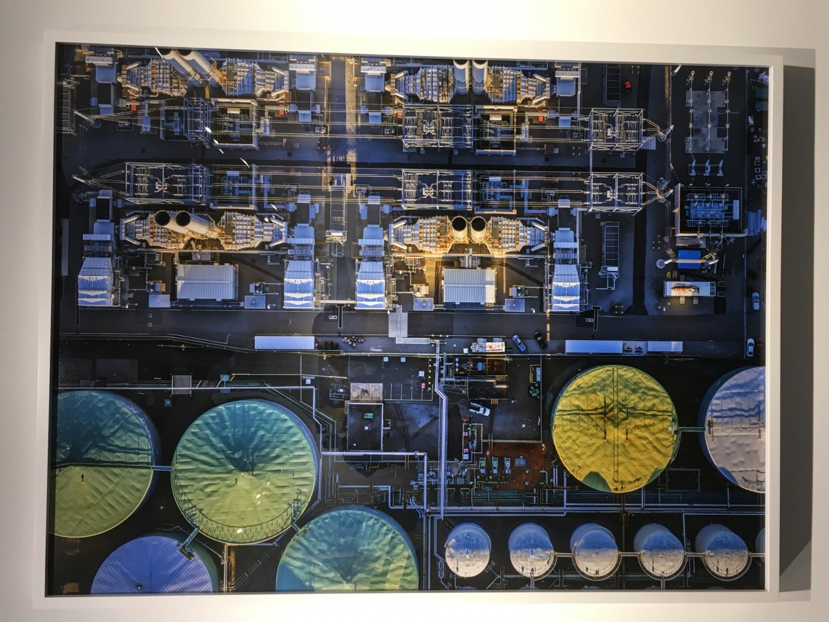
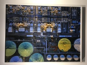
The Leaning Out exhibit at the Benrubi Gallery was one of the first exhibits that really spoke to me. Jeffrey Milstein clearly took time to find the perfect angle and location to snap his ariel pictures of industrial sites. His photos are full of symmetry and patterns which are very appealing to the eye. In the chaos of the busy images, you are able to filter out the noise and get a real sense of the 21st-century life which is heavily polluted with industrial materials. Whether this is a good thing or bad thing is subjectively up to the viewer. The colors captivated in the image also promote this conflicting idea as seen in the photo below. Even though this is an industrial site, the light seems to be taken when the sun is setting or rising and the reflection off of the metal is very captivating and to me kind of calming.

Industrial Site


Another exhibit I enjoyed was Facades – Grand Tour at the Yossi Milo Gallery. The main reason I enjoyed this one is because I previously was an architect major and really enjoy the beauty of buildings and structures. Every time we look at a big building we mainly only get an obstructed perspective and never the full view. Markus Brunetti was able to capture his buildings from a straightforward perspective without any line of sight obstructions. This is a view we rarely get to see. I was impressed with his determination to photograph so many detail shots and then take the time to manipulate them in photoshop to get perspective he was going for. The buildings he chose also had a great use of color which appeals to the eye along with symmetry as well. Displaying these photos on the scale that he did was also appealing because I think he was trying to mimic the actual feeling of when you are standing next to these structures. My favorite building is attached below.

Druskininkai, Visų liūdinčiųjų Džiaugsmas cerkvė


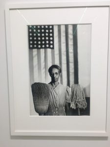
The last exhibit I enjoyed was the one of Gordon Parks exhibit. This is because I appreciated his motivation to bring awareness to the lives of blacks in the 1940’s. He uses high contrast in his photos for impact and to bring focus to his main subject. Another thing he does is use his background for support in his message. For example, in the photo of Ella Watson (down below), you see her standing in front of an American flag which represents the American dream. Unfortunately, she is frowning and is holding a broom and mop which to me represents that the American dream is not all it is believed to be. It is also a reference to the American Gothic painting by Grant Wood. Overall this exhibit did leave an impression on me.

Ella Watson


Philip Lorca-Dicorcia

My favorite photo of Lorca-Dicorcia’s 1990 “Hustlers” collection is the one of 28-year-old Chris. First I would like to point out that compositionally you are automatically drawn to the subject because the building which vanishes towards him. There also seems to be a light shining from the direction of the photographer which is beaming against the walls. This gives you the impression that the sun might be beginning to rise. The sunrise impression is appropriate for the subject because, in the line of work that Chris is in, they are known to work through the night until morning time. As he sits on the second floor and looks down towards the ground, his face is light up from a light below which allows you to see his facial expression. His face seems to be thoughtful and gives me the impression that he might be thinking about his night, life or even lifestyle.  The body gesture of him holding on to the bars above him while his feet dangle below gives me the feeling that he is trying to hold on to something secure while he lives a pretty loose and dangerous lifestyle. The last thing I would like to mention is the building itself. I initially wanted to say that Chris is at a motel, but what I find striking is that there are no windows and the doors seem pretty industrial and heavy. These details remind me of a prison, just a door with some vents which could be a representation once again of Chris’s lifestyle.


Leibovitz and Erizku

One of Leibovitz most famed portraits was the one of Demi Moore during her pregnancy. This was due to the nude nature which was groundbreaking during its time. Some people supported the beauty of her pregnant body and others opposed it and considered it to be pornographic. In my opinion, the photo is absolutely stunning! Leibovitz uses a classical setup in which he has a plain black background. Using a broad light setup, she places the main light above her left shoulder and shines it down on her face. She then places a very light fill light on the other side and probably a very dim backlight to separate her from the background. This lighting creates a beautiful contrast with Demi’s curves and most importantly her baby bump. Moore looks like she is glowing and she represents the raw natural beauty of pregnancy.

Erizku took a completely different approach with his also popularized pregnancy shoot of Beyonce. Erizku stages his shoot with a backdrop of flowers and a bed of earthy greens. The shoot is very colorful and playful. He also places a veil over her head which to me makes a representation of the Virgin Mary, which I must say I find a little odd. In order to highlight the colorful backdrop, Erizku uses Rembrandt lighting. It seems like the lighting is head on and the fill-in lights are strong enough to remove any shadows. There may also be a background light lighting up the blue sky. Beyonce’s pregnancy portrait depicts the more cheerful whimsical of giving life.

Avedon and Mannion

Avedon was an American portrait and fashion photographer. He is a very successful photographer because he has the ability to reveal true character in his photos. He does this by using high contrast, using high exposure on the face and keeping the shadows very dark. When he uses the high exposure the face, he captures very fine details that reveal some character. He is also able to capture emotion through the subjects facial expressions. I find this very intriguing because being able to capture an emotion at its peak is hard to do. I particularly enjoy his self-portrait which conveys a unique brilliance.

You can clearly see the influence of Avedon’s work in Mannion’s portraits. Although he has a similar style, Mannion has a more modern look. In the Jay Z portrait, Mannion uses the traditional white background in order to create a high contrast with Jay Z’s black suit. There is also light shining on Jay Z’s face which highlights his face in great detail. Also, Mannion was able to capture the well known Jay Z character which is determined and strong-willed.

Kander and Karsh

Yousef Karsh is a 20th Century American-Canadian photographer is well known for photographing celebrity and prominent figures of his time. Wilson Churchill, John F Kennedy, Martin Luther King and Queen Elizabeth II are just to name a few. He was particularly successful in his portraiture because he used dramatic composition to convey a particular perception of his subject. He accomplished the dramatic composition by using a high contrast in lighting for strong political figures such as my favorite of Dr. Martin Luther King. The light is directly placed on his face as he looks up to the sky because it is a representation of his high hopes and dreams of the future. The dramatic contrast is a representation of the song figure that Mr. King was in our American history. Karsh also photographs Mr. King in his University robes with books in the background in order to portray how well educated he was. When he photographed Queen Elizabeth II, he photographs her in a soft light because she is to be seen more as a loving motherly figure. Overall Karsh very successfully uses lighting and background display to create a classic portrait style.

Nada Kander is a British-Israeli photographer well known for his portraitures and landscapes. His passion for photography began at the age of 13 when he bought himself his first Pentax camera. Kander’s style is a little more modern in that his portraiture is more playful and not as serious as Karsh. The portrait of Mark Rylance immediately caught my attention. Kanders’ use of soft light and heavy use of shadows creates a sense of mystery. Even though Mark is in the dark, the candle he is holding draws you towards him and wanting to see more of him. I believe Kander chose to photograph him this way because it is a representation of Mr. Rylance profession which is a play writer. He is technically never in the spotlight but ultimately his creativity is the fire to all his works. I have never heard of Nada Kander until this assignment but I am glad I did because he is someone I would definitely look for inspiration from.