Topic Four: Headphones Ad and Hearing Loss Campaign

1. Brand Identity :
Our group is using a pair of Turtle Beach headphones as the brand for our photos. Turtle Beach is a headphones brand that caters to mainly gaming and also music as well. It’s one of the fan favorite gaming headset brands for game console like the Xbox One and PS4. Turtle Beach headsets are the popular to use for video game tournaments and online gaming. While also using them, their more advanced headphones give the feature of “superhuman hearing”, enhancing your hearing of the game while playing it.

The hearing loss campaign in New York City helps provides the ads like “Hear Today. Gone Tomorrow”, as well as cater the campaign to the ages of 18 to 44 demographic that mainly uses headphones for music. They also give the message of knowing the signs of hearing loss, being careful with the volume on your device, take breaks, turn down the volume when needed and if anything asking your doctors about hearing loss and how to prevent it.

2. Communication Problems :
For this brand, there isn’t really no main campaigns for this brand of headphones at all. I feel like their should be a easygoing and glowing campaign for headphones of this style, especially if it caters to gamers and mainly the younger demographic of gamers (ages 13-25)(Ad 1, Ad 2). For both the headphone ad and hearing loss campaign, It should communicate a bright and solid lighting and modeling to bring to life the message.

3. Image Ideas:

As an idea, the headphone ad should show the headphones as a big stage in headphone technology. for the hearing loss campaign, we can pitch the idea of taking pics to give the campaign a message to keep your ears healthy to turn down the volume on your headphones to benefit your hearing.


Topic 4: Headphones and hearing loss

 1. Summary

Brand identity
Our group is using a pair of WESC headphones for our photos. WESC is short for We Are the Superlative Conspiracy and is a Stockholm-based company mainly focusing on clothes. They get inspiration from snowboard and skateboard culture and are focusing on reaching a younger audience with the style of the headphones being very hip and in bright, vibrant colors. WESC has a NYC store and teamed up with hip hop music producer Dante Ross to make a set of premium headphones, as well as teaming up with NYC skate shop owner Amy Gunther for a special pair of WESC headphones that she was featured in the ads for. (Ad 1, Ad 2.) The copy for these ads read:

WESC – © WeAretheSuperlativeConspiracy
Even a good listener is usually thinking of something else, but this time they won’t. Through the core of science and the biggest bag of love WeSC brings the freshest headphones ever. All designed to fit the individual as much as the lifestyle. Feel at home grooving with us. Your ears have never looked sexier. Weactivists – Ray Barbee, Chris Pastras & Amy Gunther

Public service campaign
The ads were part of a campaign sponsored by the New York City Department of Health and Mental Hygiene in 2013. The ads said “Hear today. Gone tomorrow”, where the first part shows a close-up photo of an ear with earplugs, and the next photo is another close-up showing an ear where the earphones are switched out with a hearing aid. The tagline of the campaign is “Turn down your music before you can’t hear it anymore.” It’s a powerful message, and the target audience for this ad should in my opinion be teenagers and young adults, from 13-23, to establish good listening habits early. The campaign advised people to not listen to music over 85 decibel as it can damage your hearing over the long run. The article gives advice as to what signs to look for that would be an indication that your hearing is getting worse (you have to turn up the sound on the TV, you can’t follow a conversation etc), and says that if you want to keep listening to music in the future, you should turn down the music now.

2. Communication Problem
Headphone ad: Inspired by the copy from their ads, I think the ads should communicate how these headphones are so great, you won’t be thinking about anything else. You’ll zone into the music. It’s also important to communicate how fresh and cool they’ll make you look.

Public service campaign: The ad should clearly communicate that one of the people in the ad is hard of hearing, the sad/frustrating emotions connected to hearing loss, and how the person is now excluded from conversations and from enjoying music the same way as before. It should communicate this in a powerful way that would inspire the target audience to change their headphone habits.
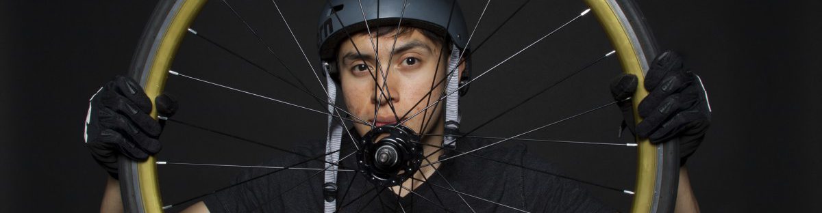
3. Image Ideas
Headphone ad – It should show someone who is completely absorbed in the music, smiling, perhaps dancing. Or it could be someone laying on the ground listening to music with a smile on their face, maybe their eyes closed, totally zoned into the music. The lighting should be bright and cheerful and wardrobe should be young and cool but not too vibrant since the headphones should stand out.

Public service campaign – One idea could be for two people to be talking to each other, where the hard of hearing person has to lean in to hear what the other person is saying. The hard of hearing person could be in the dark while the hearing person is in the light. It could also be a photo of just the person who can’t hear, lighted in a dark way, showing the person as sad and frustrated about the loss of hearing.

4. Results
I think the results for the headphone ad came out pretty successful and in terms with the image ideas I had of a person dancing while getting lost in the music – something that connects to the copy of the WESC headphone ads.

For the hearing loss ad, we could have tried more dramatic lighting and we weren’t successful in putting the person with hearing loss in darker lighting/in the shadow, but I think the idea of the headphones being unplugged works well, although I think the plug should have been more in focus and sharper.

Album with 20+ photos 
Hearing loss ad
Headphones ad

Topic Four: Headphones

Brand Identity

WeSC is a Swedish clothing brand that is influenced by sports such as skateboarding and snowboarding. There main office is located in Stockholm and their name stands for “We are the Superlative Conspiracy”. This brand brings observation to Swedish underground artist, musicians, skateboarders and has a very mainstream vibe. Looking at their campaign ads, I could tell this company was European. Their design aesthetics are clean, but also recognizable to our current trend in graphic culture. They use line weights with bold text demonstrating that  they are up to date and very stylish. The colors they use in some campaigns are vibrant. I believe the target audience varies from 16-30 years old.

Summary of NYC Public Service Campaign on Hearing Loss

The article states a series of ads that were appeared in NYC subway cars targeting New Yorkers who turn up the volume of their personal listening devices. The tagline of the campaign is “Turn down your music before you can’t hear it anymore” advising us to not listen to above 85 decibels at a regular basis because you put yourself at risk from permanent hearing loss. It tells us that if we want to listen to music in the future, we need to be careful in how we maximize our volume to drown out external noise. There was a survey released in JULY 2013 stating that New Yorkers from ages 18 to 44 admitted to heavy headphone use and have reported to have hearing problems. The article also gives us some pointers to go by using volume-limiting features on your personal listening devices as well as knowing the early signs of hearing loss. For example, if you need to increasingly turn up the volume on a TV or any media or if you experience ringing in your ears. It’s best to go and ask a doctor for a hearing test.

Image Ideas

I would do a lot of different shots from close-up to medium shots. I want to capture a sense of stillness and sophistication. I want to use great lighting for the shots and maybe some darker once to show a sense of allure. The expressions might be serious rather than playful. For the wardrobe, I am thinking of a very liberal and bohemian vibe. For these two different image, I would play around with the lighting so for the hearing loss its going to be super simplistic. I would maybe do profile shots as well as a close up of the ear and do various shots of a person enjoying the blast of the music and then show the emotion of the person who lost their hearing.

Topic 4: Headphones

  1. The headphones I will be using are JVC gummy headphones. JVC offers professional electronics products.  JVC is a leading developer of sophisticated audio and video products. JVC uses superior technologies to deliver high quality sound and images. For this project my target audience will be young adults. The public service campaign for hearing loss, “Hear Today, Gone Tomorrow. Turn down your music before you can’t hear it anymore,” is trying to aware people of the use of headphones and loud sounds. It is trying to tell you to reduce the volume of your headphones and never listen to the maximum volume, this is what a lot of young adults do. Young adults try to drown out external noise by using music and headphones not really considering the outcome later on in life. This campaign is just trying to spread awareness on it.
  2.  Headphone ad: Try to be in a good/happy mood. Zoned out by the music, “in the zone.” for Hearing Loss ad: In a much more serious mood, with no smile.
  3. Headphone ad: Lighting will be bright and clear, happy expression, casual wardrobe (listening to music on the train.) Hearing Loss ad: black and white or dark photo (use of shadows). depressing, straight face.

Results Headphone JVS: I feel like this image was successful. It showed a sense of unity and happiness which was what i was aiming for originally.

Results Hearing Loss: I also think the image was successful for this one. I feel like the sense of motion worked well with this ad. It was dark and unhappy which was what I wanted for this shoot.

Health Care for All

  1. After researching on health care companies, I noticed a lot of their portraits are with people smiling, looking healthy, shows diversity and family.  The lighting is well light in either taken in studio with a plain background, hospital that is bright or outdoors in nature.
  2. The images should should happy healthy people.
  3. My photographs with show people being together, smiling in healthiness and proud of being alive and well.
  4. The result was great. I captured a natural and not forced smile from my model. Also the lighting was evenly lit.

Topic Four: Headphones

Description of the brand:  Bose is a one of the biggest companies specializing in audio equipment. The company was established in 1964 and it is well know for its speakers, home audio systems, noise cancelling and wireless headphones, professional audio systems and car sound systems. The target audience: everyone who can afford it. Regular headphones price is around 150$, audio systems price can get to 5000$ and up. For this project I am going to advertise wireless headphones and include the tagline “Wireless music deserves Bose”.

PSC Hearing Loss:  “Hear Today, Gone Tomorrow. Turn down your music before you can’t hear it anymore.” According to WebMD hearing loss is the third most common health problem in the U.S. Now this is problem not only senior people but young as well. Age range of people struggling  with hearing problem is from 18 to 45 years. Listening loud music constantly can bring the hearing loss.

Intention: Bose. Show the wireless feature, clean and minimalist design of headphones. PSC. Show the consequences from listening loud music, hearing loss.

Image ideas: For Bose using a lot of lights, positive images. Wireless = comfort = happiness. For PSC using less lights, using shadows and darkness for negative expressions. Headphones or a wire like a symbol and cause of the problem

Result: In spit of the technical challenges with the camera I am pretty satisfied with the result. It took some time to find right settings for the camera and to set up the light. For first part of the project I used positive attitude and I think the dancing pose complements my concept. I decided to use Bose logo in unusual place  and I think it caches the attention well. Also, the Bose ad looks clean and it fits the general style for all company’s campaigns. For the second part of the project we set up dramatic light and I really like how  headphones were used in negative way. The loop from the wire on the ear was an allegory for possible bad outcome of overusing headphones. For the body copy I used transparency tool which made it blend with the background. With the low contrast between body copy and background the image speaks first.


Topic Four: Headphones

Brand Summary: I’ve chosen to use Skullcandy headphones for this particular project. Since the beginning of Skullcandy, they’ve always marketed their colorful, street-art inspired headphones to people who are physically active. This includes skateboarders, snowboarders, skaters, etc. With every product release, they release a plethora of colors which appeal to their demographic. Skullcandy makes both over-ear headphones and inner-ear headphones. Lastly, I’ve chosen their brand because I’ve been a Skullcandy user for nearly a decade now.

PSA Summary: Essentially, young adults are listening to music using headphones three times as much as older individuals. Also, young adults who report heavy headphone use also report more hearing problems.

Image Ideas: To promote Skullcandy, my idea is to have a partner posing with the headphones and enjoying them. The subject must be “in the zone” and visibly smiling. Skullcandy’s ads are always vibrant and energetic, so my photography must reflect that.

Result: The lighting setup was tricky to perfect. My group had to use a large black board to block the light seeping from the ceiling lights above the computers. In addition, the camera settings were also a challenge to get right. I don’t have much experience using the light meter but I’m learning more and more about it with every class.

In terms of shooting the photography, I loved that we had the option to shoot in either a white or black background. I decided to use the black background for my hearing lose ad and the white background for the Skullcandy ad. This is simply because the different backgrounds convey different moods, tones, and attitudes.

Headphones and Hearing Loss

Brand Summary: Skullcandy is a brand that has a distinctive name that stands out on its own, but that’s not all it has going for it. Being specialized for Bluetooth, Skullcandy headphones allow one to  listen to music while having full functionality of their smartphone, all in one convenient unit. The audio quality is also a “treat” for the ears, hence the name of the company.

PSA Summary: People who use headphones regularly are experiencing hearing loss due to excessive volume, aging as young as 18 to 44, and the article urges regulation of use to preserve one’s hearing.

Intention: Provide emphasis on Skullcandy’s compact design and convenient features, in addition to its quality of sound. For the PSA, stress the importance of moderation in use so as to not cause irreparable damage to one’s hearing.

Image Ideas: For Skullcandy, photographs of my subject multitasking while “listening” to their music come to mind. For the PSA, images of the headphones half-on a person still struggling to hear a conversation manifest.

Results: Despite some troublesome technical difficulties, I think the shoot went well. The exercise in lighting ratios was juxtaposed very well with a practice in mood lighting. 1:1 ratio lighting was very flattering for an ad, and it would have complimented many products, not just headphones. The moodiness that more uneven ratios created, in addition to a dark background, definitely works well with a foreboding and cautioning PSA.

Topic 3: Health Care For All

After looking at various health care websites such as Fidelis Care and Aetna to name a few, I realized the Portrait photograph style was used. Images that is family related were used to showcase health care. Portraits of father and son, mother and daughter, husband and wife all with smiling faces, vibrant with life, happiness and contentment reflected on their face. Another aspect of the photographs used is the lighting factor that was used from different angles to achieve the desire effect to communicate a specific message that one should join that health group. The faces and body of the subjects were flood with light that allowed them to stand out. Allowing the on looker to really pay close attention to the image.

Communication Problem: Every image sends a message, thus I believe the image that is used to promote the Health Care For All company is one that shows vibrant, active life, happiness, contentment, and a brilliant smile.

Image Ideas: Portrait of a healthy, smiling, and overall happy person that reflects a life that is pleasant and enjoyable. Props can be used. I may or may not.

Results: I’m happy with the images. And I believe that my group was able to communicate the intended message. We played with various lighting technique such as Rembrant and Butterfly and was able to generate the effect needed to capture lots of amazing portraits.

Topic Three: Health Care for All

Summary: Firstly, the companies I viewed were Anthem, United Health Group, and Aetna. After scrolling through several health care company sites, I began to notice a striking similarity between them. All of the company websites contained extremely positive photographs. This includes people smiling, looking up towards the sun, and doing energetic activities. In addition, adults were often seen playing with their children. In terms of lighting, almost all photographs seemed to be very bright. This creates an enlightened feeling in my opinion.

Communication Problem: In terms of promoting Health Care for All, I believe the image must express a feeling of self-worth. The image should show an individual doing what they like to do, whether it be hiking, reading a book, painting, or even laughing.

Image Ideas: I’d like to capture an image of an individual happily reading a book. But my image idea will vary depending on props that can be used.

Results: My initial plan was to have a partner happily reading a book. This would radiate a feeling of joy, relaxation, and comfort. Nonetheless, it may look too much like a promotional advertisement for a local library more than a HealthCare ad. So in that case, I chose to use an image of my three partners. Considering they’re of various races, I thought this would describe “healthcare for all” perfectly.