COMD3504 - Section OL69 - Spring 2022

Author: Sadman Hafiz (Page 2 of 3)

Sadman Hafiz- Week 7 Response

McLuhan argues that society and people are more shaped by the form of media than the content of the communication that it delivers. McLuhan also describes technology and media as “extension of man”. Media is a very powerful source of communication, information, etc. but it’s also very complicated. According to McLuhan any form of media is an extension of human capability, it affects not only our way of thinking but also the way we interact and communicate. Media can easily alter our perspective of the world by altering the true message that it was supposed to project or deliver. It extends our capabilities because we gain certain knowledge by experiencing new things on the media but it’s not always a good or a true one.

Technological progress continues to produce new forms of media through which we communicate. What makes the form of technology media bad or good depends on how the users use it and view the messages in it. We often think that media such as the news are always giving us correct information but in general, this information often goes through several sociological and political aesthetics, these media produce information that they think is correct so often times this information is completely altered. This progress in technology media is also taking away our privacy as we continue to share information about ourselves through these mediums, it’s very risky and can cause severe problems in later life. We enjoy seeing memes about people and information that exposes them, but when it comes to us we realize how disgraceful and harsh it can be when our privacy is known by people who we don’t even know. This reminds me of the “South Park” episode “Lemmiwinks” where which shows how people can even commit suicide due to this information leakage on technology media. Through this, it changes our mentality and the ability to think and makes us act a certain way. It depends clearly on us to understand what actually is true and real using our instincts and our own thinking.

McLuhan believes that medium is the message and language is a form of a medium that communicates without any specific shapes. Similar to that as designers we create new communication methods through our designs which are independent and have no specific form or shape. Thus, our designs and arts themselves are forms of the medium that communicate in our language, it contains our feelings, our way of thinking, and expressions. As artists and designers, our goal is to use different mediums in a way that does not alter our works and which will show and present us as who we are in the real world.
Sadman Hafiz- Week 6 Response

For Jan Tschichold typography was all about clarity and simplicity. In The New Typography, Tischichold mentions that typography is a form of communication and a language thus it is very important to take this into consideration while creating typographic designs. According to Tischichold, “The essence of the New Typography is clarity. This puts it into deliberate opposition to the old typography whose aim was “beauty” and whose clarity did not attain the high level we require today” this is very accurate; typography is something that is used everywhere in every era as a form of communication and language. It is very important for the typography to reach the highest level of clarity so it can be understood by every individual regardless of age, tradition, ethnicity, and country. Old typography was all about beauty which was making it lose its purpose and effectiveness. Tischichold also stated that “typographic form must be organic, it must evolve from the nature of the text.” Tisschichold believes achieving a clear and unambiguous form while maintaining beauty is possible when the organic basis of the typography is kept the same because these organic forms are the marks through which the letters are understood by the audience. If these forms were lost then there will be no point in typography designs.

One of the amazing points that Karl Gerstner made in this reading was the description of the problem being a key ingredient to the solution itself. Gerstner mentions “To describe the problem is part of the solution. This implies: not to make creative decisions as prompted by feeling but by intellectual criteria.” We often state that designers are individual who solves problems and makes communication but we do not think about the problem itself. If one cannot understand or have a clear understanding of what the problem is asking or what is the main issue with it, it is impossible to get any results, and for this reason, describing the problem clearly is a part of the solution itself. Gerstner says that these problems cannot be solved through feelings, it requires critical thinking. The vast and unique these intellectual criteria are the better and create the work becomes. There can be a lot of solutions to a single problem and each one of them can be effective and put of which one of them can possibly be the best solution. Through these intellectual criteria, Gerstner created programs and bases that deliver multiple options and all of them are potential answers to the problem. To get the best answer from this we must then rely on our decision-making and the intellectuals.  

Grid and design philosophy is very interesting to me because I have never been a big fan of using grids and this is probably because I am not very good at using grids. According to Brockmann, the grid is an ordering system and it lets the designers construct their work using the different elements and parts of the grids. Grids are kind of like a canvas where the designer is capable of constructing their work through various approaches. For me personally, I believe that grids themselves can be considered a design and I know how hard it is to make an effective grid for my designs. After reading this excerpt I realize how important grid is and how it can give my work a very unique and interesting look depending on how I use it.

Sadman Hafiz- Discussion 5b

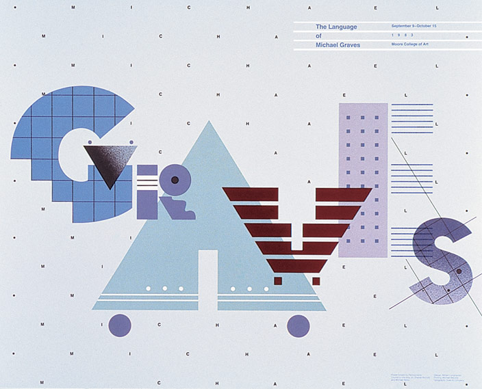
I will write about a poster named The language of Michael Graves, designed by William Longhauser in regard to postmodernism during 1983 for an exhibition that displayed some of Michael Graves’s works. The readings I’m going to use are Munari’s Design as Art and the Course in General Linguistics by Ferdinand.

Type: Poster

Medium: Offset lithograph on paper Support: paper

Dimensions: 44.1 x 54.3 cm (17 3/8 x 21 3/8 in.)

Place: Philadelphia, Pennsylvania, USA

made in the USA

The Language of Michael Graves

Sadman Hafiz- Discussion 4b

Today’s manifesto for designers may have changed but I still think that Marinetti’s manifesto of futurism which was the rejection of the past still applies for the current designers. Design is something that is evolving every day based on technology and the audience’s tastes. Sure, some clients may want and value old designs, but this won’t always work since the new generations will want something new and fresh. Many designers today still produce work that reflects old design elements which means they are using elements that have been invented by the past designers. This won’t make the new designers popular; people will not remember the designer since they are not creating designs that reflect them. Old designers became famous because they invented something that they owned. We as current designers should create a design that reflects who we are and designs that are completely unique for which people will know us. Our designs will only be successful when people will recognize us just by seeing our work. Also, we should set aside our ego and value what our audiences want and what demands are trending. We often get mad when people reject our work but that’s just how designs work, our entire purpose is to make our audience happy through our designs and to develop a language that communicates with mass people. We don’t create designs for ourselves we create them for our clients, thus our manifesto will always be to create new designs that satisfy the changing world. Only by doing these will give us recognition for both our works and as a designer.

Sadman Hafiz-Week 4 Response

According to the authors of the Bauhaus, the communication of an artwork requires thinking, observation of the world and adaptation. The authors believe in minimalism, and creating art for social and industrial purposes which was missing from the past art.These authors also believe in their own ways that art can not be taught, it’s for us to decide what art is and what we ourselves consider as an art, past art education was lacking these and were focused more on teaching art. Every individual is different and has their own imagination and perspective of the society around them. When we think of this, it is very accurate that teaching art through education is not very effective since the school or the teacher who’s teaching the students will most likely present the students as how she sees art and what her value is. This prevents students from discovering new ideas and keeps them in the past.

The term “art” for these three authors are like craft and construction through which something new can be produced. Adaptation to modernity is a big factor that has been addressed in these readings over and over. Technology plays a big role in art and design which have changed many things, and we as artists are responsible for using it to our advantage, one example of this is the Typophoto. Maholy sees communication in two ways, first is the typography; in typography, communication is done through the use of type. The other way was photography which is a visual communication through photographs. Maholy combined both these and created the Typophoto which he considered to be the most effective way of communication.  It is clear that the communication through Typophoto will appeal to both the visual learners and the casual learners since it contains a little bit of both elements. Through the Typophoto Moholy was able to make a new form of communication language which was very modern and effective.

Just like the founder Grupius and Maholy, Bayer also looked for change. Bayer stressed that typography is a common thing for all of us but we often consider it as a design or a form of art. This was probably one of the reasons as to why books and the way it was written haven’t changed since Gutenberg’s invention. Also the designers were afraid of changing it because it may have taken away the legibility of the language.. Bayer thought that the old style of typography was too complicated and he wanted to reduce the types to bare minimum without any additions. Bayer simplified the type by taking away the serifs which made the typography way more simpler and legible. 

Bauhaus developed their students and designs in relation to the demand of the changing world which made it very successful. To be still effective in the 21st century they need to follow the same exact route, which is to reflect on the work done in the past and how to take it to the next level by meeting the current demands.  

Sadman Hafiz-Discussion 3b

The commercial I choose for this discussion is -DraftKings’ debuts a spokes character in ‘Fortune: Life’s a Gamble’. This commercial 30s commercial is not just entertaining but also very effective with its strong language usage and word choices. This small commercial just by using a few facts makes us realize that our entire life is a gamble, it is all about the choices we make and the results we get in return. Most of the time, the choices we make are very uncertain and we don’t even know what the outcome or the consequences will be for them. We decide and go with the choice that we think is the best for us which clearly describes gambling, it’s no different than betting or gambling at a casino.

What makes this commercial effective is its direct use of the term “gamble”. The Draftings is clearly telling its audience to download this app and gamble on the games. The term gamble when we hear it, we try to avoid it because it’s a very uncertain way of income which is very addicting and can cause a mass loss. The reason why this commercial is not afraid of using this term is simply that they are saying that our life is just as uncertain as to the term gamble itself.

They are telling us by giving facts that, Love is a gamble, trying to reach for glory is a gamble and just like these, we gamble in many aspects of life. Thus, using their app and gambling with the games will mean nothing compared to what we are going through every day. Overall, the language in this commercial is very direct and on point which has the potential of capturing a mass audience.  

Sadman Hafiz- Week 3 Response

Authors in all three readings try to convey the importance of adapting to the changing world. All three readings also promote a past rejection because, in the authors’ view, it prevents new generations from evolving and adapting to the new changing environments. Technology had a big impact on design and played a big role in these authors’ perspectives which shaped the way they think.

Aleksandr Rodchenko became a constructor from a painter because he believed that industries and utility were very important compared to representational art. The invention of photography started to take away the purpose of art for which many artists and designers tried to develop art using this technology, Rodchenko was one of them.  Rodchenko developed new forms of art by combining technology one of which was the use of photomontage. He saw graphic design as the core essential for society and mainly focused on designs for social purposes.

Marinetti on the other hand compares old art in the museum to a dead person. In his Futurista, Marinetti states that vising a museum once a year to admire an old art is no different than visiting a loved one’s grave once a year just to remember the old memories and dreams of the person. Marinetti rejects the past completely and thinks admiring old stuff only makes a person stressed and opens the wounds which try to deny the future, Marinetti thinks that young living futurists should never have these mentalities.

Lastly, El Lissitzky, who also shares a similarity to the previous author shares an interesting topic. Lissitzky states, the innovation of printing books by Gutenberg still stays as the highest achievement in book art, the only changes that happened were a few tweaks to it here and there. Latter he also states that “Yet in this present day and age we still have no new shape for the book as a body; it continues to be a cover with a jacket, and a spine, and pages 1, 2, 3”. Through this example Lissitzky tries to show that instead of still admiring this new design, none of the designers or constructors have ever tried to change the look of the book by trying new things. All did was develop the old design again and again.  

All three authors had their own different ways of delivering the message to the new generations of designers, but in the end, the message was the same. They wanted the young designers to discover new ideologies, they wanted these designers to think about what design is for them. Instead of reflecting on the same old ideas, they should develop their own ideas which the people of the present will admire.

Sadman Hafiz- Week 2 Response

After reading the articles I want to write a little bit about the importance of signs in a language. Both Course in linguistics and Counting sheep signify the role of signs and how it relates to the language we speak. Language can be a tricky subject; I have some friends who are from the same country but from different regions of the country. They have the same language but due to the different regions, the same exact language varies to a level that some of them can’t even understand one another. Just a little tweak in the same language can make it sound like a completely different language. Signs on the other hand can be very specific due to their history, signs are a form of communication through visual representation. I’m personally a visual learner, I learn and memorize better when I see any forms of visuals compared to written statements, and not just me I believe visual learning is the most effective among individuals compared to other methods. I believe signs make communication a little easier, probably why we see a lot of signs on the road, large institutions, hospitals, tourist spots, etc. where not everyone speaks the same language.

The readings state that language can be changed but their history remains the same and fundamental basics of communication always remain the same. As I said earlier signs are much easier to understand for most people than verbal communication but that doesn’t mean that everyone understands them. A basic communication technique we see in signs is the implementation of different colors, the most common ones being – red, green, and yellow. Almost everyone can tell that red in most cases will mean danger and green means safe, it is applicable for almost everything whether it’s for road signals or exit signs on buildings.

The design itself can be a form of language which I believe communicates better than an actual language. Design is a form of non-verbal communication; it is more effective in communication compared to a verbal language for most people especially when they don’t speak the same language. Signs are also forms of designs, which are developed to speak or give direction in a non-verbal manner. The overall design is most effective because it speaks to individuals of different cultures, languages, races, and ethnicity in a way that none of the existing language can.

« Older posts Newer posts »