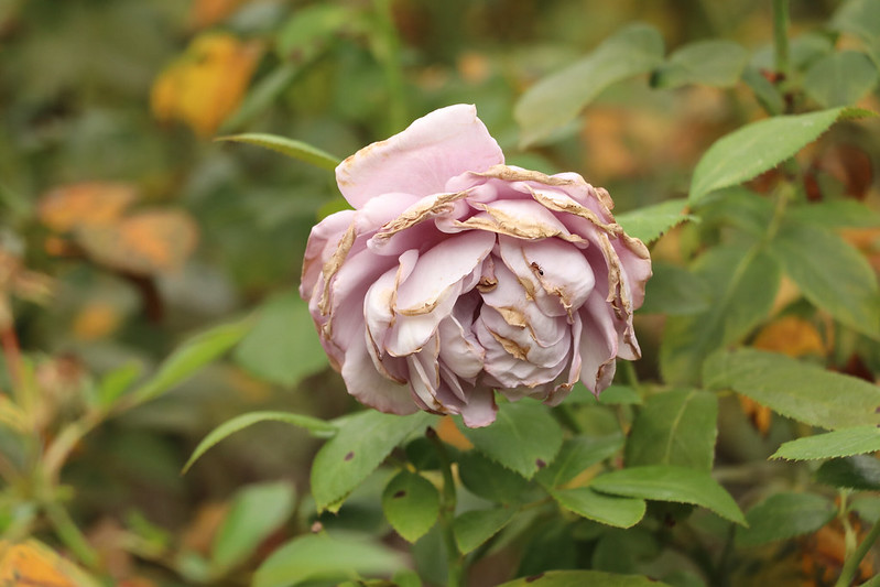
Robin Michals | COMD 1340 Photography 1 DO97

Category: Course Activities (Page 6 of 11)

Week 8 – Midterm – Critique Guidelines

Critique Etiquette

  1. Respect the presenter. Give them your full attention.
  2. Ask questions about your colleague’s photography. This is not the time to ask questions about your personal concerns.
  3. Start with the positive when you comment on your colleague’s works. Use the terms below that we have learned this semester.
  4. Be generous. Offer your thoughts. Your opinion and judgements are important. Do not leave the work of giving feedback to the others in the class.
  5. Conversely, please do not speak over your classmates.

Vocabulary

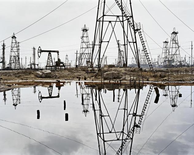
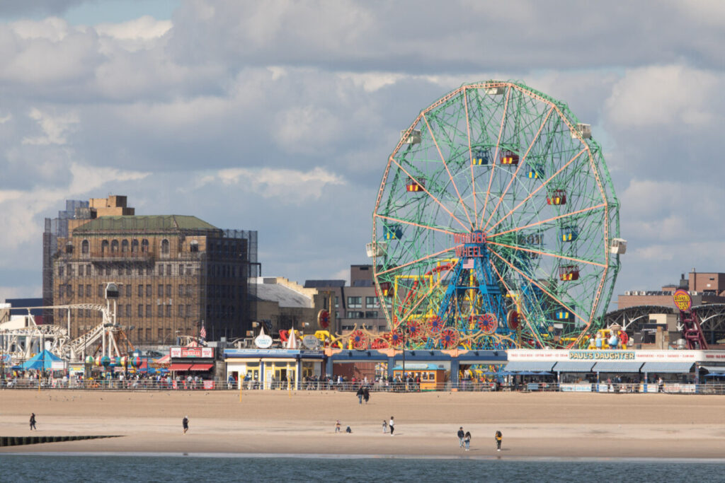
Framing: How the frame brings together the elements inside the rectangle juxtaposing them, creating relationships between them

Types of shots: how much information is in the frame

  • a long shot
  • a medium shot
  • a close up
  • an extreme close up.

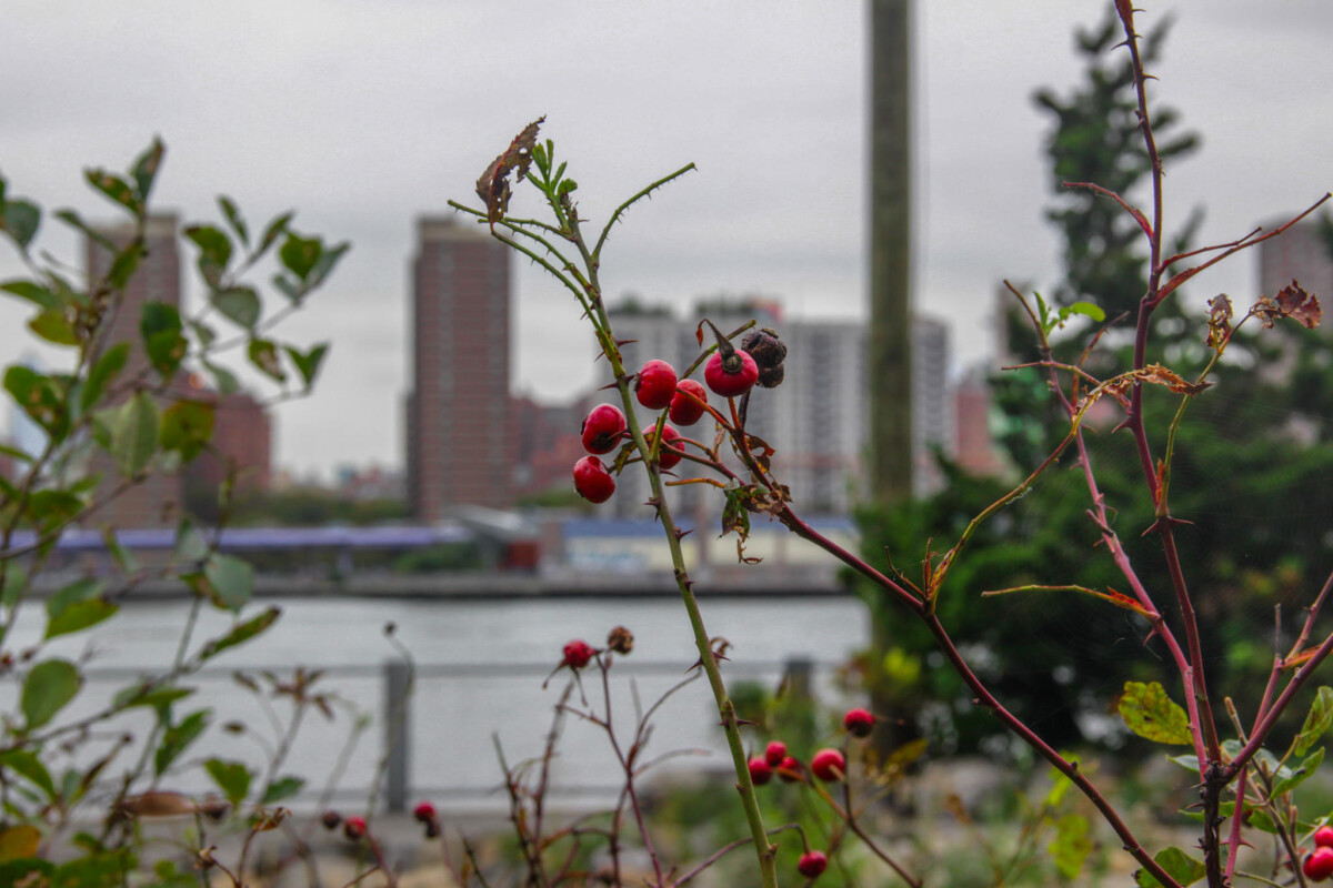
Frame within a frame – use elements in the frame to enclose the main subject and draw attention to it. A frame within a frame can be a window or door or it can be items in the foreground such as branches.

Angle of View:  describes the camera position in relationship to the subject. The angle of view may be: 

  • a worm’s-eye view
  • a low-angle
  • eye-level
  • a high-angle
  • a bird’s-eye or aerial or overhead view
  • an oblique angle.

Rule of Thirds – Instead of placing the main subject in the center of the frame, divide the frame into thirds horizontally and vertically and place the main subject at one of these intersections.

Fill the Frame –  (get closer) – do not leave empty areas that do not add to the composition and plan to crop in later.

Diagonals – Sloping lines

Leading Lines – lines in the photograph that lead the eye to the main subject

Patterns – repeated elements. Break the pattern for visual interest

Figure to Ground -the relationship between the subject and the background sometimes described as negative and positive space.

Diffused light – light that comes from many directions and creates soft shadows

Direct light– light that come from one direction and creates hard shadows

Contrast: The measure of difference between bright areas (highlights) and dark areas (shadows) in a photo

High contrast : Large difference between highlights and shadows. Mostly lights and darks without many mid tones        

Low contrast :  Little difference between lights and darks. Mostly mid tones.

Frozen Motion-Motion is stopped and captured in the frame with a fast shutter speed.

Blurred motion-moving elements blur with a longer shutter speed.

The Decisive Moment: A term coined by Cartier Bresson- “the simultaneous recognition, in a fraction of a second, of the significance of an event as well as the precise organization of forms which gives that event its proper expression.”

CUNY Photo Challenge – deadline Oct 28th

Enter your best photo taken in the class to date.

Read the criteria of the judges and select the image you think best fits what they are looking for.

You will need to include a title, a brief description which could include the class and assignment or not and location.

Forward the submission email for 1 pt credit.

Homework

HW 6: Reflections

HW 6: Reflections

Due November 2, 2:30 pm. 4 pts. 

Reflection – 1. the throwing back by a body or surface of light, heat, or sound without absorbing it.

Working outside during the day, photograph reflections to create strong compositions that include a combination of elements that are seen directly and by reflection. Reflections can be found in water, windows, and cars among other surfaces. Do not confuse reflections with shadows. Working outside during the day, take enough photographs to end up with 30 interesting photographs with reflections. No credit will be given for improperly exposed photographs or out of focus photographs. No credit will be given for photos taken inside without sufficient light.  Upload to an album on Flickr. Send your best two to the class group.

Reflections example by Edward Burtynsky:

Global Corrections – Yunique

For my before image, I captured a some berries in a bush. At first glance, the mood of this photograph is very dull and dreary. All from the color and lighting of the photo. There are also various colors being used, but I felt that it should give the image a bit of pop to it.

For my after image, there have been many edits that helped changed the mood of my photograph. In Lightroom, I wanted to give my subject, the berries, a bit more color to it. I wanted to increase  the hues on my reds in the image so that the series appeared more lively and present. I decreased my exposure slightly, increased the contrast and reduced some of the highlights. I also reduced some of the whites in the image. clarity was also fixed in which I increased it slightly. I also wanted the trees in the background to be more greener, so I also messed around with the green hues within my image. Sharpening, Vibrance and Saturation were also increased slightly.

Edited pictures Lisbeth M.

before After

I adjusted the whites and blacks and I made the saturation higher, I also played with the exposure.

I adjusted the blacks so it would be true black and the white to be true white.

In this picture I adjusted the highlights so the clouds would pop out more, I also adjusted the blacks and whites.

For this photo, I adjusted only the shadows and the whites to make it lighter and make the beautiful view of the sky more vibrant and the pier a little more visible.

Critique by Lisbeth M. / Jazziah C. work

I really love that he was able to capture the bees sitting on the flowers, it is really hard to do and the depth of field created by the background is really cool, he also used he rule of thirds.
The vibrant color of the flowers make contrast with the dead grass and I like the fact that his focus is on the purple floors rather than the white ones. I also like that he filled the frame with the flowers.
This is my favorite one, it has a romantic feel to it and I love the singular red rose in the middle of the frame. I also like the contrast of the red and green and the amount of exposure he used.
« Older posts Newer posts »

© 2024 COMD 1340 DO97

Theme by Anders NorenUp ↑