Author: Lisbeth Marmolejos


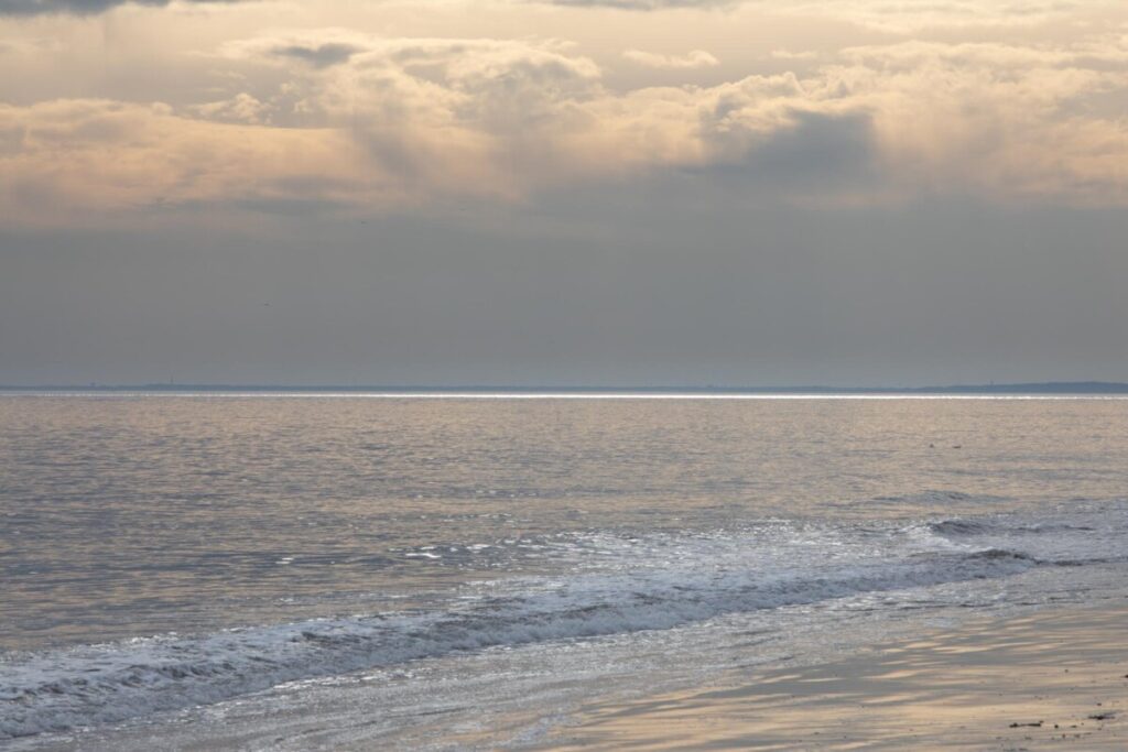
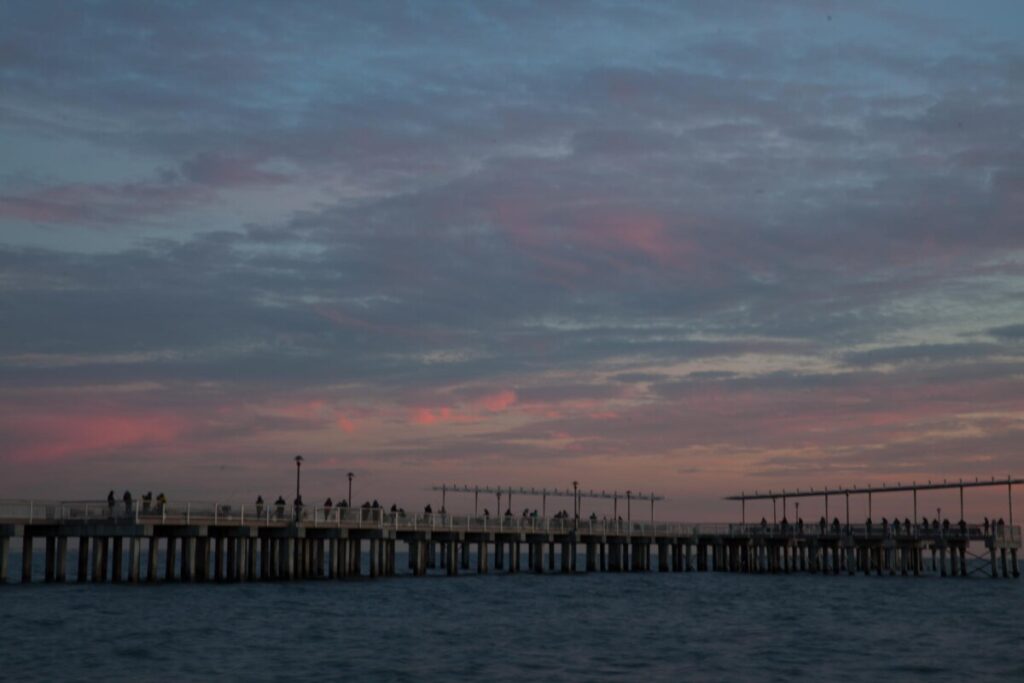
Original 
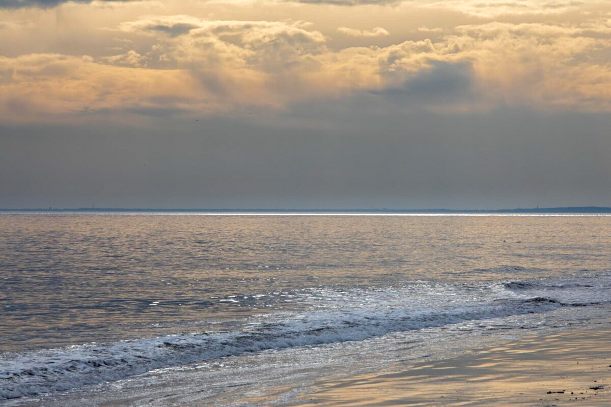
edited

I adjusted the whites and blacks and I made the saturation higher, I also played with the exposure.

I adjusted the blacks so it would be true black and the white to be true white.
In this picture I adjusted the highlights so the clouds would pop out more, I also adjusted the blacks and whites.
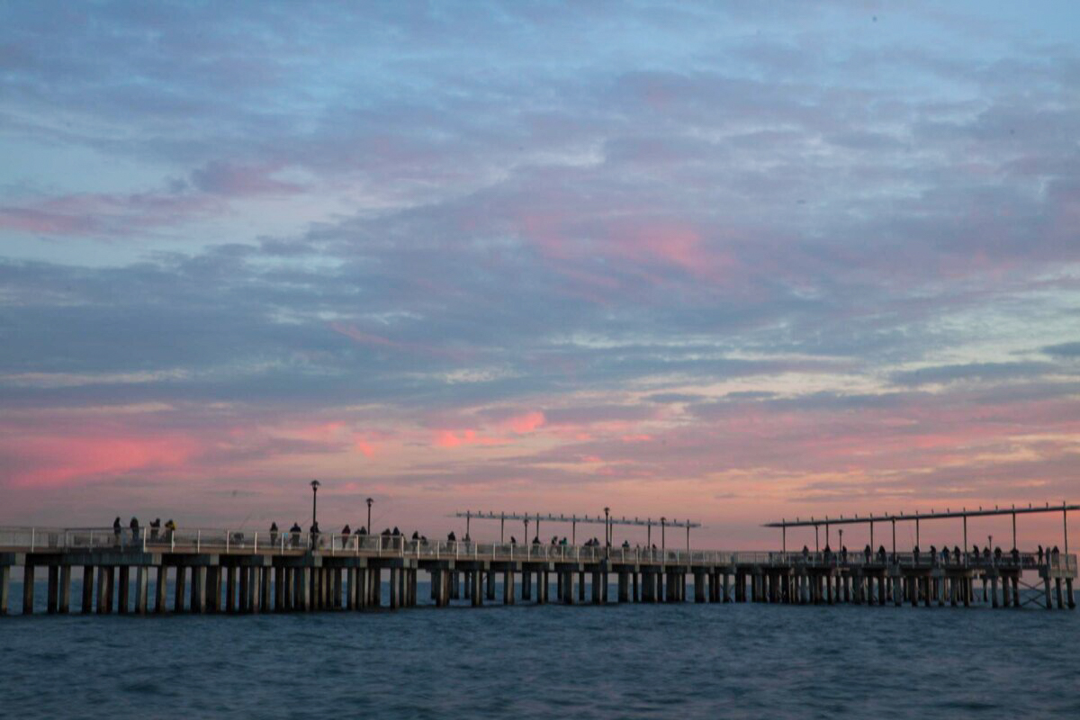
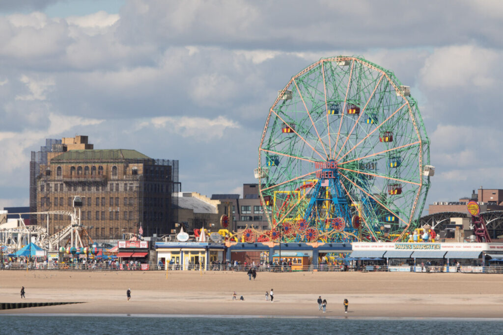
For this photo, I adjusted only the shadows and the whites to make it lighter and make the beautiful view of the sky more vibrant and the pier a little more visible.
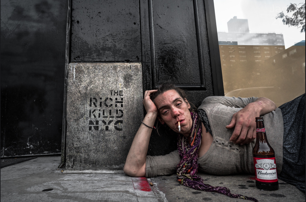
A photograph that really speaks to me and I think is visually engaging is a photograph from Suzanne Stein’s photo album “New York street one”. This photograph shows a woman, perhaps homeless laying down on the ground with a lit cigarette in her mouth and a Budweiser (Beer) standing right by her side, she is laying down against this wall with the words “The rich Killd NYC” printed on it. I totally agree with the phrase. The rich take and keep on taking and keep on spending their money in wrong ways instead of helping those in need like this woman. Suzanne Stein’s photographs show what the raw, ungentrified NYC is like. All the homeless people in the streets, the families struggling to get home walking through a sea of people, the hardworking, the different minorities. I think the intention of this photographer was to wake people up, show them what the big city is really like and she did an awesome job.
In the photograph I chose, Suzanne uses the rule of thirds to take it, as we can see the woman is on the right side of the frame instead of in the middle which gives the photograph a better look and does not make it as boring and plain. She also takes the picture from a straight angle and a little close so she could fill in the frame a little bit more and not have extra stuff in the background. Also, something I noticed was the triangular shape created by the woman’s arm while she rests her head and that caught my attention.


Recent Comments