Robin Michals | COMD 1340 Photography 1 DO97

Category: Lab: Week 7 – Global Corrections (Page 1 of 2)

Global Corrections – Yunique

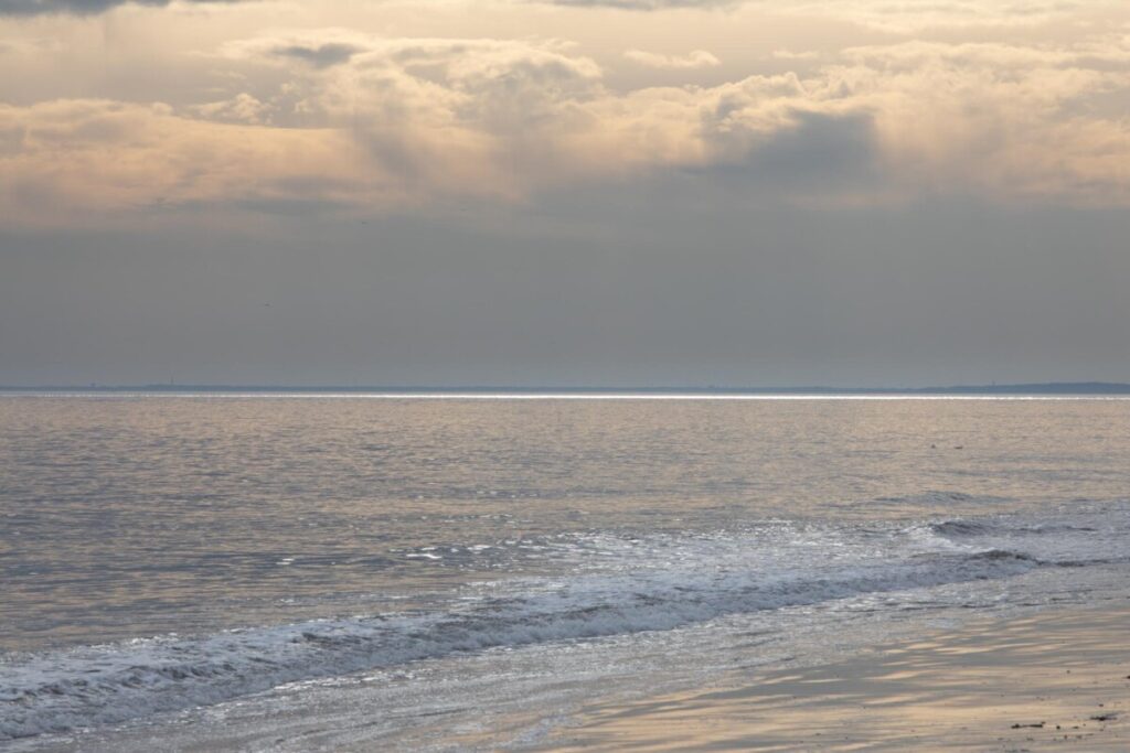
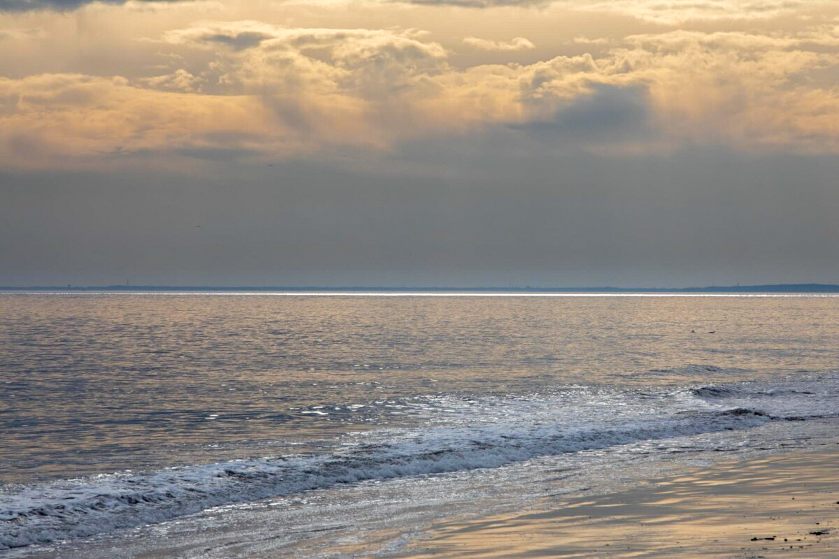
For my before image, I captured a some berries in a bush. At first glance, the mood of this photograph is very dull and dreary. All from the color and lighting of the photo. There are also various colors being used, but I felt that it should give the image a bit of pop to it.

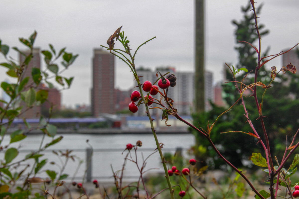
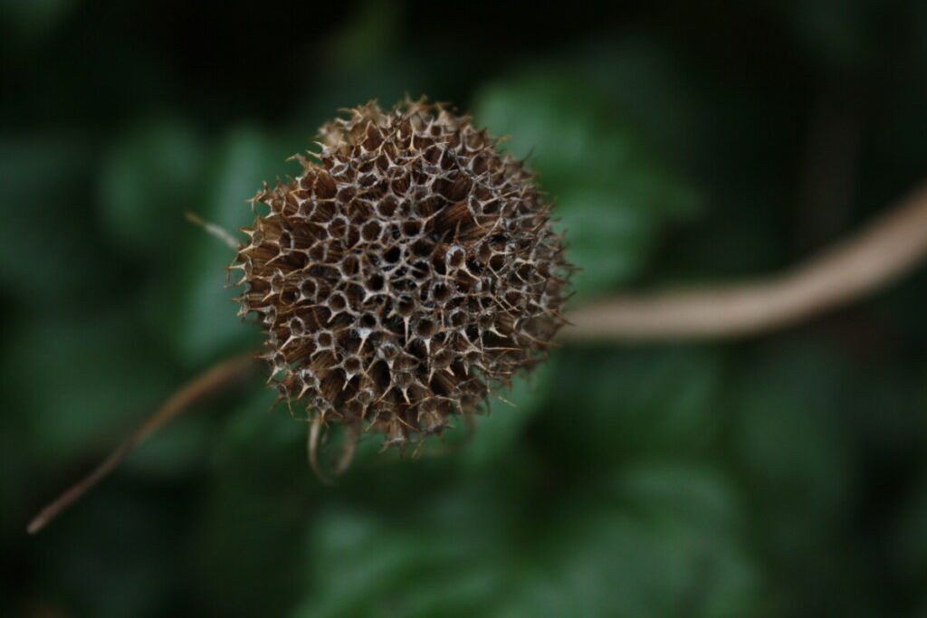
For my after image, there have been many edits that helped changed the mood of my photograph. In Lightroom, I wanted to give my subject, the berries, a bit more color to it. I wanted to increase  the hues on my reds in the image so that the series appeared more lively and present. I decreased my exposure slightly, increased the contrast and reduced some of the highlights. I also reduced some of the whites in the image. clarity was also fixed in which I increased it slightly. I also wanted the trees in the background to be more greener, so I also messed around with the green hues within my image. Sharpening, Vibrance and Saturation were also increased slightly.

Global Corrections

Global Corrections

Before
After

This image was a little dark and overexposed. I lowered the highlights to 0 to help lessen the overexposure and increased the blacks to about 53 to lighten up the image in general. I increased the shadows to about 28, along with clarity at 23 to define the outline of the panda, to separate it from the background.

Correction Exercise: Nathalie Quito

On the left, I cropped and edited the saturation of the image. I first cropped in more closer to the couple. I adjusted the clarity to make the midtowns brighter. In addition, I felt like the original on the right was very warm toned so I went to the temperature and pulled it towards the left to make it cooler. I also played with the contrast a little bit.

Edited pictures Lisbeth M.

before After

I adjusted the whites and blacks and I made the saturation higher, I also played with the exposure.

I adjusted the blacks so it would be true black and the white to be true white.

In this picture I adjusted the highlights so the clouds would pop out more, I also adjusted the blacks and whites.

For this photo, I adjusted only the shadows and the whites to make it lighter and make the beautiful view of the sky more vibrant and the pier a little more visible.

« Older posts

© 2024 COMD 1340 DO97

Theme by Anders NorenUp ↑