Robin Michals | COMD 1340 Photography 1

Category: Student Posts (Page 5 of 6)

Homework #1 – Jessica Li

Thomas Holton
http://www.thomasholton.com/
The Lams of Ludlow Street

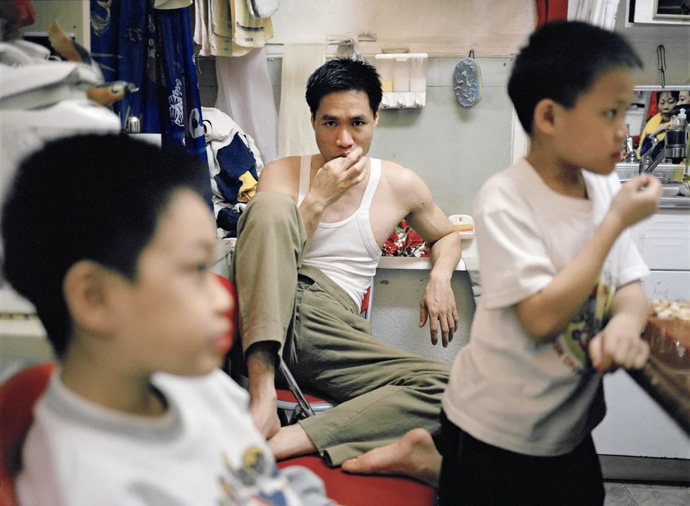
The image that I chose is a Family portrait from The Lams of Ludlow by Thomas Holton. This photo was taken in New York City Chinatown. The Lams of Ludlow shows a family of 5 living in a very small Chinatown apartment that is only 350 square feet. Holton follows the daily lives of the Lam family. This family photo shows a family of five standing with a dinner table full of food and jackets hanging in the background from small to big jackets. The purpose of this image is to show the living conditions of living in Chinatown. The mood that this image brings is welcoming and friendly. The intention of Thomas Holton is to show the lifestyle of living with a family of five in a very small living space. Also, to show a family struggling with space. Holton became a part of their family and continued to capture more pictures of the family.

The three formal elements from Steve McCurry that are most important in this photo are figure to ground, symmetry, and diagonals. Holton uses figures to ground by having a contrast between the family portrait and the objects in the background of the photo. Jackets and lights hanging with a sink on the side of this image. Also, This photo shows symmetry, The family portrait gives an even look when divided in half.  The third component that Holton uses is diagonals. When looking at this photo, this photo does not look centered but looks slanted.  These three elements help create the mood of the photograph by showing that Holton worked in a small area capturing these photos of the Lam family. These components that Holton used give a confined feeling but a family and friendly feeling.

HW1- Composition

© Suzanne Stein 2017 “DSC07951.jpg” 

Looking through Suzanne Stein’s work I noticed plenty of feelings that each of the pictures transmitted, going from delicacy to harshness. One picture that stands out to me is the “DSC07951.jpg” on the “New York Street 1” album, this picture locates us in New York City and the subject framed is a woman that I infer is in a homeless situation, based on the dust and tear on her skin and clothes; The subject poses while smoking a cigarette and a “Budweiser” Beer bottle stands on her right side , what capture my attention the most is the street art sign located on her left side, “The Rich Killed NYC”.  

Suzanne Stein manages to say so much in one shot, and in “DSC07951.jpg” particularly, the social critique to the elitist “NYC” is right on spot. Picturing a homeless person that ended up on the streets thanks to extreme poverty, drug use, gentrification, disability etc., next to a sign stating how the rich people in New York has taken over the middle and the lower classes, talks to me about how hard it can be for a person to afford having a place to live in NYC, gentrification has spread into this city hurting the people that used to live in those “poor neighborhoods.” The Sadness and abandonment Stein captured on this image says a lot about of how the life of a person in this situation might be, it feels like the subject is tired but at the same time got used to this living like this. 

Based on Steve McCurry “9 photo compositions”, Suzanne Stein Used the Rule of thirds by placing the subject’s body not directly in the center of the shot, she used instead the middle point between the wall and her hand, and her body is located to the right of the frame. The use of diagonals, as the women’s body is placed, and Leading Lines from the buildings wall, leads your eye to the message written, and her face, making this the focal point and getting the message across in a stronger way. 

HW1_COMPOSITION

Suzanne Stein- New York Street 3 https://photos.smugmug.com/New-York-Street-3/i-6d86GzJ/0/30da8e5f/X2/DSC02859-X2.jpg 

I chose an untitled image by Suzanne Stein from New York Street 3. The image is in the city along a sidewalk. The image depicts two female women, the first woman is wearing a black coat and is sitting in between two red pillars of a building on the street, the second woman is walking and wearing a suit and skirt. The intention of the photographer is to capture two subjects that appear to be of different financial statuses. I believe the purpose of the image is to show the two sides of the city, those who are in the upper class and those who are in the lower class. The mood of the image is somber as the woman on the floor appears to be gazing at those who are walking by and the photographer seems to show the viewer that she is looking at the second woman.

The three formal elements that are the most important are the Rule of Thirds, Diagonals and Figure to Ground. This photo shows the rule of thirds because both the subjects aren’t centered, one woman is to the lower left while the other is to the middle towards the right. They are both in the halves of the image so that the viewer knows to look at both subjects rather than just one. It also shows diagonal lines that are leading to the subject such as those of the red building and the sidewalk. Finally for the figure to ground, the subject of the image would be the woman on the ground who appears to be looking at the ongoing pedestrian. And in the foreground there is the reflection of a woman walking. It can also be argued that the woman on the ground is in the background and the other woman is the subject because the woman in a suit is taking up most of the photo vertically while the woman in black is at the bottom left of the photo.

HW #1 Composition Chris H

The photograph that spoke to me the most is called “Conversation” by Thomas Holton. Holton follows the Lam family as he encapsulates their ongoing life in a small apartment at Ludlow Street. In this photo, Holton captures the father’s firm pose and assertive glare as his kids unwind in front of him. The purpose of this image is to portray the authoritative power of a parent. The positioning of the three show that the father is always in control as he observes his family in the background. With just a simple glare, a parent can have an entire conversation with their child, letting them know that they’re doing something they’re not supposed to. This photograph evokes both an eerie and reassuring feeling. Eerie because the father will scold his kids if they misbehave; reassuring because he is protectively watching over them.

Three of the formal elements that are most important in this photograph are rule of thirds, dominant eye, and symmetry. Holton utilizes the rule of thirds by centering and focusing on the subject in the middle. Although his two sons are also in the frame, the father is in focus and centered in the middle quadrant, making him the main subject in regards to the rule of thirds. Similarly, by implementing dominant eye, we can also feel the father’s assertive energy as his face centers the photograph. Dominant eye brings the audience’s attention to what the photographer is trying to convey. In this case, Holton wants us to feel the authoritative power of a parent through body language and eye contact. Lastly, there is arguably a sense of symmetry in this photograph as well. With the father centered in the middle and his sons on either side, folding the picture in half would give each half an equal visual weight.

Thomas Holton – The Lams of Ludlow Street

HW1_Composition

“13th Street and 2nd Avenue” – Suzanne Stein.

This photograph is of a person walking in the streets of New York City. I think the purpose of this photo is to show the feeling of the morning after a long night out in the city. I think the photographer is trying to show the viewer that the journey home can be lonely or full of regret. It contrasts with the feeling that the person in the photo would have felt the night before. The fact it is in black and white also adds to that feeling of loneliness or regret. Black and white give the photo a darker tone than color would. I also think this is the feeling the photographer is going for through the subject themselves, through their missing shoes.

I think the three formal elements that the photographer used were leading lines, diagonal lines, and framing. The lines of the wall and railing surrounding the person all lead towards them. This directs the viewer’s eye to where the photographer wants. Straight to the subject. The use of diagonal lines, also in the walls and rails, shows movement in a way. They are going in the direction of the subject so one would assume that they are walking in that direction, rather than possibly standing. The same walls and rails, as well as the roof of the scaffolding also act as a frame within the picture. They are very close to the subject, but you are also able to see the building in the background. So, they act as a frame and separate the subject from the background. This would also work effectively if there weren’t any buildings in the background, but I think that contrast makes it more noticeable to the viewer. I believe these elements combine effectively to show the message that the photographer is trying to present.

« Older posts Newer posts »