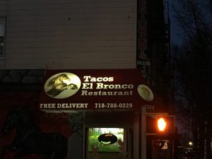
I live in Sunset Park and I have only been living here for a few months although I have lived here before. The typography in Sunset Park is mostly old style typefaces and have not changed much since I have left before. I have never paid attention to the specific lettering and spacing in the words and advertisements on the signage, but now that I get the chance to pay attention in detail, I see how much meaning it has to the neighborhood. I live in a predominately Hispanic neighborhood where there are many Mexican restaurants and traditional Spanish foods everywhere. The type displayed is more serif than sans serifs fonts. Many of the signs are Spanish signs which depict mostly serif fonts if you really pay close attention to all non-English signs. I enjoyed detailing the different typography all around me, I truly got to notice how much the fonts fit in so well with the neighborhood theme.
 Updates from Smash Magazine
- The End Of The Free TierFree-tier pricing is a common marketing strategy. “Free” gets people in the door and allows them to settle in and see how things work. But, as Juan Diego Rodriguez explains, the practice of free *tiers* is often conflated with free *trials*. And while the distinction may be nuanced, the consequences of sunsetting free-tier pricing may […]
- Conducting Accessibility Research In An Inaccessible EcosystemConducting UX research that includes participants with a variety of disabilities is vital to building inclusive technology, but most prototypes used for testing are inaccessible. Rather than continuing to leave out feedback from disabled consumers, which ultimately leads to exclusive technology, researchers must get creative in their workarounds and be relentless in their efforts.
- Using AI For Neurodiversity And Building Inclusive ToolsThis article illustrates how AI can be leveraged to build tools that can be inclusive with a little bit of an additional effort.
- F-Shape Pattern And How Users ReadScrolling, scanning, skipping: How do users consume content online? Here’s what you need to know about reading behavior and design strategies to prevent harmful scanning patterns. An upcoming part of Smart Interface Design Patterns.
- How To Work With GraphQL In WordPress In 2024What options do we have for integrating GraphQL with WordPress in 2024? Leonardo Losoviz describes the developments that have taken place in this space over the last three years.
- Converting Plain Text To Encoded HTML With Vanilla JavaScriptWhat do you do when you need to convert plain text into formatted HTML? Perhaps you reach for Markdown or manually write in the element tags yourself. Or maybe you have one or two of the dozens of online tools that will do it for you. In this tutorial, Alexis Kypridemos picks those tools apart […]
 How Design News
- An error has occurred, which probably means the feed is down. Try again later.


Hi Marisa,
Try using a few more photos and/or replace the one of the building. The building and branches are so prominent that I can’t notice any type in that photo. I should be able to recognize what you’re describing from the typography and how it reflects your neighborhood.