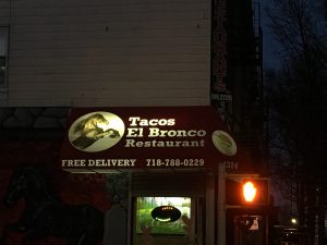
I live in Sunset Park and I have only been living here for a few months although I have lived here before. The typography in Sunset Park is mostly old style typefaces and have not changed much since I have left before. I have never paid attention to the specific lettering and spacing in the words and advertisements on the signage, but now that I get the chance to pay attention in detail, I see how much meaning it has to the neighborhood. I live in a predominately Hispanic neighborhood where there are many Mexican restaurants and traditional Spanish foods everywhere. The type displayed is more serif than sans serifs fonts. Many of the signs are Spanish signs which depict mostly serif fonts if you really pay close attention to all non-English signs. I enjoyed detailing the different typography all around me, I truly got to notice how much the fonts fit in so well with the neighborhood theme.
 Updates from Smash Magazine
- Three Approaches To Amplify Your Design ProjectsThere are many ways to elevate a design project from good to incredible. For web and product designers, it’s not just about adding more animations and flair. What it truly comes down to is a reframing of your thought processes starting before the project even kicks off. Olivia De Alba presents three approaches that designers […]
- An Introduction To CSS Scroll-Driven Animations: Scroll And View Progress Timelines10 years after scroll-driven animations were first proposed, they’re finally here — no JavaScript, no dependencies, no libraries, just pure CSS.
- Mastering SVG ArcsSVG arcs demystified! Akshay Gupta explains how to master radii, rotation, and arc direction to create stunning curves. Make arcs a powerful part of your SVG toolkit for creating more dynamic, intricate designs with confidence.
- The Importance Of Graceful Degradation In Accessible Interface DesignFew things are as frustrating to a user as when a site won’t respond. Unfortunately, it’s also an all-too-common scenario. Many websites and apps depend on so many elements that one of any number of errors could cause the whole thing to fail. As prevalent as such instances may be, they’re preventable through the practice […]
- Creating An Effective Multistep Form For Better User ExperienceForms are already notoriously tough to customize and style — to the extent that we’re already starting to see new ideas for more flexible control. But what we don’t often discuss is designing good-form experiences beyond validation. That’s what Jima Victor discusses in this article, focusing specifically on creating multi-step forms that involve navigation between […]
- Dreaming Of Miracles (December 2024 Wallpapers Edition)December is almost here, and that means: It’s time for some new desktop wallpapers! Created with love by creatives from all around the world, they are bound to lighten up the last few weeks of the year and, who knows, maybe even spark new ideas. Enjoy!
 How Design News
- An error has occurred, which probably means the feed is down. Try again later.


Hi Marisa,
Try using a few more photos and/or replace the one of the building. The building and branches are so prominent that I can’t notice any type in that photo. I should be able to recognize what you’re describing from the typography and how it reflects your neighborhood.