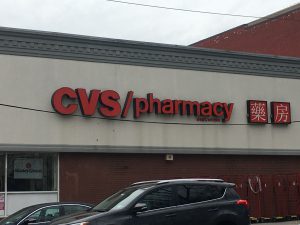
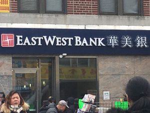
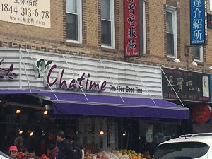
I have been living in my neighborhood for as long as I can remember. Usually when I walk around the area, I never thought about how typography is used to make my neighborhood the way it is. To me the letters on every single banners of the stores or buildings were literally just words that were there to inform me what the building is or what they sell. I never actually stopped to analyze the way each and every individual letter was presented or why this store decided to go with this particular font. Then I was given the assignment to go out and take pictures of how typography was involved in “My World.” I have come to realized that the use of different fonts and colors of the letters gives the word more meaning and characteristic of the building. From using fonts with serifs or san serifs, to using fonts that lean towards hand written calligraphy, it gives the reader an idea of what the company or store wants to portray to the world as them. Below are some pictures of stores that I’ve took around my neighborhood. I hope these pictures can allow you to see the characteristic of each letter as it did for me.
 Updates from Smash Magazine
- Conducting Accessibility Research In An Inaccessible EcosystemConducting UX research that includes participants with a variety of disabilities is vital to building inclusive technology, but most prototypes used for testing are inaccessible. Rather than continuing to leave out feedback from disabled consumers, which ultimately leads to exclusive technology, researchers must get creative in their workarounds and be relentless in their efforts.
- Using AI For Neurodiversity And Building Inclusive ToolsThis article illustrates how AI can be leveraged to build tools that can be inclusive with a little bit of an additional effort.
- F-Shape Pattern And How Users ReadScrolling, scanning, skipping: How do users consume content online? Here’s what you need to know about reading behavior and design strategies to prevent harmful scanning patterns. An upcoming part of Smart Interface Design Patterns.
- How To Work With GraphQL In WordPress In 2024What options do we have for integrating GraphQL with WordPress in 2024? Leonardo Losoviz describes the developments that have taken place in this space over the last three years.
- Converting Plain Text To Encoded HTML With Vanilla JavaScriptWhat do you do when you need to convert plain text into formatted HTML? Perhaps you reach for Markdown or manually write in the element tags yourself. Or maybe you have one or two of the dozens of online tools that will do it for you. In this tutorial, Alexis Kypridemos picks those tools apart […]
- How To Monitor And Optimize Google Core Web VitalsThe three Core Web Vitals metrics don’t only tell you how visitors experience your website but also impact your Google search result rankings. In this article, we’ll look at what Core Web Vitals are, how they are measured, and how you can use DebugBear to monitor them continuously.
 How Design News
- An error has occurred, which probably means the feed is down. Try again later.


So, based on the typography used in your neighborhood, what does it reflect about your neighborhood?