Inspiration #7 – Marcel Christ

Drink

Hennessy

In the hennessy photograph, it gives off this relaxed vibe. The background is a warm gradient color which again gives off a calm atmosphere. The drink itself is glowing due to the surreal sunset, displaying it as if the drink was a tropical beach of sorts. Like previously mentioned, this gives of a vibe of going to the beach, drinking and watching the sun set. What makes this image work is what I previously stated, it invites to people to have a drink. Like it’s saying this ‘the drink” you buy when you’re relaxing at the beach by yourself or with someone else. It’s simplistic and minimal, nothing too gaudy or over the top. Even with the inclusion of the sunset it doesn’t feel too much. Like mentioned before, it just presents itself as something you drink you’re chilling on a sunny day.

Andrew Scrivani

In the photograph what I find appealing about is the dish is off center, following the rule of thirds horizontally. It is angled at a three quarter view, it allows us to view each ingredient and mostly see the rice. If it were overhead we would only see the shrimp and greens, Moreover, the dish has vibrant colors and the natural lighting coming from the top makes it appetizing. The wooden surface makes it modern and the detail of the green herb on the bottom left of the photograph makes it more vibrant. That the dish be presented neatly.

Andrew Scrivani

After last week class, I view food photography so much different now. Andrew Scrivani has great pictures. When I went on his website, his website looked very yummy. All of the food pictures were nicely lit and looked so colorful.

My favorite picture on his page was this picture. It reminded me of the pictures I took of the tomatoes in class. This is an example of taking pictures of a lot of the same thing.There’s several clams all over the picture. The clams are placed all over,  giving  the  image  great  proportion.  Most  food  photography  is  either  shot overhead  or  at  45  degrees  to  the  food. Andrew  Scrivani shot it overhead,  and  it  works  perfectly  considering  it’s several  clams.  Another  thing  I love  it  how soft  the  lighting  is.  It  feels  never  natural  and  brings  out  the  details  in  the  shells.

Insperation #5 – Quentin Bacon

Pancakes

Pancakes

A lot of the backgrounds from Quentin Bacon give off the rustic and homestyle feel. For example a lot of the backgrounds are these aging table counters which gives that rustic look to the images. Other backgrounds give this vibe of it being made at home with the table cloths, plates and cooking accessories. And some background look like they were made in a restaurant or other setting like a bakery. The background in the image is a table with a white cloth. The props he uses in the image are a silver stand for the cupcakes and a jar containing maple syrup (or motor oil).  The angel of the view is like frontal eye level view of the pancakes but with a slight overhead view. A lot of his images contain depth of field, having a blurred background. It makes the main subject more noticeable. Another thing i notice in his images is that they are a mix of over head and three quarter view. Some of his images are also close up. The reason I chose this image is because it looks really appetizing. The pancakes stacked up nicely on each other (probably with cardboard), and each one is a golden-brown color. The blueberries also look plumped and juicy. Then the maple syrup runs down the pancakes like a water fall.

Andrew Scrivani

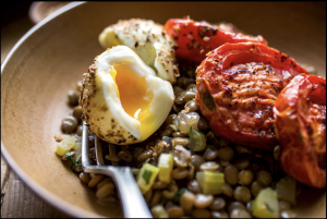
Andrew Scrivani, photographer, director and producer has several photographs that capture my attention. The one that stands out the most, amongst the rest is the image below, with the eggs, lentil salad and tomatoes. What I enjoy about the image is that it is places on the grid which makes it look like the rule of thirds was used. The food is placed on the further right, leaving a small space between the plate and the food. Even though the photographer cropped out a small piece of the plate, I think the image is complete, and nothing is missing from it. When it comes to contrast, the viewer can see the details of each and every example that was used in the red subject which is are the tomatoes. The lentils of this photograph are half focused and half out of focus. The reason is because the photographer decided to create a depth look within the image. He tried to capture the most important aspects of the setup which were the bigger elements such as the eggs and tomatoes. The scallion added to a more fun look because it is a yellow-greenish color, which isn’t seen anywhere else in the photograph. The view of this image is more of an overhead, but not to dramatic. It is definitely not eye level, but more like an in between eye level and overhead. This angle makes it have more of a realistic effect since the viewer can see the 3D aspect of it. The background was wisely chosen in my opinion because it is not too dark and not to subtle. It is a right color so that the main focus would be the plate on the food. However, the photographer did a good job using a wooden-like plate because it brings all the food together to form an interesting photograph.

Insperation #6 – Andrew Scrivani

Food

Spaghetti and Meatballs

I chose this image because it looks the most appealing to me, plus I really enjoy spaghetti and meatballs. The placement of the plate with the spaghetti and meatballs is centered but not equally distant because the plate is more closer to the bottom edge of the photo. It is very clear that the main subject of the picture since different parts of the plate land on different intersections when the image is set in a rule of thirds grid. I’m not entirely sure of the perspective as the foods are not diminishing in size. Perhaps it has converging lines because the fork and spoon intersect but again I’m not really sure. So the angel of view is over head. There is tonal variations between the backgrounds and main subjects. For example the white plate pops out against the wooden cutting board. Then the spaghetti and meatballs are more visible in the white plate than they would be if they were on the wooden board (also that would be weird if they were on the board without a plate ). In the photo it appears the light in the photo is soft light, I say that because the shadows do not make a clear distinct figure/shape. It’s more vague the outlines and more conjoined instead of forming a distinct outline. The edges also look soft. I could be wrong but to me it also looks likes the light used is window light.


Andrew Scrivani

rasberries

Andrew Scrivani’s work is intensely beautiful. My favorite of this photographs is the simple raseberry. I love the color consistency and attention to detail. You can see the deepest detail of the rasberry, only one is concentrated on and the raseberry is in sharp image while the rest is in blur or out of focus. This photograph has a simple day light with bounce and it works beautifully with this color and fruit as you can see with the light, a piece of the fruit looks a bit transparent hence works well with this kind of light. From the looks of it, the natural light was a back light because of how it appears behind the subject of photograph. There is a shadow underneath the fruits which leads me to also believe it can be a diffused light. Andrew’s work is so simple yet to pleasing to the eye because of the balance of the subject matter and lighting.

Quentin Bacon

Unlike other photographers we have discussed, Quentin Bacon is most known for the Photographs taken of food. His photographs allure the audience with the natural lighting and equisite detail set from the cheese in this dish. What sets this photograph well is the attention to detail, notice how the image of the food is sharp and the background is blurred out yet we are able to make do that it is some type of restaurant, wood chairs polished, it also sets a lovely ambiance to fill with the fine dinner show to us in the image. It’s also clever in that Bacon tried to keep a constant color scheme here with white brown and white and the color consistency also makes the photo all the more appeasing. Notice that the light is equally distributed there is a soft light, its not hard on the food and it doesn’t give it an over saturated look.

Quentin Bacon

  • depth of field
  • white background
  • not too busy
  • neutral to the subject

The photograph is appetizing because of the composition, the way it’s plated evenly on the to wooden board. The two separated sandwiches that creates depth of field, as we focus on the centered sandwich. The background is white and does not distract the audience from the subject, the cloth underneath the wooden bounces light onto the board and sandwiches. The use of natural/available light makes the sandwich refreshing, as it is a healthy looking sandwich. Moreover, the use of extra ingredients such as the herb and the tomato directs us to the sandwich. Plus, the angle that the photograph was taken compliments the sandwich because the bread is tilted slightly so we can view the ingredients but can still see the bread.
What I noticed about his style of food photography is that they make use of filling the frame or not, high angle, a few are at eye level.  As well as make us of his props and background, some props make the image feel more authentic and tells a story of the creation of said food. The background enhances the subject and the details.

Quentin Bacon

I feel that food photography is very important because it’s what will get people to go ahead and make the food purchase. The food has to look very delicious and Quentin Bacon does a wonderful job of showing food.

From looking at all of her photos, her pictures feel as if I’m at the table with the food as well. I love how she’s able to bring the food to life. My favorite picture on her page is the dish od Mac and cheese. This image shows how cheesy the meal is.

The Smith DC

I like how she was able to capture the moment. I feel that this brings it out more than just a regular close up of the dish. This was a smart image because it shows not only the outside of the dish but the inside and what to expect when they put their forks in the dish.  Another great thing about the image is the lighting, I think there’s only a key light because the dish is well lit and I don’t see any shadows. I feel broad lighting was used. The lighting makes the dish look really appealing and there’s a good amount of contrast or clarity which brings out the crispness on top of the dish.