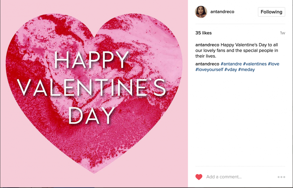
Going further into the work I have been doing for Antandre, so far I only have two completed pieces, two Instagram posts, one for Galentine’s day and one for Valentine’s day.
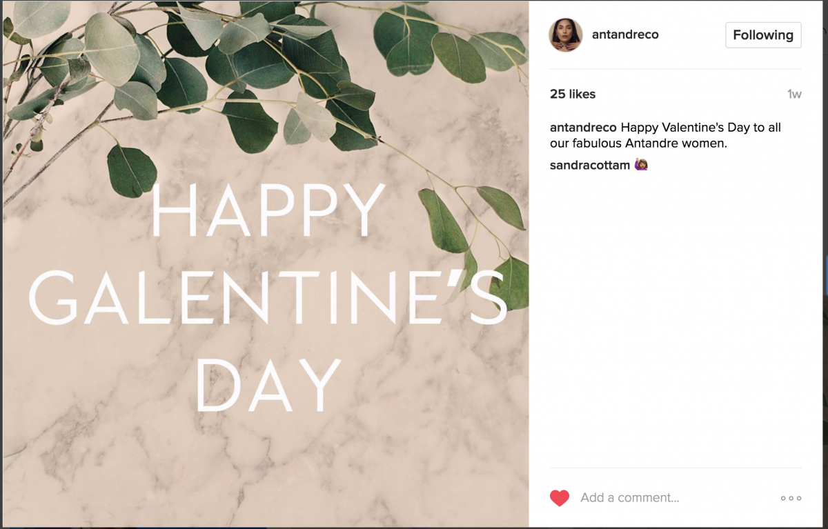
I only meet with Monil every Monday, and the Galentine’s day was an assignment given to me on my first day meeting with him, to be submitted day of. It was challenging because his description of what he wanted was very vague and I wasn’t provided with any resources or images. It was also challenging because of the time crunch, consider we had the meeting at 2:00-3:00 PM and it takes me an hour and a half to get home. So i sort of had to scramble and figure out what they wanted, search for appropriate images, and just hope what I scramble together is what they’re looking for.
Same thing the next day, I woke up to find a message asking for another post for valentine’s day. Already throws off my day because I had a doctor’s appointment and didn’t know how long that would take and when I would get to it. This one was more stressful because their description was even more vague. They basically said “something that contrasts this but isn’t this” (referring to the first post). I ended up with 20 variations and they went with one of the ones I liked least. Oh well.
Back to a larger project, revamping their website. Kinda.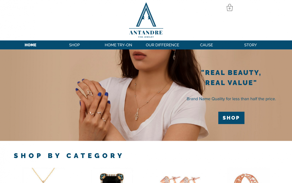
This is what their current website/homepage looks like. It doesn’t speak to sophisticated “older” women. The blue is the biggest eyesore in my opinion, and apparently they received a lot of similar feedback and are looking to get rid of it. The typography is very strange too. Very bold and not fitting. This is where I come in.
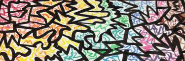
Over the course of this and last week I have been compiling different color pallets that can potentially be integrated into their brand.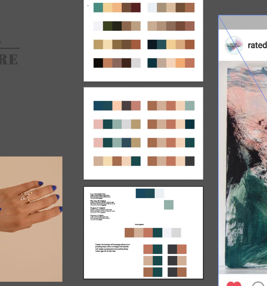
The bottom is basically not what we agreed on to be the final pallet but to work with and define. I’ll be making mockups incorporating the bottom colors into the website and images.
A conclusion we came to is that there really isn’t much room for color on the website, that blue is the biggest thing giving us a problem. So we’ll try stripping the navigation bar and incorporating the color pallet in the images only, that way there will be consistency in the brand and visuals.
As I said in my previous post, I’m meeting with Monil and one other (intern?) this Friday as well as a conference call with the only other female member on the team. I don’t know who either of these people are and what they do but I’m sure the girl has a higher say as she always has to approve everything we do.

