
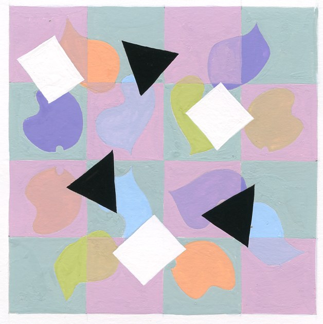
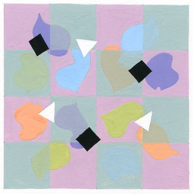
The purpose of this project was to create a pattern consisting of three spots and 2 accents. There are four units with three spots in each unit. There is one original unit, a flip of the original, and a flop (to the top right of the top left unit, as well as to the bottom left). The spots are on a checkered background, each square a muted color. One color is transparent while the other is opaque. Two accents were to be placed on top of the spots, three of each, one in black and the other in white.
I created two compositions of the same project, with different sized accents and different color for the transparency. My reason for this was to see which would be more aesthetically pleasing. In the first composition, the pink squares are transparent and the green are opaque. So wherever the spot lies it would appear opaque on the green and transparent on the pink. The first composition also has larger accents, the squares in white and the triangles in black. In the second composition, the green squares are transparent and the pink are opaque. The color placement of the spots themselves are also arranged differently. The accents in this composition are smaller and the squares are now black where the triangles are white.
The challenge I found in this assignment was in the color placement as well as the color mixing. It was difficult to create a color light enough to still appear muted. Color placement was difficult because I did not want to place the same color spots so close together, but also wanted for there to be a good range of opaque to transparent in each color. The composition I find to be the most aesthetically appealing is the one with the larger accents and the pink transparency.

