Texture/Figure/Ground

shannon belozerova

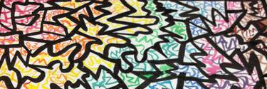
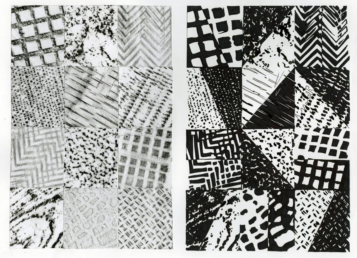
In this project, I was to collect a set of 12 different textures to be transferred for a 50/50 figure ground. The original set would be transferred over to the right and a composition would be created using the 50/50 figure ground. For this, each texture was to be divided in half, where one half would resemble the original and the other would resemble a negative of the original.

This assignment was fairly difficult in finding the appropriate textures and mapping the 50/50 figure ground. Texture were found in everyday items and surroundings such as shoes, trees, floors, etc. They were obtained by rubbing a black crayon over a white blank paper against the textures. To transfer the textures to the right I traced them onto tracing paper on both sides so the transfer won’t flip the textures. Mapping the 50/50 background was difficult because it also had to be visually appealing. It included deciding where to split the texture in half, horizontally, vertically, or diagonally and on which slope. The actual execution of the final piece, the negatives, wasn’t all that difficult.

Transparency in Pattern

shannon2 Transparency in Patterns

The purpose of this project was to create a pattern consisting of three spots and 2 accents. There are four units with three spots in each unit. There is one original unit, a flip of the original, and a flop (to the top right of the top left unit, as well as to the bottom left). The spots are on a checkered background, each square a muted color. One color is transparent while the other is opaque. Two accents were to be placed on top of the spots, three of each, one in black and the other in white.

I created two compositions of the same project, with different sized accents and different color for the transparency. My reason for this was to see which would be more aesthetically pleasing. In the first composition, the pink squares are transparent and the green are opaque. So wherever the spot lies it would appear opaque on the green and transparent on the pink. The first composition also has larger accents, the squares in white and the triangles in black. In the second composition, the green squares are transparent and the pink are opaque. The color placement of the spots themselves are also arranged differently. The accents in this composition are smaller and the squares are now black where the triangles are white.

The challenge I found in this assignment was in the color placement as well as the color mixing. It was difficult to create a color light enough to still appear muted. Color placement was difficult because I did not want to place the same color spots so close together, but also wanted for there to be a good range of opaque to transparent in each color. The composition I find to be the most aesthetically appealing is the one with the larger accents and the pink transparency.

Transparency in Shapes

Transparency in Shapes


The purpose of this project was to create a composition out of specific shapes. This composition was to include visual elements such as space, scale, size, distance, position, density, and interval. In addition to composition, the shapes were to overlap one another, an illusion to be created with paint.

Arranging the shapes into a composition and choosing colors for each shape were most challenging. For the composition, all the previously stated elements were to be taken into consideration in the process. Finding the right size of the shape, the right position, the right scale and the right amount of distance between shapes and the borders was difficult. It couldn’t be random because it also had to be aesthetically pleasing, however was not meant to look like a particular arrangement as an image. Choosing the colors was difficult as well because they couldn’t be too similar to the color of the overlapping shapes. The purpose was to mix the paint to make them appear as if they were overlapping; if you were to place an orange shape overĀ a red shape, for example, the overlap would not be so evident.


Welcome!

This is the first post on your Learning Blog. Edit or delete it, then start blogging!

The ePortfolio is both a Learning Blog and an Academic Career Portfolio. Use the Learning Blog to document your learning experiences and class assignments each semester.Ā As time goes by, add content to the Academics and Career sections to show your department, graduate institutions, orĀ future employers how well prepared you are for your chosen career.

NOTE: Remember to add appropriateĀ CategoriesĀ and TagsĀ to your posts. This will help your professors and other visitors find the content they are looking for. The Categories “Coursework” and “Field Trips” and the Tags “OpenLab” and “City Tech” have already been applied to this post. Feel free to make changes!