Exam #1 – Wed March 4

As I announced in class, we will take our first midterm exam this Wednesday (March 4).  The exam will cover the material up to and including basic probability.

Here is a list of concepts/topics that will be covered on the exam:

  • frequency tables, relative frequencies, frequency histograms
  • measures of central location: mean & median
  • measures of variability: sample standard deviation, sample variance
  • quartiles, 5-number summary, box plots
  • paired data sets: scatterplots, positive vs negative correlation, the correlation coefficient, linear regression
  • basic concepts of probability: simple probability experiments, sample spaces, events

Here is a guide on how to prepare for the exam:

  • do these exercises from “HW5-Probability”: #1, 2(a)-(d), 4, 5(a)-(c), 8, 9
  • review the outlines/notes/spreadsheets for Classes#1-8 (available under Files and the Calendar page)
  • review the solutions to Quiz 1 and Quiz 2 (available under Files)
  • review the WebWork exercises and solutions from “HW2-Graphs”, “HW3”, and “HW4-PairedData”
  • in particular, review the following WebWork exercises:
    • HW2-Graphs: #2, 3, 4, 10, 11, 13, 14
    • HW3: #1, 2, 3, 5, 10
    • HW4-PairedData: #1, 3, 6, 13, 14, 20, 21, 22

(Note that you can view solutions for past WebWork sets by clicking on “Download PDF or TeX Hardcopy for Current Set” and selecting the options for “Show:

 

“How Bad Will the Coronavirus Outbreak Get?” (R_0 and Case Fatality Scatterplot)

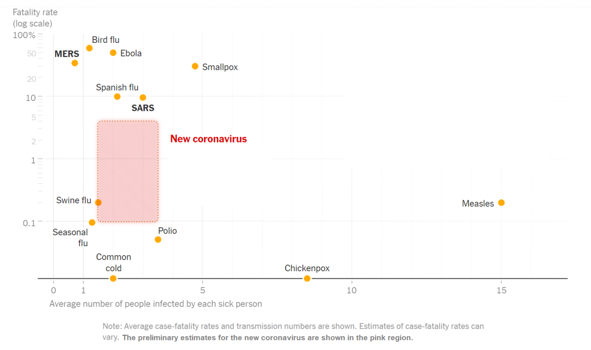
Here is a scatterplot (among a number of interesting graphs) contained in a NYT article headlined “How Bad Will the Coronavirus Outbreak Get? Here Are 6 Key Factors”

Infectious diseases: fatality rates vs transmission (via nytimes.com)
Infectious diseases: fatality rates vs transmission numbers (via nytimes.com)

The article includes this text regarding the graph: “The chart above uses a logarithmic vertical scale: data near the top is compressed into a smaller space to make the variation between less-deadly diseases easier to see. Diseases near the top of the chart are much deadlier than those in the middle.”

(See also this link which includes a number of discussion questions regarding this graph: “What’s Going On in This Graph? | Coronavirus Outbreak“)

Note that the variable on the horizontal axis in the scatterplot above is “Average number of people infected by each sick person”.  Also from that  article is this discussion of that statistic:

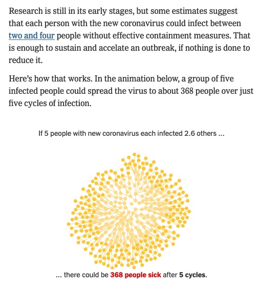
excerpt from "How Bad Will the Coronavirus Outbreak Get? Here Are 6 Key Factors" (nytimes.com)
excerpt from “How Bad Will the Coronavirus Outbreak Get?
Here Are 6 Key Factors” (nytimes.com)

(Click thru to the article to see the animation, which illustrates a form of exponential growth.)

In epidemiology, that number is called “the basic reproductive number” of an infection; see https://en.wikipedia.org/wiki/Basic_reproduction_number.

Here is the paper linked to in the excerpt above (published on Feb 13) that summarizes various estimates of the basic reproductive number for coronavirus: “The reproductive number of COVID-19 is higher compared to SARS coronavirus