“The Aging of America”: Frequency Histograms For US Population Age Distributions

Here are some examples of frequency histograms showing the age distributions of the US population at different times in history (and projected into the future):

  • From the New York Times: “The Aging of America” (Published: February 5, 2011)
  • A similar post appeared on WashingtonPost’s Wonkblog: (published: August 13, 2013), which included this: “This is a mesmerizing little animation created by Bill McBride of Calculated Risk. It shows the distribution of the U.S. population by age over time, starting at 1900 and ending with Census Bureau forecasts between now and 2060.”

What do you notice about how the distributions evolve over time? Click thru to either the CalculatedRisk blog post on which this animation first appeared or to the WashingtonPost link to read some discussion.

Also here is a related set of histograms that were featured in the NYT Business section in May 2014, as part of an article titled “Younger Turn for a Graying Nation“:

NYT-graying

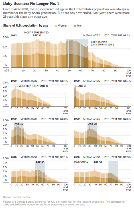
That was an installment of a weekly column in the NYT Business section titled “Off the Charts,” which discussed a graph and the underlying data.

List of Spreadsheet Functions/Techniques

We will use the comments to this post to keep track of the various spreadsheet functions and techniques we will use in class during the semester.

You will be asked to post a comment briefly summarizing a spreadsheet function or technique at sometime during the semester (which will earn you a point towards your course participation grade).

You should post the given spreadsheet function or technique, and give a short summary and/or example of what it does; this can be copied directly (or preferably adapted) from the built-in spreadsheet documentation (see my first comment below for an example).

Google Spreadsheet: Class Age Data

Here is the link to the Google spreadsheet we created during our first class session on Monday, containing the class age data we collected:

Class Age Data – 27 Jan 2020

Note that you can only view the spreadsheet via the link, but if you have a Google account, you can save a copy to your Google Drive (“File->Make a Copy”) and then edit your copy.

We will continue working on this spreadsheet this week.  But in the meantime you should familiarize yourself with the basic spreadsheet functions and techniques (e.g., copying and pasting formulas) that we introduced in this spreadsheet.

First OpenLab Assignment – Introduce Yourself

Your first OpenLab assignments are to

  1. join the course group, and
  2. introduce yourself to your classmates (see below).

This assignment is due Monday, February 3.  Each of these assignment will earn you one point towards the participation component of your course grade. Late submissions will receive partial credit.

Assignment. Write a comment in reply to this post (scroll to the bottom to find the “Leave a Reply” box–if you’re viewing this from the site’s homepage, you will need to click on the post’s title above, or click on the Comments link to the left):

In a brief paragraph (3-5 sentences), introduce yourself in whatever way you wish (what do you want your classmates to know about you?  Some ideas: where you’re from, where you live now, your major, your interests outside of school, etc.)