Huseyin Akis – Blog Entry #14

I can’t believe it’s my last week working here at City Tech Image & Visual Communications. It feels like just the other day, I started interning here. This past week at City Tech Image & Visual Communications, I made several PG4U (Professional Growth For You) logo comps. I brought the right ascender of the U’s points down, using the direct selection tool. So, this way I could place “Professional Growth” in the middle of the G and U.

On the last page, I changed the alignment of the letters. I placed an X shape in one of the logos. For the other logos, I created rhombuses around them. The rhombuses were placed between the letters and words of Professional Growth. These were the final logo comps, I created for the PG4U program.

HUSEYINAKIS_PG4U draft 10-01


HUSEYINAKIS_PG4U draft 11-01

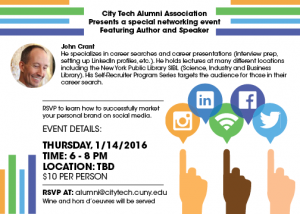
This week at City Tech Image & Visual Communications, I had to create a “5×7”e-mail flyer, for the City Tech Alumni Associations networking event. I created mock ups for the flyer. I created silhouettes of hands and the colors I used were peach, tan and brown, to show different ethnicities. The hands are pointing to a circle and inside the circle there are four logos, of major social media networks.

The idea of the graphic is to direct people, to use different social media sites and apps as a way of networking. I wanted to show the hands; selecting different social media is easy. It’s just like making selections on smart phones.


HuseyinAkis_Flyer Mockup 2

Near 4 o’clock, I signed my name on the internship evaluation form. I thanked Mr. Vargas for giving me an opportunity to work with him.

Huseyin Akis – Blog Entry #13

Today, its November 18, 2015 and I’m still interning at City Tech Image & Visual Communications. I’m starting to feel less shy towards my Co-workers. I talk with some of my Co-workers a lot more now. It’s a great thing to communicate with Co-workers. If there is nothing to talking about, it never hurts to say “Hello, good morning”. Communication releases stress and makes me feel comfortable with my Co-workers.

I entered the office around 10 o’clock with a smile and said “good morning” to my Co-workers. Mr. Vargas came along, while I fired up Illustrator. He took a look at my logo comps for PG4U (Professional Growth For You) the Alumni Associations new mentoring program. He told me to “replace the font of the 4 to Bebas Neue and keep the font of U as Gotham”. The Bebas Neue was too condensed next to the Gotham and it looked off. I decided to use Futura Std Bold Condensed for the 4 and I brought the letters close to each other.

I made a bunch of variations with the letters. For some of the variations, I overlapped the letters with each other. In several of the variations, I joined the letters. For two of them, I cut the lower left side of the U a bit. This way the PG4U draft 6-014 looked like, it was a key fitting in the U.

My supervisor took a look once more and told me “to add transparency like I did in the older comps”. I jotted down the revisions he told me to make on a notepad. The day was pretty much over, so I packed up and left at 4 o’clock.

Hanwool Kang Internship blog #12

A few days ago, I got a text message from one of my friends. She wondered if I’m looking for a job. She said that there is a position in her company. It is about organizing digital files. I didn’t know what it does exactly, so I told her I’m in graphic design major and about to graduate. She said her company has creative department so I can do graphic design work or web design. I thought it is a good opportunity. Honestly I can’t take the job right now because I have to do school work, intern, and another part-time job. I don’t have enough time to do that. I asked her if it is possible to work one or two days or wait for me until I finish school. I know it doesn’t make sense. There is no company waiting for worker. However I don’t have any other choice. She said she will take about that with her manager. I just hope that it is still available when I’m done school.

Filicia Hopkinson Journal Entry 14

November 30, today I showed up to for my internship to find that my supervisor, the art director, was not in for the day. So for today I get a free day. I have to see if it was just a family emergency or if I don’t have to come in for the week. Hopefully, she is not sick.

December 1, so I came in today and was told I would be designing a holiday postcard for the college. I was not sure how many designs I would need to have done by the end of the day but I decided to have at least three done. Before I did anything I started thinking up words one would associate with the winter and holiday season. If something was too cliche, I would cross it out until I could come up with a suitable idea for it. This continued for about an hour before I began sketching, horrible little sketches, but sketches nonetheless. I knew I had to incorporate the either the word “joy” or “peace.” For both of the designs I chose the word “joy” since it was the shortest and I had at least two ideas for them. In one idea I decided the make the word “joy” into gingerbread cookies. I was very hungry so I have no idea why I tortured myself like that. The second one, the word “joy” would be made out of snow, I chose a holiday looking font by the name of Wallington. It is a pretty nice font.

Travis Montalvo Blog#14

Fourteenth Entry: December 1st I didn’t notice it until now, but I’m 92 Hours in and I feel as if I finally just started picking up momentum. I believe in the earlier weeks of the internship I was trying to find out where I fit in and how my voice could be of assistance. But now it’s like another family. Everyone is also making jokes and discussing current events that make you understand the personal side to these professionals. They were completely normal, and far from stuck-up as I initially saw them to be. (Hopefully, if they ever were to read this, they know where I’m coming from). I remember the first day I walked in, hardly anyone was smiling and they were conference calls every other day for sales results and compliance in the retail stores.

We now are actively advertising the 50% off Plans in NYC. We were able to get the approval for a Bus that projects a digital Ad roughly 20 feet wide on its side. This particular bus is meant to drive slowly on major Avenues to bring the most attention to the Ad it is displaying.

We are currently working on many Flyer Variations for the 50% off promotion. So I’m hoping at least 3 of 10 get approved for mass distribution! I’m also looking forward to Thanksgiving of coarse.

Hanwool Kang Internship blog #11

After I finished logo for “big production”, I was about to make a mockup. Basically Artwing is a photography agency. Photographs are really important. A photo can make totally different web-site. So I needed some information of the company and some pictures for home page and project page. I asked them before I begin to design.  Because the New York Artwing’s office is being renovated, I usually work on bean n bean cafe in Manhattan. When I work on cafe, my supervisor, scott, visit me and discuss about the project. However since that day, he never come to cafe and email me in two weeks. Finally, I got an email from him. He said that he wanted to see the progress. I felt that I had to show something, so I made a mockup using image from internet. I asked why you didn’t email me. He said he didn’t know he got mail from me. I wanted to say something. I thought it waste my time. Anyways he really likes my mock up. we discussed lay out and main category. He wanted very simple website even doesn’t want slides show.

Huseyin Akis – Blog Entry #12

The last time I was at my internship site at City Tech Image & Visual Communications office. I started on a new project, I had to create a logo for the Alumni Associations mentoring program called Professional Development For You (PG4U). The challenge is to make the logo similar to the Alumni Associations logo. I did research and sketched numerous thumbnails.

We later decided, on which thumbnails I could work with on Illustrator. On Illustrator I created several comps of potential logo’s I could use. This way I could see; which typeface and variations work best for the logos. We decided on which logos and typeface works best.

Today, I was feeling much better. I rolled into the office with a smile and said “good morning” to my co-workers. I setup my MacBook Pro on my desk and fired up Illustrator. Mr. Vargas assigned me to do different versions of a logo. For each logo I used either Bebas Neue or the Gotham typeface. I changed the arrangement of each logo and applied color with transparency.

The fonts worked well because they were both Sans Serif. Bebas Neue is a condensed compared to Gotham. We compared the two and choose, which one worked best. The colors I used were the City Tech colors blue and yellow-orange. When I applied transparency I lowered the opacity of the yellow-orange and the navy. The colors turned into lemon yellow and lavender.

As it approached four o’clock in the afternoon I packed up. There were still some revisions that needed to be taken care of. Mr. Vargas wanted me to continue creating more comps.

Filicia Hopkinson Journal Entry 13

November 24, and I am still battling my cold along with dealing with a lost voice. As bad as that sounds, it was not, besides the occasional bouts of almost sneezing everything else was fine. While working on a few projects the art director approached me stating that there was a few things I needed to do. Following, I learned that I will be doing some logos, not necessarily designing them, just typing out the department names and offices. If you are thinking that that sounds boring, once again you would be right. It was extremely repetitive, type the name of the department, then create an outline from the text, then white out everything. It was so mind-numbingly boring that I made a few mistakes here and there. However, nothing that could not be fixed with a simple retype and overwriting the file before anyone sees. I may have started off a bit slow but I managed to finish everything before the end of the day. Currently I am waiting for my next project, which Lisa tells me will be a little bit more creative. I am happy but not too happy, still not into the whole graphic design aspect. And when your next door office worker having a small breakdown about a project that was due yesterday it all does not seem to appetizing. However, I’m starting to like web design again so there is that. Oh, and I finally sneezed, NOW that was the biggest highlight of the day. With that done I could actually concentrate on what needs to be done.

Filicia Hopkinson Journal Entry 12

November 23, two more days before Thanksgiving and I’m at my internship, I have lost my voice and currently working on a few projects. At the moment they do not have anything for so I spent the day reworking some of my old websites. Especially since the release of the Samsung Galaxy S6 edge, I needed to figure out how my website would look on its screen. While coding for my website I realized that the background image I had for it was too small. So I re-sized at 960 pixels. Of course doing that I ran into something else. Since it is a one page design, I had to figure out how to keep the graphics on their respective sections which is turning out to be a chore. And then I ran into an additional problem that I did not have yesterday. The paragraph on the site is not doing what I told it too on the style sheet. Problems like these are annoying, but unlike graphic design. I like problems like these, it lets me flex my brain and figure out where the bug is or what code did I leave out that causing the page to act so wonky. I am not at the point where I could say that I love web design but I definitely like it. A whole lot more than I do graphic design. Maybe I should have went into computer science since I like coding so much. I should probably look into that later.

Filicia Hopkinson Journal Entry 11

November 18, I heard back from Lisa about my designs, the boring one was obviously gotten rid of but the constellation and the slightly better one I was asked to work on some more. I was given a paper filled with copy for what would be the information appearing on the postcard and I was asked to play with the type a bit more to make them seem less boring. Most of the design work was done, I just needed to add the CUNY Logo as well as the Brooklyn College logo to the back of the post card. Next it was type, I played with type hierarchy a bit a long with the typefaces that the art director had given me. I was given some direction with what information was the most important. Obviously it was the name of the students whose pictures were featured on the postcard who also happen to be the names of the students are a part of the fellowship. I spent so much time playing with the type that I had nearly forgotten the CUNY logo and Brooklyn College’s logo. The CUNY college’s logo was supposed to be small while the Brooklyn College logo is supposed to be big. Makes sense right, well what is seen as big and small is entirely subject to the art director’s perspective. I made the CUNY logo to small and the Brooklyn College too big, so I had to go back and forth re-sizing. I remember something like this from Communications and Design class, logos are a funny thing. If it is to big, it is too loud; however, if it is too small your viewers can’t see it. Somewhere in the middle there is perfection…or as close as you can get to it.