Monthly Archives: April 2015

Journal #10 – Brian Rubio

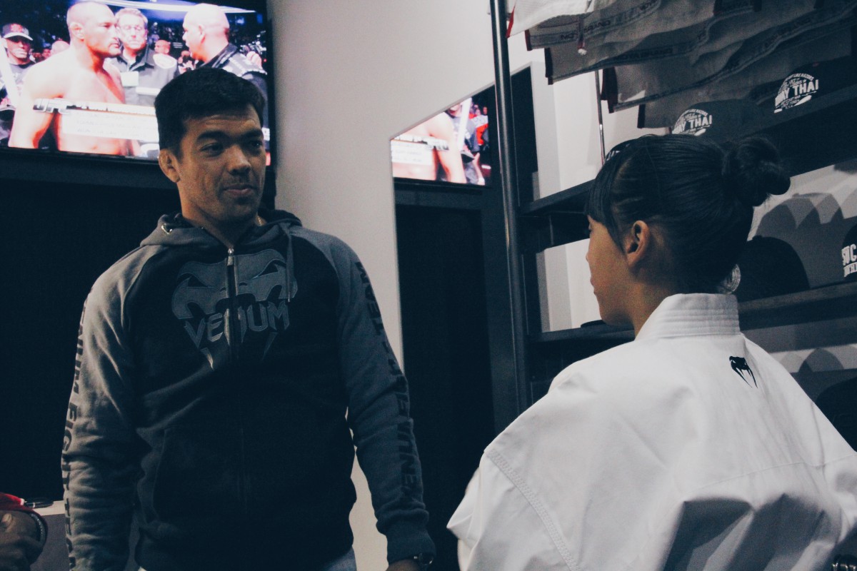
This week at my internship was very productive. After last weeks visit from Lyoto Machida, a professional MMA fighter, the boss and I came up with an idea that would help both the store and my photography. The idea is, when ever we have a signing or an event most people scramble to take their phones out and hold up the line to take a photo. To avoid this, we decided that I can be in charge and take photos of each guest and at the end of the event edit and post them on a designated album on the shops Facebook page. Each guest/customer that is following the shop via Facebook can freely go into the album and download the picture thus creating more traffic onto the page and exposing my work at the same time. Along with this idea the shop has allowed me to watermark the pictures with their logo and my own. Learning to watermark several pictures at a time was a challenge on its own and it isn’t something we’ve learned in class. After watching some tutorials on Youtube I found it easy, the next challenge was to separate the landscape and portrait photos so that the watermarks can sit in the same position in each photo (easier said then done). Regardless of the work and research I’m very excited to have this opportunity and grow with this company. Sharing ideas and watching them develop to make a company improve in the slightest is a wonderful thing.

Here are some of the shots from that day.

IMG_0955 IMG_0956 IMG_0957 IMG_0958

Journal #13 Josephine Woods

This week is is very busy busy busy. In my internship I am finishing up on the minor details on my futuresandoptions.org app. I readjusted the text placement so on all slides the text are even on every slide in both the IPhone and android apps. now all I have to do with this app is work on the content and than place it in a PhotoShop mock up presentation so I can present it to the clients and the class.

I want back over my babybuggy.org app to make sure I didn’t have to fine tune it, or make any major changes. So far the app is still complete and only thing I need to do is place it in a PhotoShop mock up document to present it to the clients and show it to the class.

My first app I designed was stompoutbullying.org, I had to do a major over haul with this app. Had to change a few of the images and and add two more images to the slider.  I’m still working on this app but I’m sure I can save this app and finish it in time so I can show the clients.

I am hoping that I will finish everything Monday and start emailing the clients. I only have two weeks left of my internship and I want to make sure that everything is complete so that i can add even more work to my portfolio other than school work.

Entry #7

Last week at the internship I had to keep working on a project I started a few weeks back. My first task in this project was to create a web invite for the Women in STEM Luncheon. I had the chance to just make a few changes to the piece that someone else had created for the same event last year, but I preferred to try something new and came up with a design from scratch. I sent the two designs to the client, and she chose my original creation — that felt really rewarding.

Now, this new project was to take the same visual elements from that web invite, and create a printed program to be given to each participant of the event. I was given only a few hours to finish this, but with the help from Prof. Jordan and the quick feedback from the client, I was able to get everything done in time. The client was really happy with the final results, and so was I.

On Friday, I had to take pictures at another faculty event that took place here at City Tech, on the sixth floor. I enjoy taking pictures at these faculty events because it’s nice to see professors in kind of a student set up. At this event, they were encouraged to share their opinions on ways to improve teaching. It’s always interesting to see some of them acting shy and not wanting to raise their hands when prompted to — that makes them more relatable to me as a student.

Journal Entry #3 (Sean Beharry)

The Greater New York Postal Consumer Council (PCC) website had a few errors on the back end that needed to get taken care of. I contacted Parker Web (the web design company PCC hired) about one the problems that needs to be resolved. A week later they sent me a email asking if I fixed the problem, when the whole point of me contacting them was for them to fix it. Since its a back end issue and I didn’t create the site I wouldn’t try to alter any coding or else I might mess something up I’m not aware of. The problem was the plugin for the photo gallery, it had a back end problem which wouldn’t allow anyone to upload image galleries via Word Press. Parker Web was uploading images via FTP totally ignoring the problem so I had to let them know that wasn’t very professional. Also they had a link to their website in the footer of the PCC website, basically free advertising. I asked the PCC board if they approved and they said no, so I had Parker Web also remove their link from the footer.

Journal #12 Josephine Woods

This week April 13th to 17th, was more of have too get work done, finish the finer details.

On Monday April 13th; I was working on the smaller  details, like text and font sizing, images and placement. I added the images from futuresanfoptions.org website and placed it in the app. Also I created icons on the tabs so when the users isn’t on the about page they would see an icon instead of words.  It took a long time sizing the images and icons, but end at the end of the day I think everything came out beautiful.

On Tuesday April 14th; I try placing text from a section of the site however it didn’t quite workout in the way I would like it to. I had to try recreate the text and numbers from font in Adobe PhotoShop. I couldn’t find the right font to match so I had to search for a similar font. Oh man talk about tedious, it took me two and a half hours just to find a similar font in PhotoShop. The worst part was that the numbers was a different font than the text, plus there was 2 to 3 numbers in each fact and the numbers was different as well. Than after I found  similar fonts I had to place each fact sentence in 10 different PSD slides. I came in at 2 pm and work til 4:30 pm on the fonts alone and than another half hour on just placing and re-sizing the fact font for 10 different slide. I leave at 5 pm every day and as soon as 5 pm came I gave up for the day. I actually saved everything and closed the laptop, said bye to everyone and I just walked out the door.

On Wednesday April 15th; I crated two more icons one foe who we are and the second one was for how you can help. I started uploading the finished png’s to the server and assigned them to the slide part of my app.

On Thursday April 16th; I had a mandatory BTTIP meeting I had to go to before I went over to my internship. The meeting the BTTIP coordinators discuss about summer opportunities for summer internship even if I graduate I can still apply for the internship. It was very vague and they didn’t know much about it either, but all they knew was that big technology industries will be hosting this internship and that it starts sometime in June . Than after the meeting I went to my internship for awhile and just fixed some more details with color and placement of content.

On Friday April 17th; I moved content from the futuresandoptions.org website and placed it in their respective place in the app.

Journal Entry 11- Latimel Rodriguez

Last weeks internship was a tough one. I was going through financial difficulties and transitions from an old job to a new job. This is only relevant because it’s truly difficult to juggle full time employment and part time internship. Non the less I was fortunate enough to be given the opportunity to work from home. Al understood the hardships I was facing and provided me with the opportunity to record my hours and work from the comfort of my home.

Similar to if I was headed to internship that morning I woke up at 7A.M. and got dressed and ready to head out. I brewed my morning coffee except that day I was going to work from home. Why get dressed then? I feel I work better if I treat my home like a personal studio. I rummaged through old videos turned on my Spotify to my favorite Hip-Hop album and started bumping it heavy.

The process started I grabbed the image of a model holding the barbell behind his head and dropped the file into Photoshop. I then proceeded to saturate the image, intensify the shadows and lighten up the mid tones. After I was satisfied with the way the image looked I then placed a gradient map using the colors black and transparent, and what this technique does is further intensify the shadows without affecting the highlights and only affecting the mid tones slightly. Pleased with the outcome i then posterized the image using only four colors. Explaining it is very fast but the entire process took about an hour to execute.

While running photoshop I opened up illustrator and dragged the photoshop file into the illustrator program. I then proceeded to trace the shadows of the posterized image using the pen tool. This process alone, you won’t believe, took a day and a half. The following step was adding the shadow spread. To explain what this looks like , they are the triangle lines at the end of the shadow. The mid tones were next for pen tool process and it was similar to the shadowing of the illustration, but instead of a black color I chose a tint of pink.

I chose impact as the font family because of it’s strength and masculinity. I kerned them closer because when you think of someone thats fit you think of “tight”, “in shape”, and I wanted to show that through the type. All and all working from home is difficult because theirs a lot of motivation at work, but I was pleased with the outcome and the poster in its entirety took me about 16 hours.

Raise The Bar_poster

Entry #6

Last week was a very busy one. After photographing at the Brooklyn Museum, and the Borough Hall event, I got to take pictures at the Literary Arts Festival at City Tech. The festival took place in the Vorhees building and it featured students and faculty with various set of skills. There were poetry being read, alongside essays, and there was even a dance presentation by two students. The latter, in special, required a lot of concentration of my part. Since I wasn’t using a tripod, it was a challenge to get shots that weren’t blurry, because of the fact that the dancers where constantly moving (as they should). Luckily, I was able to achieve good results.

Prof Jordan asked me to arrive early so that I could take pictures of the backstage, and I did. It was great to see the last minute rehearsal taking place, and important for me to have an idea of which angles worked best.

The amphitheater where the festival was being held was, as expected, very dark and that was a challenge with which I had to deal. I had to be careful to make sure enough light was hitting the camera, but in a way that the parts of the stage that were well lit didn’t come out overexposed. Of course, post-production is fundamental, and Adobe Lightroom came in handy when it was time to fix those little details.

The event lasted around a total of two hours and I was pretty tired afterwards. During the entire time, I was going up and down the stairs on the side of the amphitheater to get diverse and exciting shots. I got a total of 350 shots, so I had a lot of curating to do.

Journal 11th Entry – Mohamad

Last week I didn’t do any work due to the technical difficulties that I mentioned before, so I had to go downstairs to the department print shop and help with whatever they needed over there. They had to print couple of different brochures for an incoming event; I’ve been into the print shop before, but they didn’t have that much to be done. So It was me and the lady that runs the shop, she had a little knowledge about basic printer configurations which she taught me, plus how to change ink and paper in big printers. We had to print 3000 of each brochure, looks like it was a big event, so I had to ask the lady what kind of event is it. She said it is a Property Registration seminar and it is held all over the five boroughs. At first I didn’t catch what she said, but when we started printing, I saw that it is the brochure that I was designing last week, and was waiting for the director’s comments on it. Apparently she was happy with the work, and didn’t need any change or fix in it. I felt happy that my work was processed that fast, as opposed to the ABC’s of Housing that I designed in the beginning of my internship, and had to change like a million times. These kinds of moments push me to keep going as a designer, and not to care about any difficulties, because we only learn from those difficulties to make our work and life better and easier.

Journal 10th Entry – Mohamad

This week I came to work hoping that I have any comments on my work, so when I arrived, I went straight to my supervisor and asked him if there is any reply from the director. He said that the director was a little busy and didn’t have the time to check the design, but whenever she does, she will definitely tell us. As usual he didn’t have any design work for me, so he told me that I have to start a new Council District Report, but I have to add March 2015 into it. I went to my cubicle and as usual logged in into my user, but this time the password expired and I had to replace it, it’s a monthly thing here at HPD for security purposes I guess. So after I successfully changed the password and logged in, I was shocked that everything was gone! No softwares (Adobe Collection, Cristal Reports…) everything was gone, even my design work. At first I thought it was because I had to change the password, but when a co-worker signed in at my computer, it had the same problem. So I ran to the supervisor to tell him about what happened, and he was shocked as well. He told me that he is going to contact the technician to check on what happened. I hope that the technician knows what happened, that he is that one that formatted the system and have a backup of my work; otherwise I have to restart it all over again.

Humberto MV journal entry #10

I am still continuing the saint Patricks  video editing. Now that I have chosen the clips I need. The art director, well he’s mostly everything, creative director, art director, senior designer because he’s the only designer there since it’s a 4 man start up. He gave me the music track on which I will put all the clips and match the overarching story of the video with the audio to synchronize it and make it look good. As well as add any color correction, brightness and contrast balance etc. hopefully after everything is put together I can add some motion graphics to make it even more appealing. The song being used is called beautiful day by U2 I’ve never heard of the song, but I guess it goes with the clips I have chosen. The video shows everyone is having the best day of their lives even though they are drunk, but they are enjoying themselves with their friends. They have no care in the world, every problem they have goes away just for those instances. I feel it embodies some of what the song is about just by the title.

I have also been tasked to create the logo for their new series they are creating called “brand building”. The series is about as the CEO explained it is sort of the ted talks but for how to build a brand and how to make it recognizable. The videos would be about 5 min along or depending on the topic of that video. The ideas I chose where sort of construction equipment, more specifically a crane. I felt that it signifies building and lifting something both literally and metaphorically from the ground up. Overall it has been a productive couple of weeks. I’m not sure if I can show what I’ve been working on yet I will ask next time I go.